G.A.P Sister Booklet Project. Aug - Nov 2017
This project is in association with Colosoul Group Inc., a NFP arts and media organisation providing experience and pro-bono projects for youth from Perth, Australia. G.A.P (Got Absolute Potential) is a program created by Colosoul Group Inc., to provide youths from 12 to 17 years of age an opportunity of mentoring and hands-on experience outside of the schooling system to offer youth a surviving chance in the workforce.
Check out Colosoul Group Inc. and G.A.P on their mission here:
http://weare.colosoul.com.au/
I was tasked with designing layouts for the G.A.P booklets - a sponsorship/information booklet to attract potential sponsors (businesses) to assist financial needs of the program and a weekly booklet for G.A.P participants (youth) to engage in the activities and use it as a workbook.
Sponsorship/Information Booklet. As the G.A.P logo is blue, I have decided to go for a blue theme to create consistency and recognition behind the logo. I studied that in colour psychology, blue is a colour of trust and security.
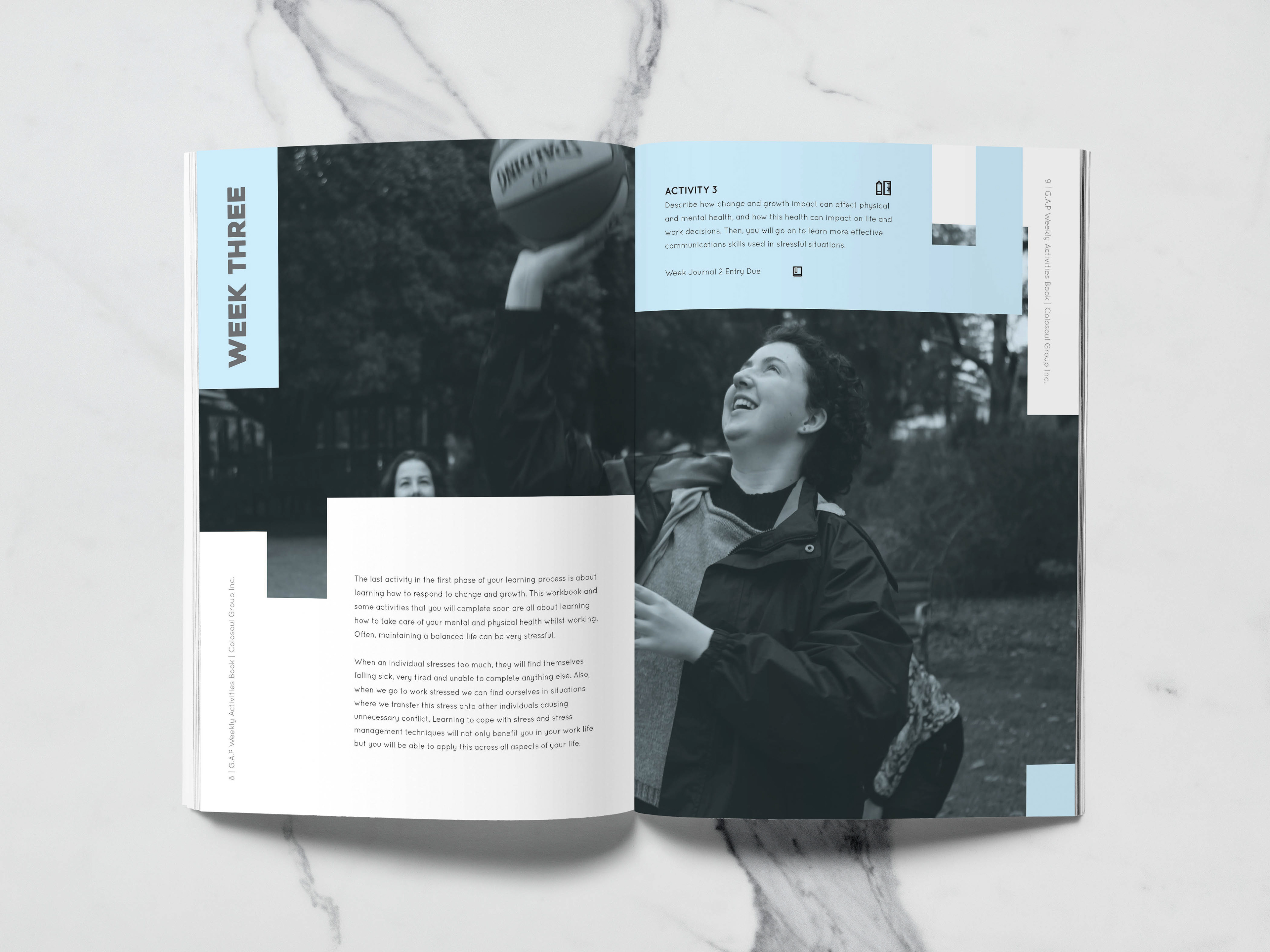
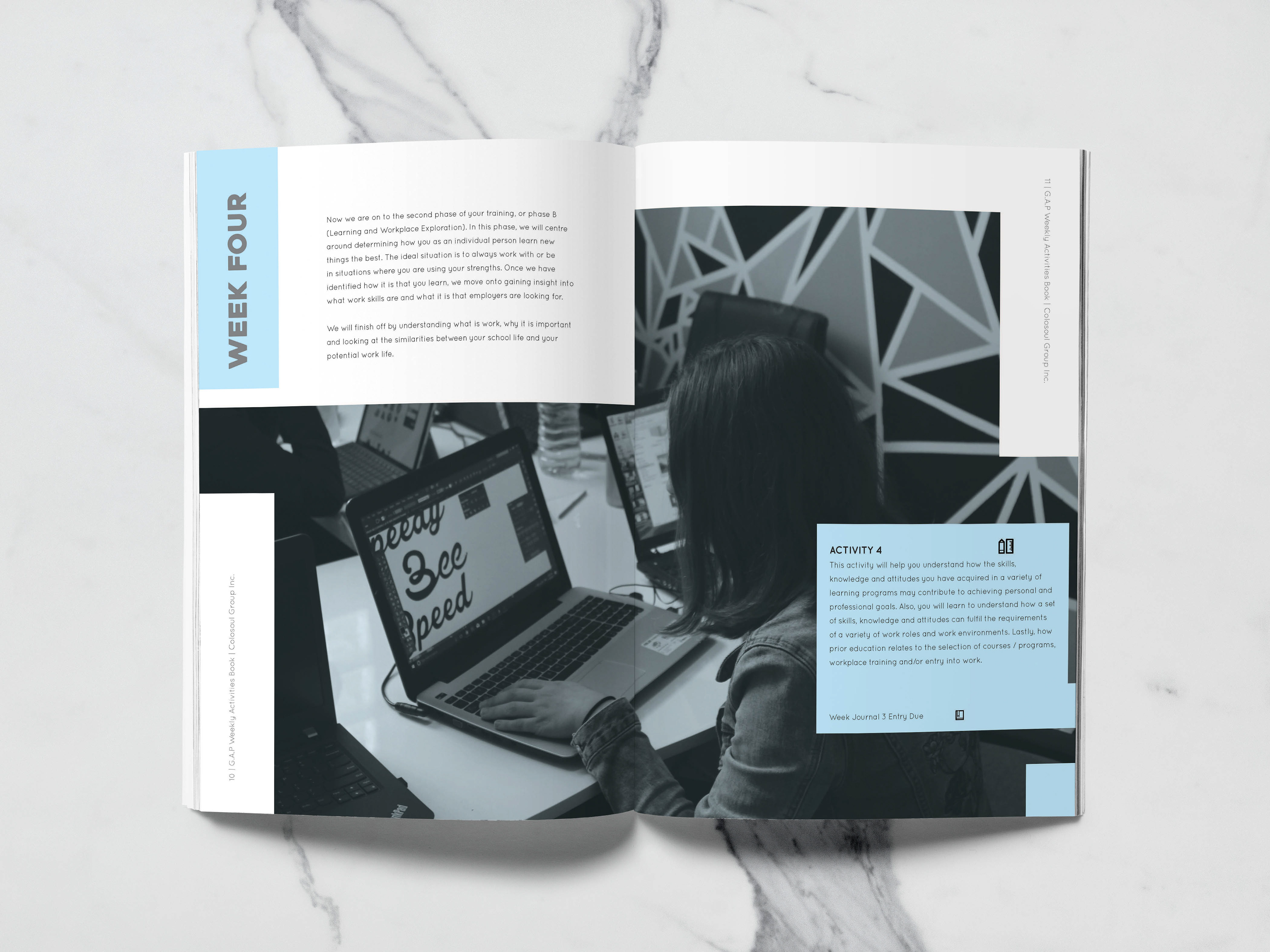
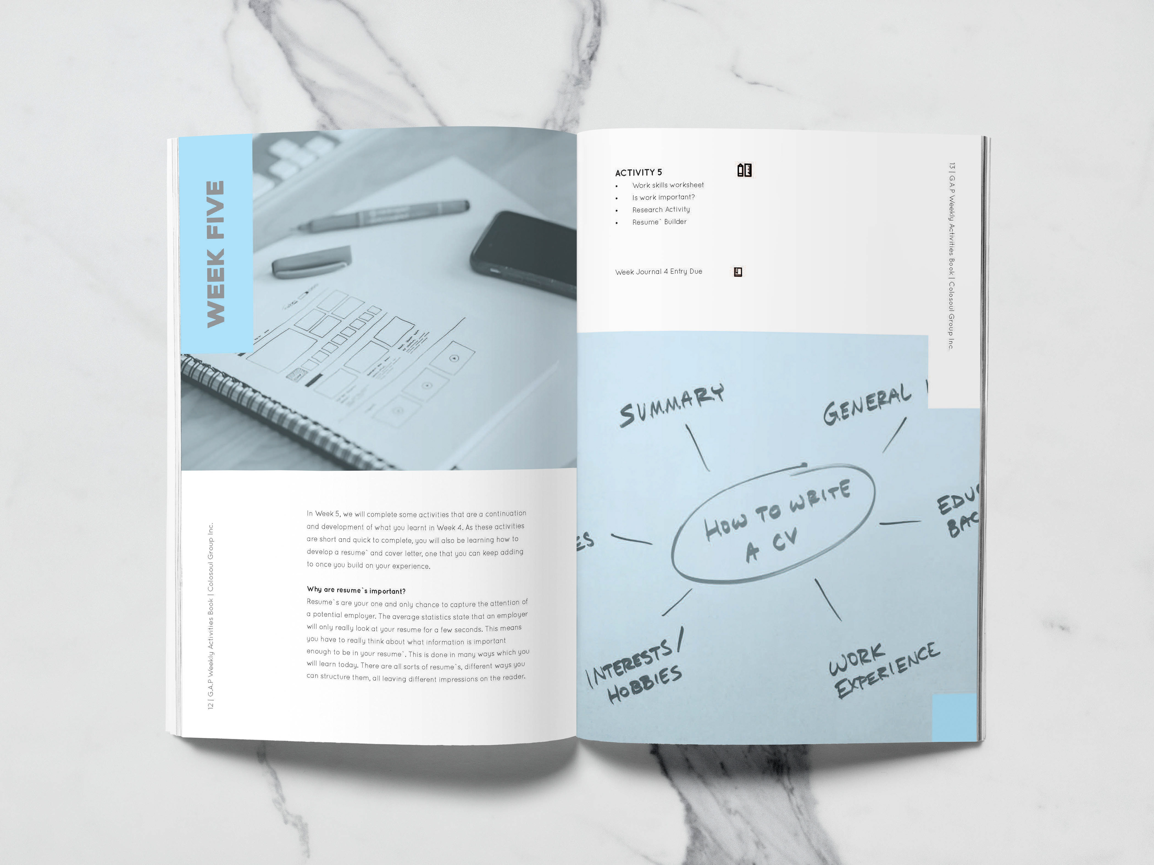
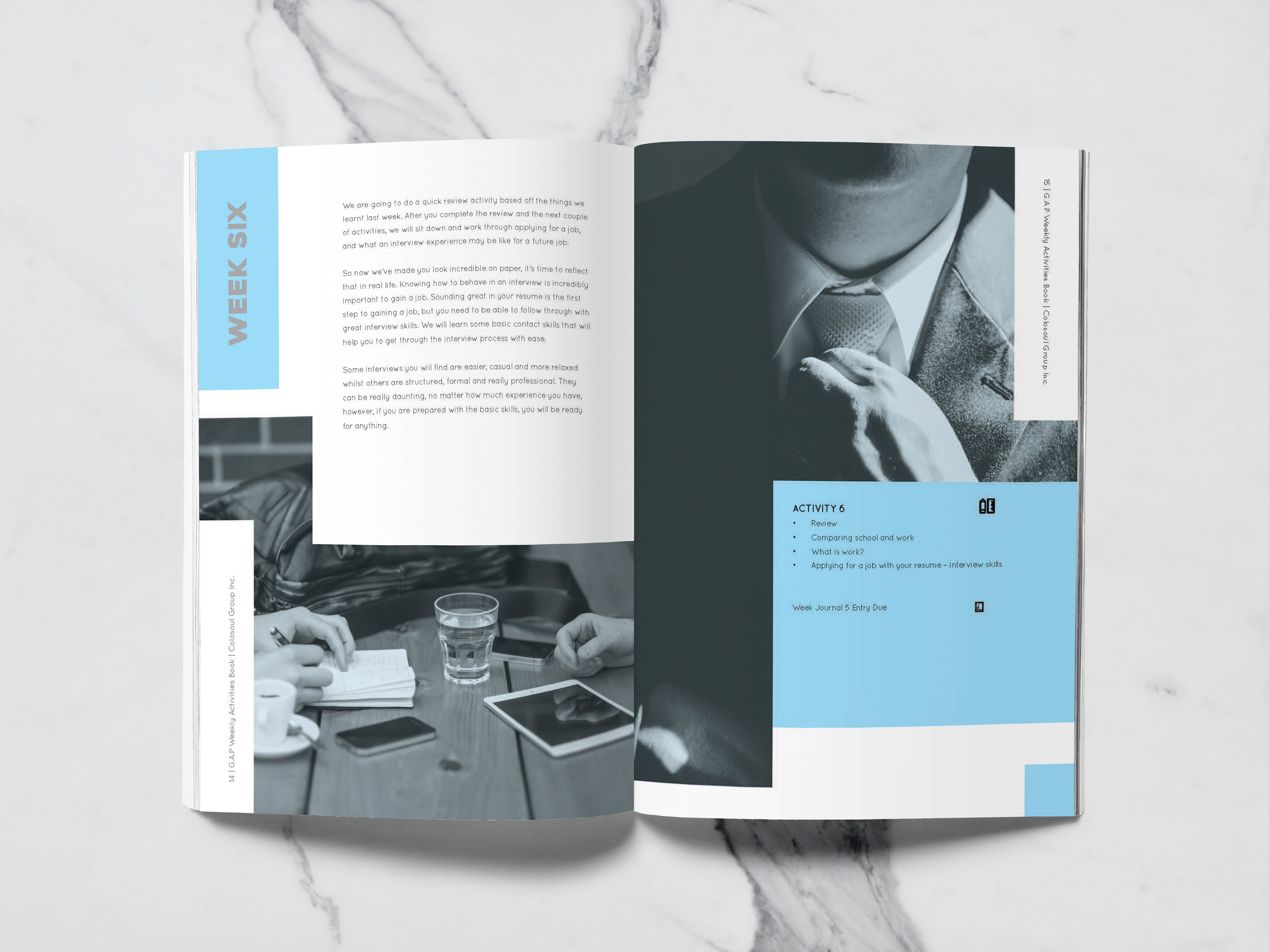
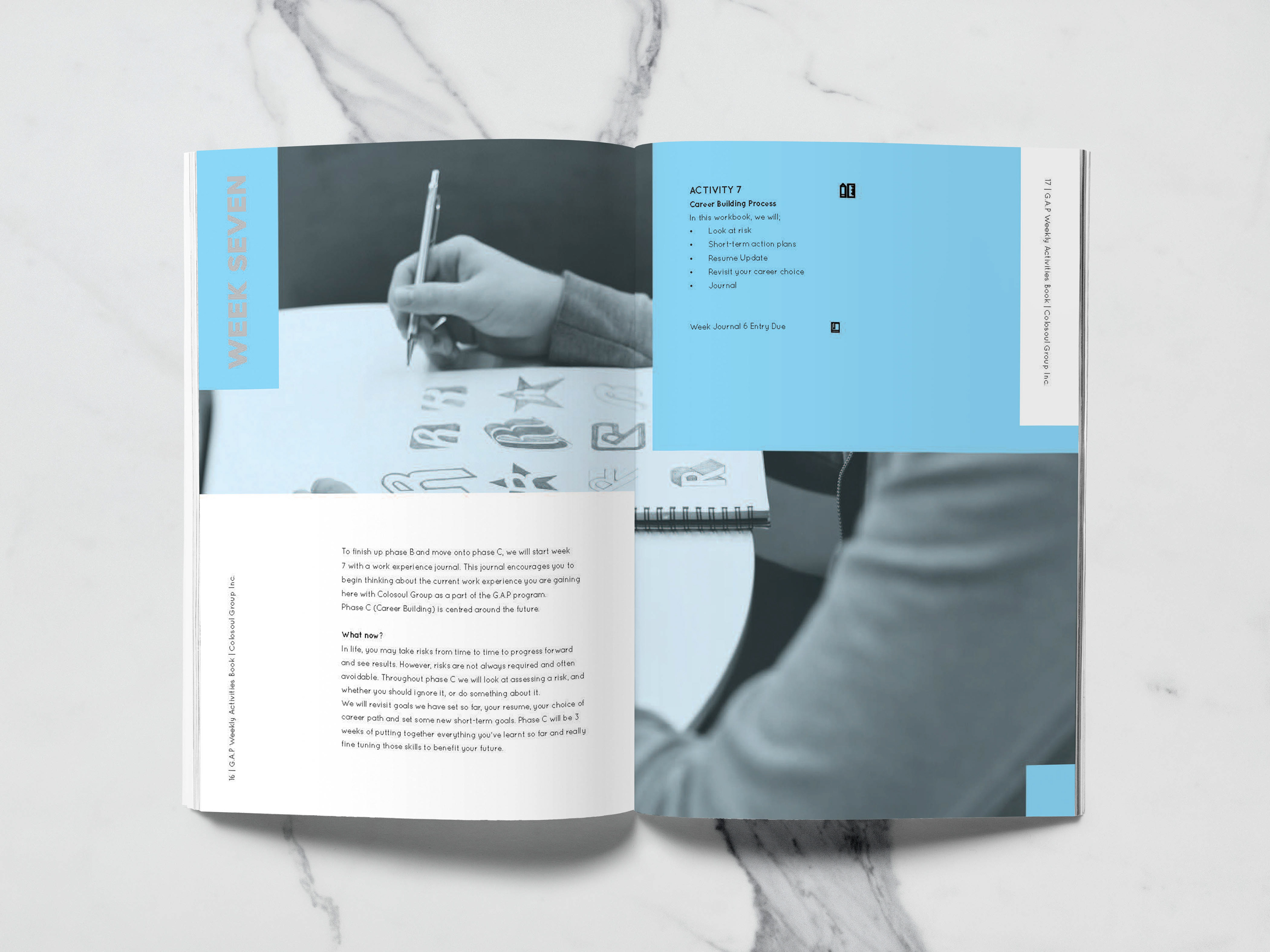
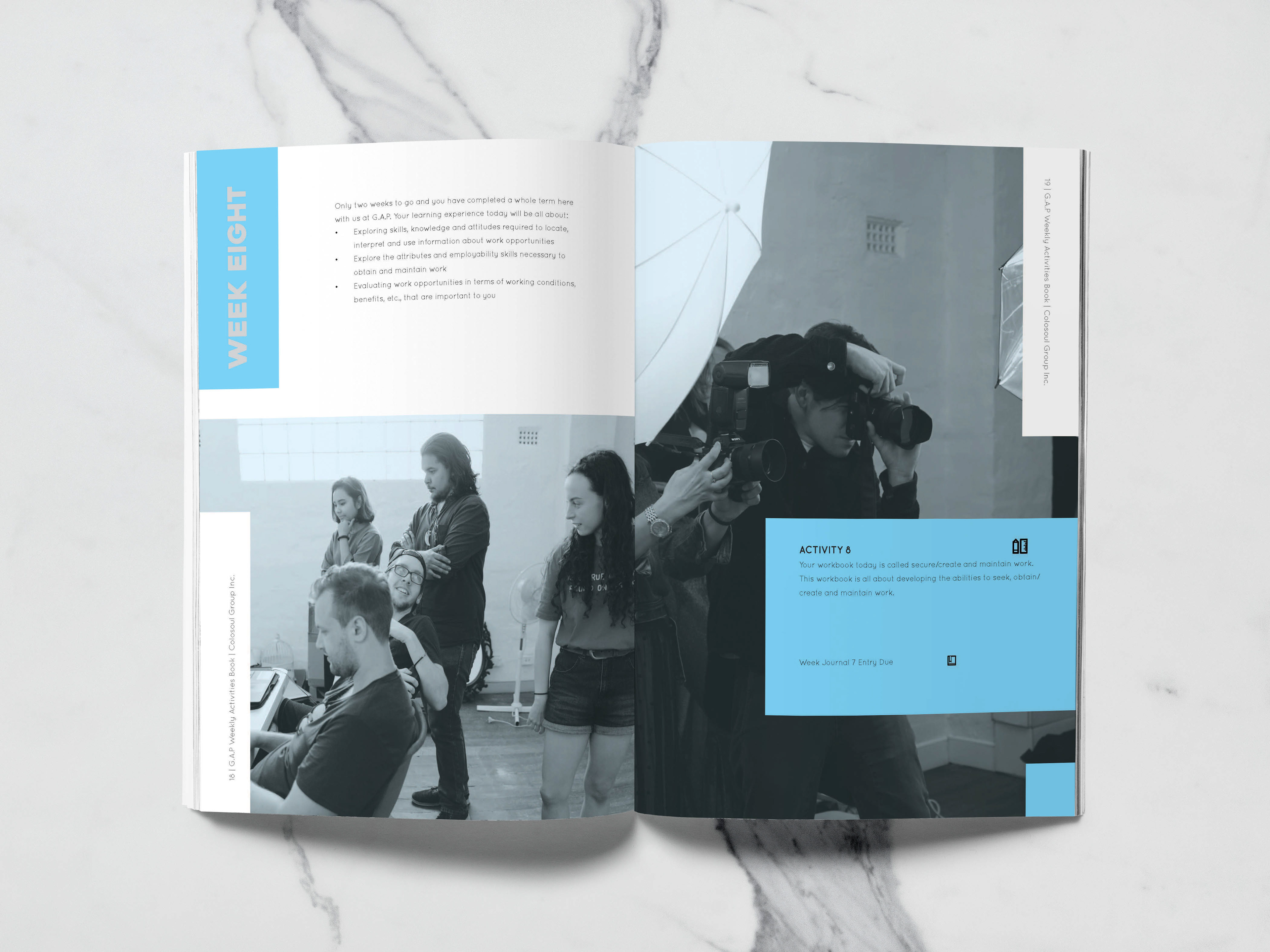
For both G.A.P booklets, I went for a jig-saw puzzle design to create an interesting dynamic as the layout and allow for more flow for the image and text between the pages. The jig-saw also symbolised the idea of coming together, and working with each other to make the system work, hence jig-saw puzzles as a showing of a great fit.
I adjusted the tints for each page, utilising it as a way-finder for the reader and a progression bar from start to finish. I used a mix media of Colosoul Group Inc's photography selection and stock images to put this booklet together, carefully selecting images to match up with the text content.
I adjusted the tints for each page, utilising it as a way-finder for the reader and a progression bar from start to finish. I used a mix media of Colosoul Group Inc's photography selection and stock images to put this booklet together, carefully selecting images to match up with the text content.
For the sponsorship booklet, I was aiming for a corporate feel as it was aimed at businesses but also appealing in a charity manner. I used more images for this booklet as I felt it would help the booklet feel more legitimate and trustworthy compared to using illustrations for the Weekly booklet.
During my time working on this project, I worked with a diverse team of people - project managers of G.A.P, graphic design volunteers from Colosoul Group Inc., and photographers from Colosoul. There were many last minute changes, and many approvals to be made, hence it had taken months before finalising the project. New photos would be taken to suit new ideas, and I remember drawing an illustration from scratch for the Weekly booklet because the project managers were not satisfied with just images for the cover.
It was hard to impress everyone, but I was glad to not have copied another design and be allowed to have my own design as the layout and cover. I was still allowed to express myself creatively, and I obtained the experience working back and forth with a diverse team, even dealing with a few frustrations of my own.
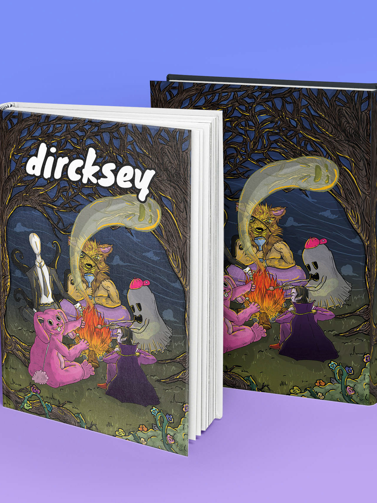
Besides the sponsorship booklet, I worked on the Weekly booklet which expressed more of my own style with the illustration cover and back cover I created. Although, I felt frustrated inside to do a sudden cover -- looking back I think it was the best decision. It made the Weekly booklet distinguished from the Sponsorship booklet and created its own identity while still being apart of G.A.P.
This cover undergone many changes, small ones from changing the colour of the shirt, background design and text layout, I felt exasperated throughout. I am happy with the design now as it best represents the G.A.P from the symbolism of the plant at the start to the back cover of a full grown tree. I also thought the little elements on the front cover background were a great way to add style and engagement.
This cover undergone many changes, small ones from changing the colour of the shirt, background design and text layout, I felt exasperated throughout. I am happy with the design now as it best represents the G.A.P from the symbolism of the plant at the start to the back cover of a full grown tree. I also thought the little elements on the front cover background were a great way to add style and engagement.



Thank you for viewing this project and supporting my Behance. Please leave an appreciation thumbs up if you enjoyed the project!
