My last project with Colosoul Group Inc.
I designed a sign to represent what Colosoul is about and attract visitors and outsiders to come into Colosoul and see what it is about.
Before this design, my older design was rejected.
Below: Old Designs (3 Alternatives).
I designed a sign to represent what Colosoul is about and attract visitors and outsiders to come into Colosoul and see what it is about.
Before this design, my older design was rejected.
Below: Old Designs (3 Alternatives).


What was wrong with the old design:
When I had a meeting with the General Manager of Colosoul, Katelyn, she told me it didn't represent Colosoul. She mentioned that it looked too corporate, boring, and the design felt cheap and tacky. At first, I couldn't see another solution, but she then mentions that she'd love the sign to be in my illustrative style. She suggested an idea but I thought it was tacky since it sounded like a clip-art or a word-art design.
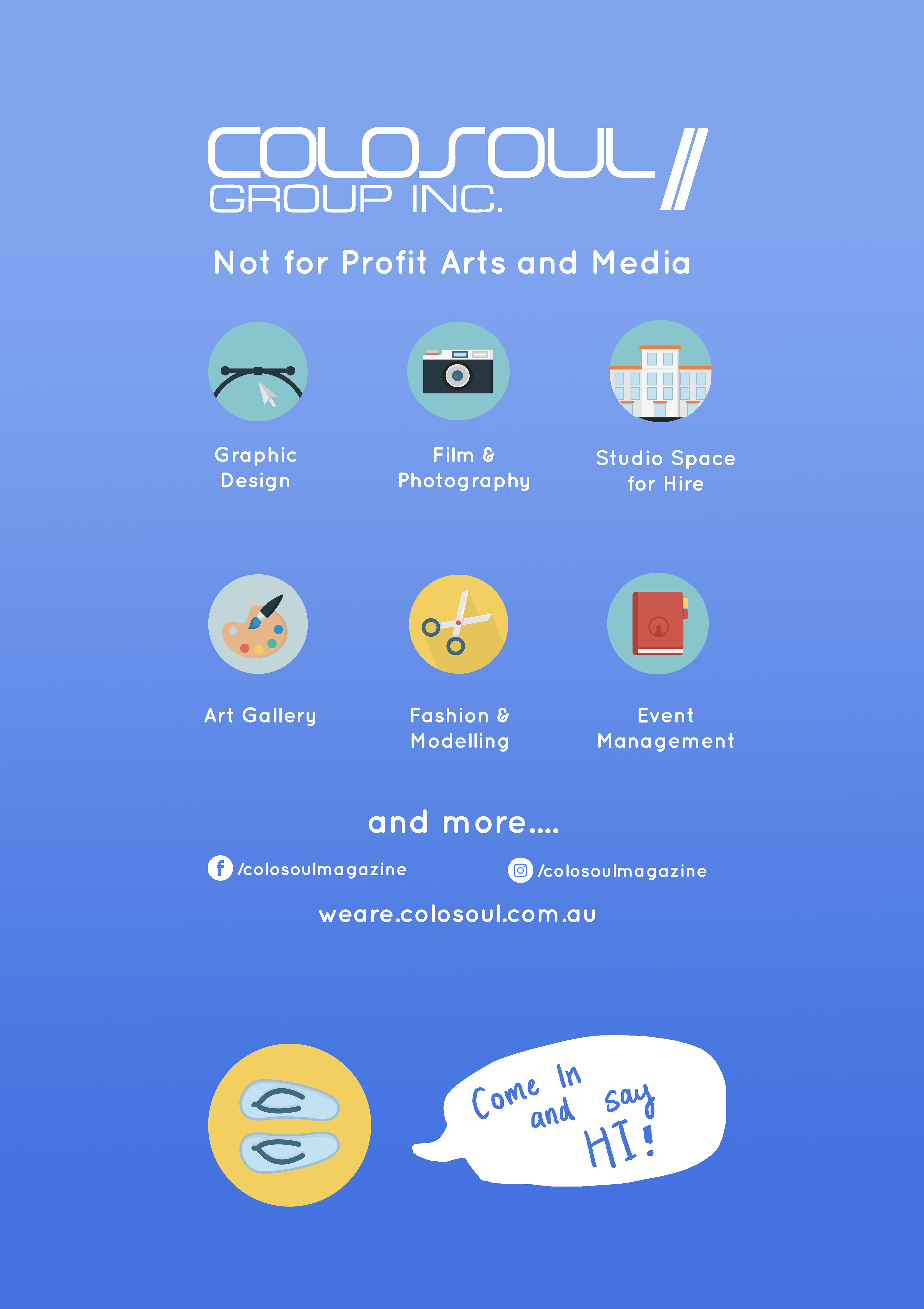
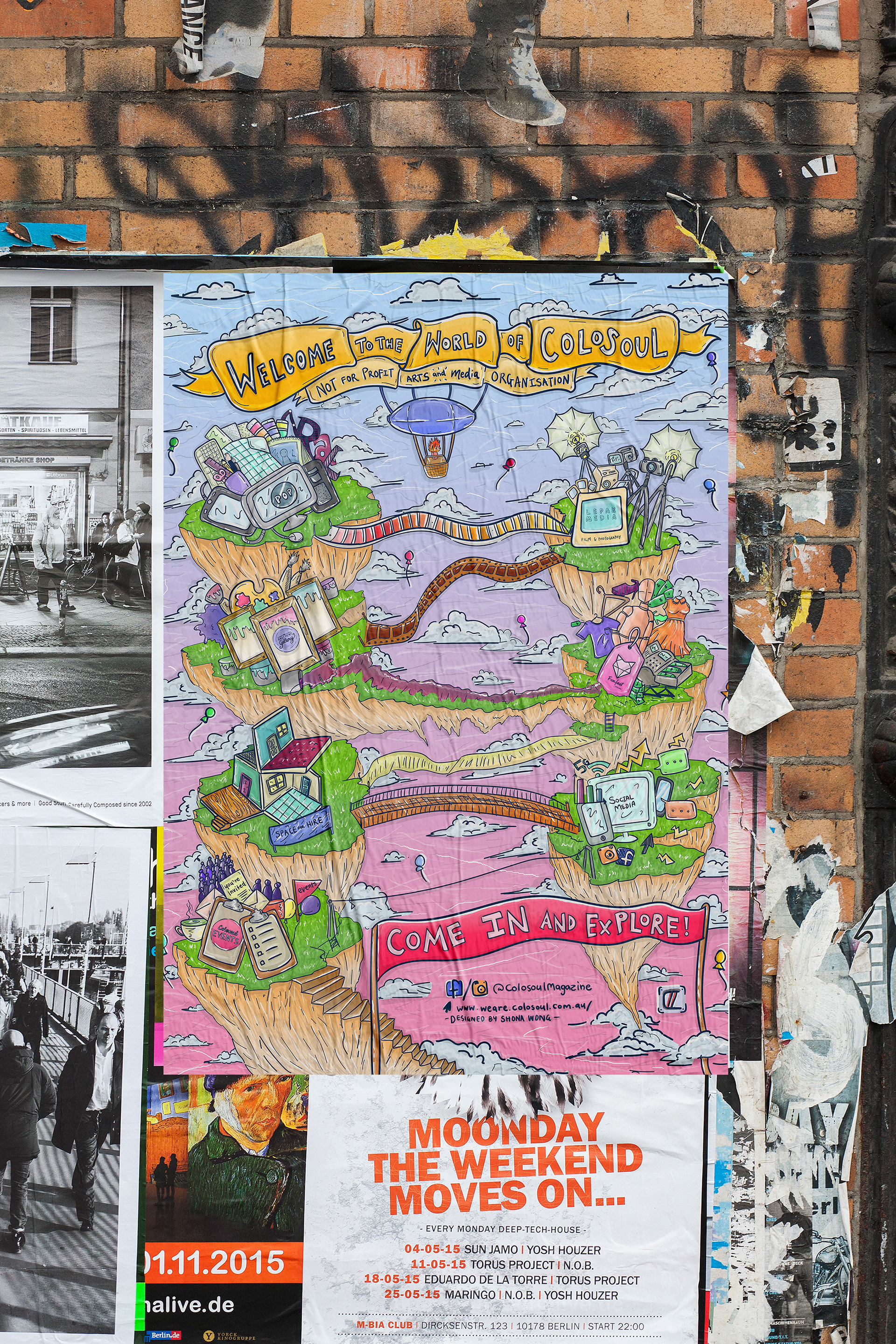
Then I suggested a "amusement" park theme - if Colosoul's departments represented a ride or a land - it would showcase what Colosoul does but in a fun, amusing way. She liked this idea and we explored it further, suggesting it could lead down so that viewers can take action to come inside. I confirmed details with her such as the necessary departments needed to be in the sign and then wrote lists of what each department would contain.
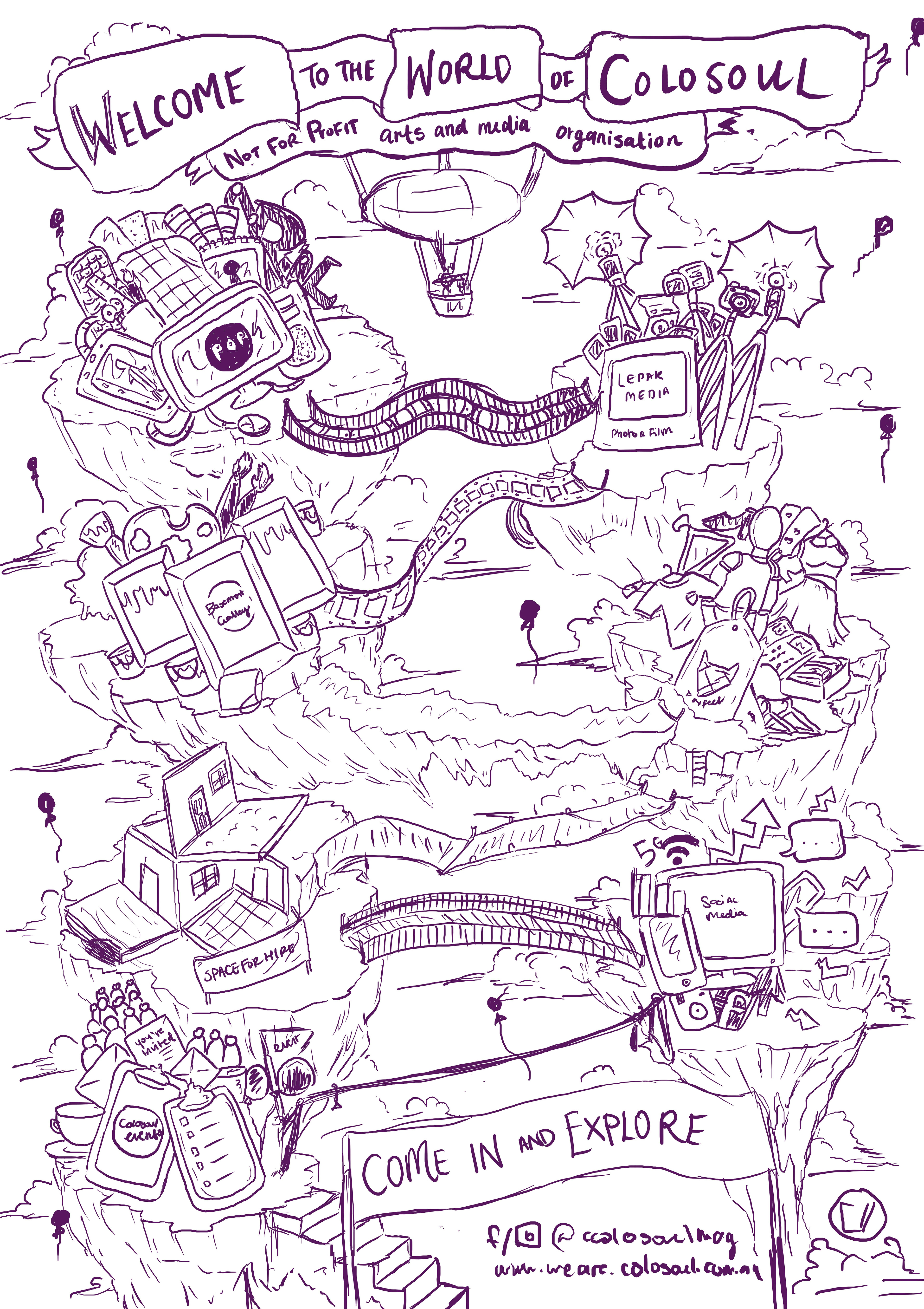
I developed a rough sketch (see below) where I would show Katelyn the design to see what she thinks.
When I had a meeting with the General Manager of Colosoul, Katelyn, she told me it didn't represent Colosoul. She mentioned that it looked too corporate, boring, and the design felt cheap and tacky. At first, I couldn't see another solution, but she then mentions that she'd love the sign to be in my illustrative style. She suggested an idea but I thought it was tacky since it sounded like a clip-art or a word-art design.
Then I suggested a "amusement" park theme - if Colosoul's departments represented a ride or a land - it would showcase what Colosoul does but in a fun, amusing way. She liked this idea and we explored it further, suggesting it could lead down so that viewers can take action to come inside. I confirmed details with her such as the necessary departments needed to be in the sign and then wrote lists of what each department would contain.
I developed a rough sketch (see below) where I would show Katelyn the design to see what she thinks.
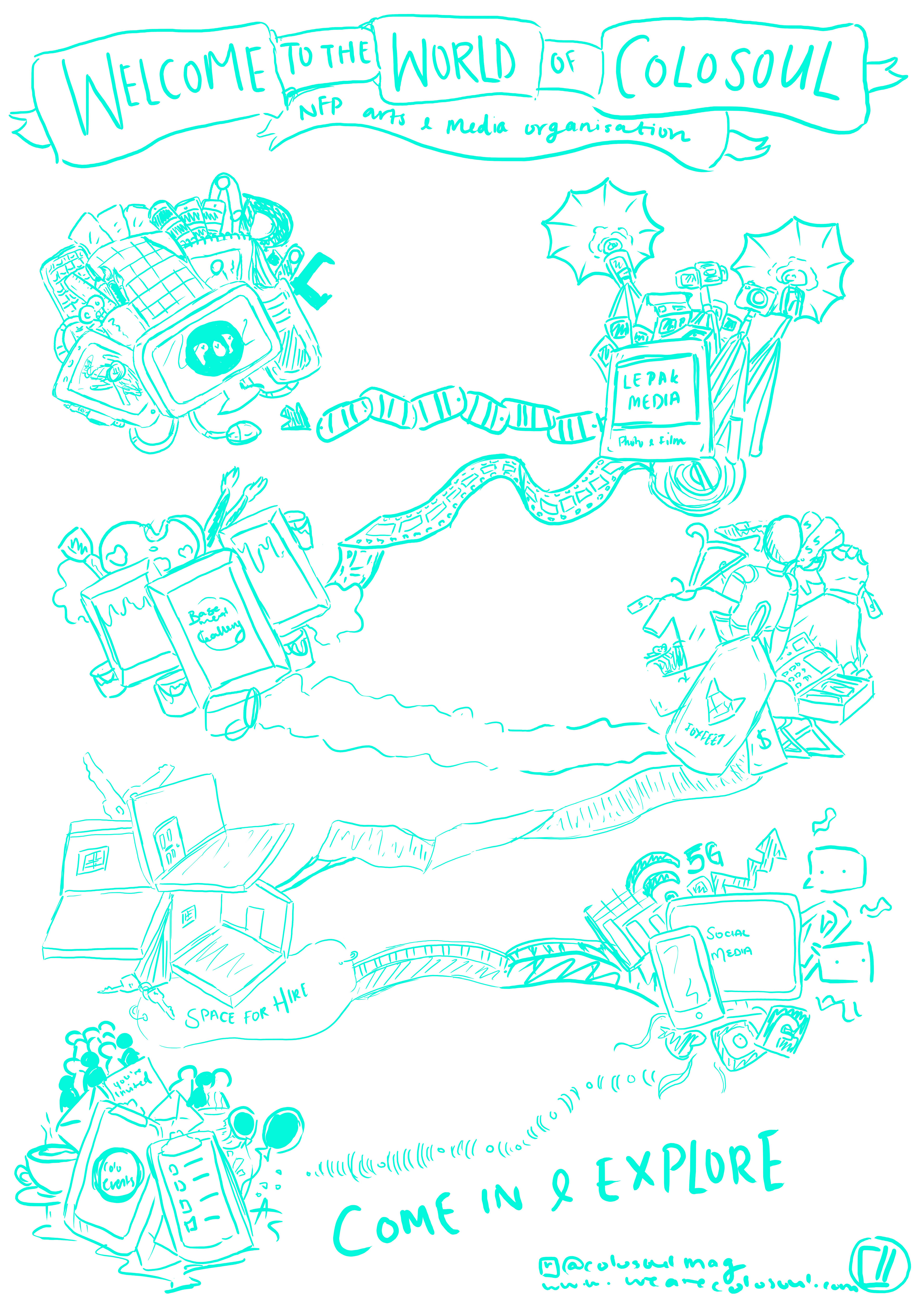
I prototyped the idea further thinking of type of background would suit. This would come eventually as I kept dabbling on the design. Katelyn loved the design which made me happy since when I first worked on the Lacuna Exhibition design (see my previous Colosoul work) she was quite harsh and hard to please.
The only feedback was that I should work on the bridges between the departments.
The only feedback was that I should work on the bridges between the departments.
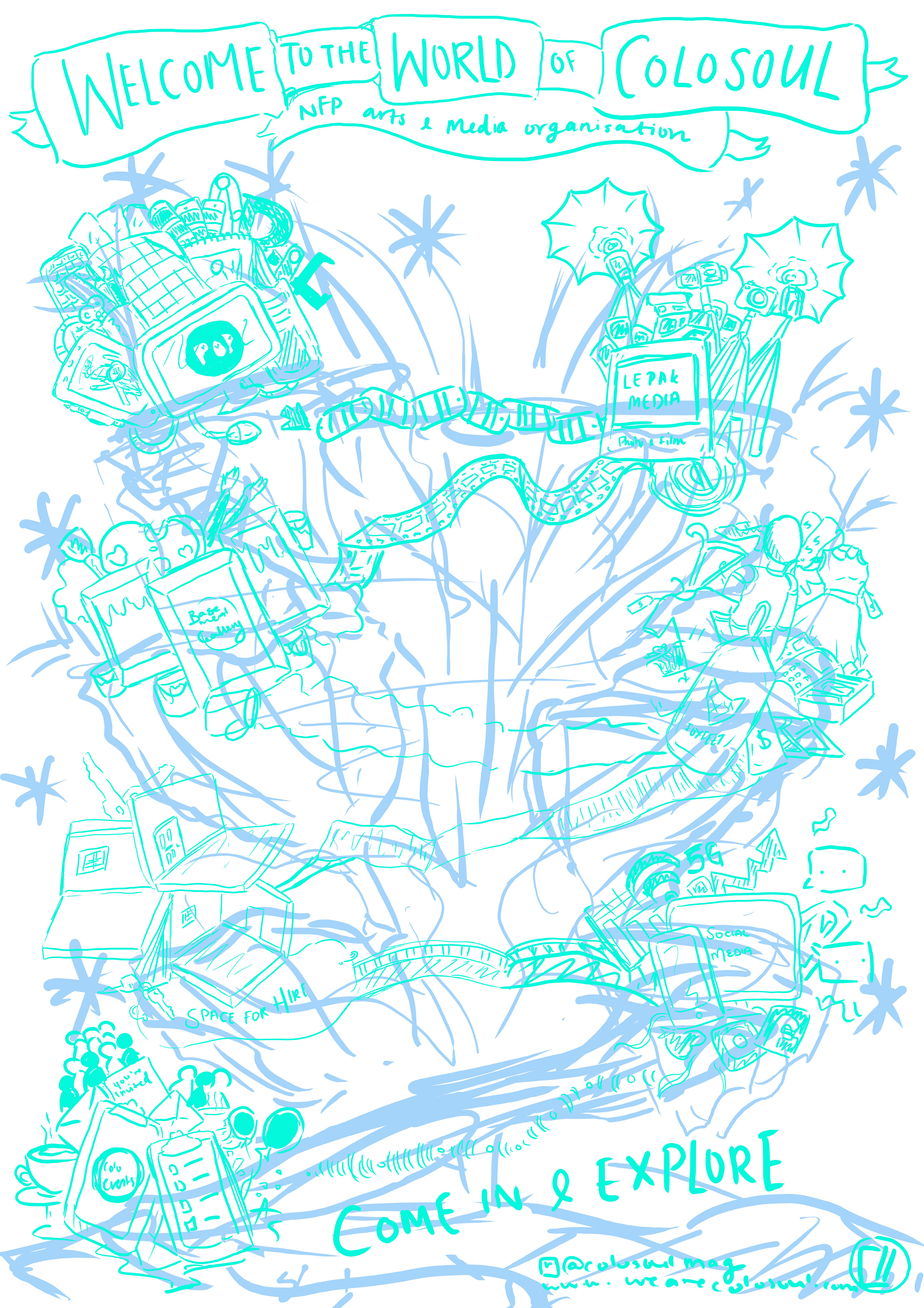
Reprised version with Katelyn's feedback taken in - after showing this to Katelyn, she had quickly approved and I got started on the line-work.
I worked on the line-work using Illustrator as it provided with more straight and less jaggy lines. Besides that, it was vector so I could easily re-size it. Of course, I had some issue with size, so I had to fix it to an A-Frame size as I got the sizing wrong with miscommunication. Luckily I hadn't colored it yet so there was still time to make mistakes and make changes as well.
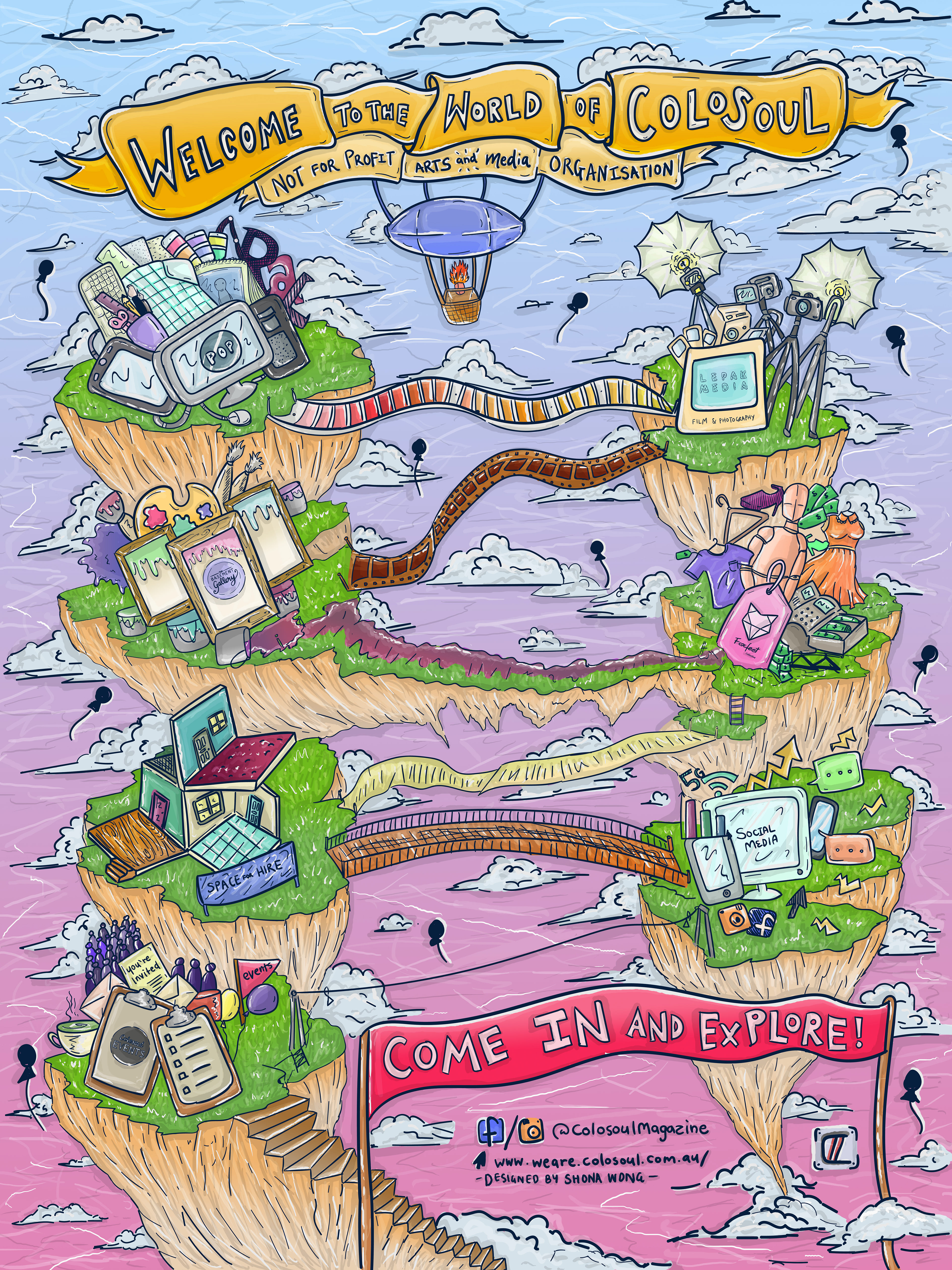
I gave Katelyn two options - Sunset Sky or a blue sky.
Overall, it was great to hear that Katelyn and many of the Colosoul staff loved this work as I worked hard and spent a lot of time coloring this sign.
Katelyn chose the sunset sky as it looked dreamier - but what do you think?
Overall, it was great to hear that Katelyn and many of the Colosoul staff loved this work as I worked hard and spent a lot of time coloring this sign.
Katelyn chose the sunset sky as it looked dreamier - but what do you think?

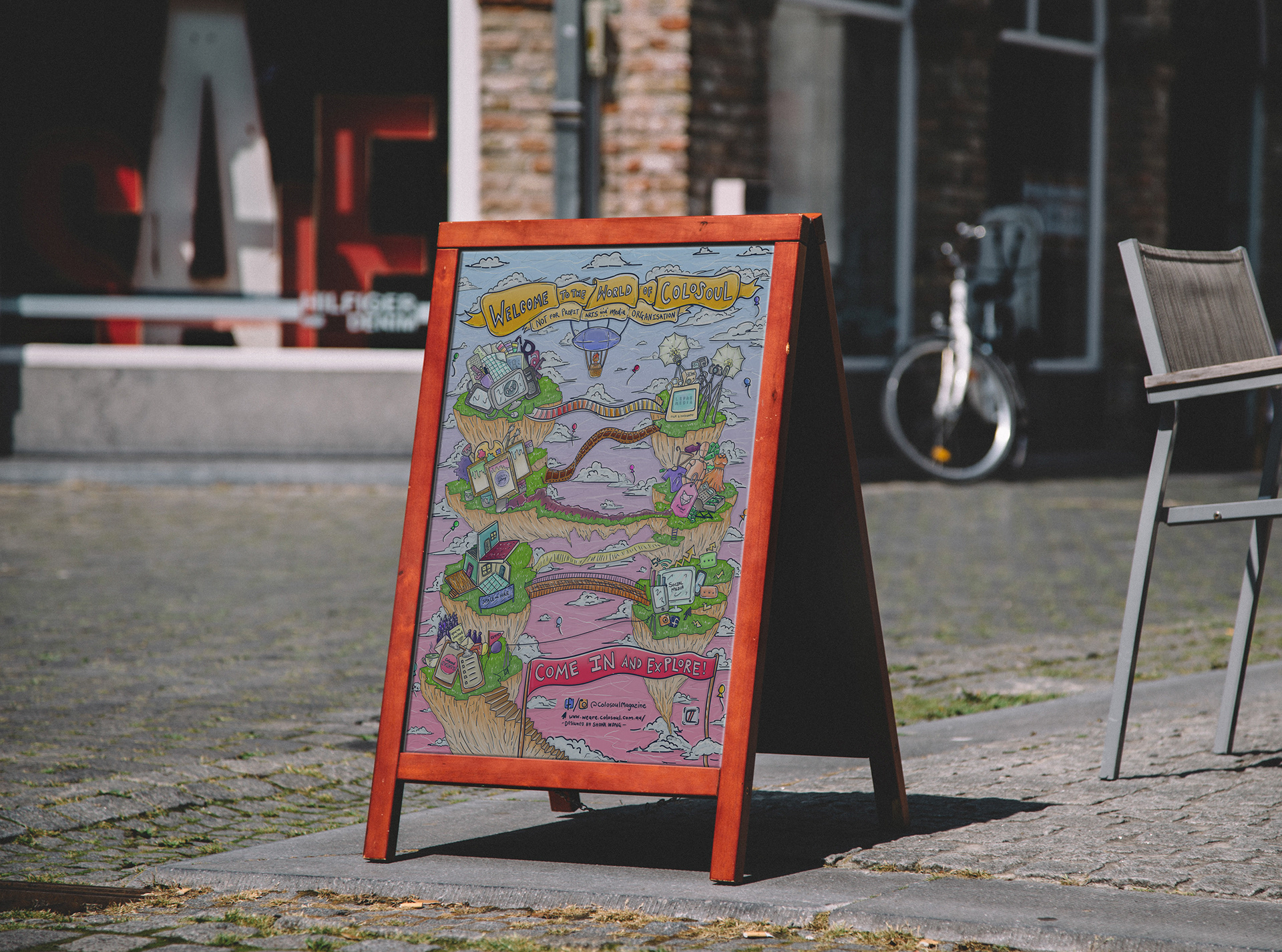
Finally, these are the final amendments and finished work for the sign. The last changes were that the "Colosoul Events" logo could not been well, so I made 2 solutions - changing the color and sizing the logo bigger and an alternative where there was no logo but just the text "Colosoul Events" so incase there wasn't time to work on this project, they can use the back-up/alternative if the test print for the preferred amended piece didn't work out. The other last change was the balloons, as someone thought that it looked like sperm or tadpoles... To clarify and address the change, I colored the balloons so that it is hard to see it as sperm/tadpoles now.
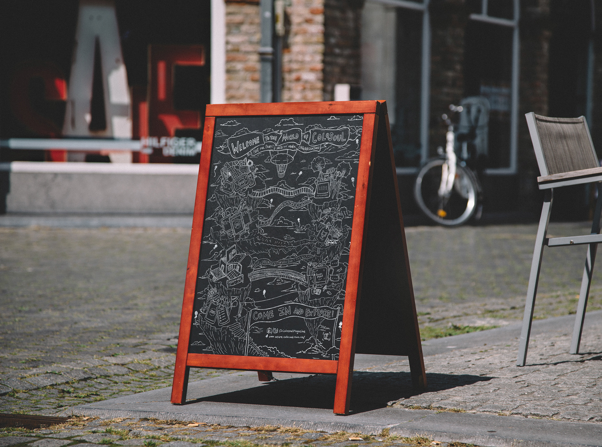
Thank you for viewing this project and journey with me. It was long, but it is to be expected while being in the creative industry. I was glad that I did make changes to this sign (even though it took more time) as it looks more unique and interesting which will invite people into Colosoul, a NFP Perth Organisation for young talents in the arts and media industry.