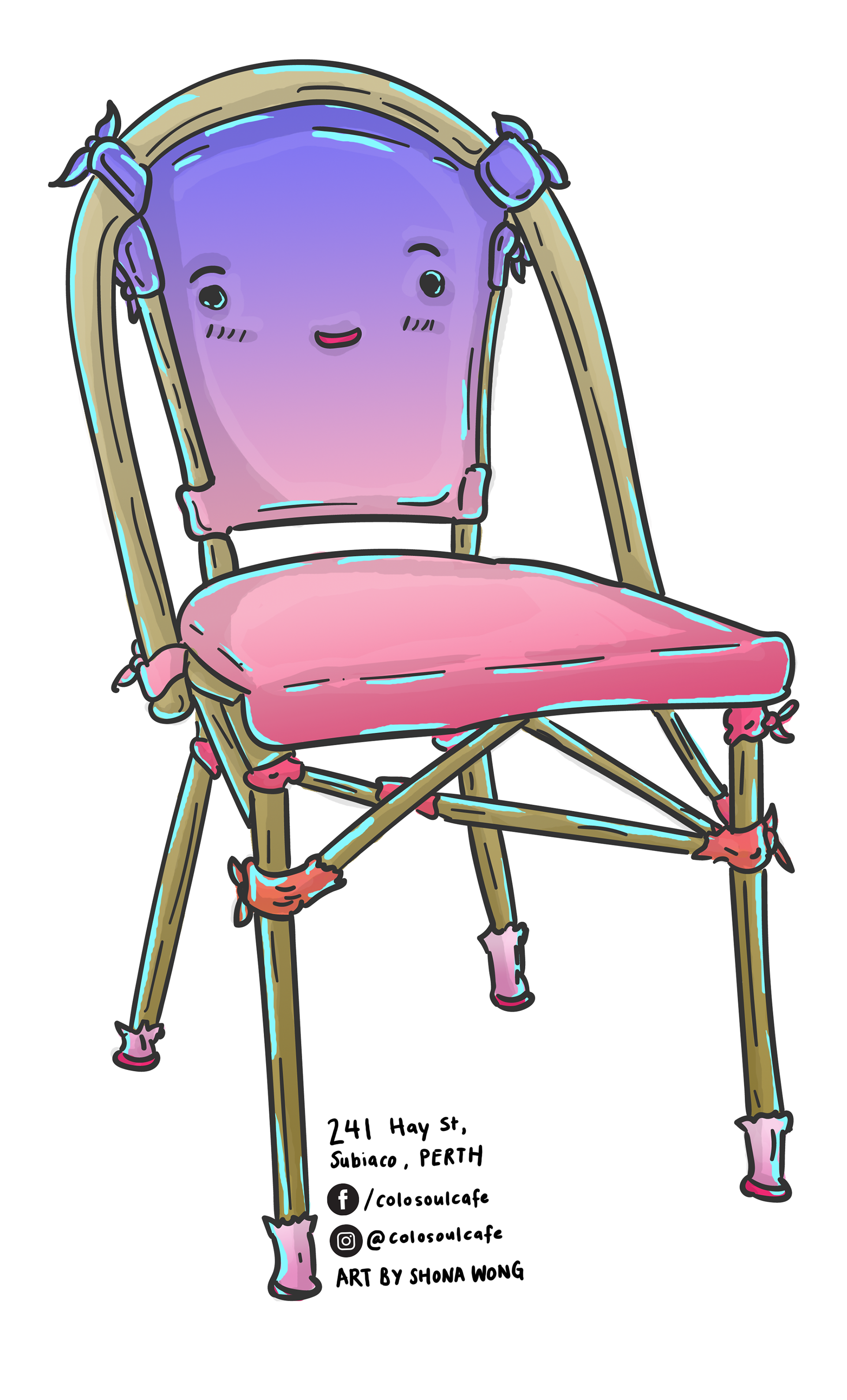
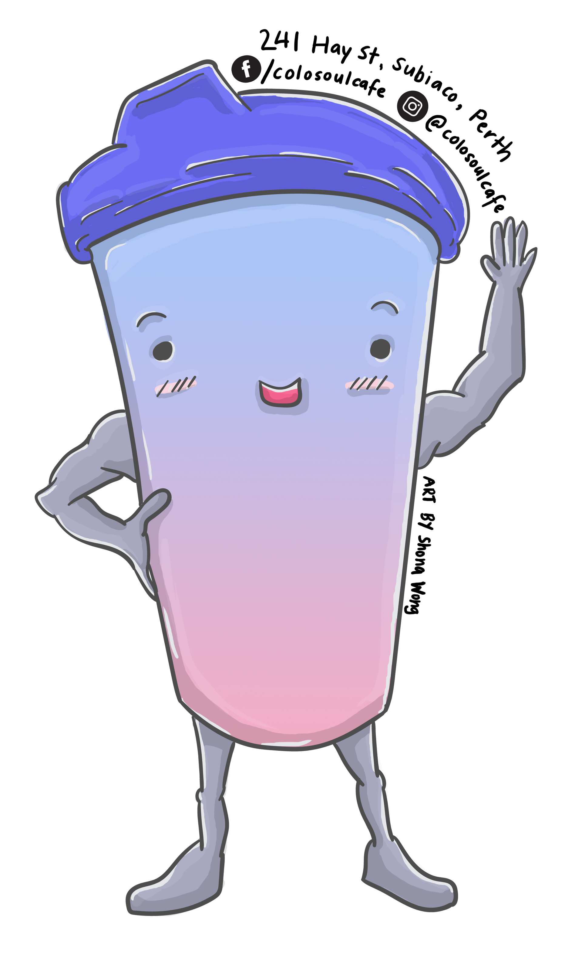
I made these illustrations to assist in Colosoul Group Inc's Campaign for their NFP café which will help train young people from teenagers to young adults, to the disadvantaged in the hospitality and barista industry.
You can support and see their campaign here:
https://pozible.com/project/coffee-that-cares-1
The illustrations were quite straight forward, to make them cute and approachable. The manager thought I had a unique illustrative style and wanted to use them to help promote the campaign. Later, I made sticker templates for my own illustrations.
I use this opportunity to not only support the café but as practice to refine my style. For the sandwich I did have an alternate design, however this was rejected as it was too quirky or did not fit the theme, so I stuck with the cute look. This was in reference to my avocado I made earlier (see below). The avocado work introduced the project manager to my illustration style.
I use this opportunity to not only support the café but as practice to refine my style. For the sandwich I did have an alternate design, however this was rejected as it was too quirky or did not fit the theme, so I stuck with the cute look. This was in reference to my avocado I made earlier (see below). The avocado work introduced the project manager to my illustration style.
Above: Original Sandwich illustration concept - based on the idea of the 'fancy' sandwich that the NFP café was going to make. To be frank, the NFP café was going to make 'gourmet' sandwiches, so I took the meaning of gourmet to be fancy. When I think of fancy, I think of those gentlemen butlers. This is how this idea came about. However, it was rejected so I had to make the sandwich look 'cute' just like the coffee cup and chair.
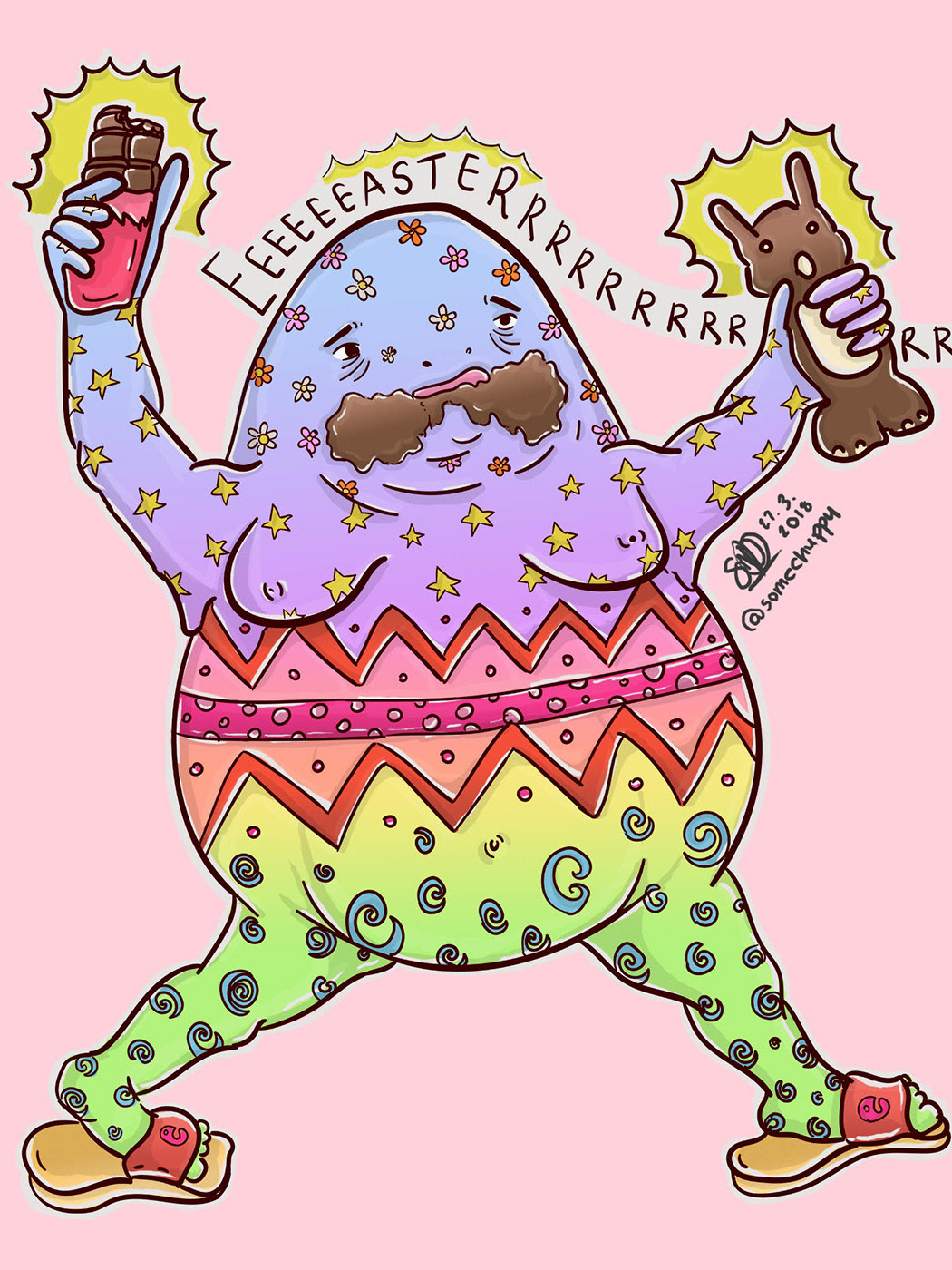
Above: My avocado character. I made this quite some time ago, while I was experimenting with my style and embracing quirkiness and personification.
Sticker set up for Colosoul Magazine and the NFP café below.
