Shona's Colosoul Works: May to June, 2017. In this collection, I did some publication/layout work such as compiling a school package booklet and yearbook spread ideas, Art exhibition booklet, and made some typography art for social media promotion. I hope you enjoy these works, these are works I do at my work experience, and I am learning so much each time I'm there. I will explain more as you scroll down, but I hope you enjoy viewing these works, to me, I like to keep a record of works as well, to see how I've changed and developed as a designer.
During May, I mostly worked on the art exhibition, Lacuna, which took place on May 27th. I worked on the social media and promotional material such as posters, flyers, instagram posts and, of course, the booklet, which would be featured at the exhibition.
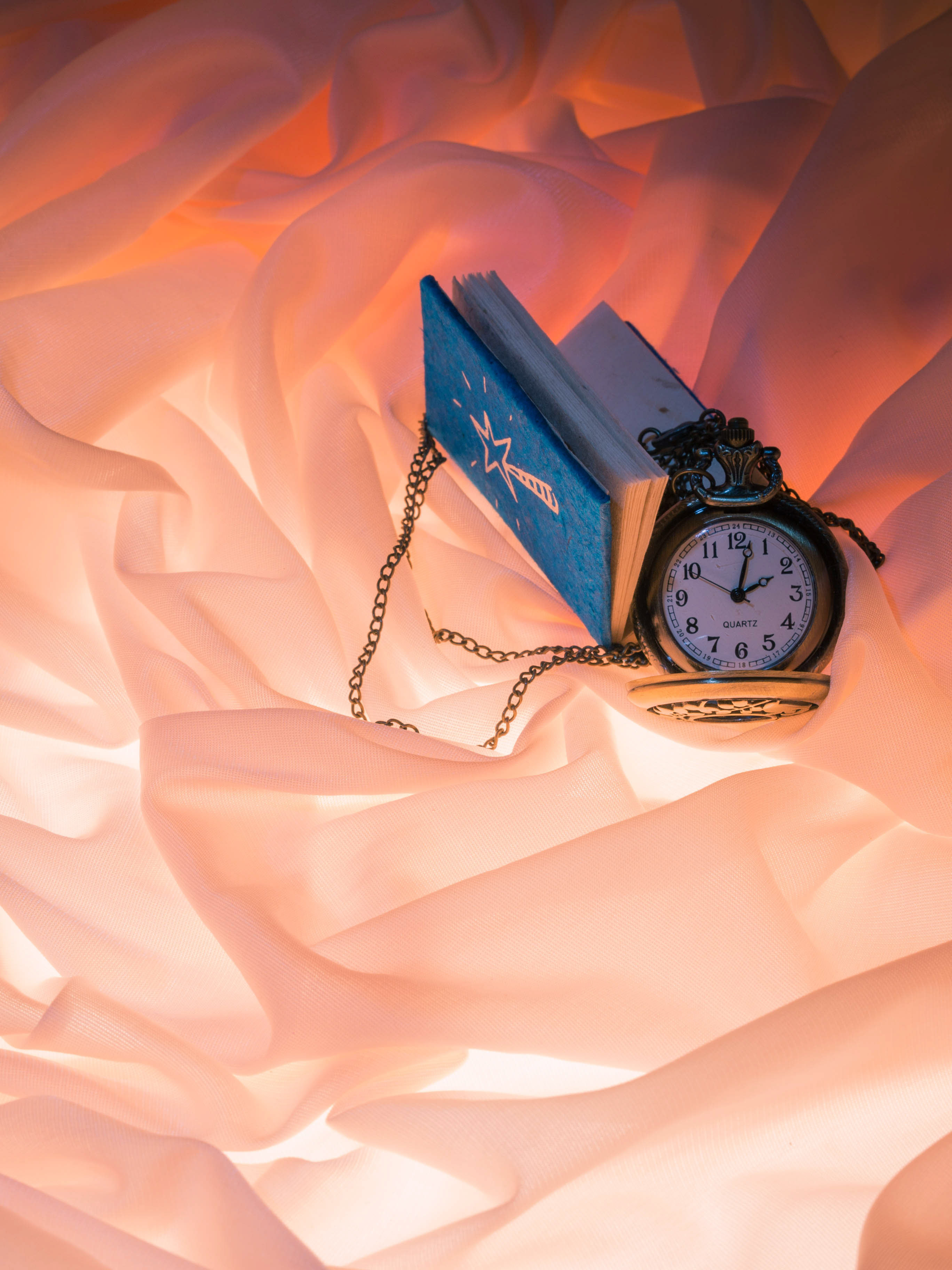
Since these books were already printed, I thought there wasn't any need to place them into a mock-up, since they were already made. I simply took photos of the booklet used in the Lacuna Exhibition. Please note, I did not take every page, but just a few of the pages to give sample of the overall feel, and look of the booklet. In the previous "Colosoul" works collection, I explained what Lacuna meant and that I'll be starting on this project. This was a very long project since I had to wait for the artist's information and files in order to compile the complete booklet. We managed in the end, so it all ends well.
As a short reflection on the booklet: I could have done the booklet better perhaps by making the text more bolder. I had used an ultra light version of the font, and although it looked good in the pdf, it looked slightly faded in the actual print. A test print would be more advisable. Although at the time, I was not in control of printing and Colosoul was in a bit of a hurry to get the booklet completed.
Though I note next time to use a more bolder version of the font, perhaps regular, or light. I had also wished that I could experiment more with the layout, I am used to putting the page number at the bottom corner, however, I'd like to be a bit more dynamic in placing the page number, perhaps on a margin or the side, to create some asymmetrical balance and aesthetic.
Although as I type this, I have created a few booklets after which you may see in some of the July Colosoul works. I would also like to take better photos, although with the budget and financial condition I am in, I cannot afford a professional camera (despite knowing how to do professional photography), I cannot achieve a crisp photo without a proper camera.
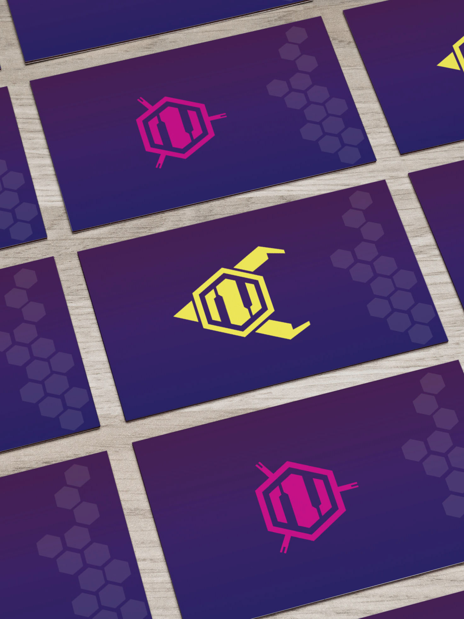
"Wait.. what? We saw this already!" (in the previous Colosoul works collection...) Yes we did! I am bringing this up because besides making promotional material for Lacuna (and basically designing the Lacuna aesthetic), Colosoul wanted their designers to make designs for keyrings that would be given as complementary gifts for the Charity Ball guests. I used this design because it was previously not used in Colosoul even though I had originally made it, (it was a rejected, unused design) and I made a few changes and coloured the original line work image, and it was later used for the keyring.
Drew De Soto, (2011, p.17) asserts, keep rejected and early work because "you will remember a design you pitched that was rejected and pull it out from the archive and save a considerable amount of time reusing the elements". I will note Drew De Soto's book in the references at the end of this collection. I highly recommend the book since Drew De Soto is a very experienced designer, and has extensive knowledge of the design industry and how clients work. Whether you are experienced designer yourself or an amateur like myself, this book will be very handy and useful.
Where was I..? Oh, Keyrings!
Above, Lacuna Art Exhibition had also a follow-up event which was a gallery held at the Colosoul Office, for people to come in and see the art work if they missed out on the Charity Ball night. I had created Instagram posts, Facebook timeline posts, and a poster as promotional material for the follow up event. This was to keep consistency for the event.
Below: Facebook Timeline post for Lacuna follow up event.
Below: Facebook Timeline post for Lacuna follow up event.
Below: Instagram post.
When using this mock up I could not get rid of the thick white borders. The poster is supposed to bleed to edges.
Anyway moving on.
Anyway moving on.
During May, I did not have much time to do Colosoul works, since I was still studying in University and was tackling exams as well, so I solely worked on the Lacuna booklet. Now in June, I had some time off due to Semester break and the exams being over so I did some more work at Colosoul and also worked a few different projects which I plan to upload more of in the future. You can look forward to works of mine such as illustration collections, typography art collections, and logo/UI designs I am working on. Although they're mostly all in progress, I can't wait to share them on Behance when I can compile them together.
For June, I worked on school package booklet because Colosoul wanted to target private schools to design their yearbook and promotional materials. So I was assigned to create yearbook spreads, and compile them into a package deal which would be sellable to private schools.
This took some time since it was difficult getting the pricing details as we had a few technical issues. Besides that, going back and forth and getting approval on various designs were quite time consuming. Which is why I could not release this collection earlier. (Sorry for that!)
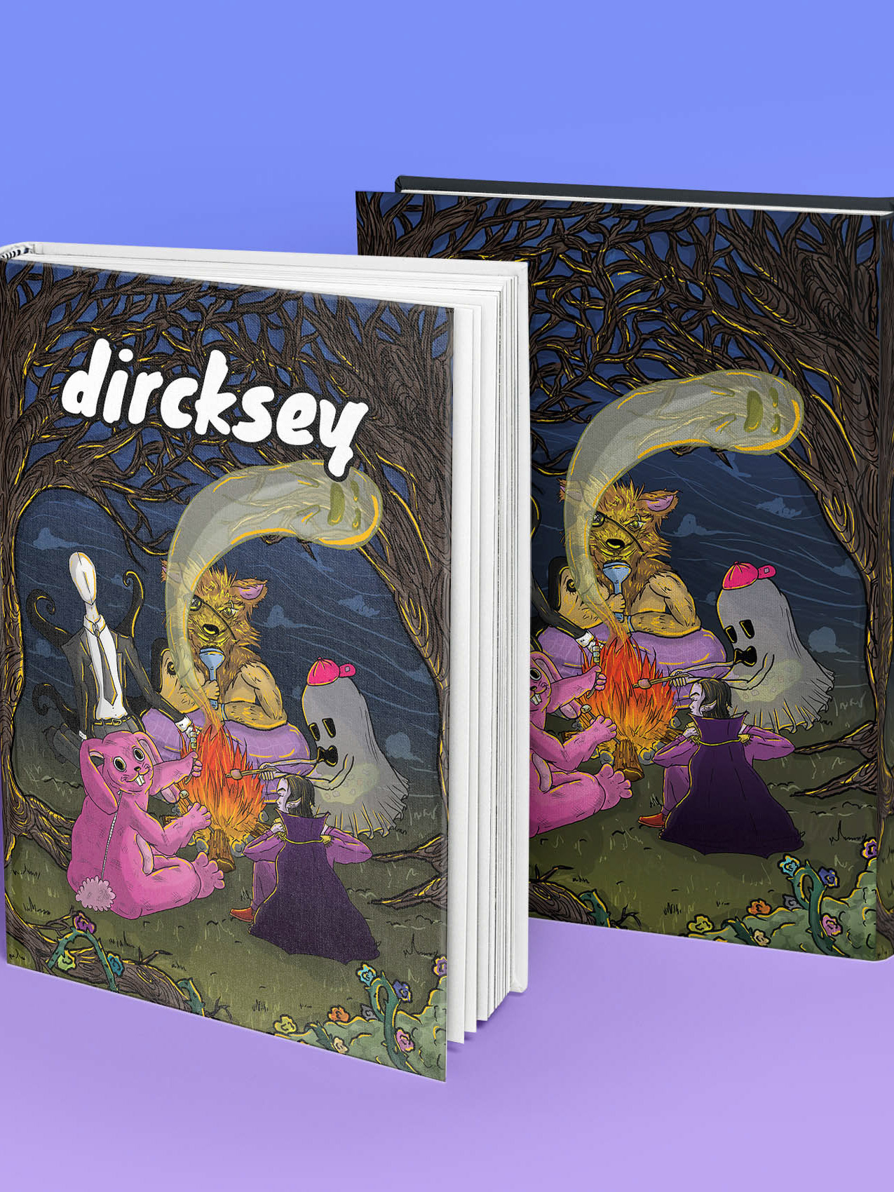
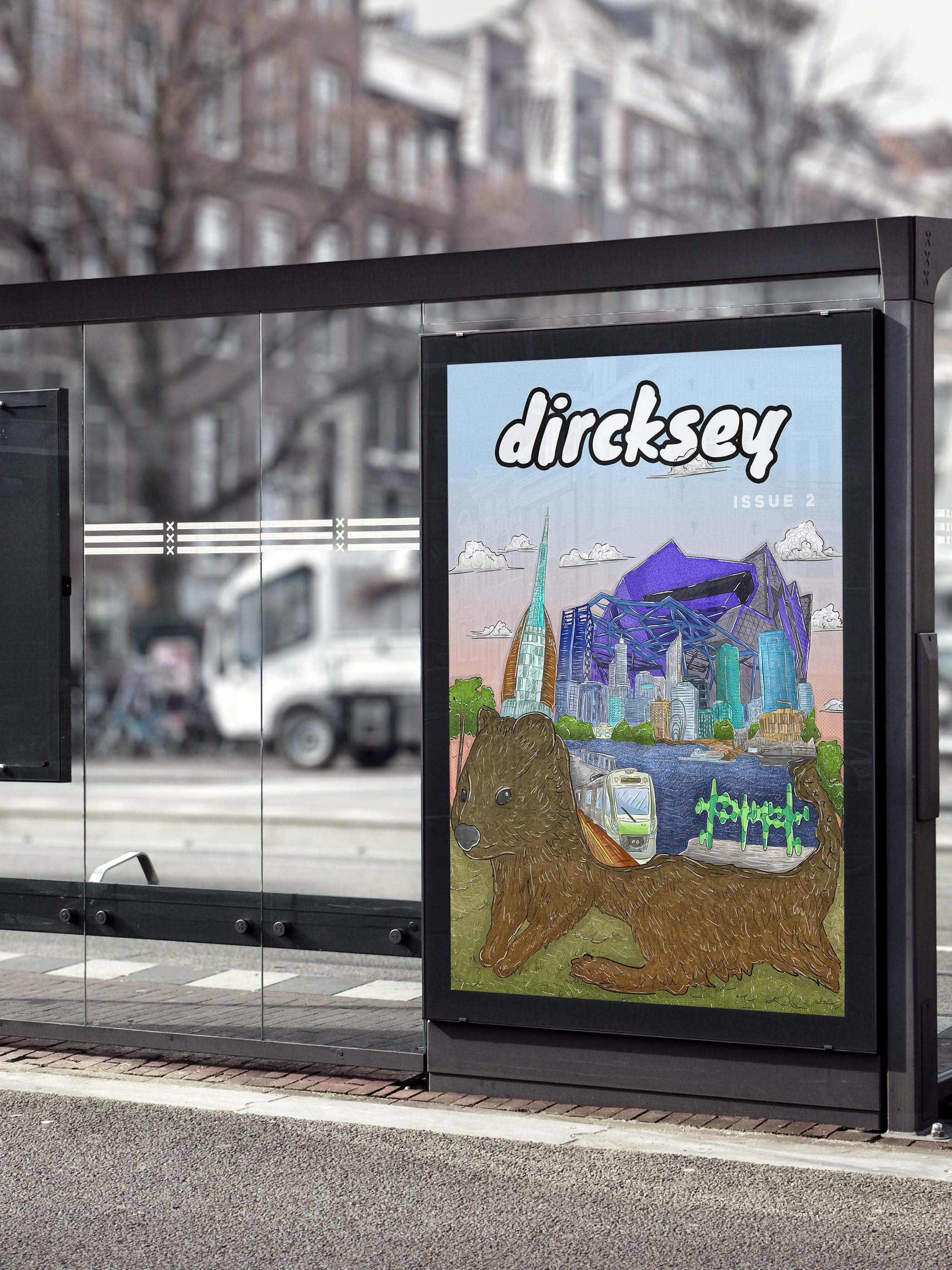
I had also worked on typography art which I did for a Dircksey article (will be shown in another collection to come), which was made as promotional material for Colosoul Events Facebook Page. It was a profile picture design although I am uncertain when they plan to use it. Either way, as noted above, Drew De Soto asserts to always keep rejected works since it can save a considerable amount of time and makes the efforts making the design worth it.
First I'll show some designs I had created initially, which needed to be changed for the booklet.
The issue with this design was the contrast. I had initially had an idea board (https://au.pinterest.com/somecharcoal/school-yearbook-looks/) for yearbook spreads and took inspiration from it. I had sketched designs (unfortunately I did not include the sketches as they were quite messy) and thought I'd like to incorporate school colours and make them vibrant and bright through out the design. But after having "fresh eyes" look over the design, (another designer in Colosoul) she had suggested that the lines contrast, the cover had wavy lines compared the rigid lines in the spreads. The client for this project had also looked at it, and suggested I give it a change. Since she wanted to target private schools, she suggested I used the yearbook covers that private schools have to keep it commercial and relatable.
This was the fixed design, I mocked up a fake school logo and kept the design consistency with the rigid lines and colours. Below, I made another yearbook spread design where the yearbook had a more scrapbook look. Although the more I looked at the design, the more I disliked it. At first I thought it looked alright, but I started to think teenagers would feel stereotyped since scrapbook.. feels stereotypical...? It felt unoriginal so I discontinued this idea. I had also made a few covers with the idea but I have decided not to show it in this collection.
After deciding on what yearbook spreads to put in, I had to make a few more different yearbook spreads, and then compile information into the booklet (pricing and contact info). This would make the package. I had to also collect commercial free images which was a time-consuming process, for the yearbook spreads and this booklet to keep it aesthetically interesting and pleasing. I'm quite happy with the final school package booklet design, as shared below.
As a short reflection, I still think I could improve on my overall publication layout design. I think the yearbook spreads could have had more theme integrated, something about it felt unfinished, but I could not pinpoint what. The school package booklet could still be more interesting. Perhaps more dynamic. The package isn't made into an actual booklet, but it is supposed to be a package that would be sent to the private school to show them what Colosoul can do for them.
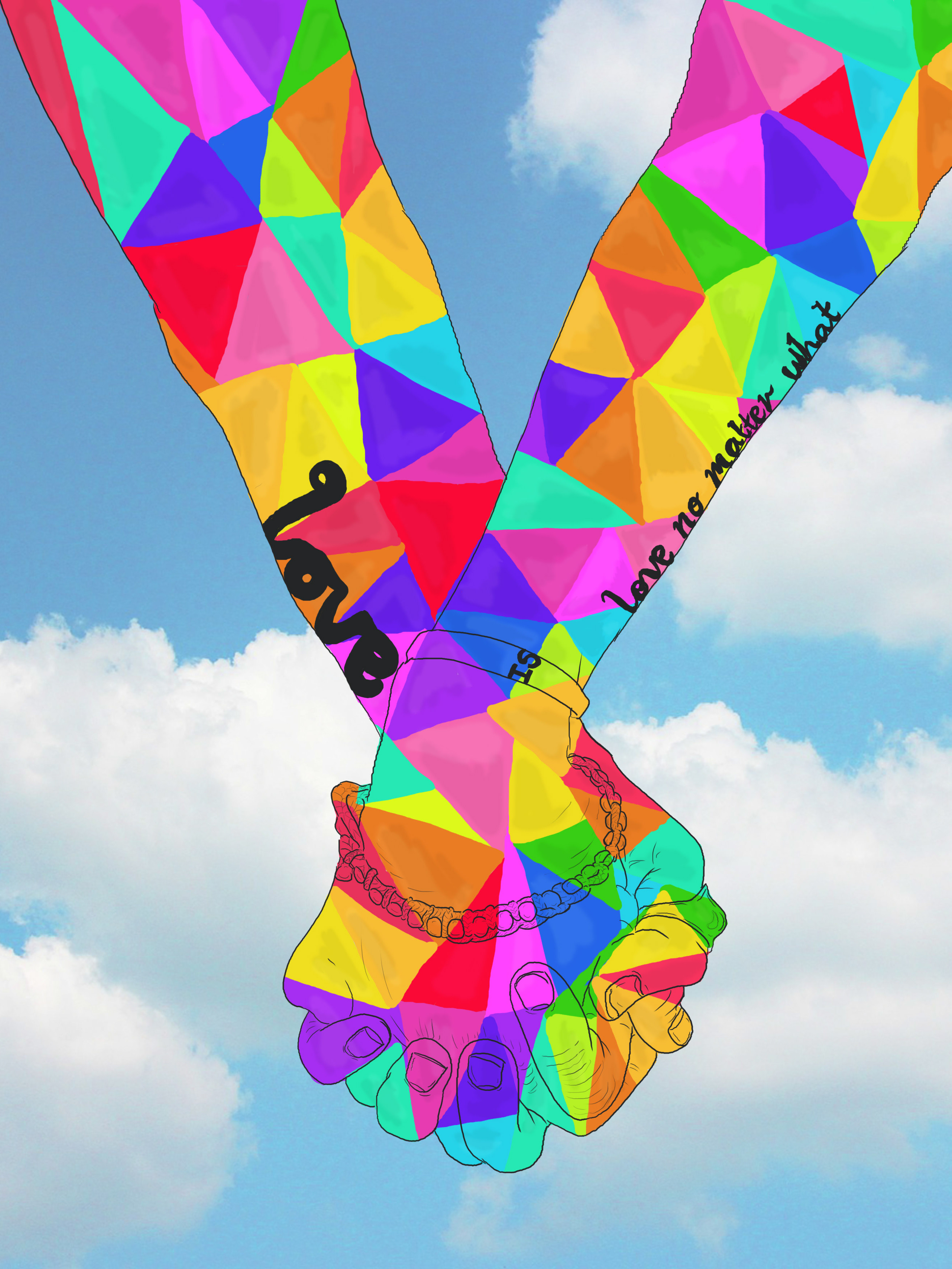
Lastly for June, I worked on a Colosoul Events Profile picture, like mentioned before, I still do not know whether they have used it or not.
Lastly for June, I worked on a Colosoul Events Profile picture, like mentioned before, I still do not know whether they have used it or not.
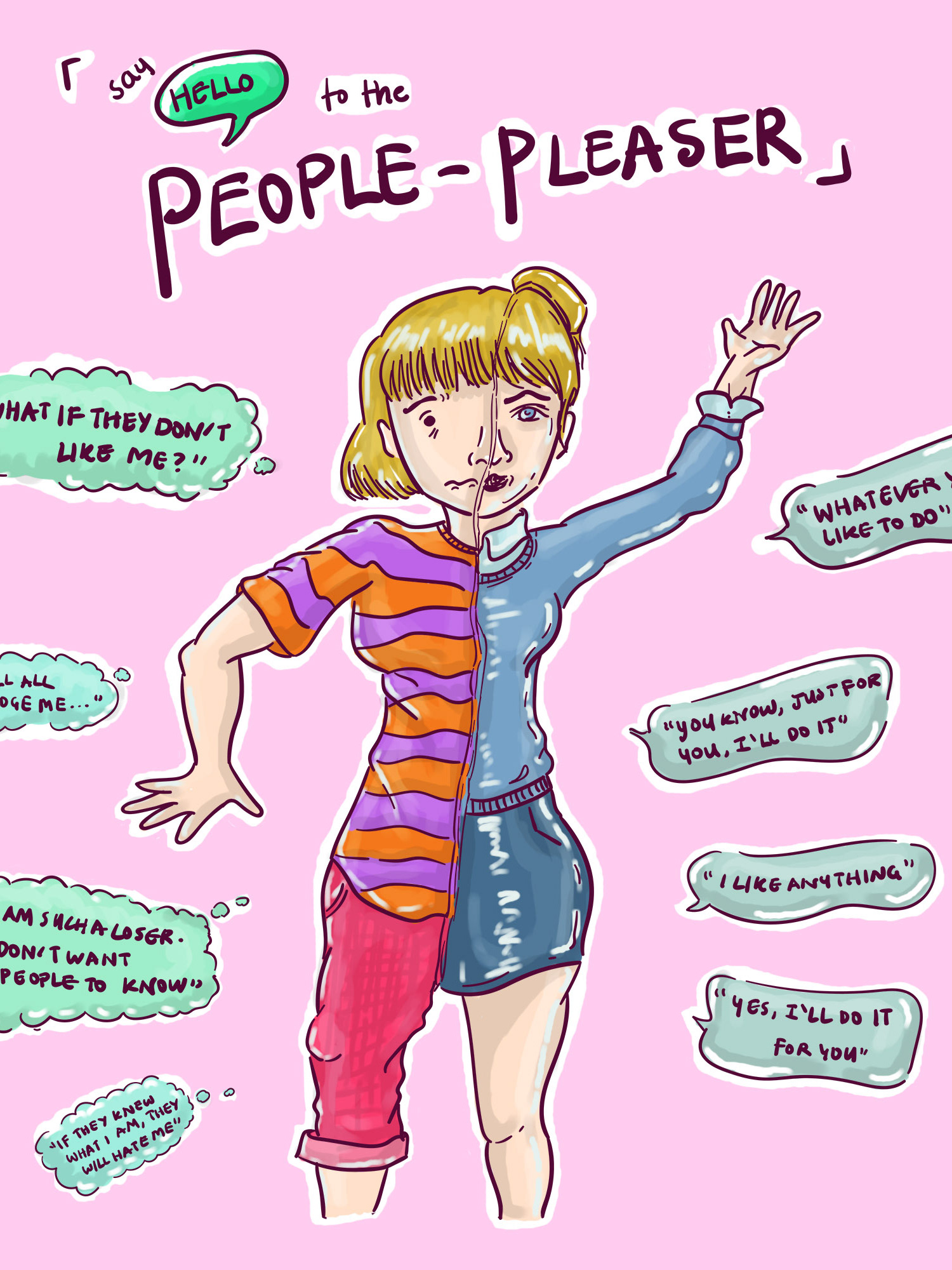
Own Typography art, it's not perfect, but I'm hoping to keep improving my hand lettering. I think it could be more smoother, which I may touch up on in the future.
Thank you for viewing this Colosoul works collection!
I hope you enjoyed watching my development as a designer and my journey! I hope to see you continue supporting me!
References:
De Soto., D, (2011) Know Your Onions: Graphic Design. BIS Publishers; Amsterdam.
Thank you for viewing this Colosoul works collection!
I hope you enjoyed watching my development as a designer and my journey! I hope to see you continue supporting me!
References:
De Soto., D, (2011) Know Your Onions: Graphic Design. BIS Publishers; Amsterdam.
