Hi followers and fellow designers, I haven't been posting much (mostly since I've been recently busy volunteering and doing work experience) but I wanted to share I've been up to and what works I've done for my graphic design work experience.
I only started working at the end of January, so wehat I'm showing you is a range of work I've done for Colosoul over the last month and a week. The style for Colosoul varies as they have many departments all with a different style. What is probably all in common is that the design has a youth and lively vibe. Everything seems contempoary or as they want the design standard to be. I hope you enjoy the series of work I have to show.
I only started working at the end of January, so wehat I'm showing you is a range of work I've done for Colosoul over the last month and a week. The style for Colosoul varies as they have many departments all with a different style. What is probably all in common is that the design has a youth and lively vibe. Everything seems contempoary or as they want the design standard to be. I hope you enjoy the series of work I have to show.
First Design, First Day:
The first design I did was for Australia Day as a social media Facebook cover. The team leader wanted to do something that was along the lines of vegemite and pop art (like Andy Warhol style) and I experimented with that idea. In the end though, we decided to stick strongly with Australian colours and I suggested a pattern. This design was simple and I thought it got the message through. Although the team leader did not end up using it and used another design to put up social media. I understand though, some designs work better than others. So even though this is rejected, I've added this in because I appreciate the work I've put in was the best I could do at the time. It was a sudden job, and I did try my best.
TEENSOUL:
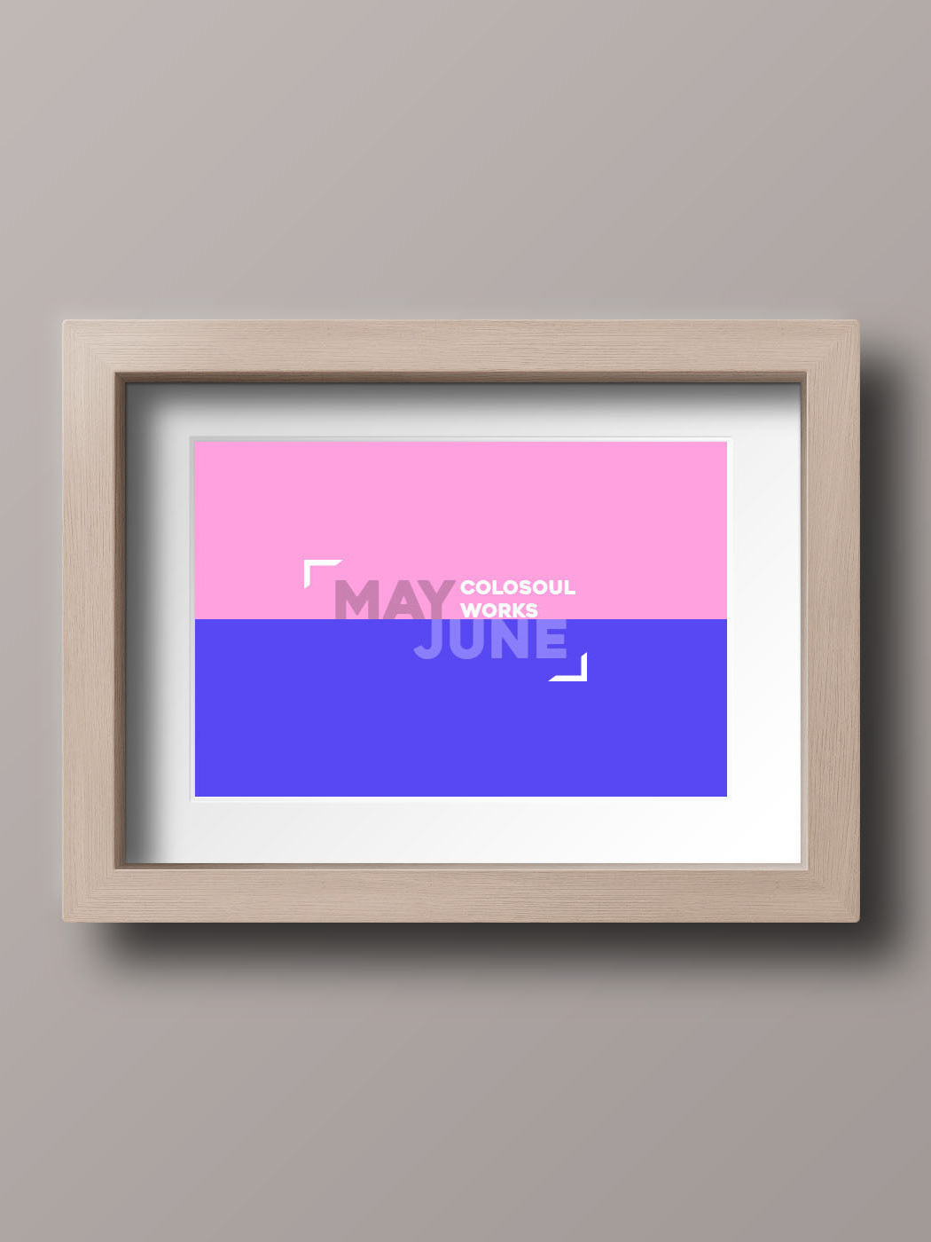
This was on the following week (Feb starting actually). I worked on another facebook cover photo for another sub department that they had. Colosoul runs several magazines and one of them is Teensoul. Teensoul is aimed at 17 year olds to attract the attention of younger teenagers and older teenagers are often seen as role models to younger teenagers. For this, I did a simple design, using media from Colosoul and manipulated the image making colour cuts to make the image interesting and using the space for an overall interesting and balanced layout.
WORDPLAY:
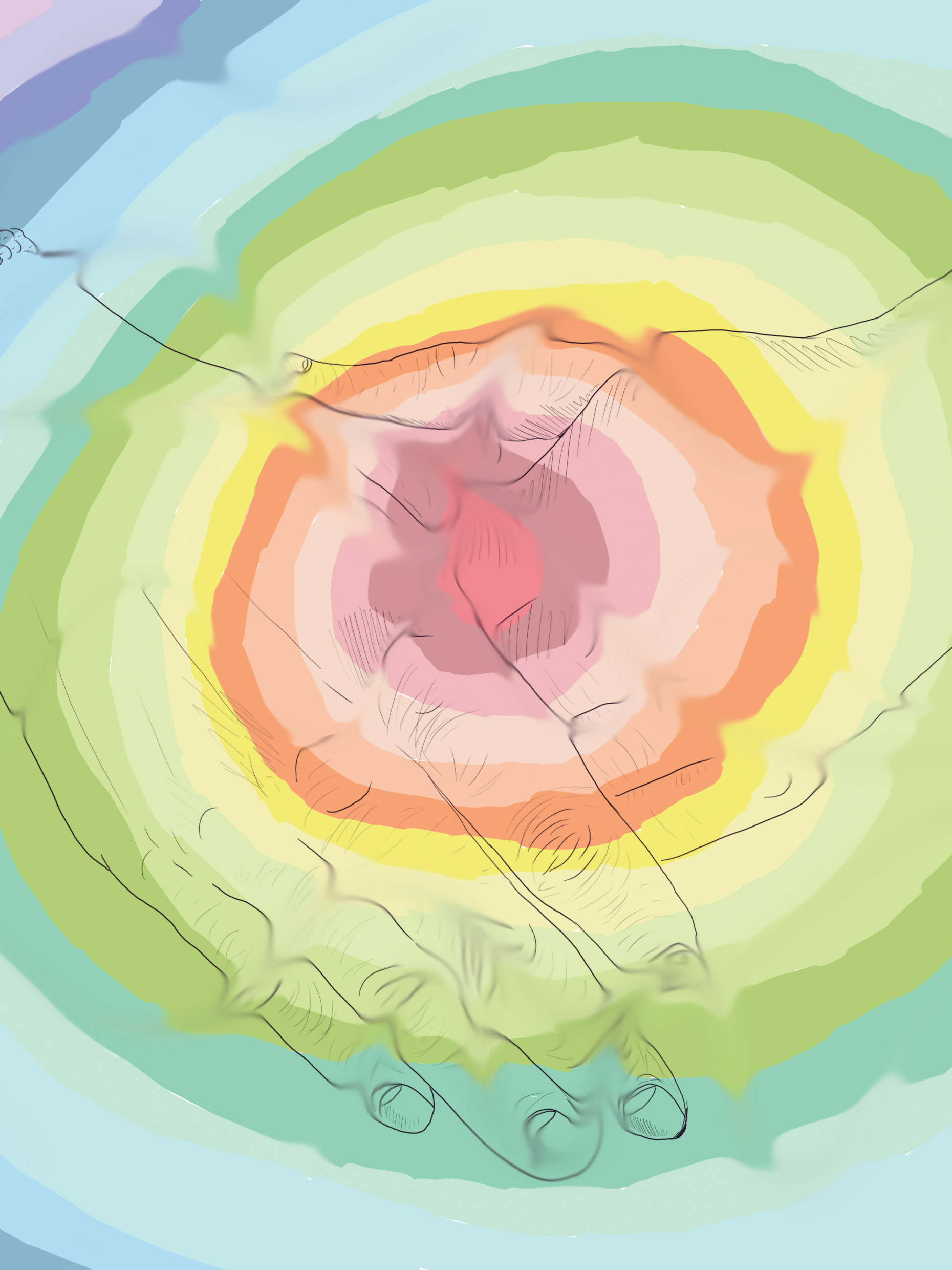
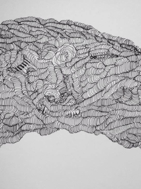
Wordplay was another magazine that Colosoul runs. I helped to create an artwork for their Facebook cover, although this was rejected by Colosoul. They suggested instead it would go well for Teensoul. I made different experiments using the artwork. Above is the line work and below I painted it using a pop art style. The idea was to substitute the 5 grey tones with colours similar to that tone and I tried that with this artwork.
Wordplay Magazine logo belongs to Colosoul.
GRETA PHOTOBOOK:
Greta Photobook, another magazine and department from Colosoul. Greta Photobook explores and showcases photography advice and inspiration for young photographers. I was asked to design a Facebook Cover Photo in which I thought about using a light sketch, (like the Wordplay line work) and having a camera taking a photo. Initially, I did think of another concept using aperture settings and f stops but I ended up sketching up this.
LACUNA:
Lacuna was the longest design I've ever gone back and forth with. The general manager was the client for Lacuna and she wanted something very specific. Above is the final design, although I will take you through some designs I made that she rejected.
Still, I appreciate the good work experience because I know that this will be normal with clients, to create a design that works for both the designer and client. So I learnt alot communicating back and forth and twiking the design to find the right design that works for both parties.
The first Lacuna design:
The concept of my design was the idea of the "unfinished portrait". Lacuna means incomplete; blank space; a missing part. Lacuna is for the basement gallery, the visual art department for Colosoul. My concept was that I wanted to go for something incomplete, however the client wanted some more colour like paint splatters so I tried to add that in. She wasn't very clear but was rather vague about it, but I added colour and then checked with her afterwards. The client wanted something along the lines as minimalistic hence the design above. She also wanted it to be not so illustrative, so it doesn't assume a style.
I checked the design with her, but this one was rejected. She stated this one was too illustrative, and that I should re do the entire design. She did, however, like the font manipulation which I incorporated in the design. Despite the frustration to re-do the design many times, she finally gave me more of a clear image to work with, giving ideas on what she really wanted. From there I developed a design that would work for what she's looking for.
Final design (ignore the crop marks).
Thank you for viewing this collection of work! Next month, I'll be working on a fruit logo and a booklet for Lacuna. Who knows what else I'll be working on! :)
Either way, I think so far, Colosoul has been a good experience so far, and it has taught me many things about what it feels like working under a design firm setting.
Either way, I think so far, Colosoul has been a good experience so far, and it has taught me many things about what it feels like working under a design firm setting.
I hope to do more graphic design work in the future! So if you're reading this, please feel free to message me! I'm keen to keep learning and improving my design skills and my soft skills for my career.
Thank you very much for viewing once again!~
Thank you very much for viewing once again!~
