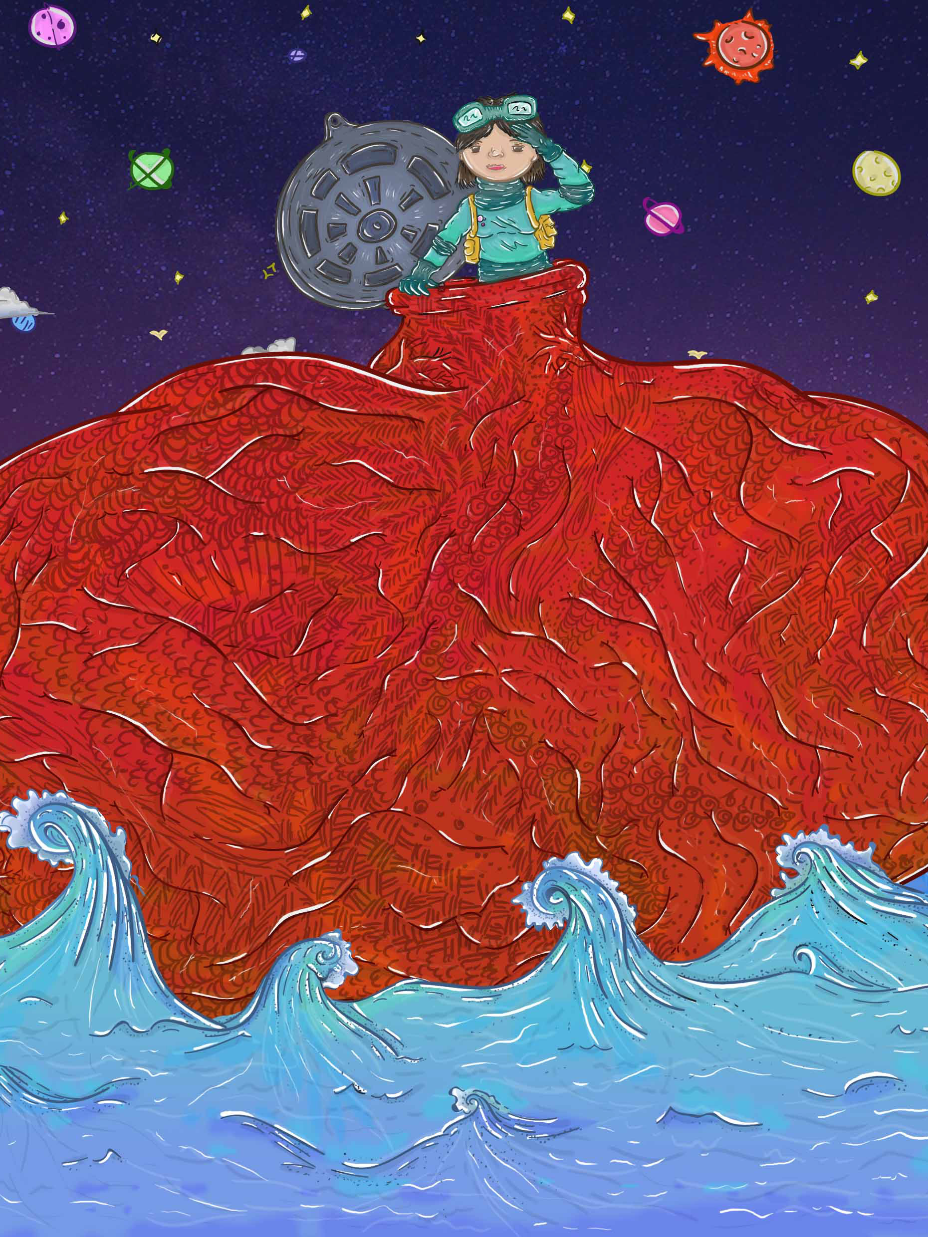
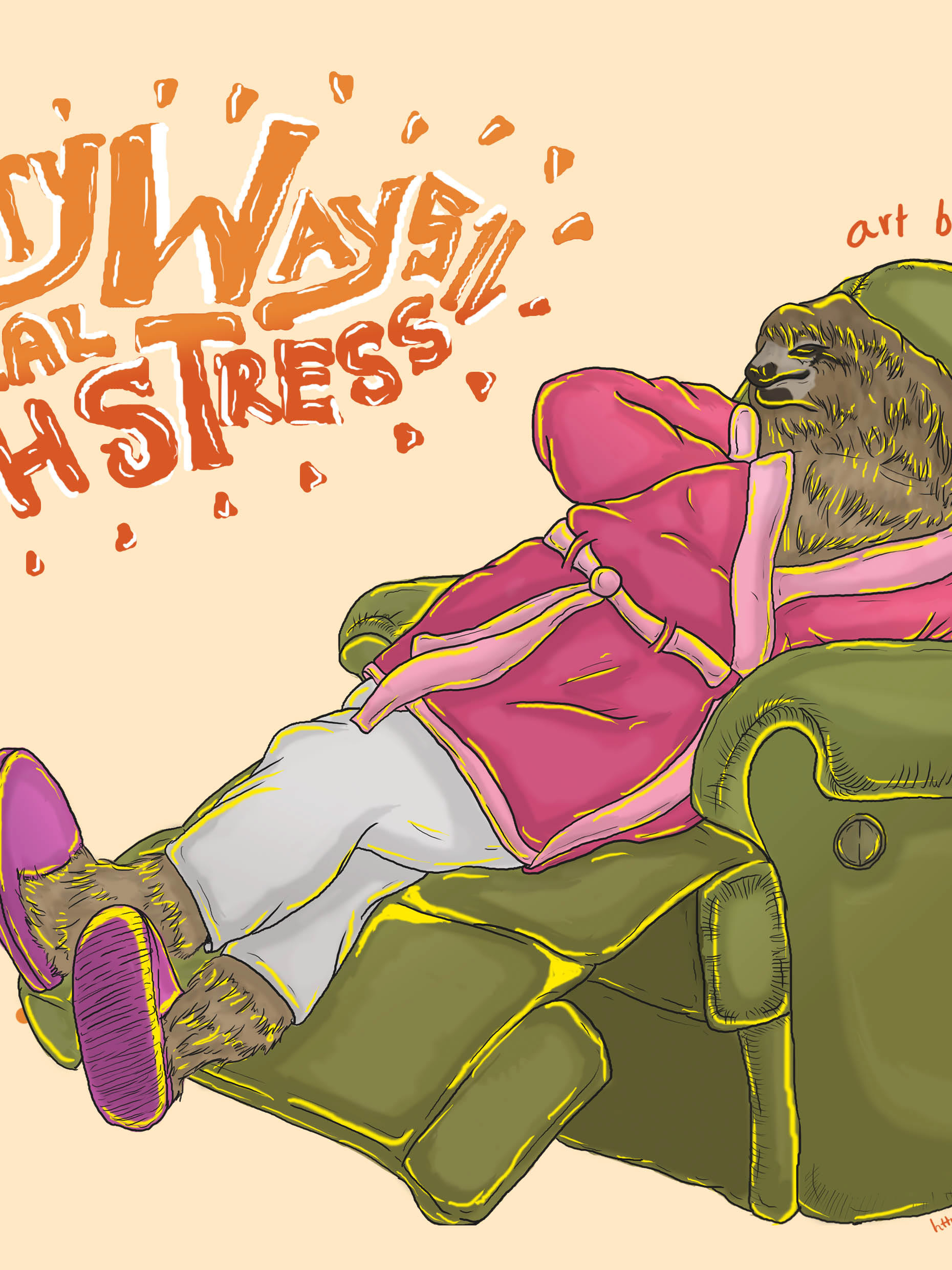
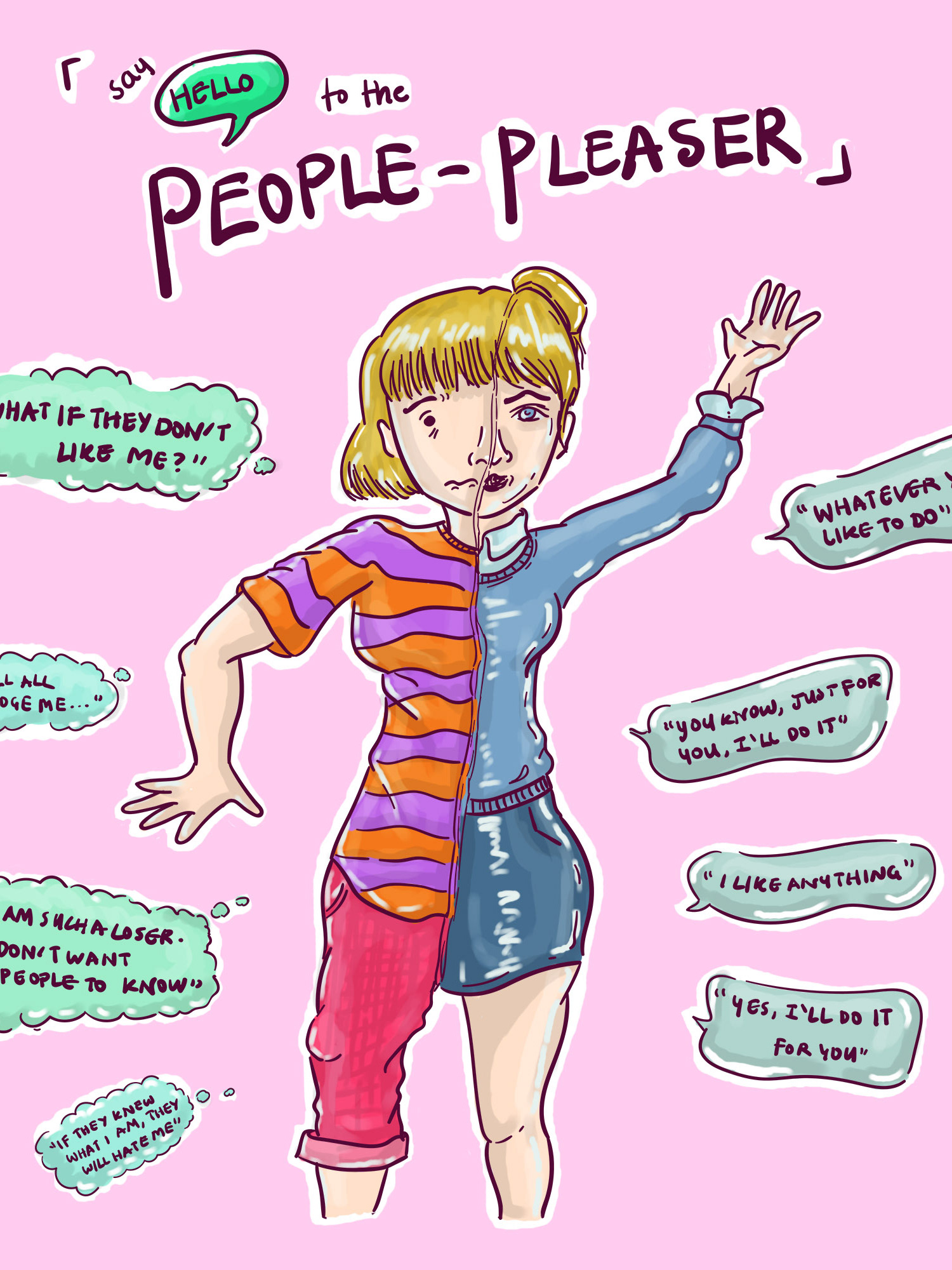
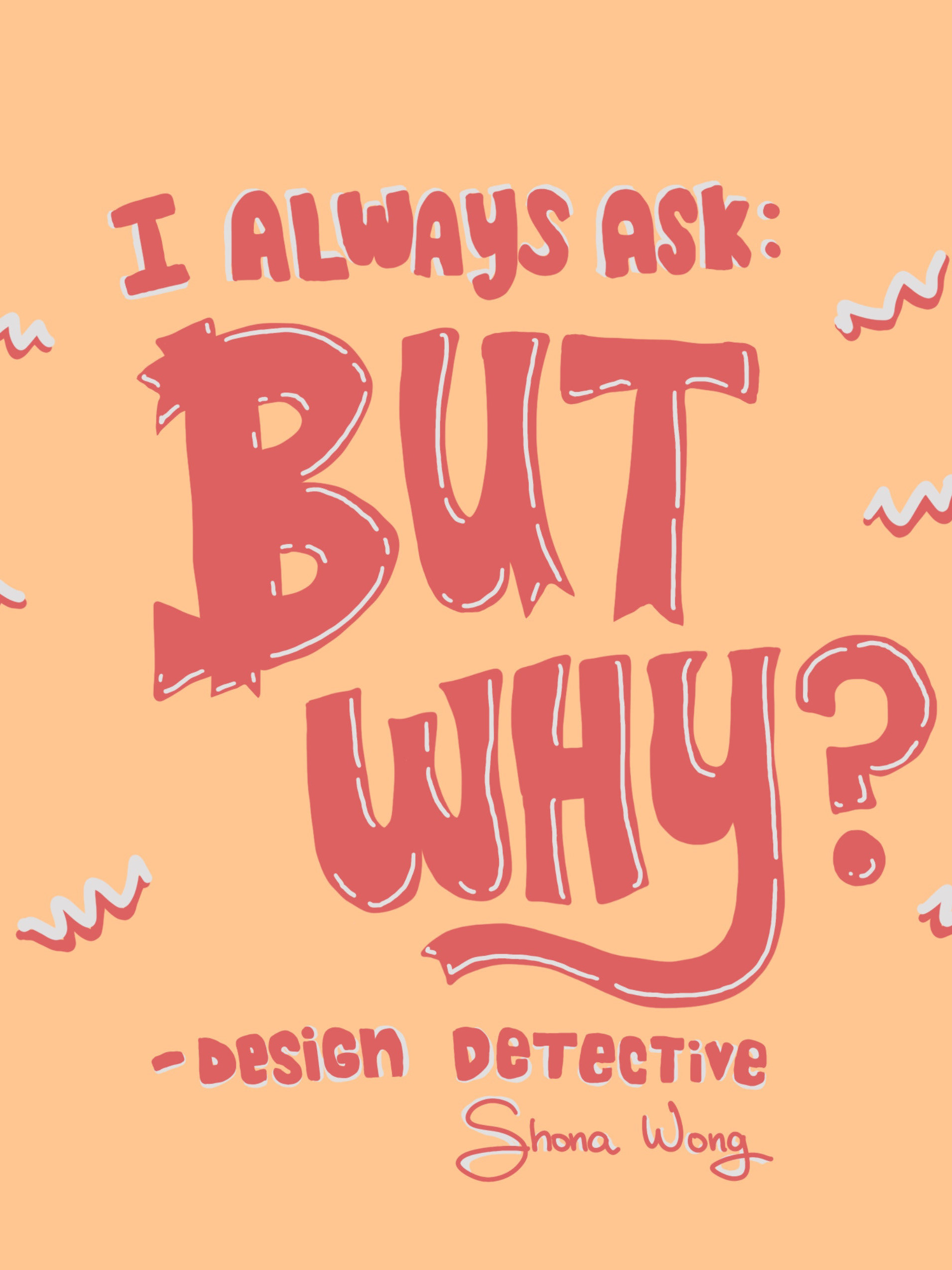
My first small typography project. I wanted to create a cover page for my portfolio and decided to create typographic art and illustration to represent myself.
I think it still needs work, but I would like to upload it to Behance for any feedback and advice on typography but also as a milestone and part of a history log. To come back to my work at a later stage to motivate myself (at least I'm hoping) because I hopefully would have improved by then.
Line art above. Used Illustrator before colouring the design in Photoshop.
I am seeking any advice on colouring in Illustrator. At the moment, I am using Photoshop but I prefer to see if I can do it in illustrator but I am not a fan of the brush or colouring system in illustrator so I'm combating that at the moment.
I am seeking any advice on colouring in Illustrator. At the moment, I am using Photoshop but I prefer to see if I can do it in illustrator but I am not a fan of the brush or colouring system in illustrator so I'm combating that at the moment.
Below is a sketch. I did use Photoshop to sketch it out and roughly draw grids as a guideline then sketch over in seperate layers. I had about 7 drafts until I settled with this one.
Thanks for viewing this short project. I am seeking any feedback, tips or advice on typography as I hope to develop my typography skills.
