In this review, I'll be showing a series of design and art I made during March - April that I worked on for Colosoul. Some of these were rejected designs and some of these were designs that Colosoul used. But please don't assume that all designs were used for Colosoul, these designs represent my progress as designer not Colosoul themselves.
For this review, I'll be showcasing St Patrick's Day Facebook Cover design, Fruit Logo exploration and the design for the keyring, which was derived form my previous design for the Greta Photobook.
For this review, I'll be showcasing St Patrick's Day Facebook Cover design, Fruit Logo exploration and the design for the keyring, which was derived form my previous design for the Greta Photobook.
// First Design // Pop Creative's St Patrick Day Facebook Cover
This design was for the Facebook Cover of Pop Creative, which is under Colosoul. I made various versions but I only put two below for this compilation. The first one was the one that was chosen. This design is referencing the Pop Creative Logo and instead of the fill being black, as it's original logo colour, I filled it with cloves as representative of luck and St. Patrick's Day. I experimented with the design and added some flourishes and worked until my team leader was happy with it.
This design was for the Facebook Cover of Pop Creative, which is under Colosoul. I made various versions but I only put two below for this compilation. The first one was the one that was chosen. This design is referencing the Pop Creative Logo and instead of the fill being black, as it's original logo colour, I filled it with cloves as representative of luck and St. Patrick's Day. I experimented with the design and added some flourishes and worked until my team leader was happy with it.
\\ Fruit Logo Design Concepts \\ This was assigned to me in February and finished by March. For this fruit logo I had to make many designs to narrow down to what the team leader wanted for the client (although it should be more for what the client wanted not what the team leader wants...) Anyway, I did various illustrations in preparation for the Logo concepts and experimented. Either way, it was good experience because I felt I was lacking in logo designing - something essential to Graphic design as a career.
These are my illustrations and concepts for the Fruit logo which is for "I'm all fruitti", a organic juice company that is optimistic, energetic and young.
These are my illustrations and concepts for the Fruit logo which is for "I'm all fruitti", a organic juice company that is optimistic, energetic and young.
I did not know too much about mock ups, but it was great being with Colosoul because I learned about how mock ups work and how effective they are to showing clients what your logo would look like on a product or on merch.
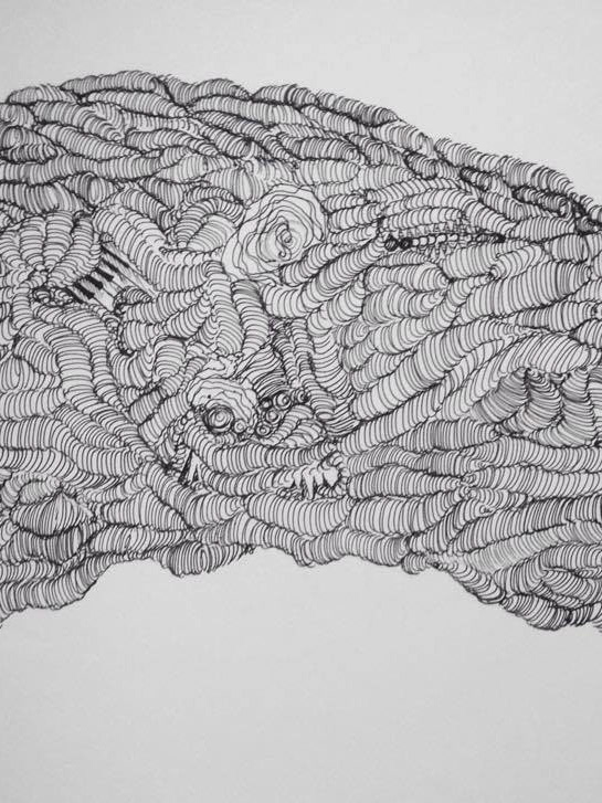
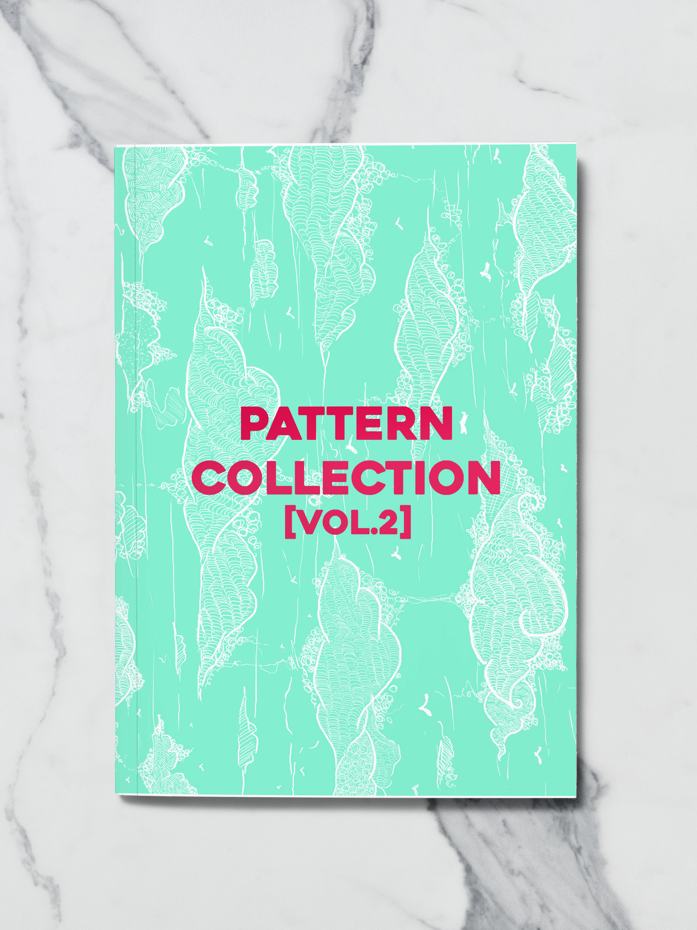
// Keyring // Previously I did an artwork for the 'Greta Photobook' but ti was not used. It was uncoloured but for the keyring, I decided to bring it back since the design I did was not used and the keyring was for Greta Photobook. I decided to colour it but still keep the line work, the main star of the work.
