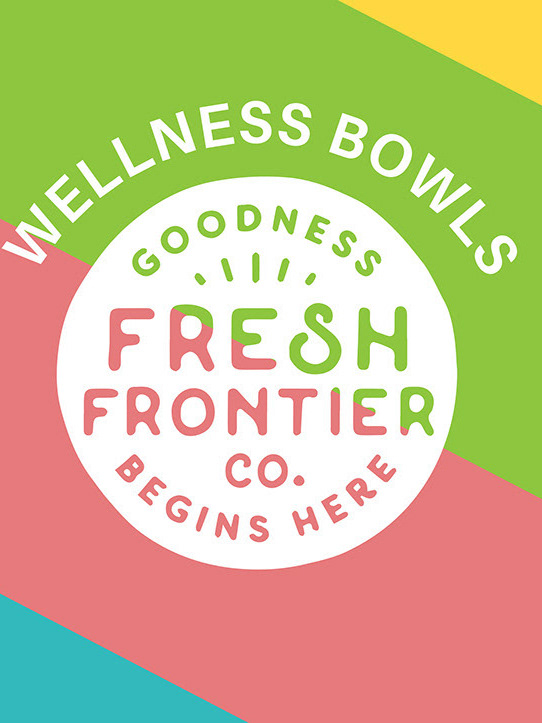
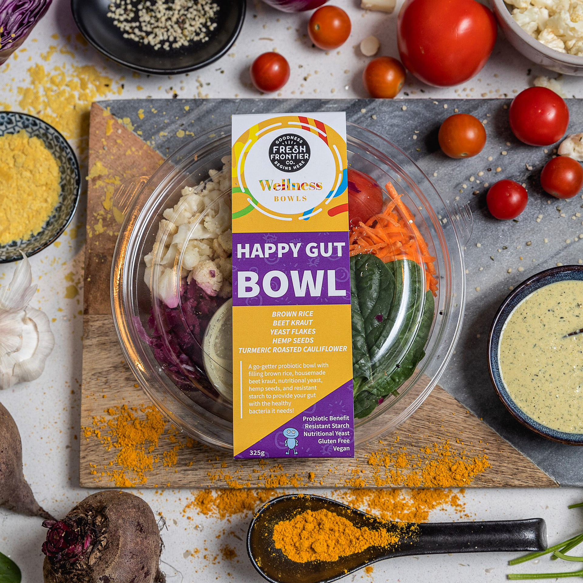
Another Fresh Frontier project carried on from the last: Wellness Bowls. Fast forward to February 2020, They were impressed with the service myself and Ann Marie provided and had come to use for further help. This time, it was with a well-known partner, COSTCO. Fresh Frontier was preparing to launch their salads at COSTCO Perth, Perth's very first COSTCO because we've never had anything like this. I live in Perth - we are a fast growing city so COSTCO was a big thing to land here.
Brief in a nutshell:
2 x Flat sticker Labels, 1x sized for 1.3kg container, 1x sized for 900g container.
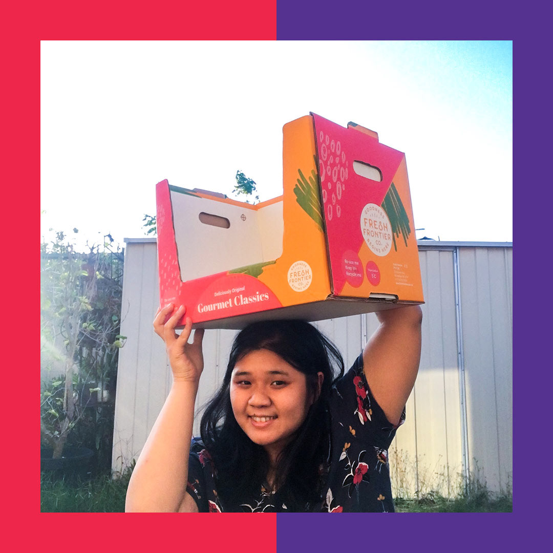
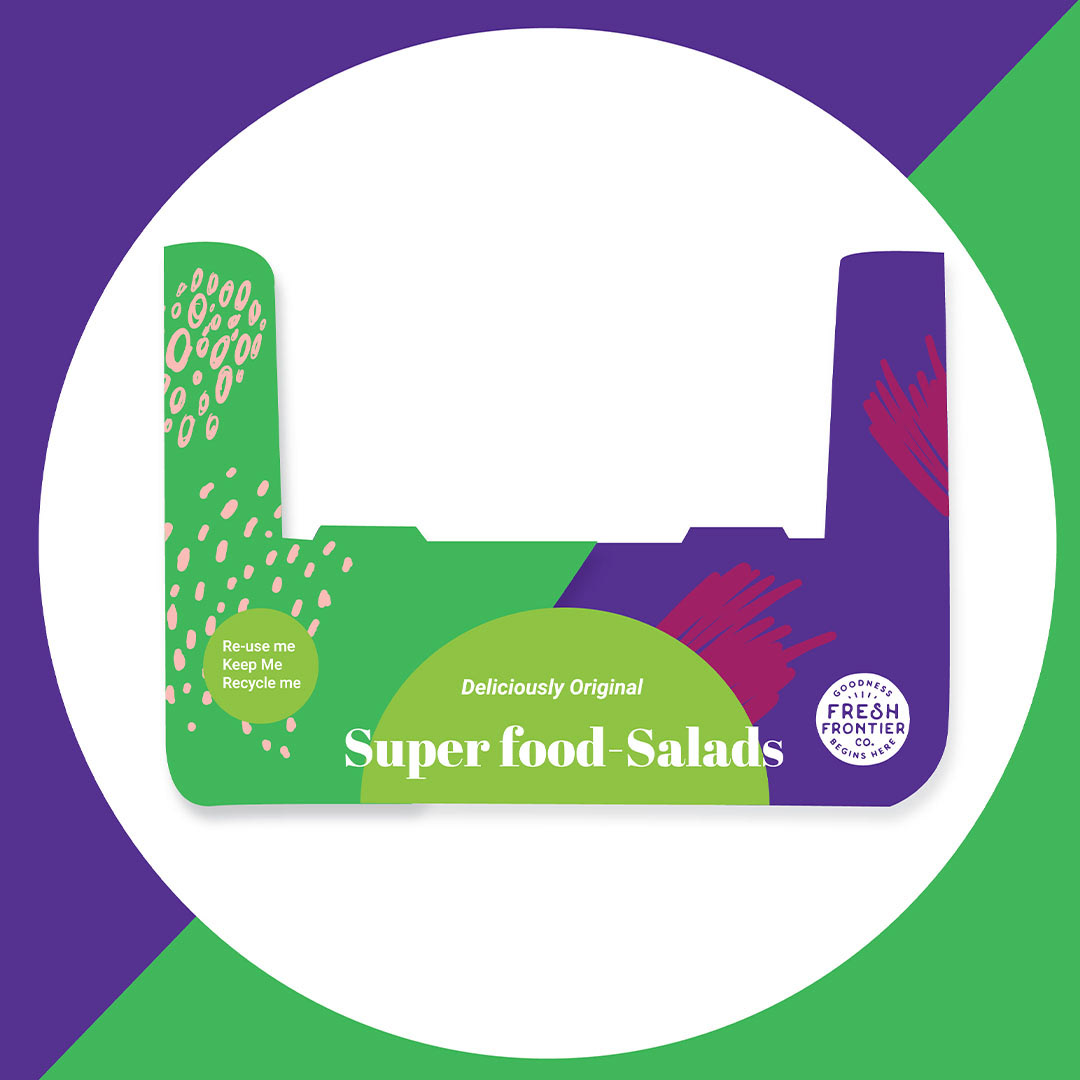
2 x Boxes, 1x 1.3kg; 1x 900g size
3 x Creative Directions (and sent back ASAP!) - just something that aligns with their vision than the last design.
Previously, Fresh Frontier had enlisted their former designer to create designs for them, but as seen from the wellness bowl project, the designs had been inconsistent and left Fresh Frontier disappointed. They had shown us their former designer's designs and art direction and came to me for help. I won't be showing the former designer's design as I don't wish to disrespect them. I believe design is subjective and I never want to put down another designer's design because it didn't work out for them. The former design simply didn't align with Fresh Frontier's new vision of their brand which doesn't mean their design is less better than mine.
But here's the thing... even though they enlisted me to do new designs, they needed it fast. Like a few days turnover time. They wanted me to come up with new creative directions for their COSTCO salad line and so I spend my weekend coming up with concepts.
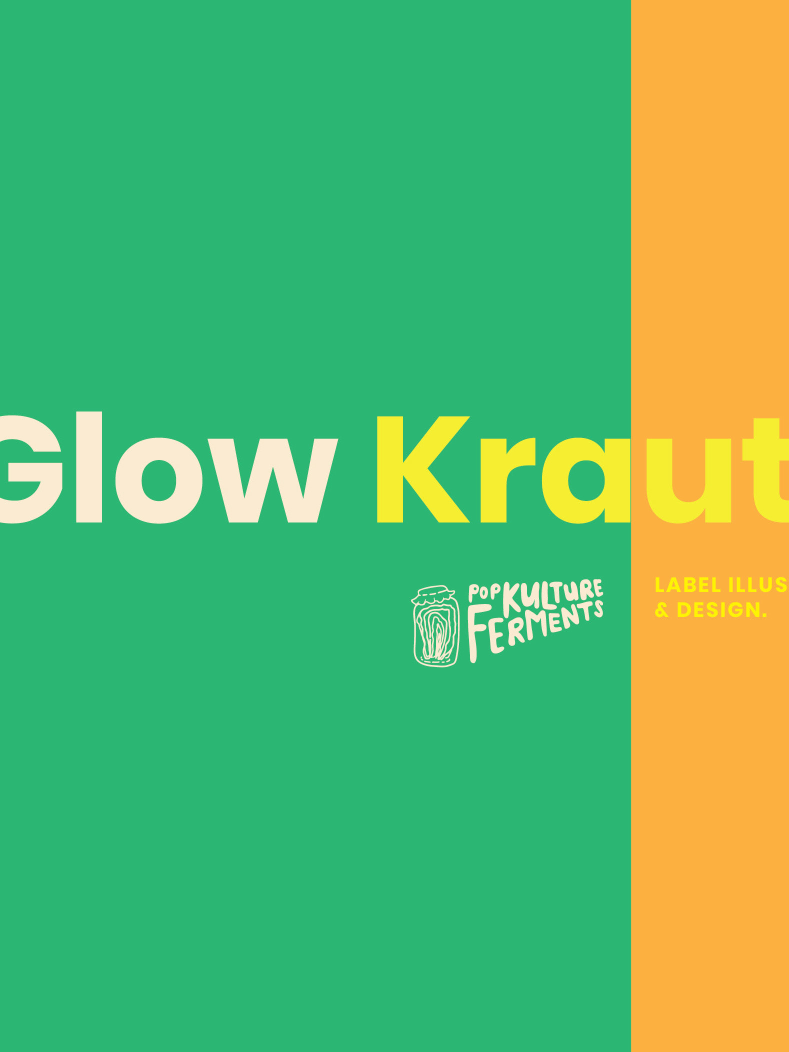
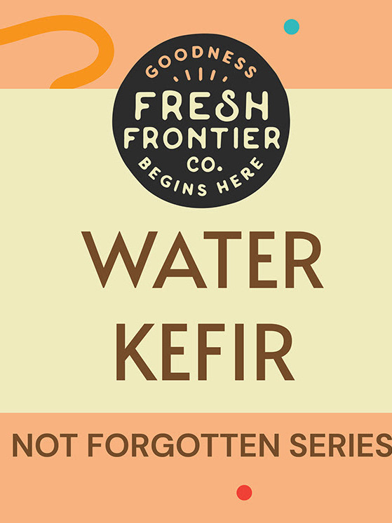
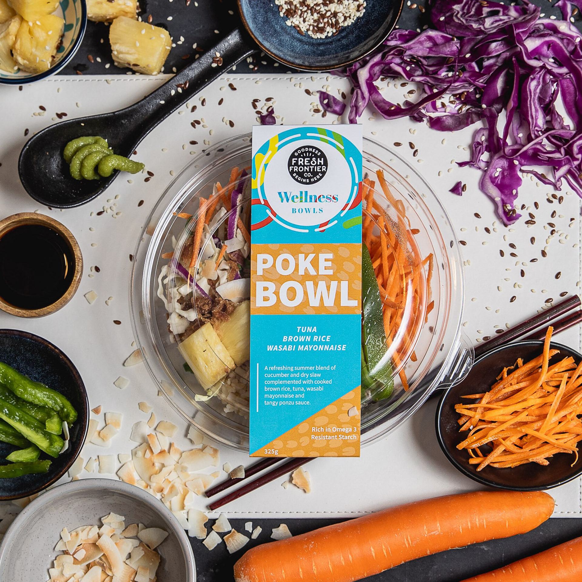
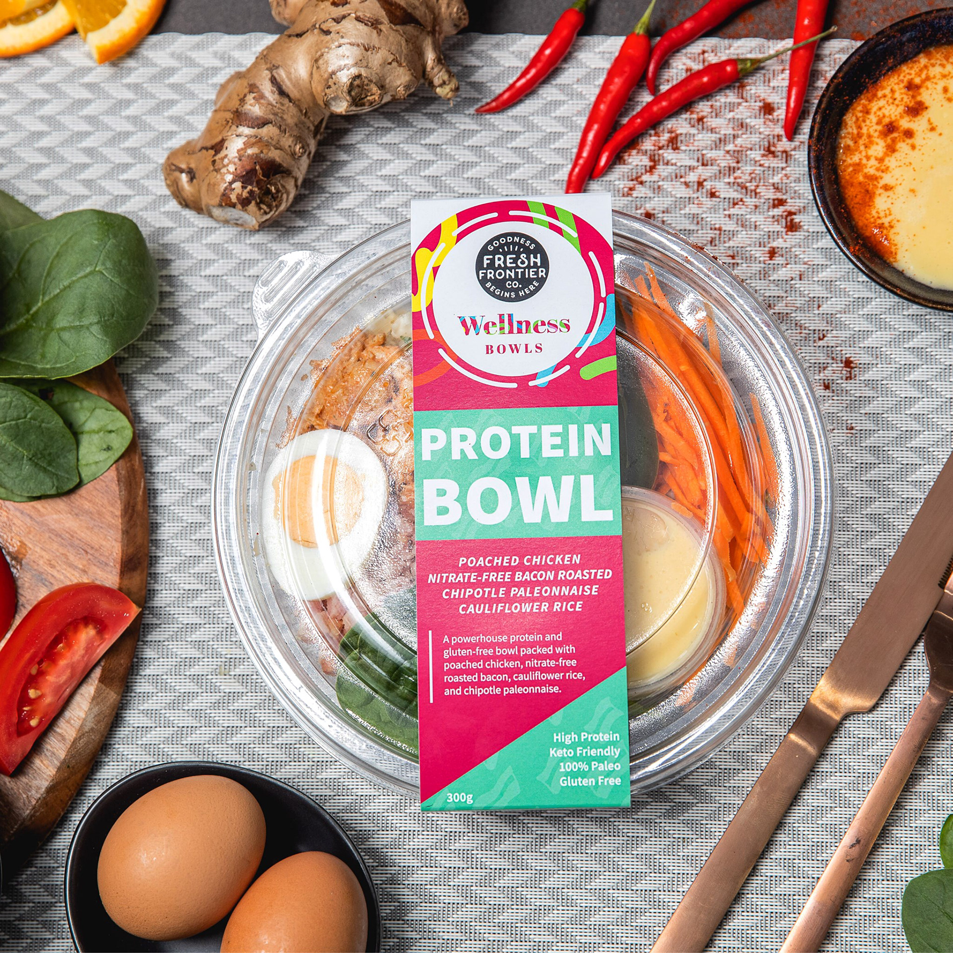
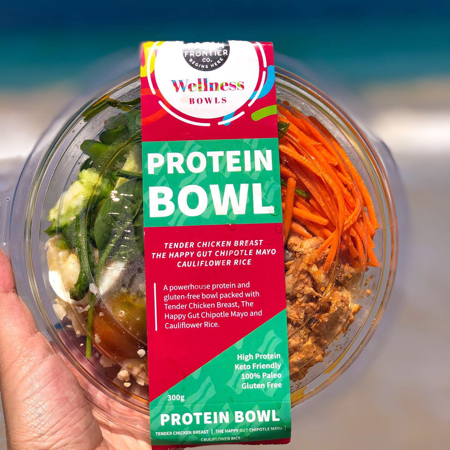
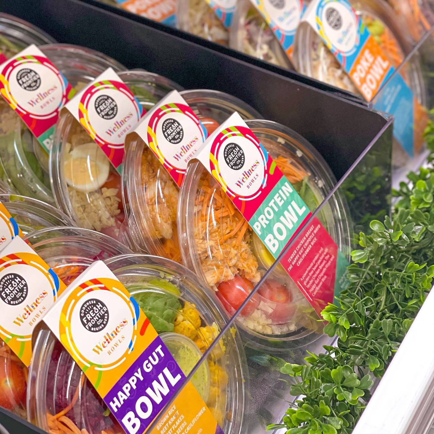
This first concept I sent over was based on the Wellness Bowl project and that design. I wanted to bring a sense of consistency into Fresh Frontier's Brand as referencing the past design but with a new variation of that design would help reinforce the brand's image.
I've put some photos of the Wellness Bowls to show you what I mean.

I only sent over two concepts to Fresh Frontier and the other was done by my colleague Ann Marie. However, in this portfolio entry, I'll only be posting my two concepts I sent over instead of sharing Ann Marie's work (besides I don't actually have her files).
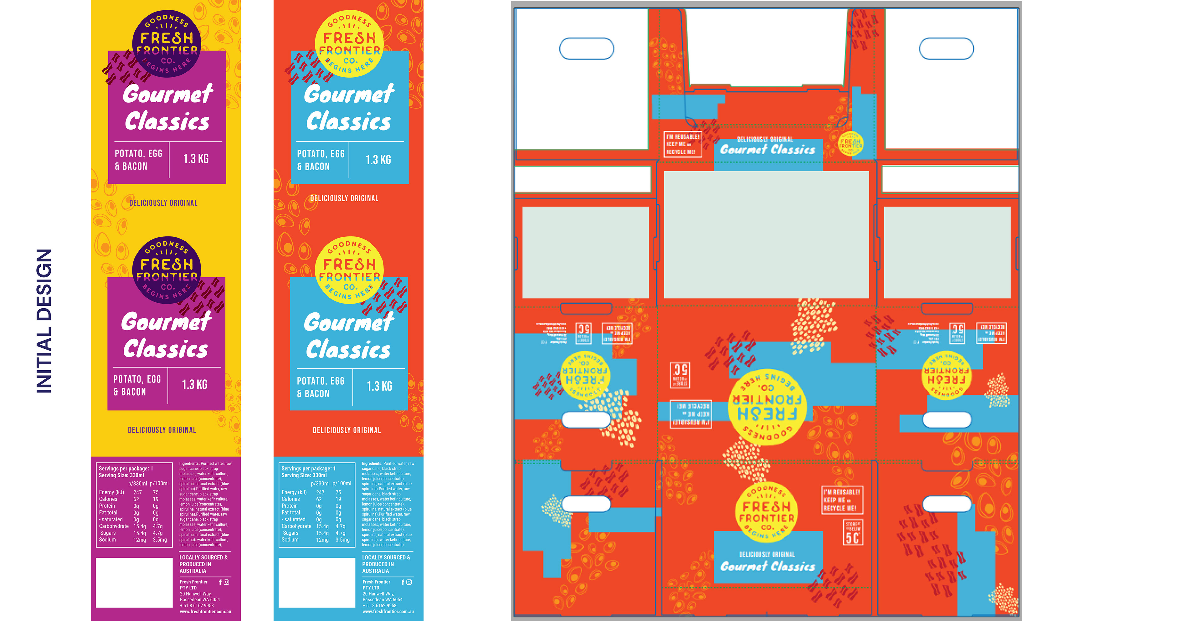
This was the second concept I delivered. I thought - let's continue the coloured theme as that was an essential part of Fresh Frontier was the colour and vitality. However, I just played around with geometric shapes. Since it was a rushed project, I relied a lot on my intuition and imagination to come up with ideas (though I did still research), I had to pull out some creative directions out from somewhere. I just wanted to make this a fun project for myself and present different safe to risky concept directions for Fresh Frontier.
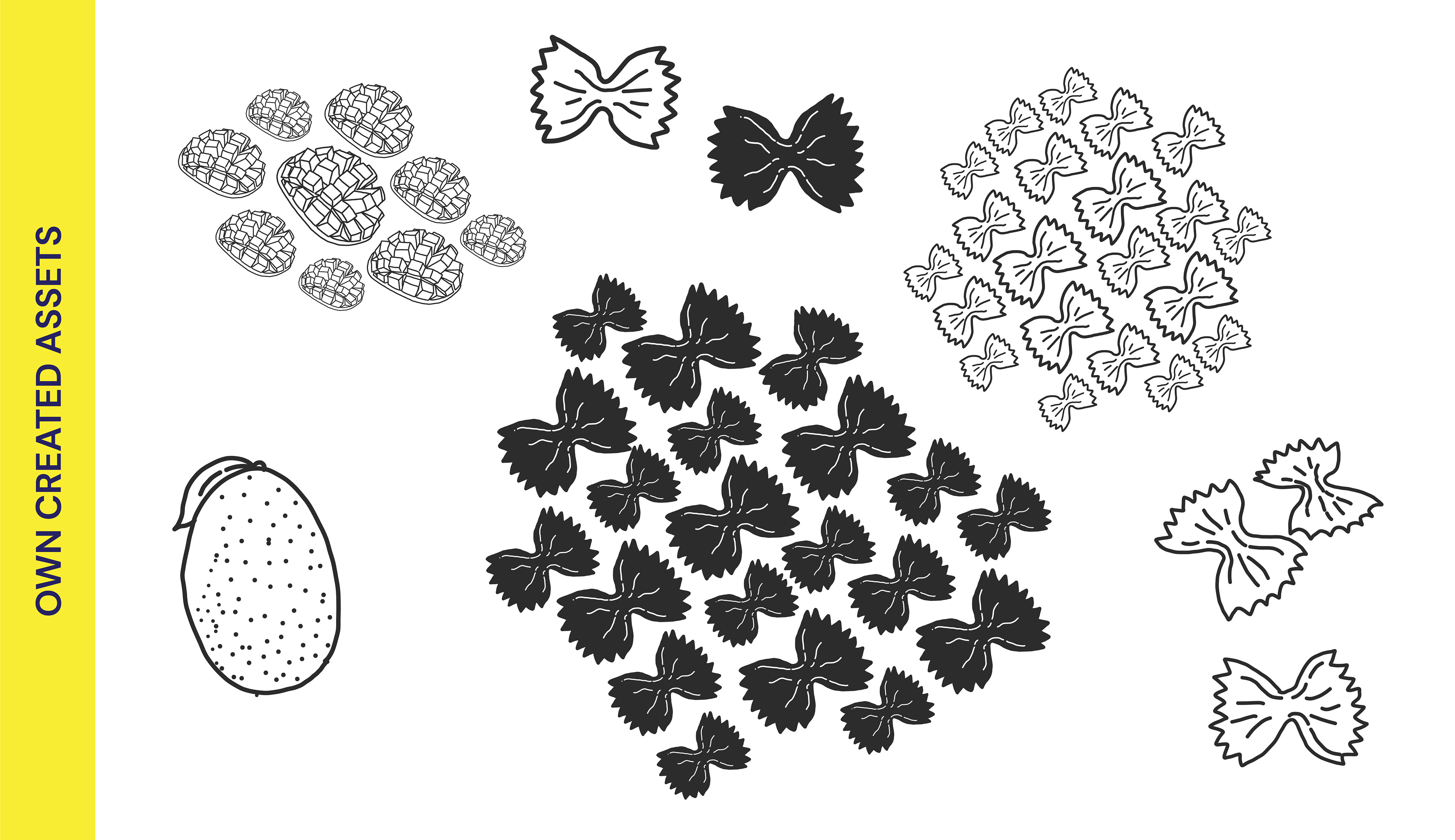
I had also re-used some assets I previously created from the wellness bowl concepts. (see below to see the array of assets I made myself for the wellness bowl project. Only few ended up being used, so I decided to re-use some of them in my COSTCO concept directions).

Since Fresh Frontier was working with COSTCO for this range, there was plenty of back and forth, and lots of waiting and approval from different parties. That's what I found different in comparison to working with a small business owner like Pop Kulture Ferments. The smaller the business, the less parties you have to go through, and the more creative you can be because it's not that corporate. The only issue is that many small businesses don't have the budget to do something high quality. In contrast, bigger businesses like COSTCO will require many parties' approval, has a larger responsibility and you can't be as creative as you'd have to follow the client's vision and appeal more carefully. On the flip side, bigger companies will always have a bigger budget.

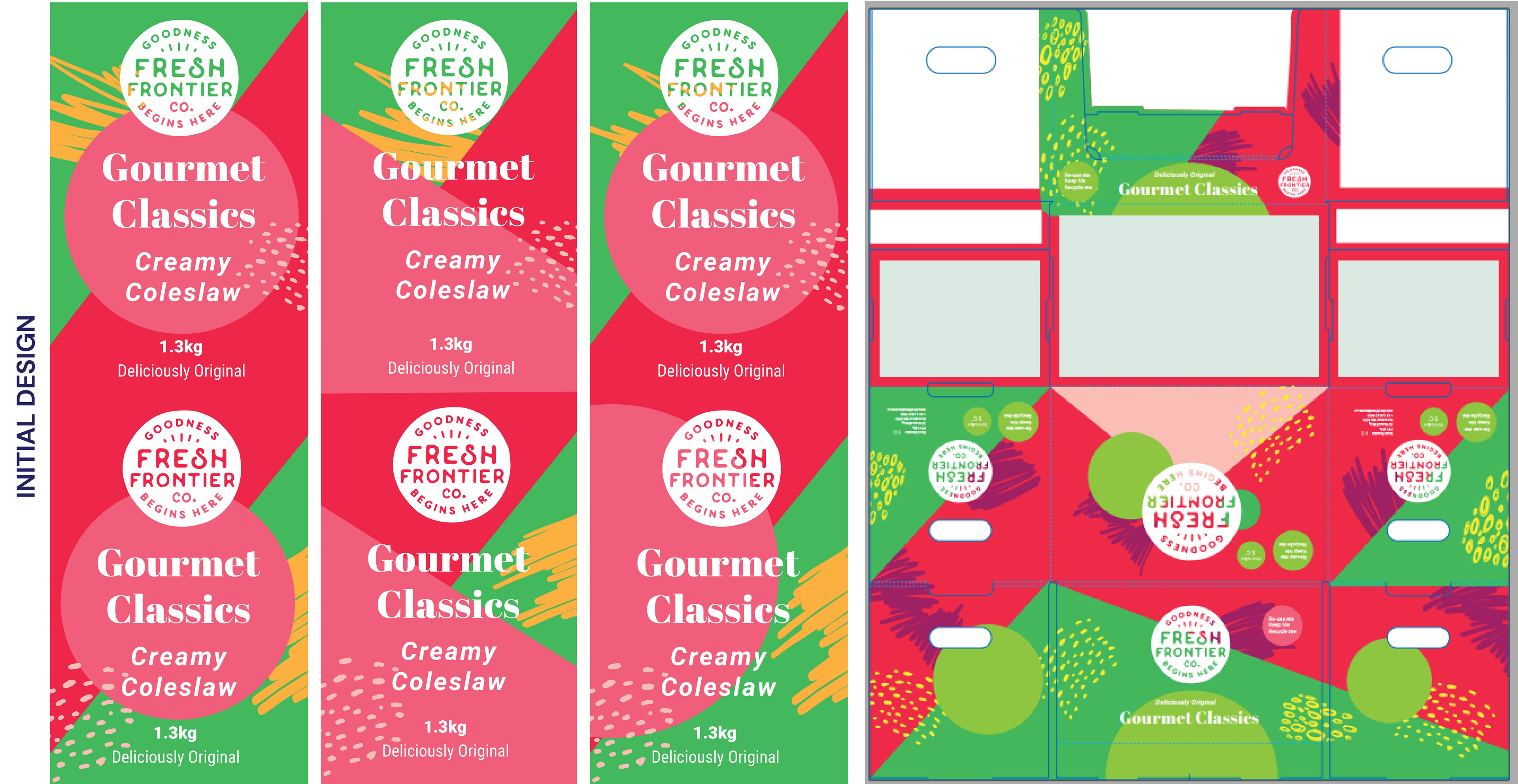
So what happened? After hearing back from the COSTCO parties, they decided to go with the first concept but they wanted to change the typography settings. Originally they suggested a method, which I did do - but only to demonstrate how it doesn't work in the design. I ended up recommending the 4th design (the very last design from left to right) as it has the most strongest hierarchy out of the 4.
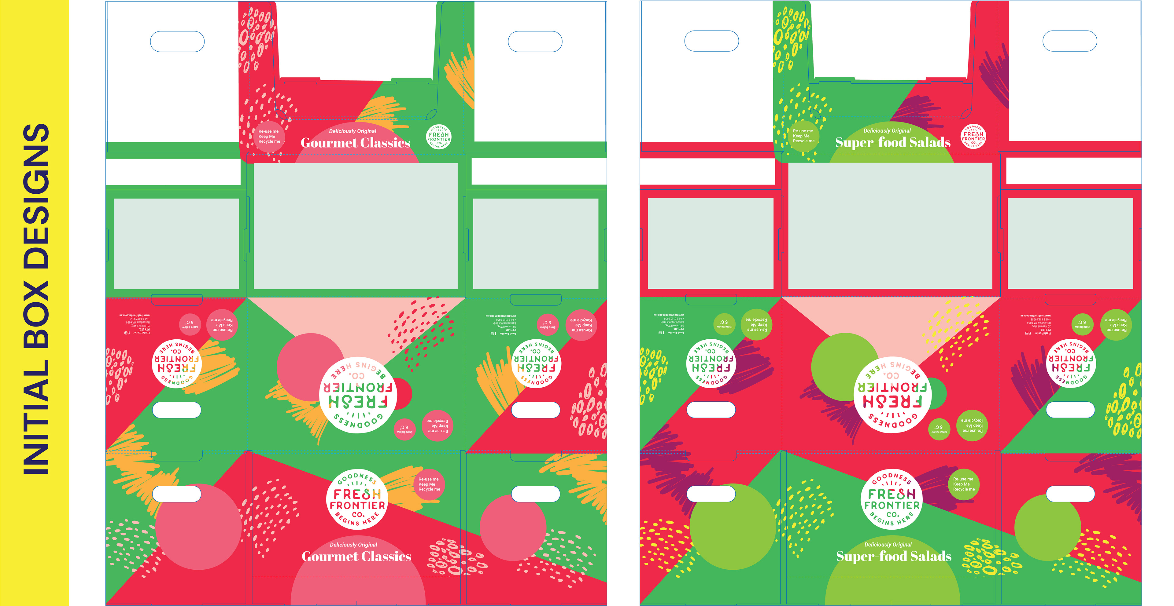
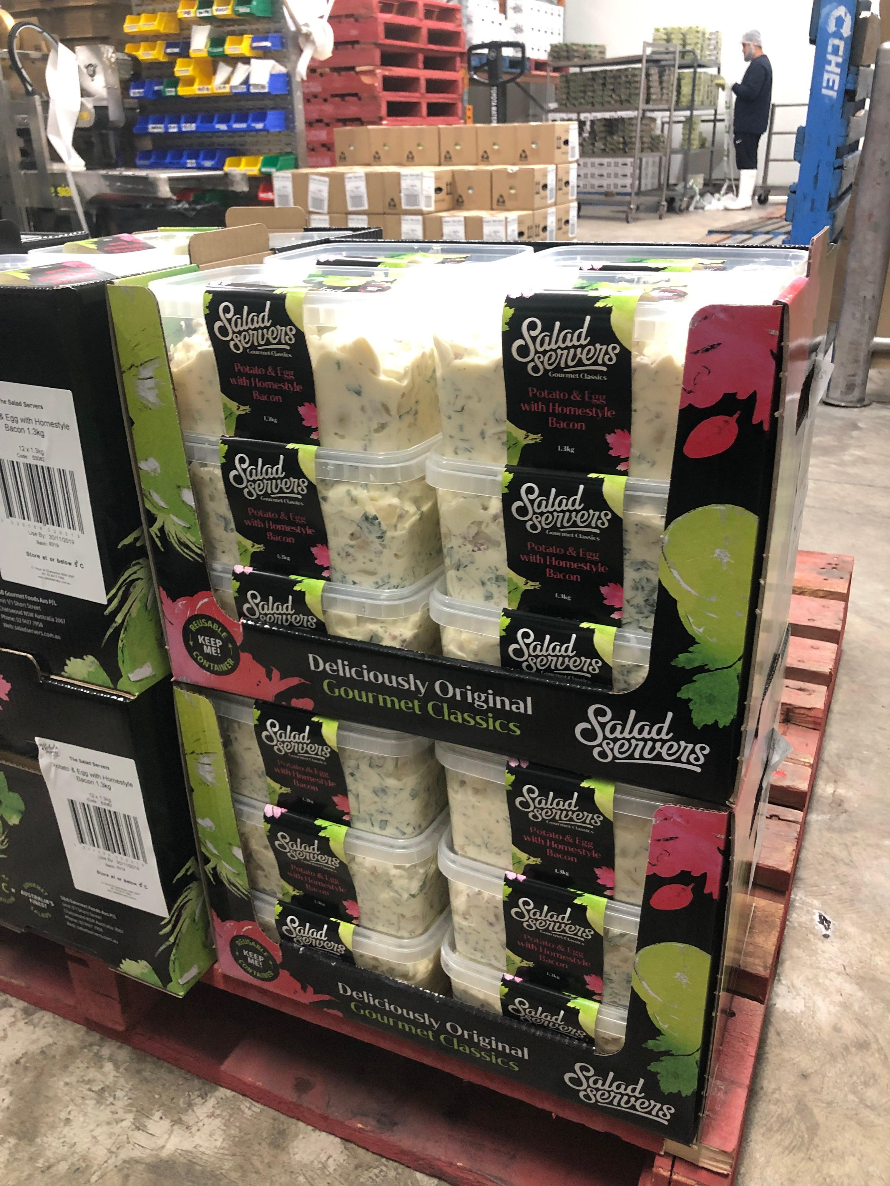
I had also sent my box designs which I did the same colours but reversed it for the two. This was the initial request by Fresh Frontier as they wanted to do something similar to Salad Servers who had their design reversed. Salad servers was actually the reference I was referred to for this project. "Just do something similar to what Salad Servers are doing". (images attached - but credit belongs to Fresh Frontier - not my designs.)

Of course, as you saw the two concepts, I never ended up doing something similar to Salad Servers and COSTCO seemed to be on the same page. They wanted something slightly different. They mentioned that the box designs needed to be more different from each other than reversed. Turns out there was two boxes for two different ranges which I was misinformed from the client initially. So I decided to have a colour play.
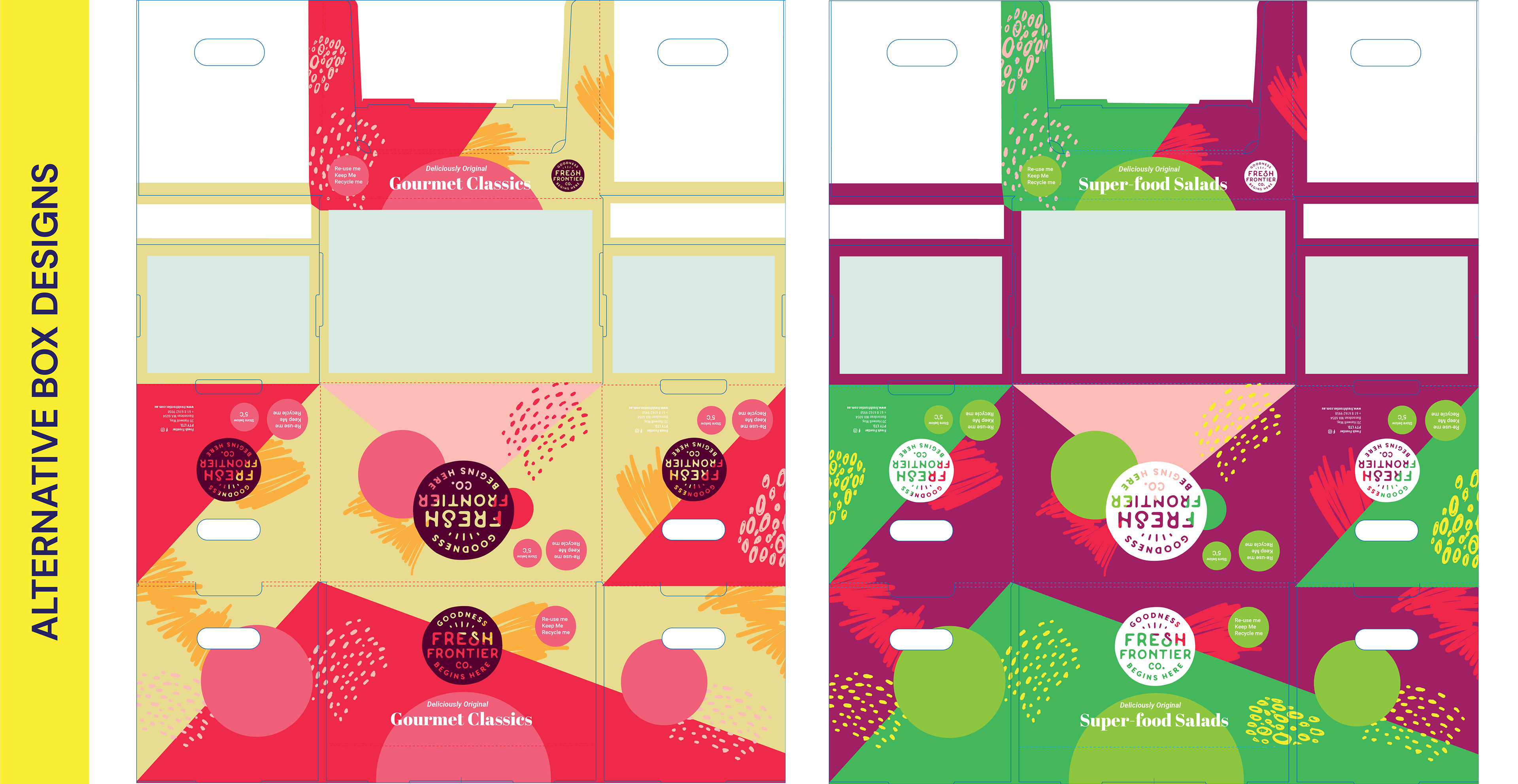
I kept playing with colours until I got to these swatches which I recommended to the client as it best shows the product range but also complements each other and goes with the rainbow theme that Fresh Frontier often raves about.
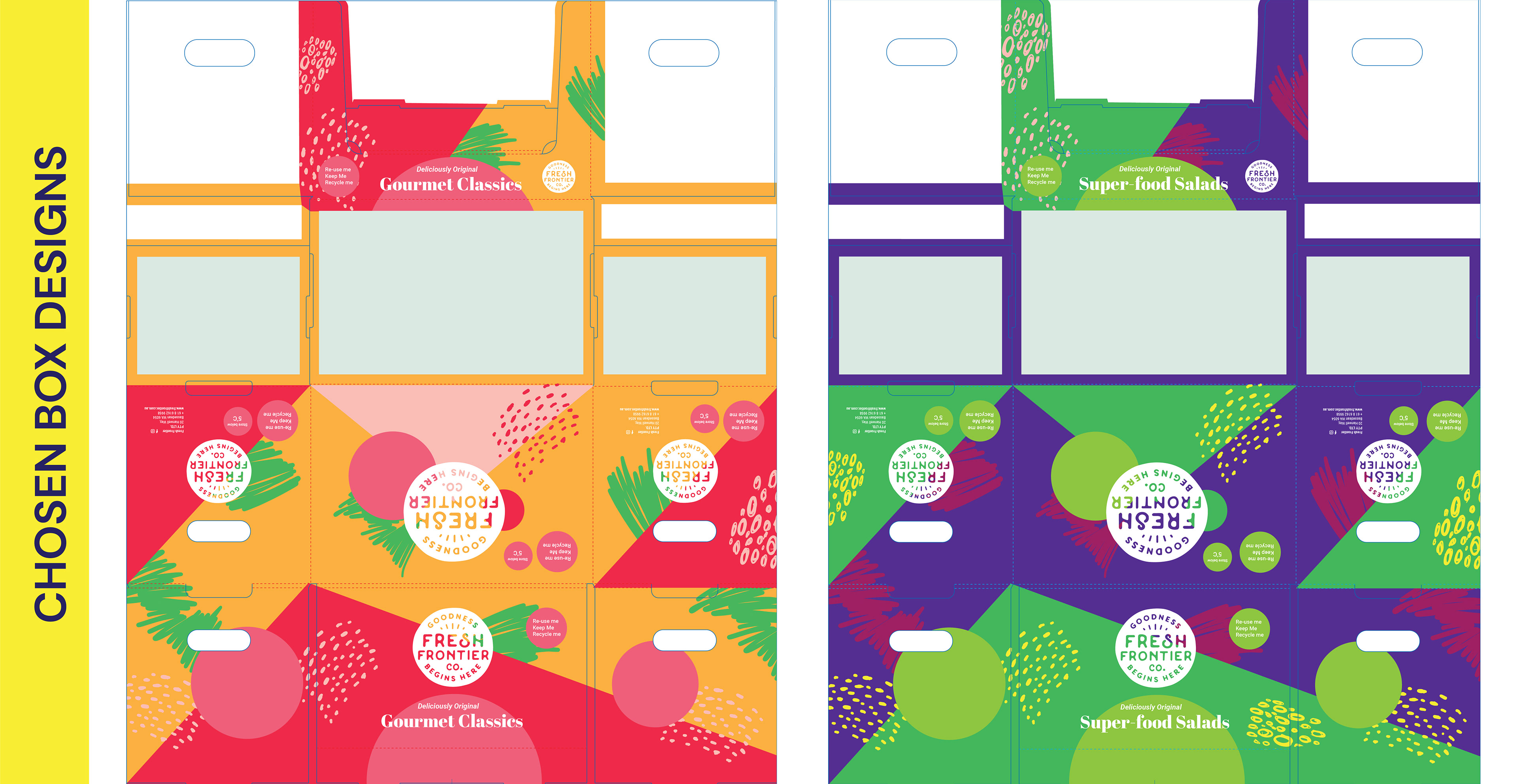
So boxes are done, what about the labels?
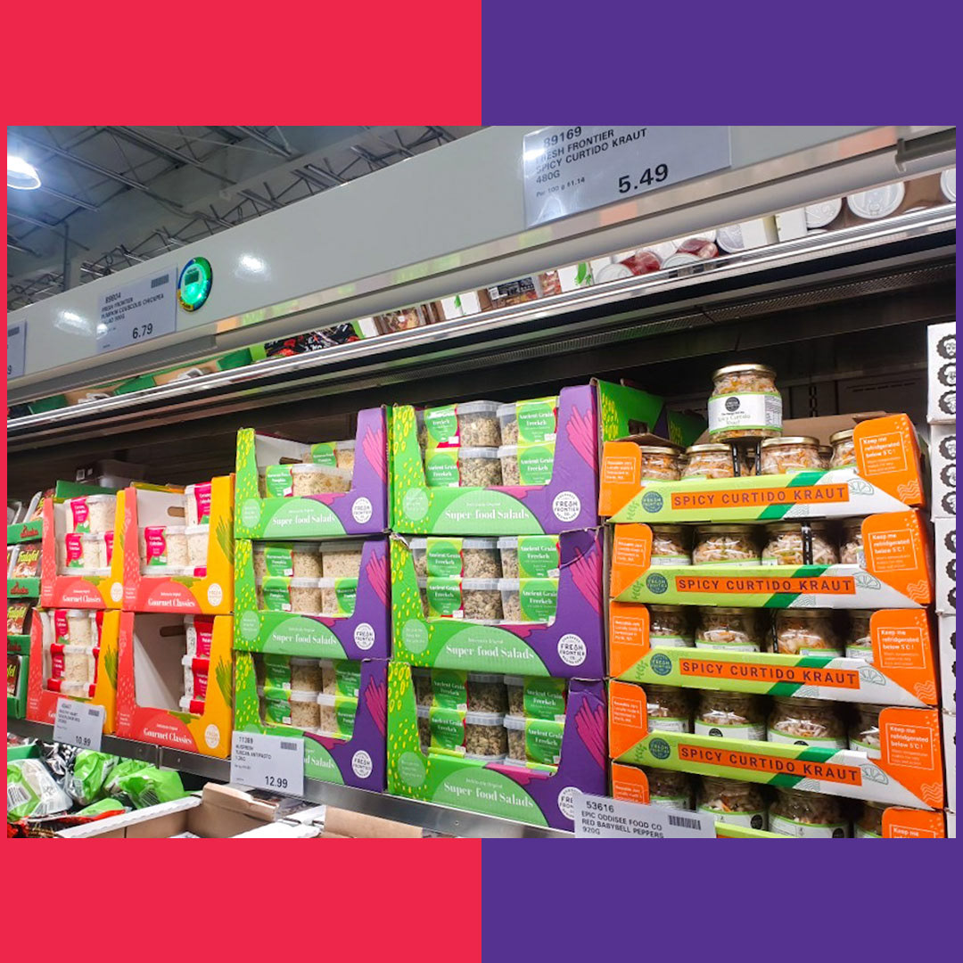
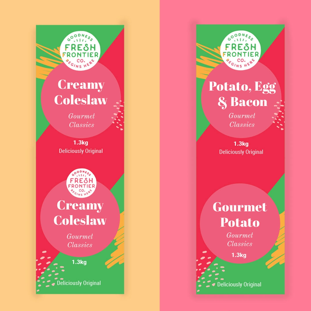
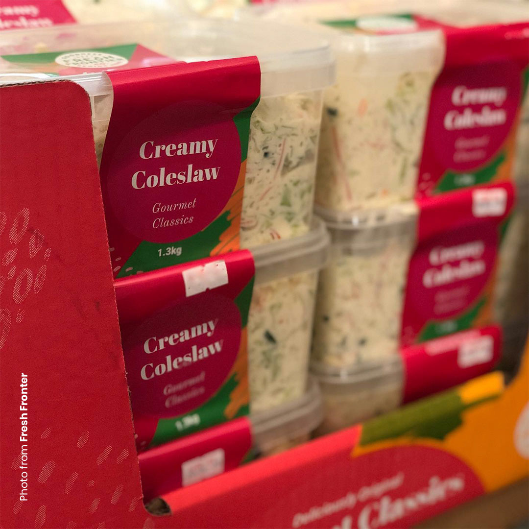
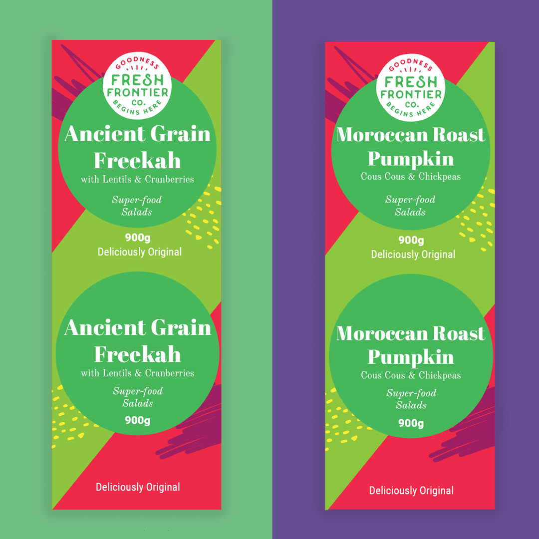
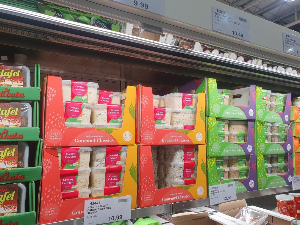
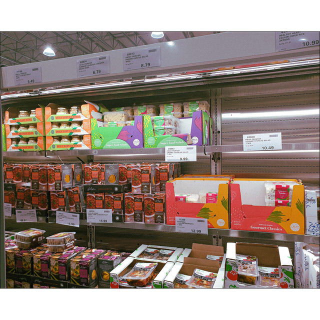
After a bit of tweaking and resizing, changing a couple of text here and there, the labels were completed too. They kept the same colours although I think it would look awesome to match the box, but oh well. Their decision, not mine. I've put more images below of the boxes and labels done in COSTCO!
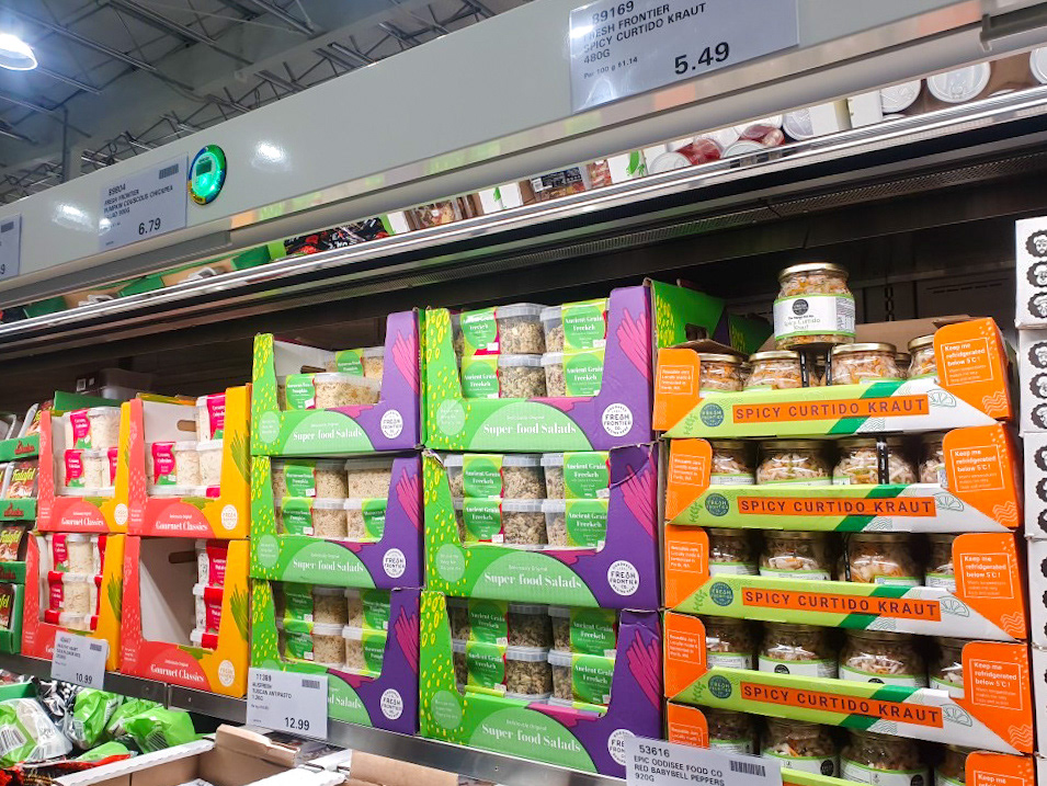
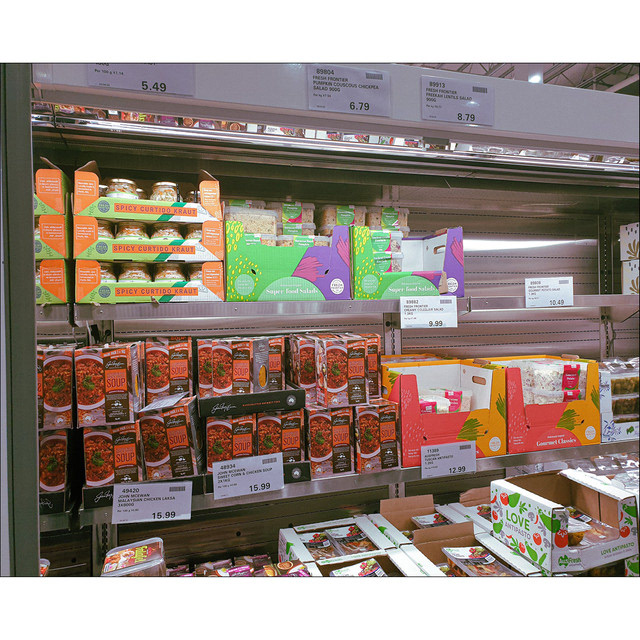
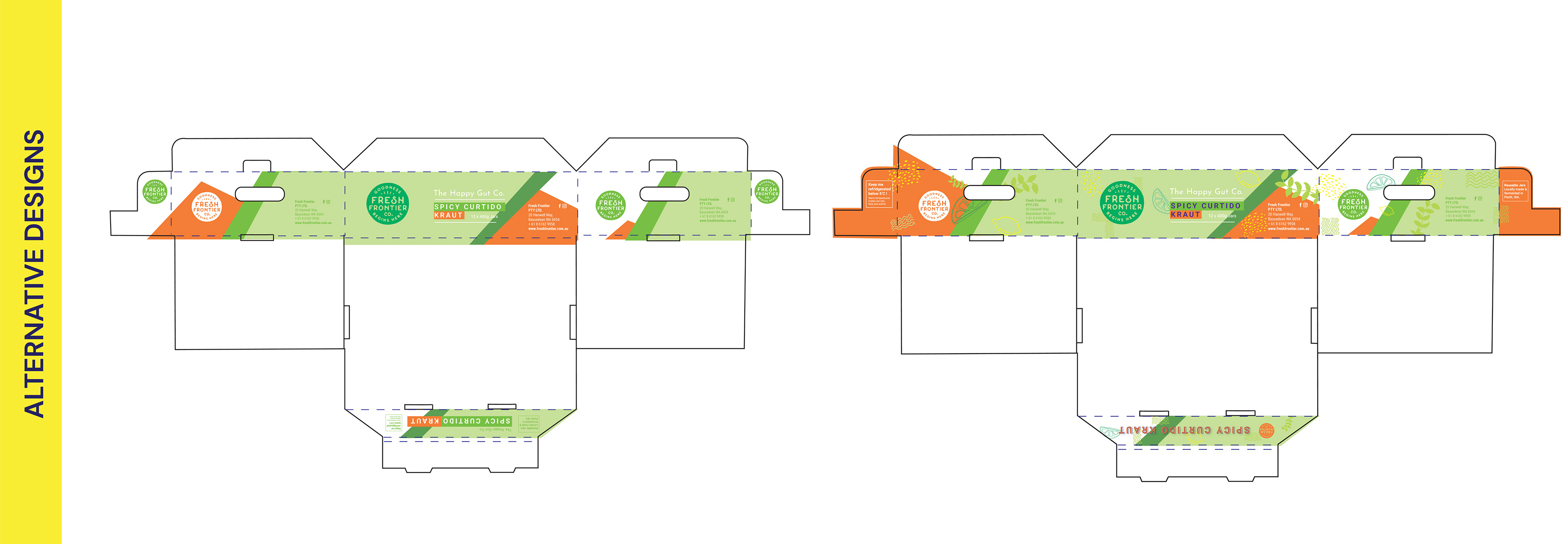
That's not all! I've decided to also compile other COSTCO side projects into this portfolio entry as well. The next thing they got me to do was to quickly get a box design ready for their Spicy Curtido Kraut and I had to work with the former designer's design (this was at a time when their kraut wasn't re-designed by Ann Marie and I yet) as their Curtido Kraut was recently requested to retail at COSTCO.

The previous design didn't have too much colour to it, so I tried to use whatever colour I could find from the kraut itself as well as utilise the green and it's shades into the design.
The next side project from COSTCO was the Fresh & Easy project. Fresh Frontier would provide COSTCO with pre-cut vegetables, i.e Cauliflower Florets or Broccoli Florets. The client required a box design and 2x labels which they wanted to keep to existing style I had done.
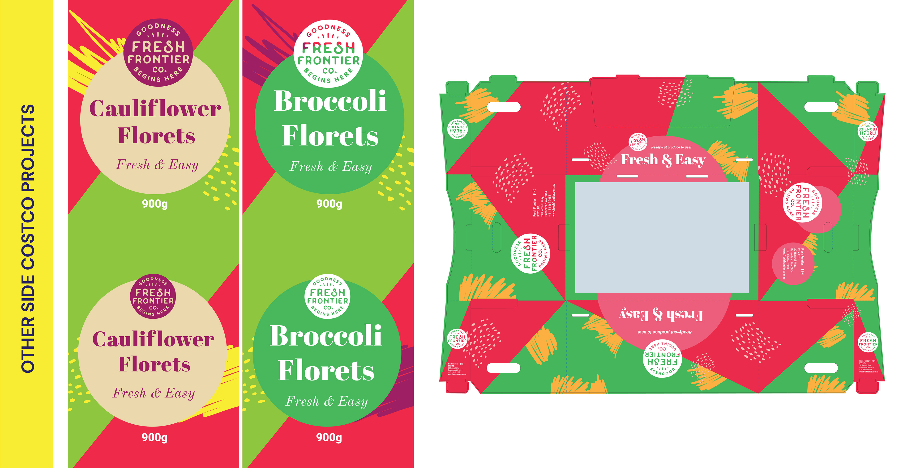
This project while it did make a start, was put on-hold after I had sent through the first concepts. Apparently on COSTCO's end, COSTCO didn't end up getting back to Fresh Frontier on what was happening with the Fresh & Easy project. However, it's still on-hold on my end up until now, so when there's something new, I might post about it!
The last project that was actually a go - is the COSTCO Chicken Mango Pasta. Fresh Frontier wanted a new label refresh for this particular product and wanted to release it in time for summer. Since the existing design had been established already, I just had to provide different colour swatches. I did end up doing some minor fun assets and that concept didn't end up getting chosen but oh well - it was still fun regardless!
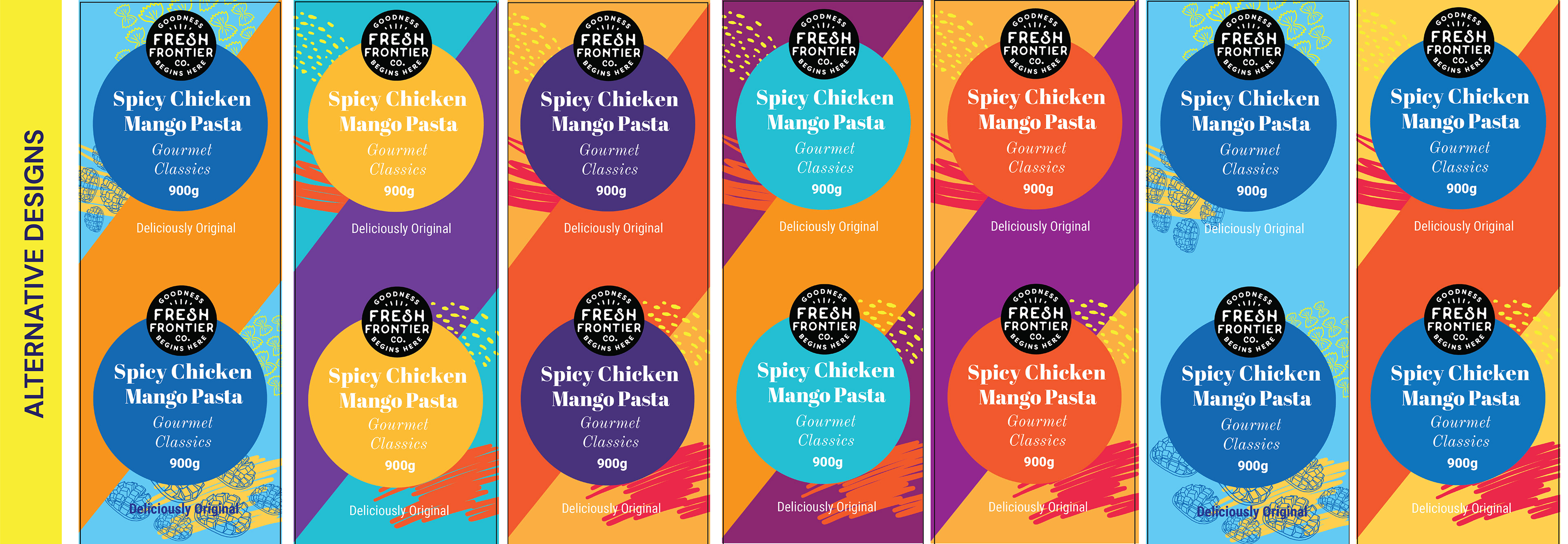
The blackline represented the die line and wasn't part of the original design! I went a couple of different routes, like a tropical route and a "spicy" route for creative directions. Either way, I wanted to keep the bright colours as this was starting to evolve into Fresh Frontier's brand.
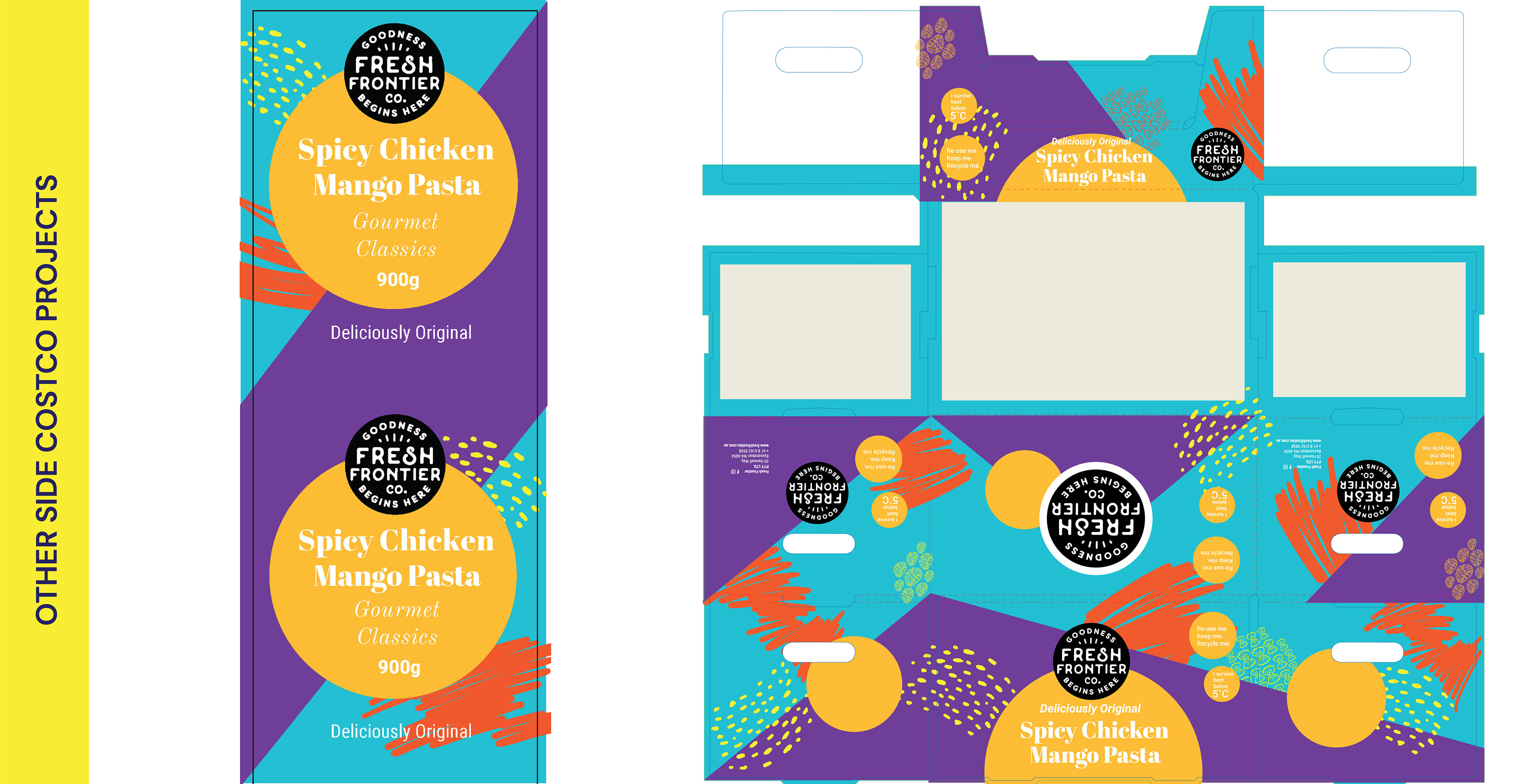
This was the design they ended up choosing for the Spicy Chicken Mango Pasta. Even though they ordered a box in, it turns out they didn't needed the box and misinformed me at the start. Oh well, I would love to see a matching box but still awesome to see the designs come altogether at COSTCO Perth!
Instagram story taken from my instagram highlights "Client Works" from my studio's instagram: @somechuppystudio.
Thank you for viewing and taking the time to see my projects and works!
If you're interested to hear about Fresh Frontier, definitely check them out!
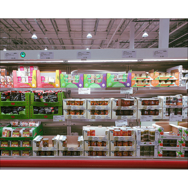
And if you're in Perth - be sure to stop by our COSTCO at 142 Dunreath Drive Perth Airport 6105!