Probably one of my biggest first projects landed with a larger sized local business that was located in WA Perth. But how? and me? a small-time designer? (mind you, I was working with Plus 4 Creative at the time and we had only been running for 1 year. We were small and barely anyone knew us.)
So how did a larger company like Fresh Frontier discover us?
It all started because I'm a gourmet food lover keen to try anything (and everything) but also being pre-diabetic and a PCOS woman, I was health conscious too. I discovered Fresh Frontier with their naked salad products, a Pinterest idea of a salad in a jar turned into a marketing product. I thought they were a indie-hipster company to be honest (and hoo boy, I was wrong). At some point, I decided to share my foodie journey through Instagram as "@someperthfoodie". Months later, I got a phone call from Fresh Frontier asking for a quote and a possible meeting for their new wellness bowl range. I later found out they had discovered my partnership business via my foodie instagram account! It turns out they had been looking for a new designer for a while but wasn't sure where to look. Since I'm always sharing food and tagging local businesses, they saw that I had owned a partnership business (Plus 4 Creative) and decided to check out our work.
You know what happens next! We got signed up! Fresh Frontier didn't always have this rainbow look but let me explain how we got them from their previous design to their new look.
Above is a collection of images from the past of their former designs and branding. (Images were taken from Fresh Frontier's social media pages & credit goes back to their team!) The branding was inconsistent and there wasn't really something concrete and it didn't feel like it was communicating a message. At least that's how my colleagues and myself felt when we were listening to what the problem was.
They've went through many designers before and been wanting to change their current design as they said "lacked creative flair". Fresh Frontier had a vision:
*They wanted a colourful and vibrant colour scheme to showcase the vitality and goodness of wellness and taking care of your wellbeing
*They believed by having a variety of colours, they would stand out from the competitors who have minimalistic packaging.
*They wanted to show wholesomeness, organic yet clean eating
*Represent their products in a fun, happy and very approachable to mums, families and communities
*Wanted to feel more professional and enter a bigger commercial market
*Have the customers know they source local, fresh ingredients that support local farmers and produce everything fresh locally with the most natural and authentic processes and ingredients.
*Have customers know the effort and honesty they put into making each product healthy and fresh.
*Was looking for new creative directions that fulfil their vision and give them a visual sense of their vision.
After plenty of competitor and inspiration research....
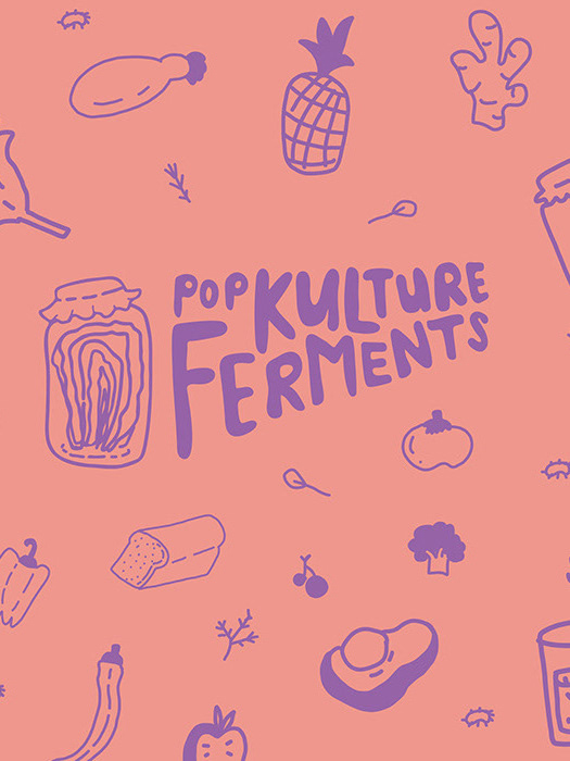
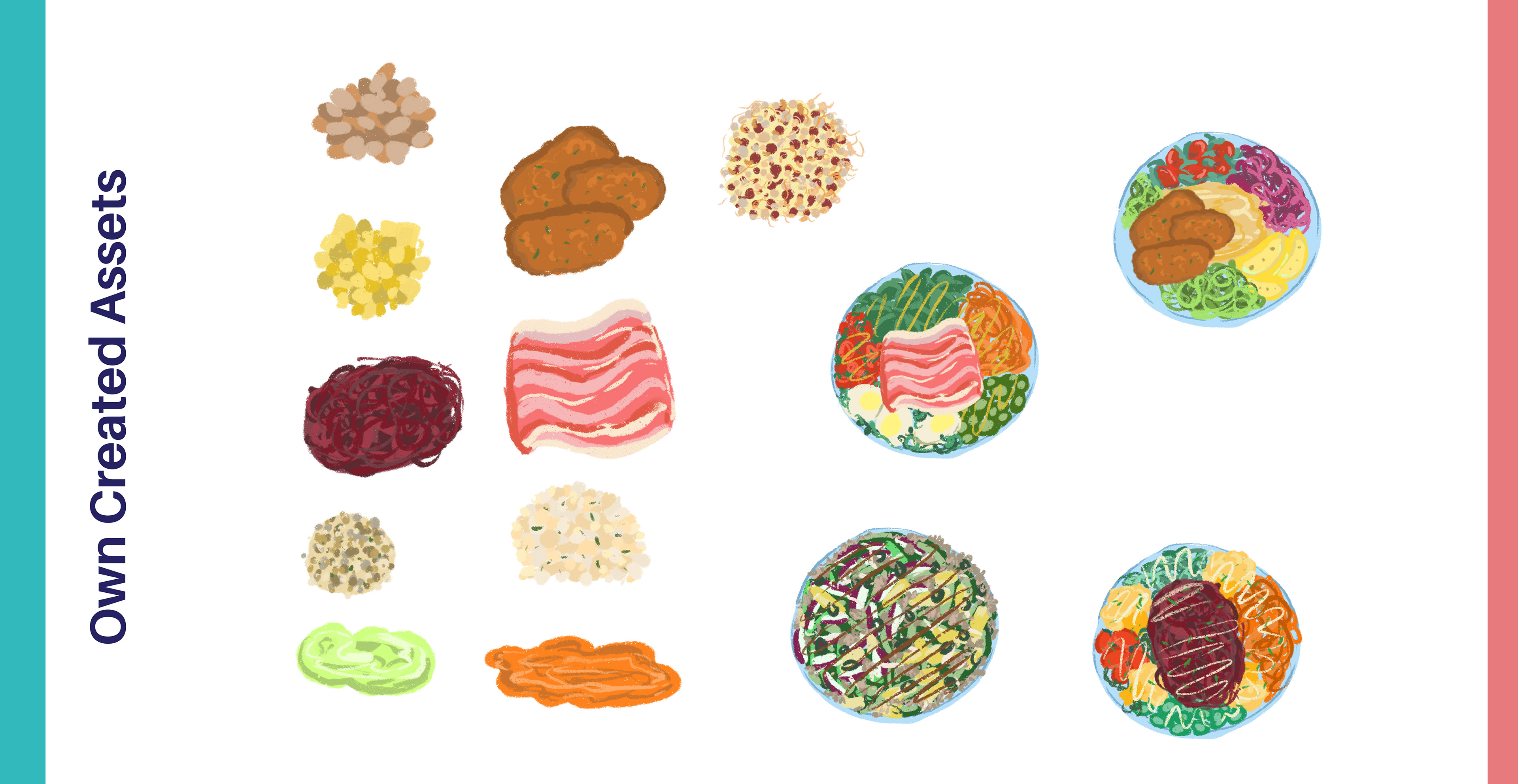
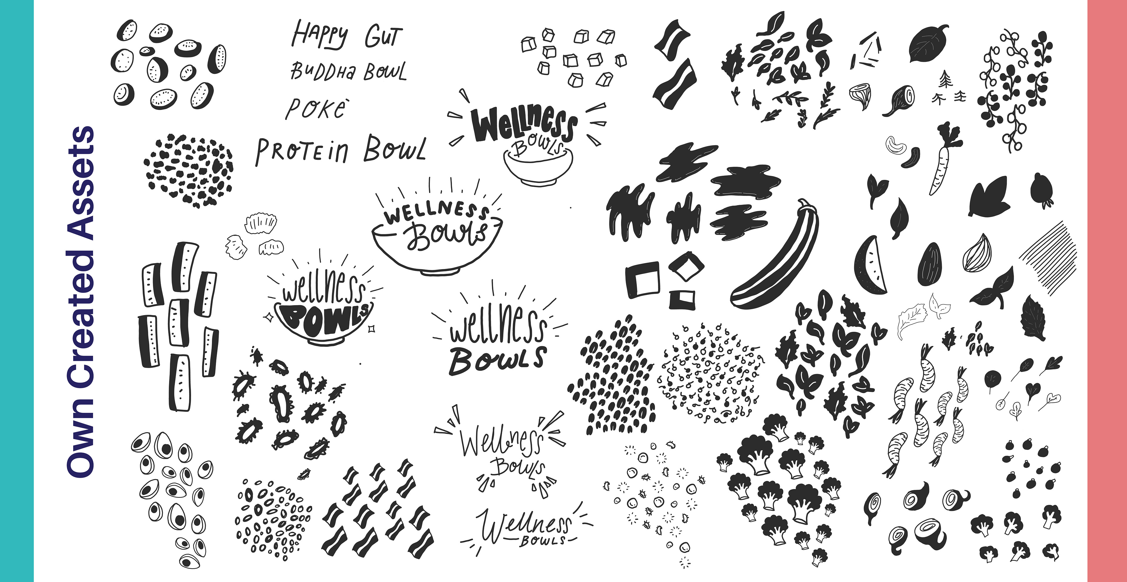
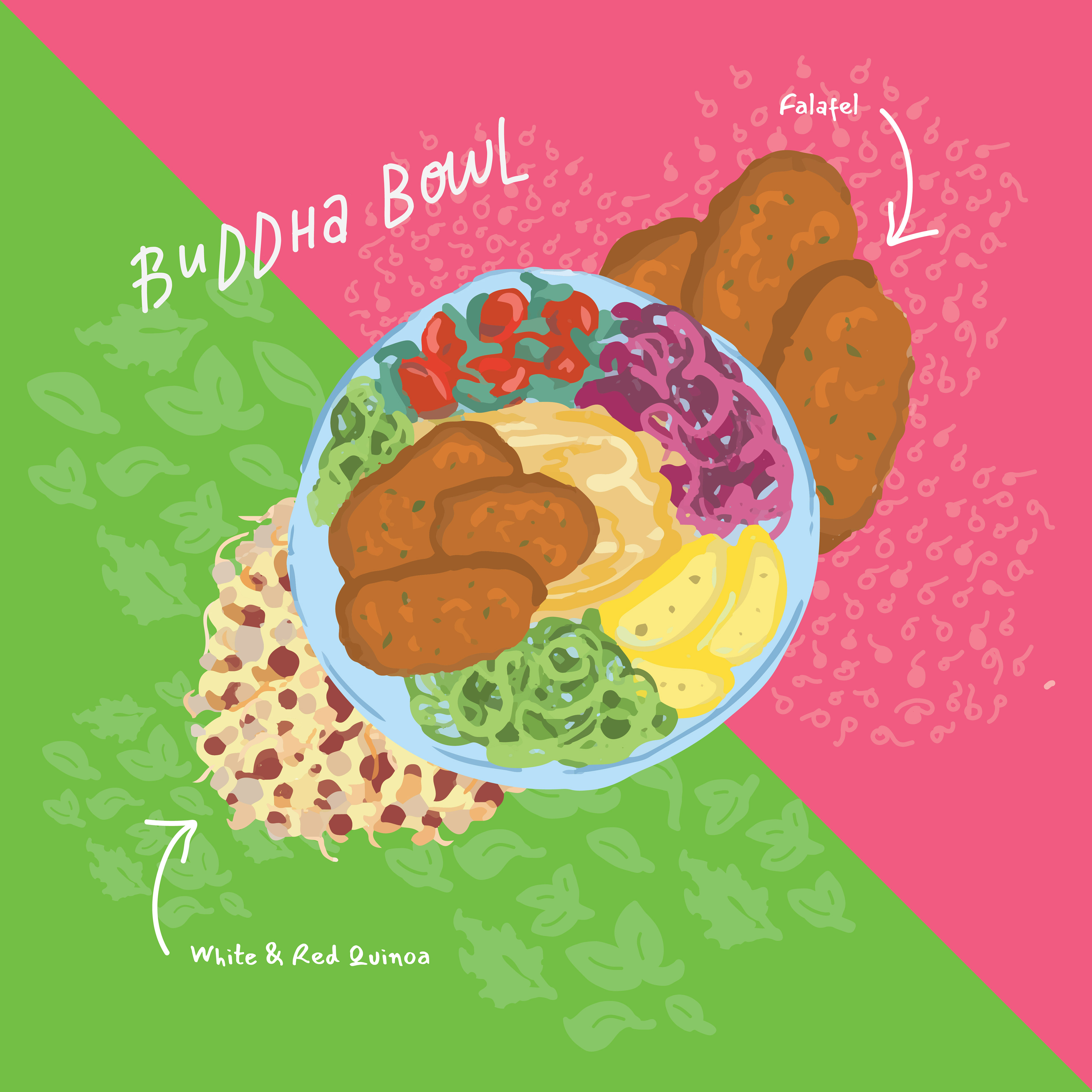
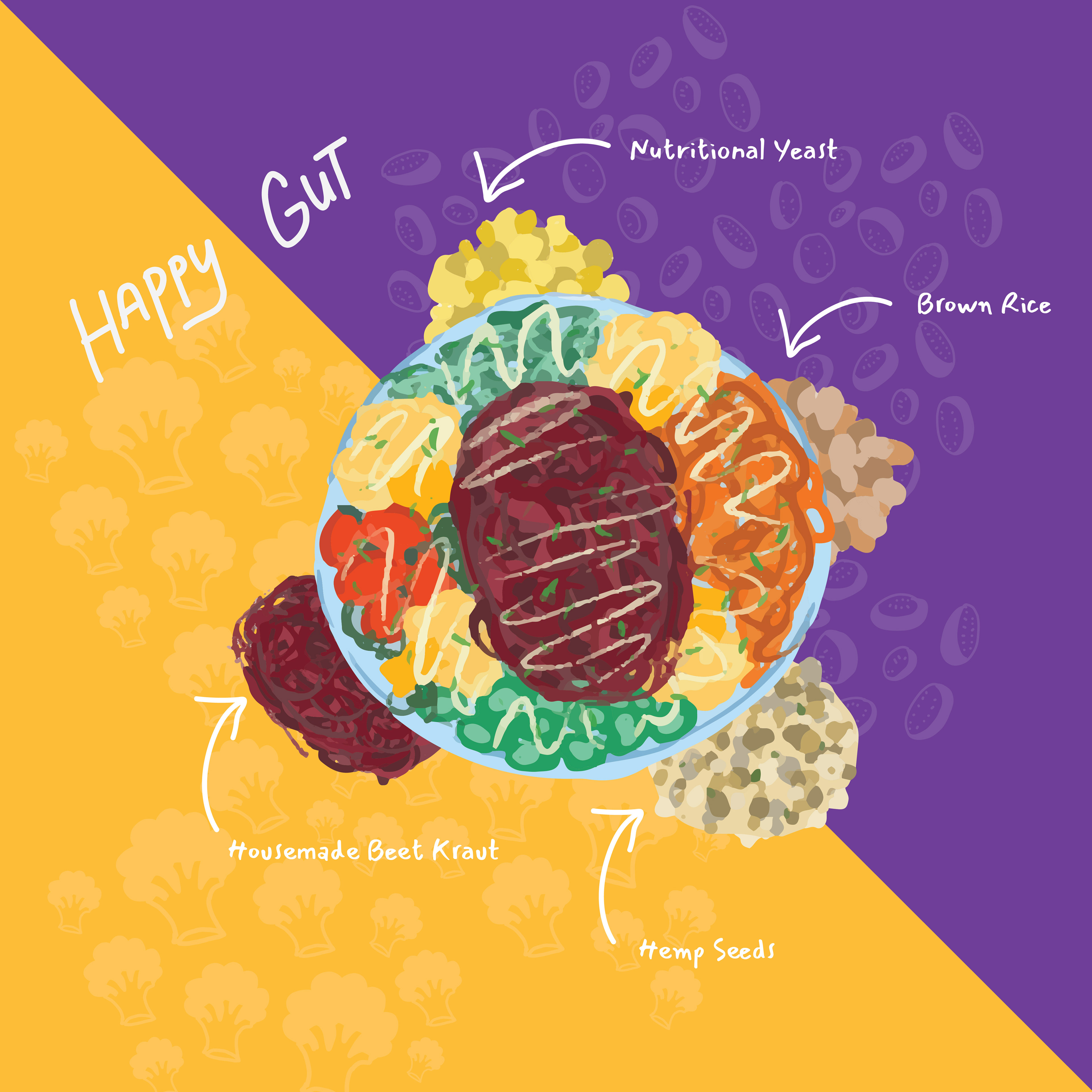
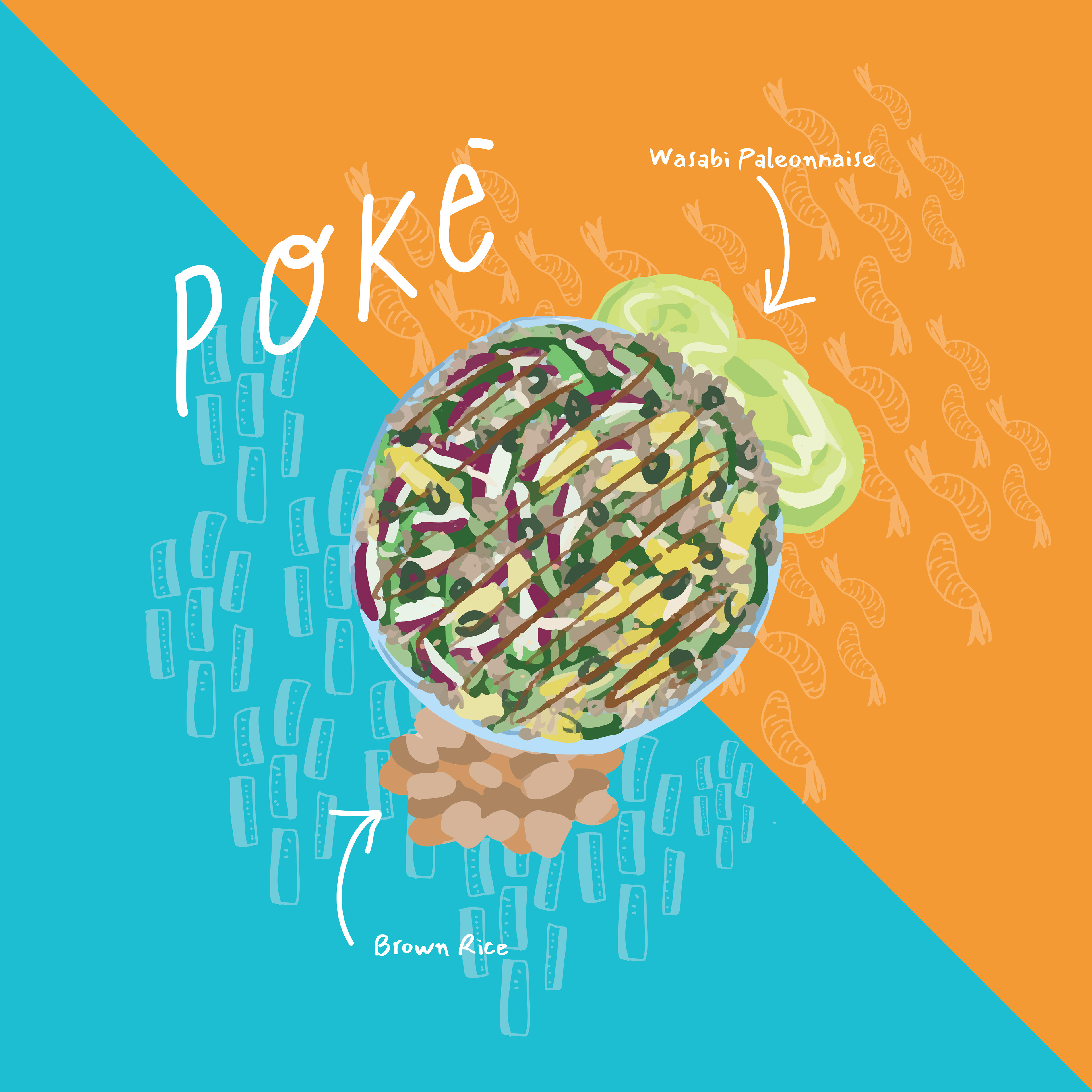
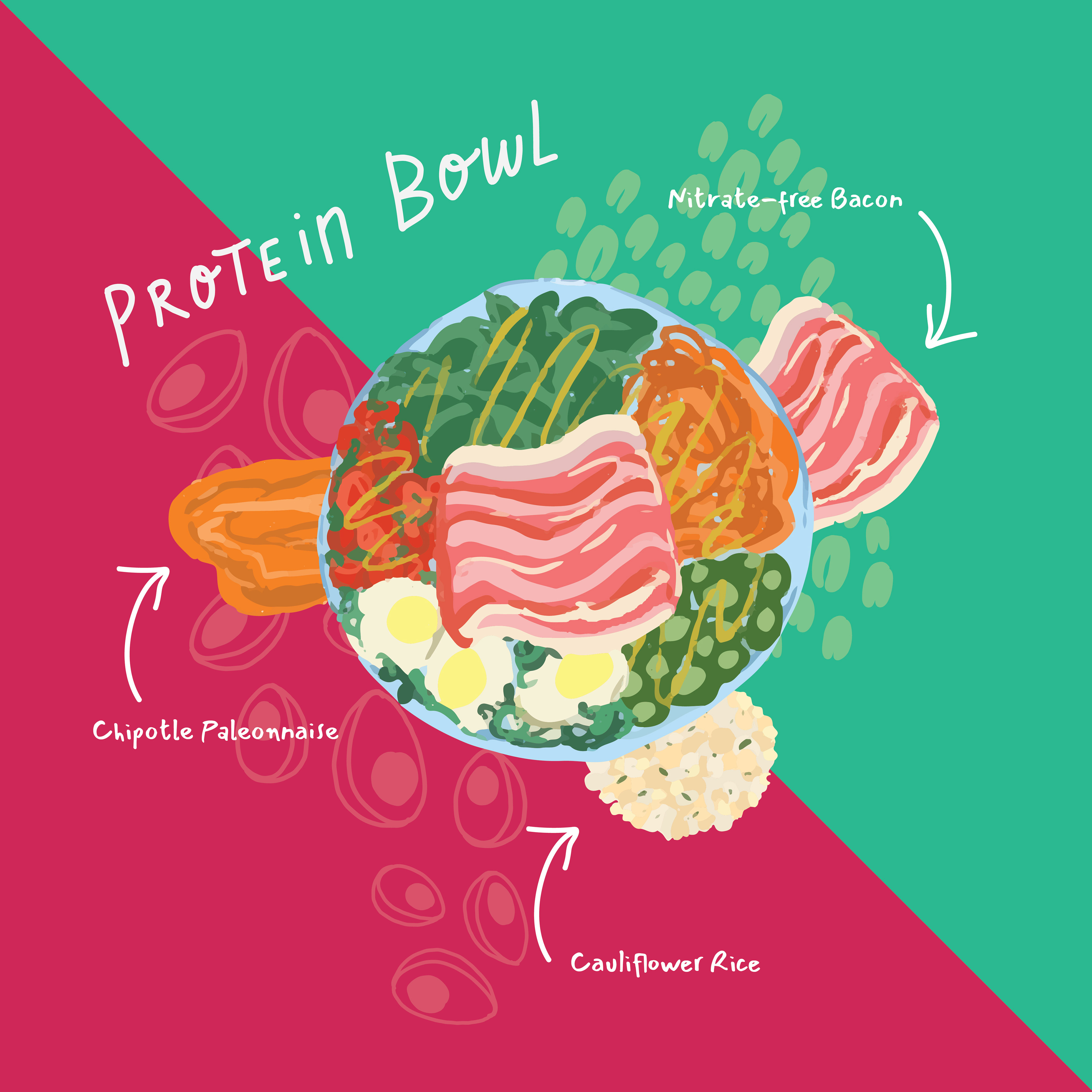
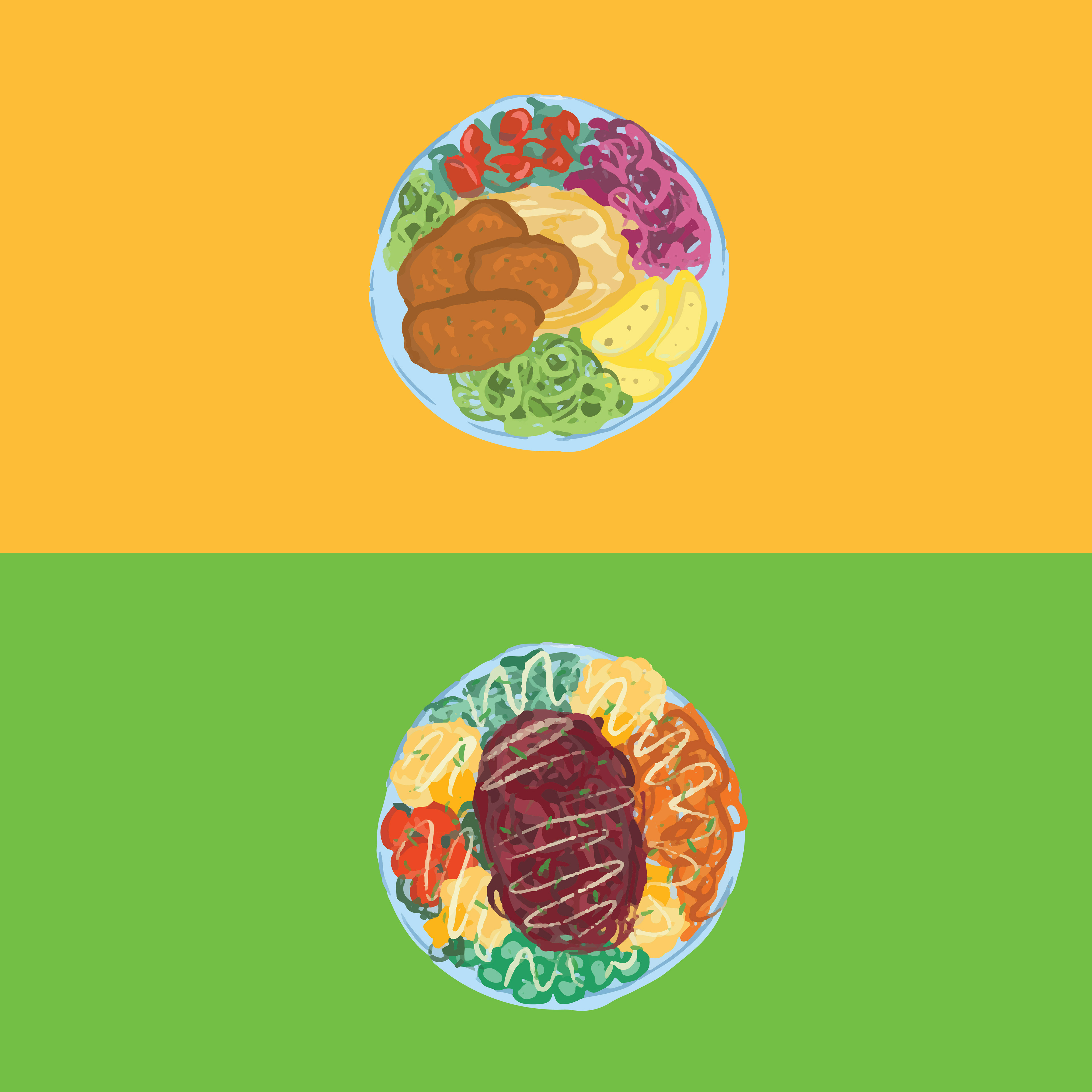
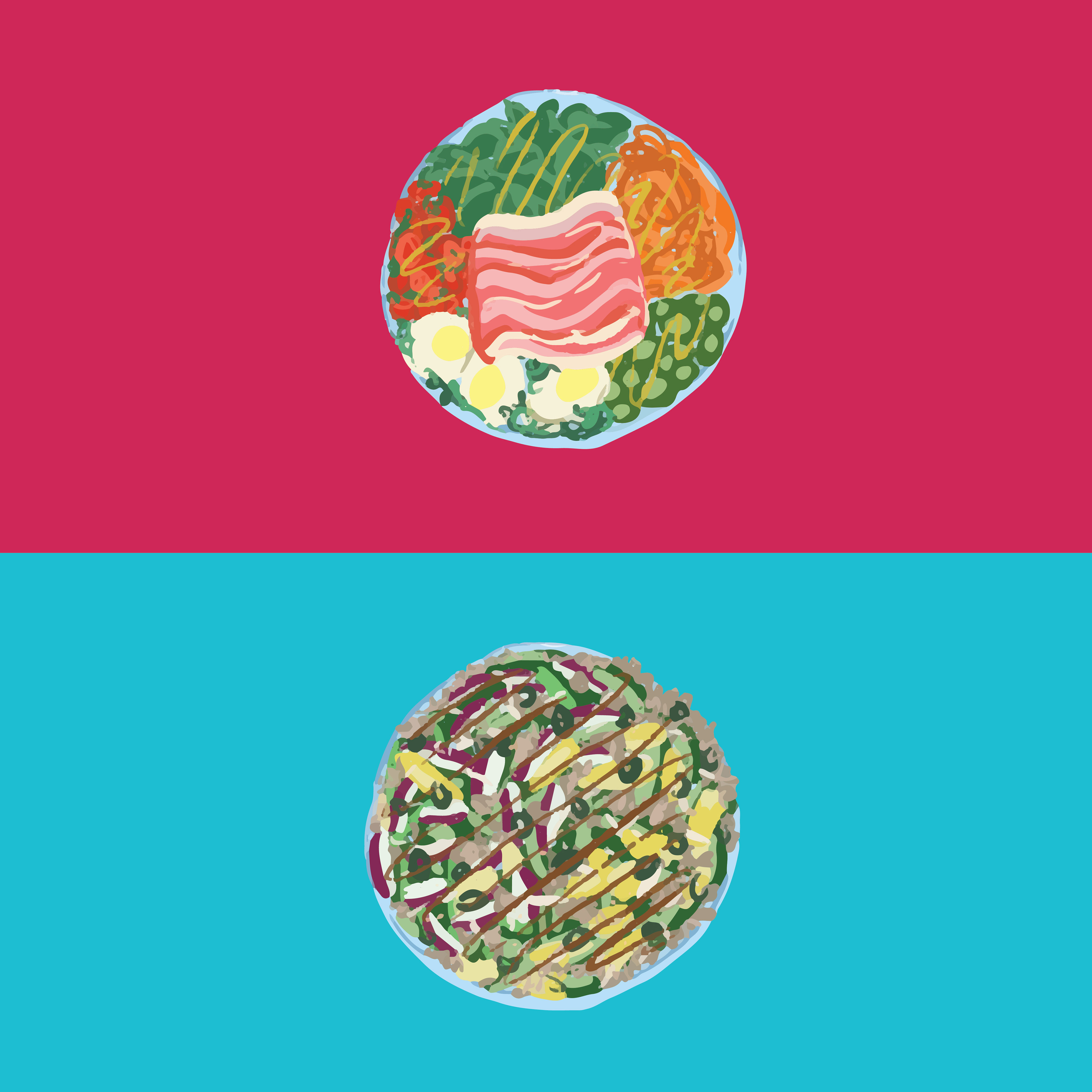
Let's say... I may have went a bit crazy... jokes aside, I decided to make a bunch of illustrated assets. I wanted to have a play and see what I could make. This was after being overwhelmed by the amount of existing inspiration and being unsure of what to do. So this was my way to feel more productive but also have something I could play with in my label designs. I made two different assets, you can see one above is line work & lettering assets, the other being a chalky-coloured illustrations. I had a meticulous look at the ingredients and decided to draw the ingredients in as a food lover myself, I imagined the visual of ingredients and food would be a nice background texture and entice customers as it would be more 'appetising'.
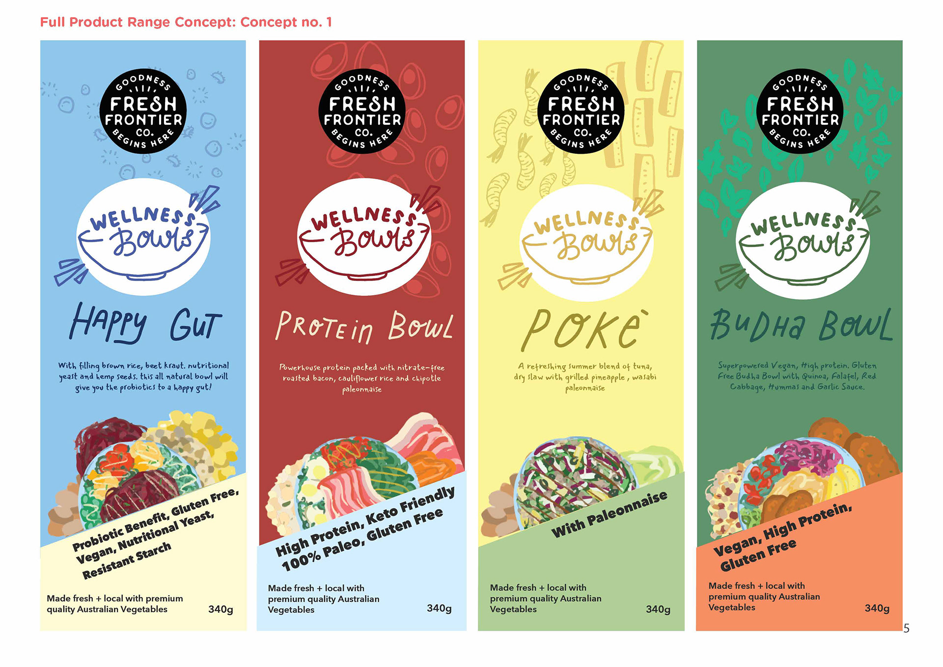
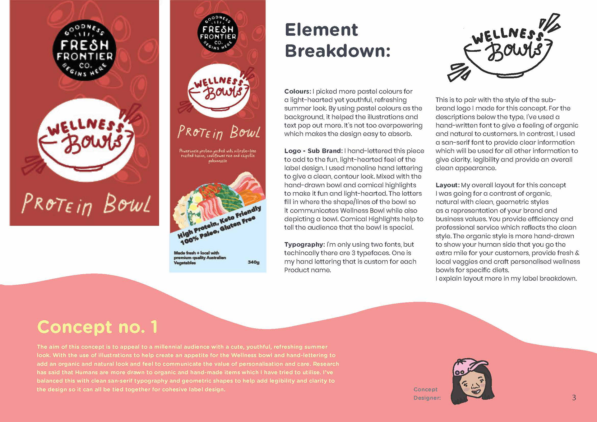
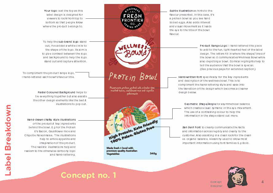
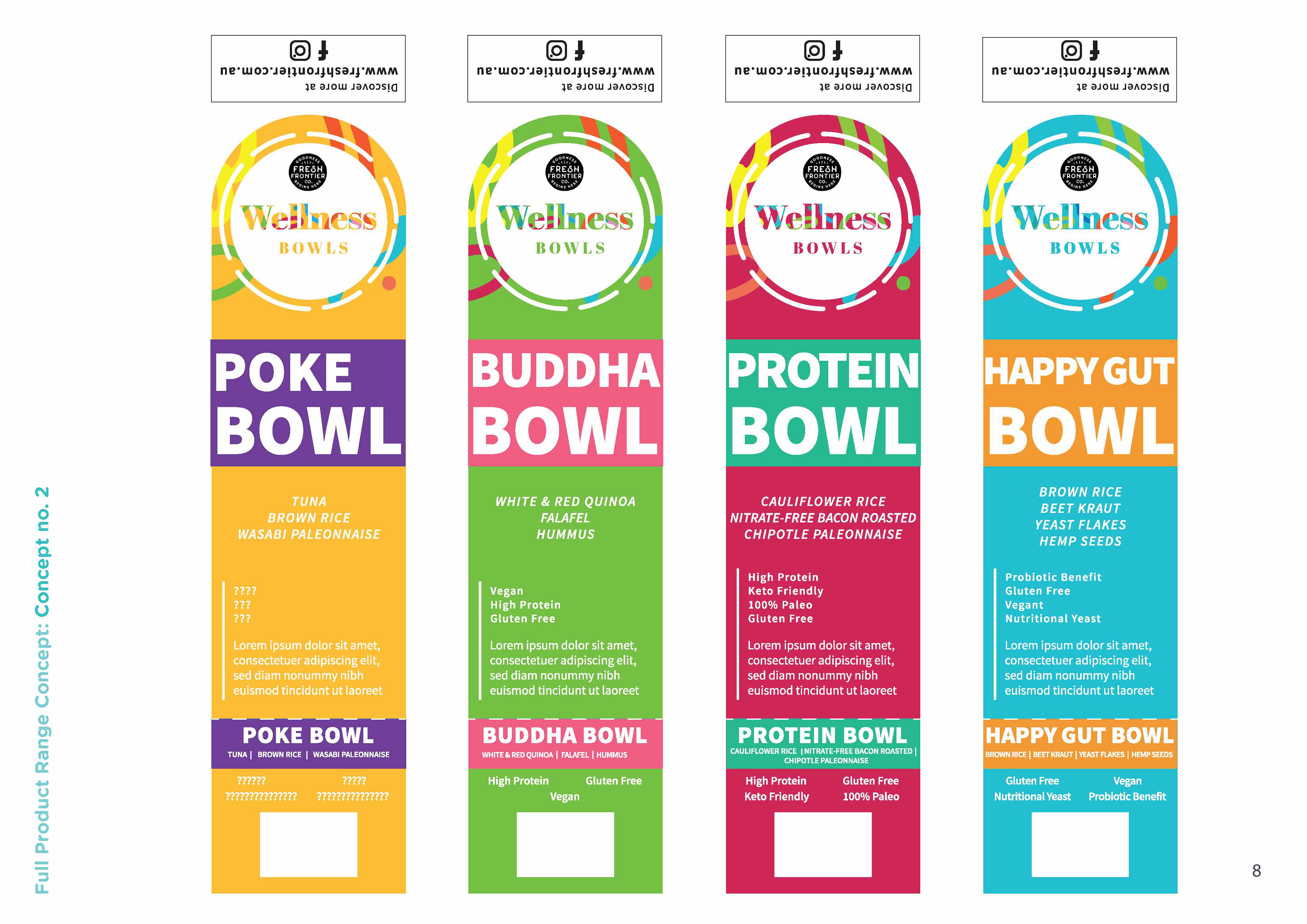
Above were the first concept I made - it's not perfect but I decided to play with pastel-ly colours and integrate my chalky illustrations. I had also added my lettering just for a fun creative flair. As a bonus, I didn't like the current copy for the labels and decided to write my own (which weirdly enough they decided to go with my copy at a later stage...)
I did a full explanation in a few pics below (if you're able to get past my shoddy quality!)
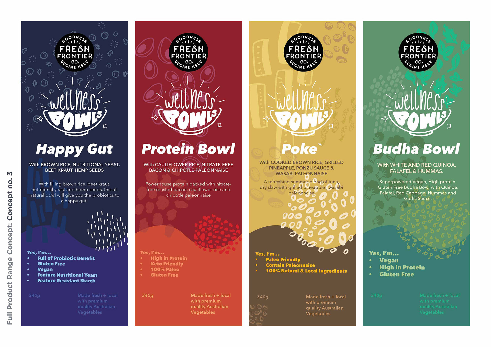
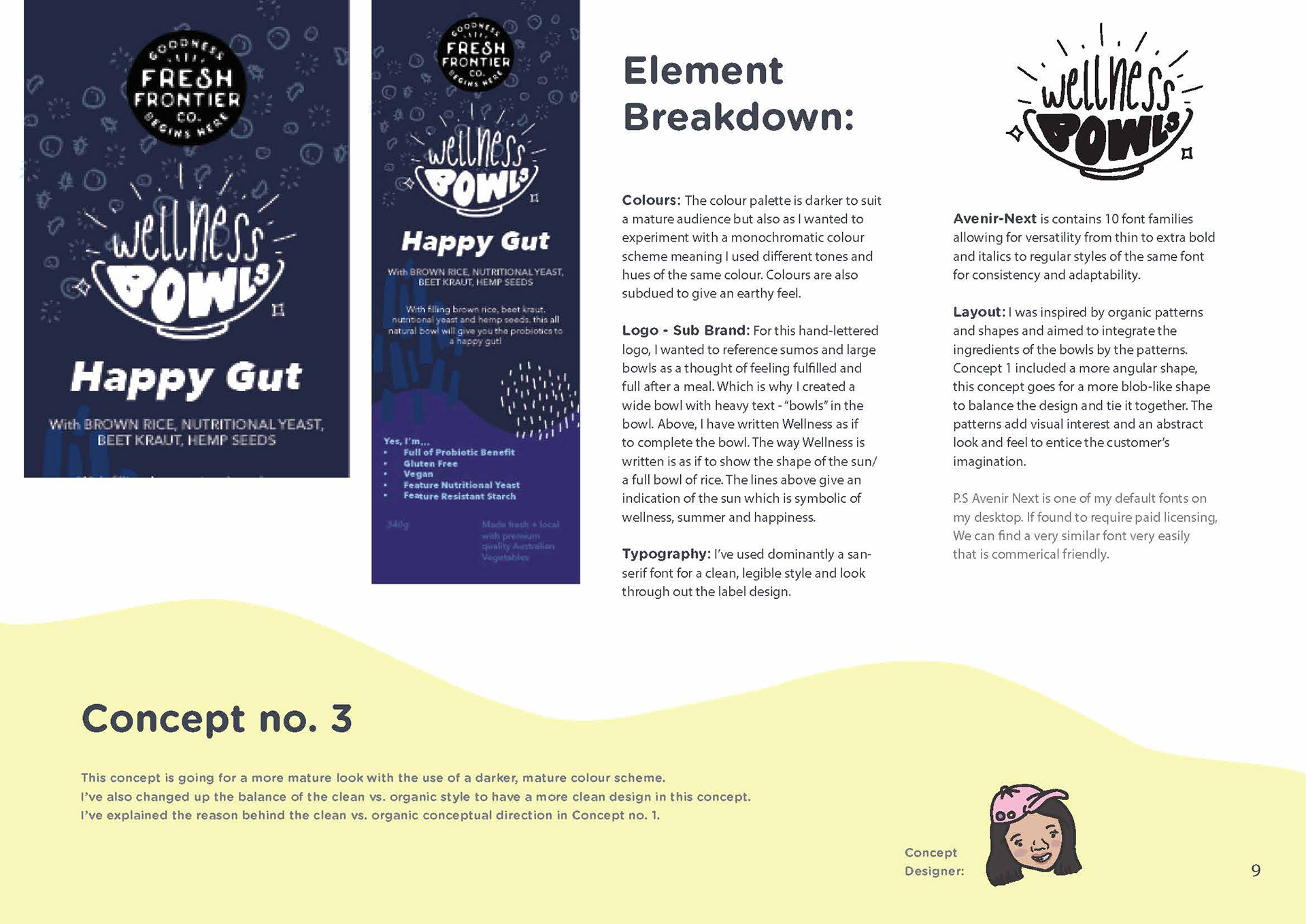
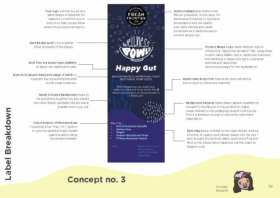
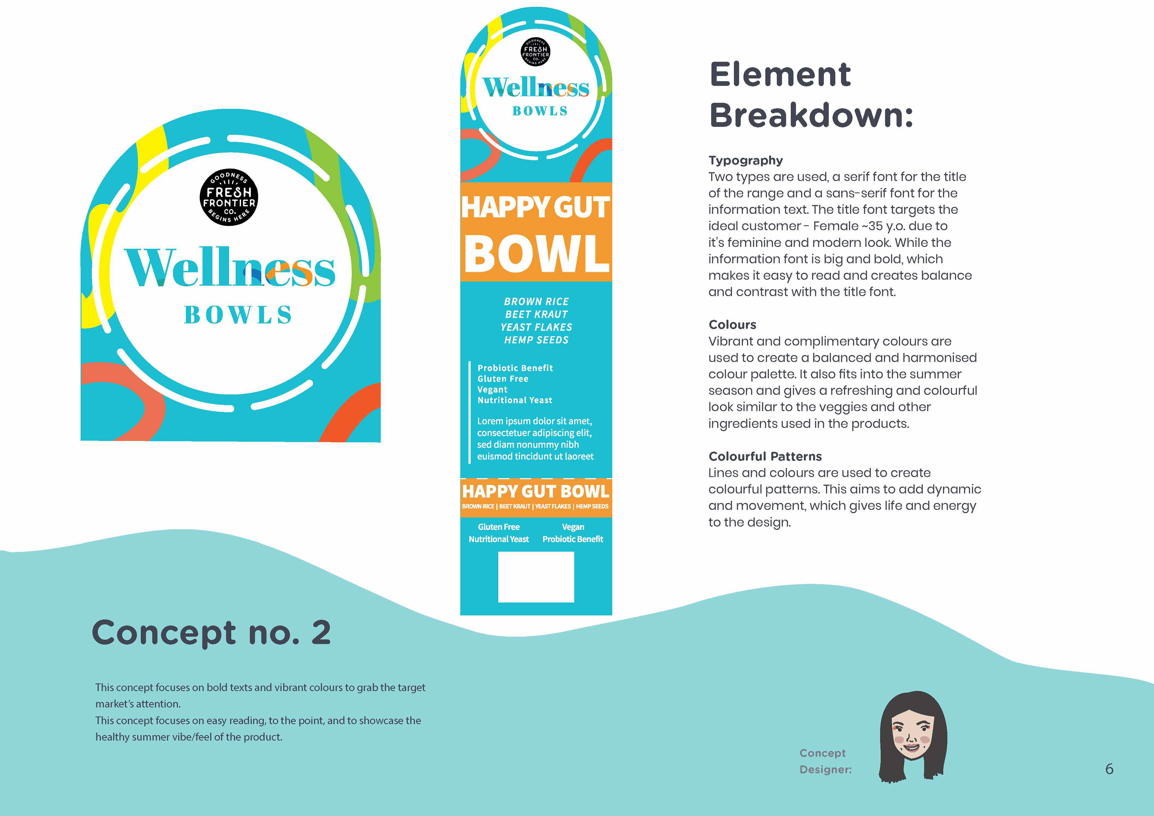
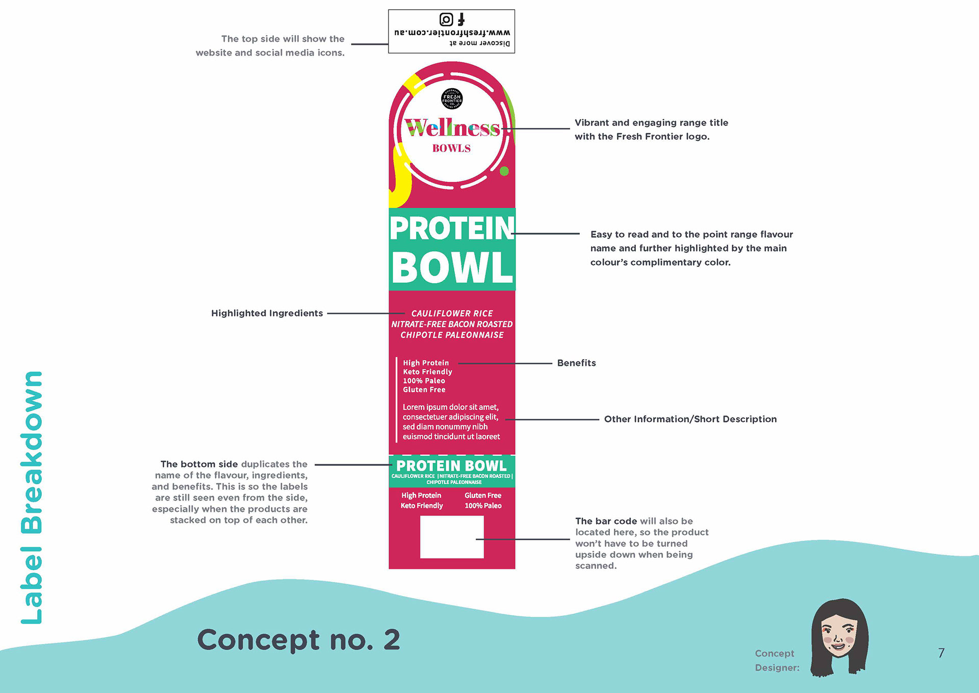
This second concept I came up with was a bit more mature and pulled back. I also wanted to integrate a fun "Yes I'm...." as if talking to customers. This time I added different assets in - my linework assets. Also to note.... The Budha was spelt that way because I was under the impression they wanted Buddha to be spelled as "Budha" but then when we met up, it was clarified that it was a spelling error on their end. Facepalm points to me...?
Lastly, I wanted to show my colleague's design. My colleague is Ann Marie. Since we were in Plus 4 Creative together, she made a concept as well, which I've shared below but the credit belongs to her. (Unfortunately, she doesn't have Behance.)
So what happens next?
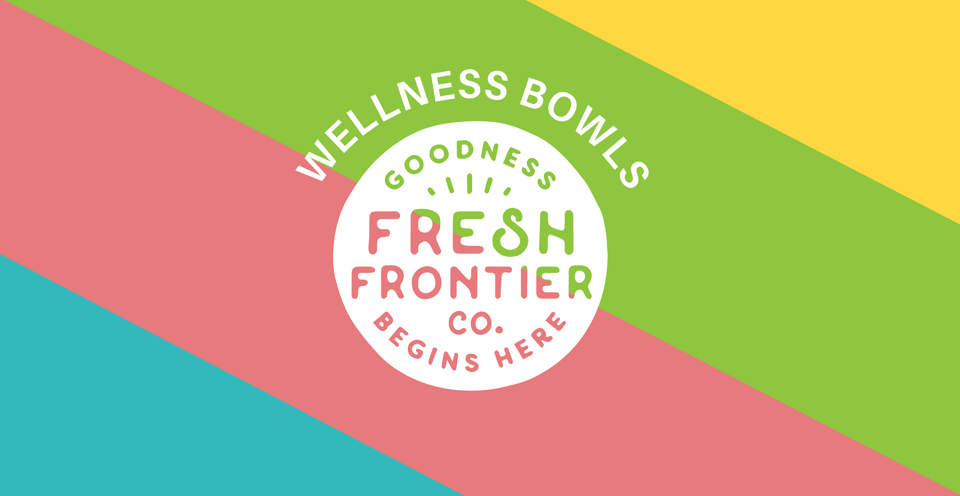
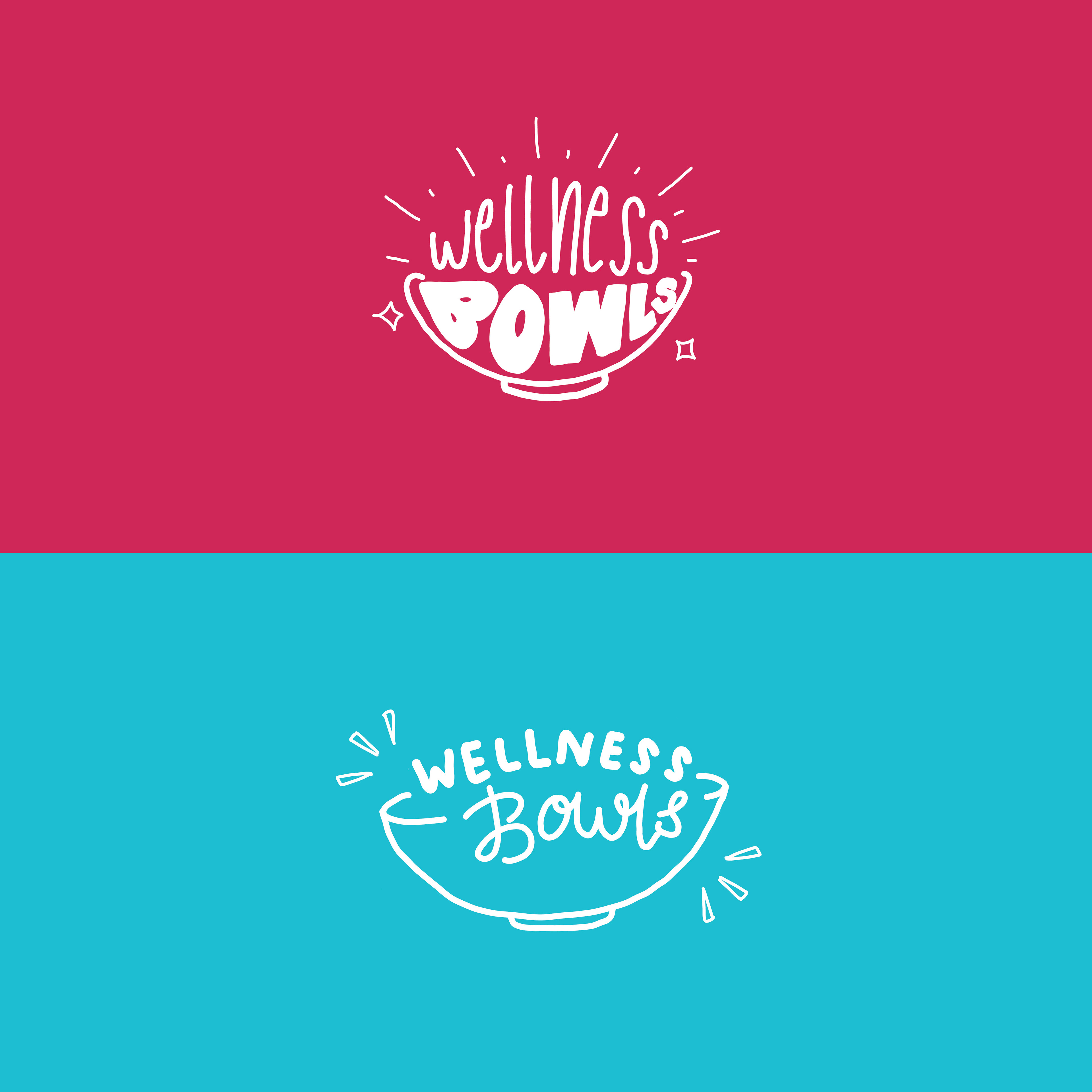
Turns out Ann Marie had the design down-packed. It was almost exactly what they were looking for! Simple, and the colours were "on-point" as the account manager would say to us. The only thing were few refinements to make it even more appealing. Ann Marie integrated some of my ideas of a geometric layout (triangles) and some of my linework assets.... and boom.
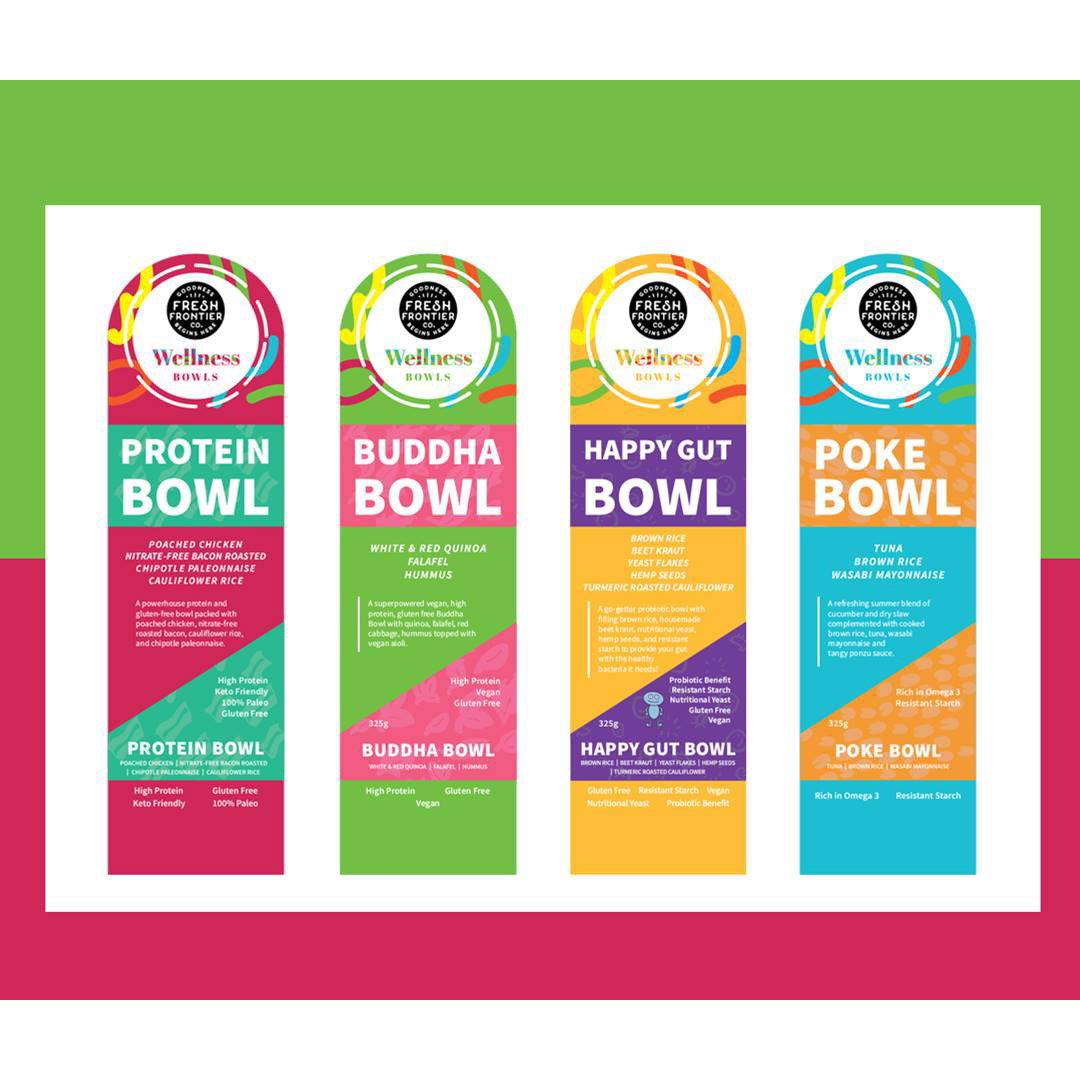
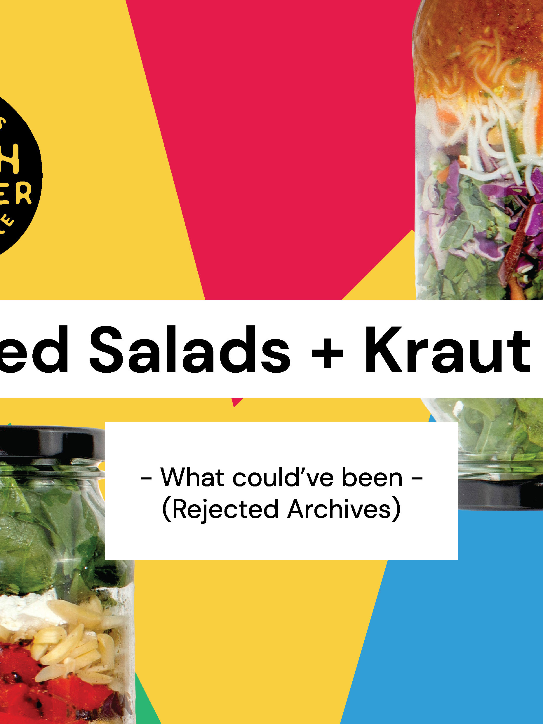
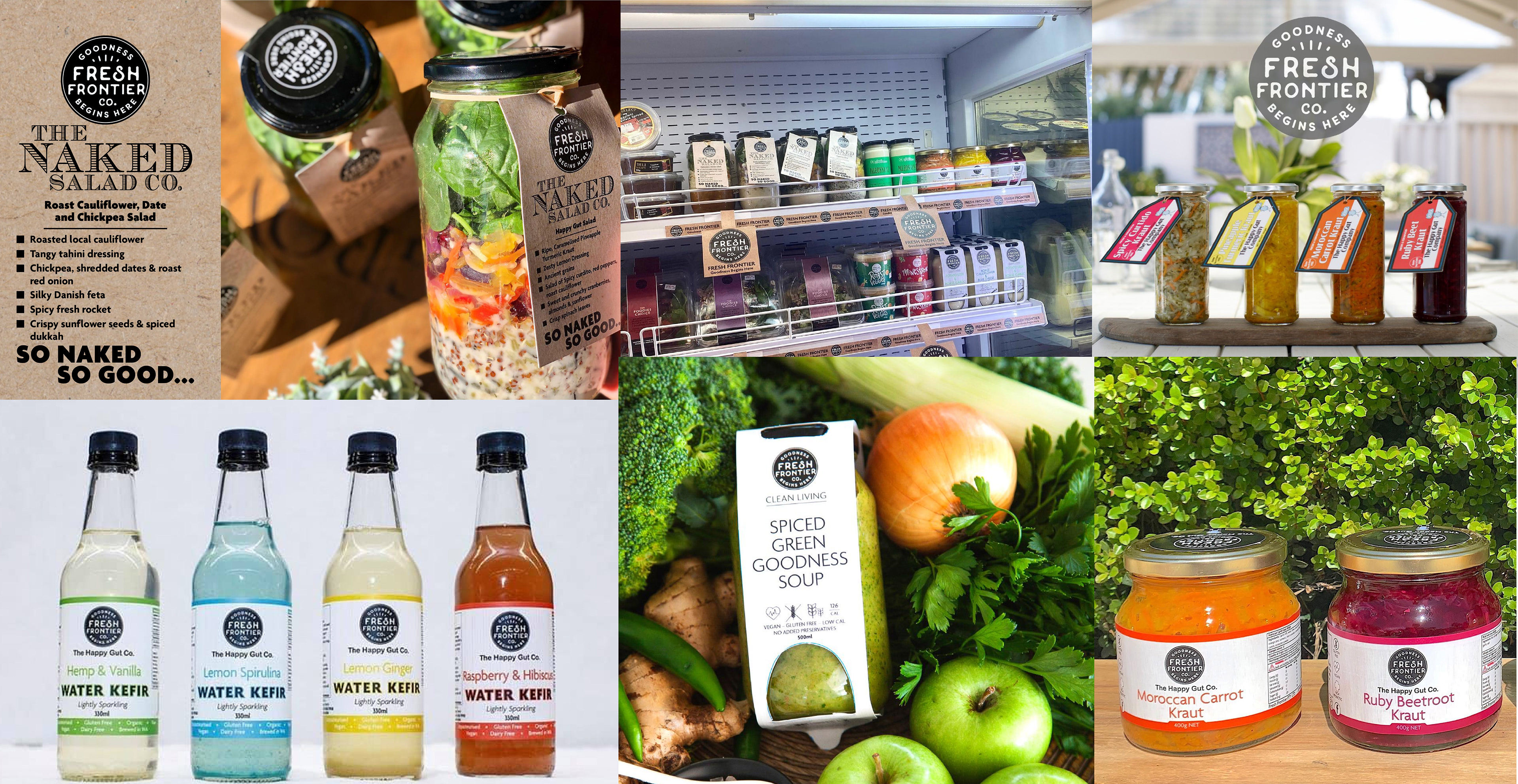
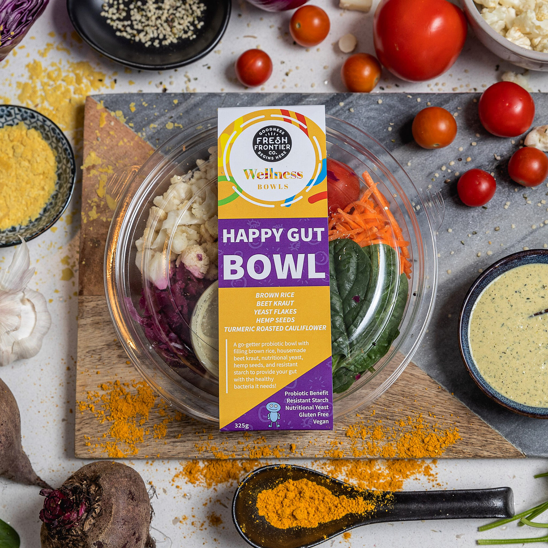
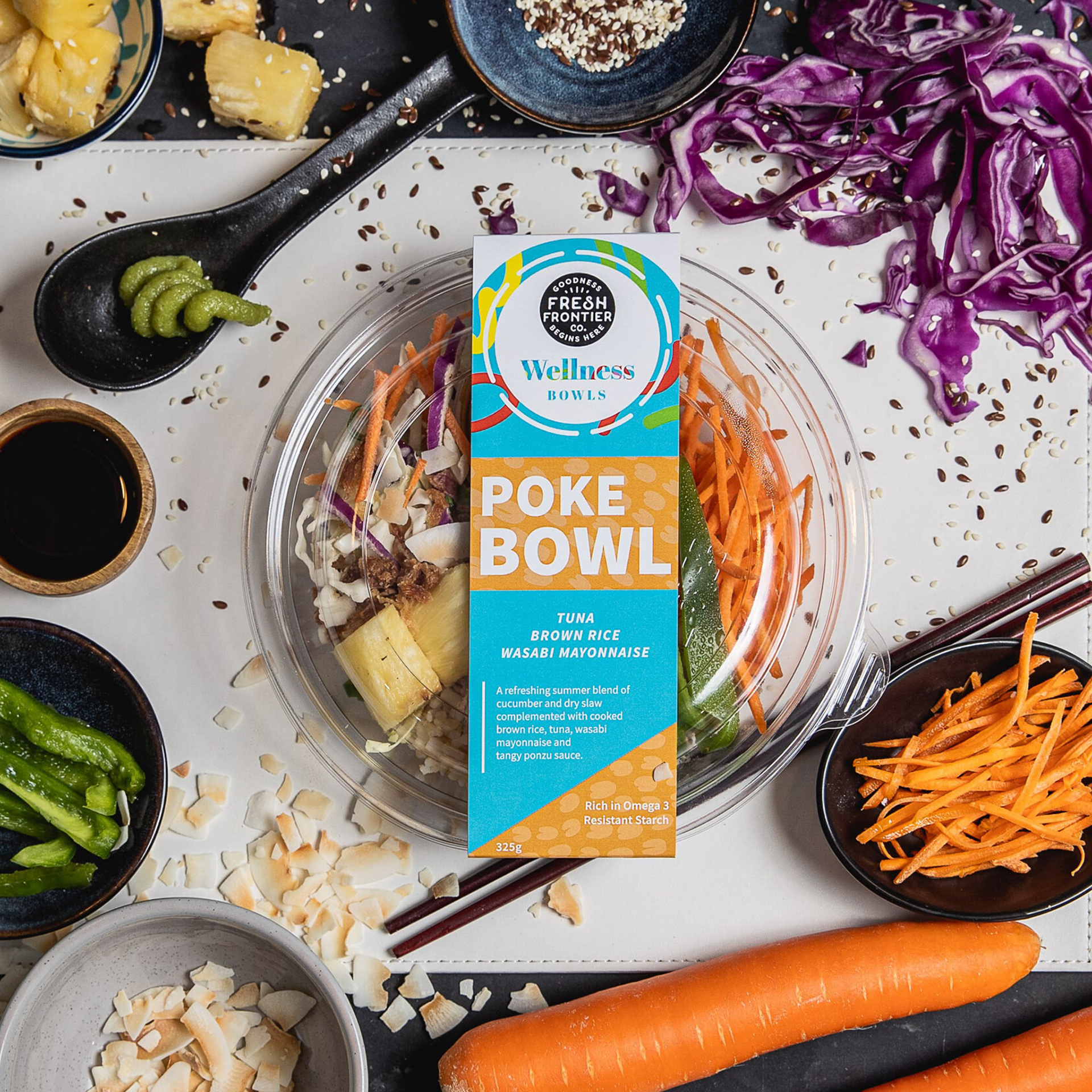
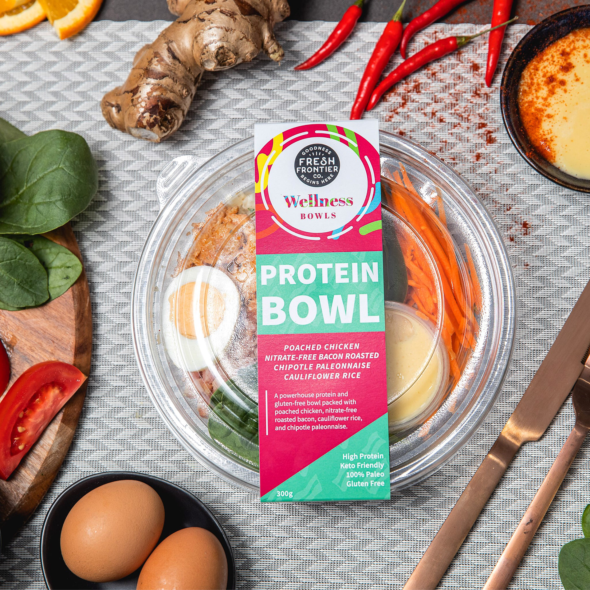
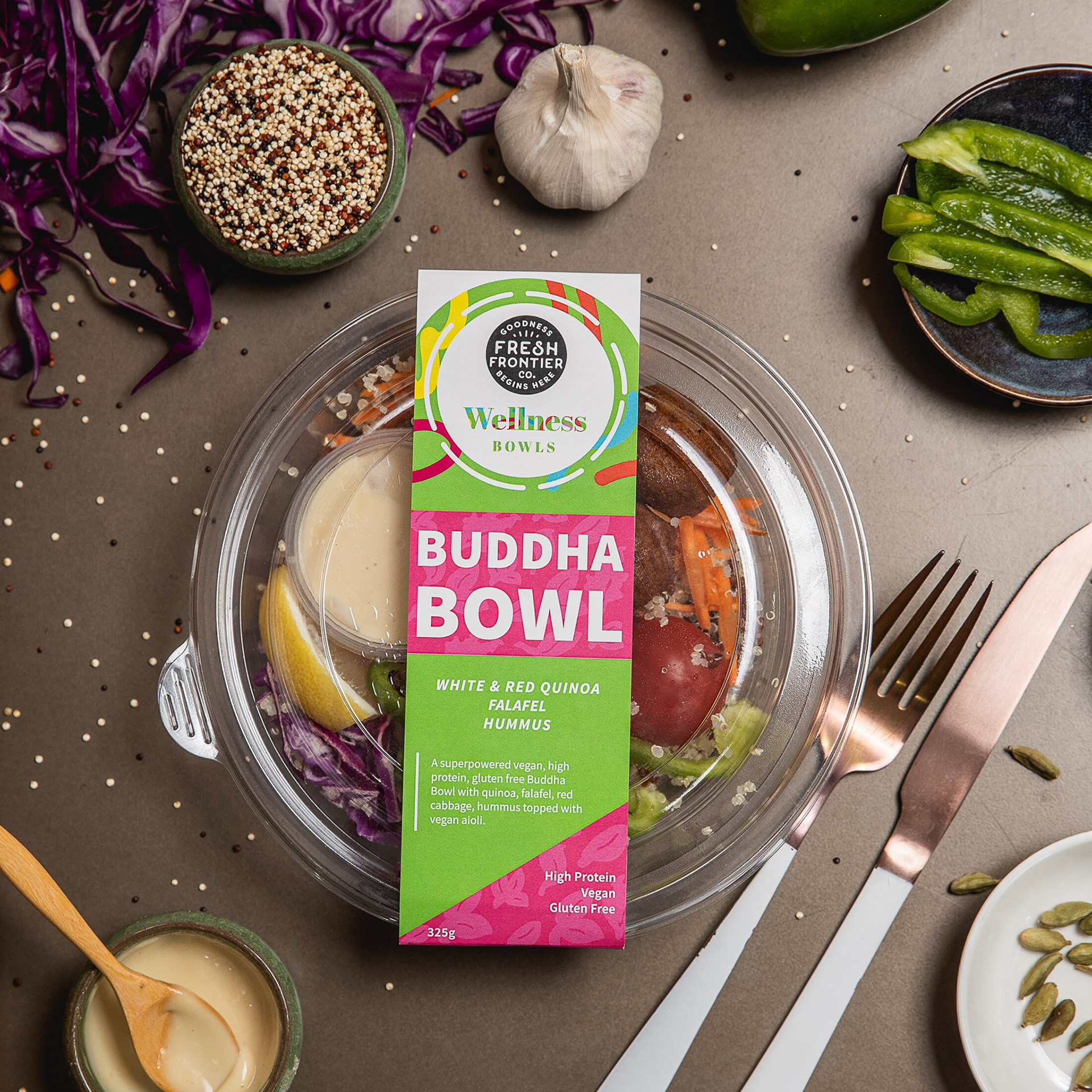
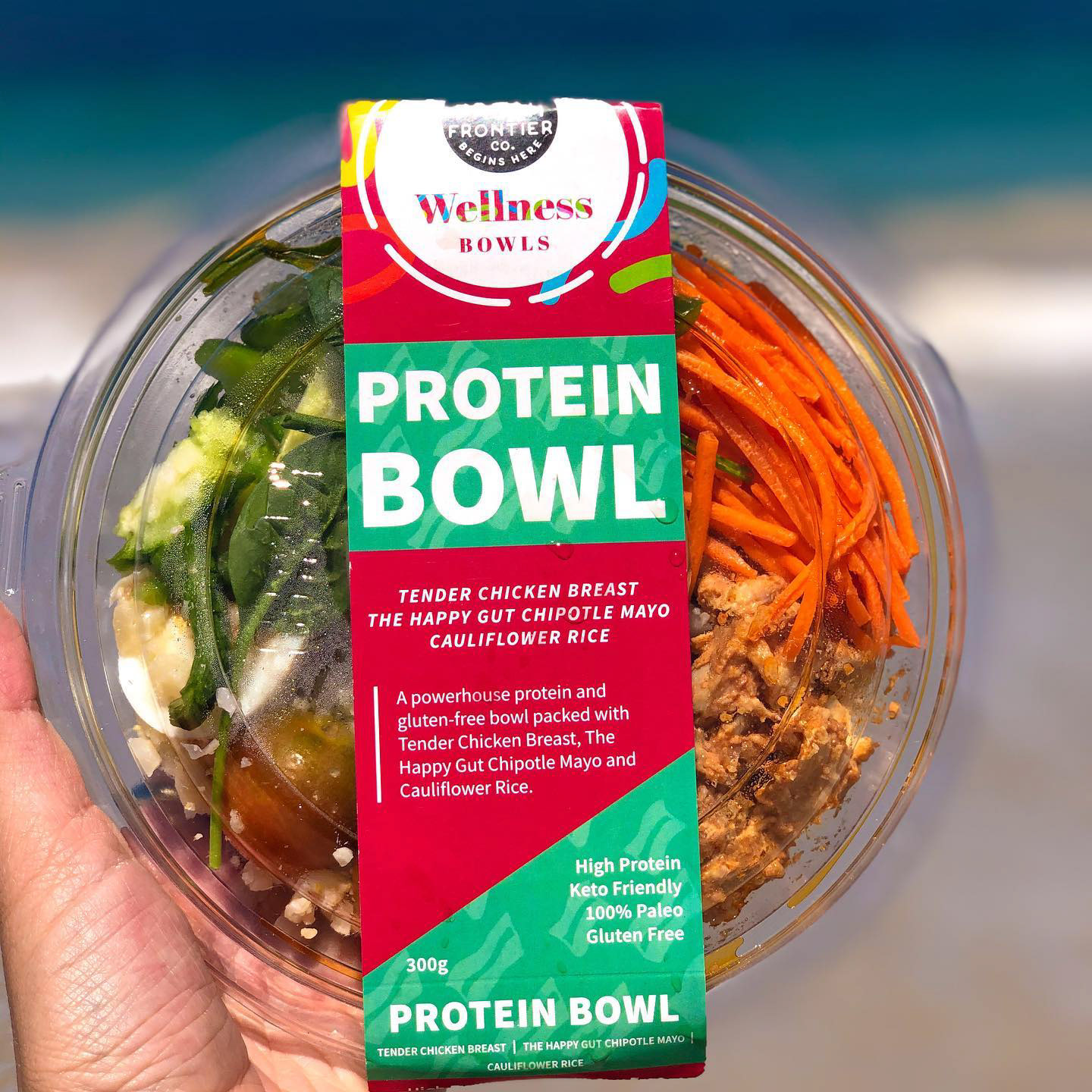
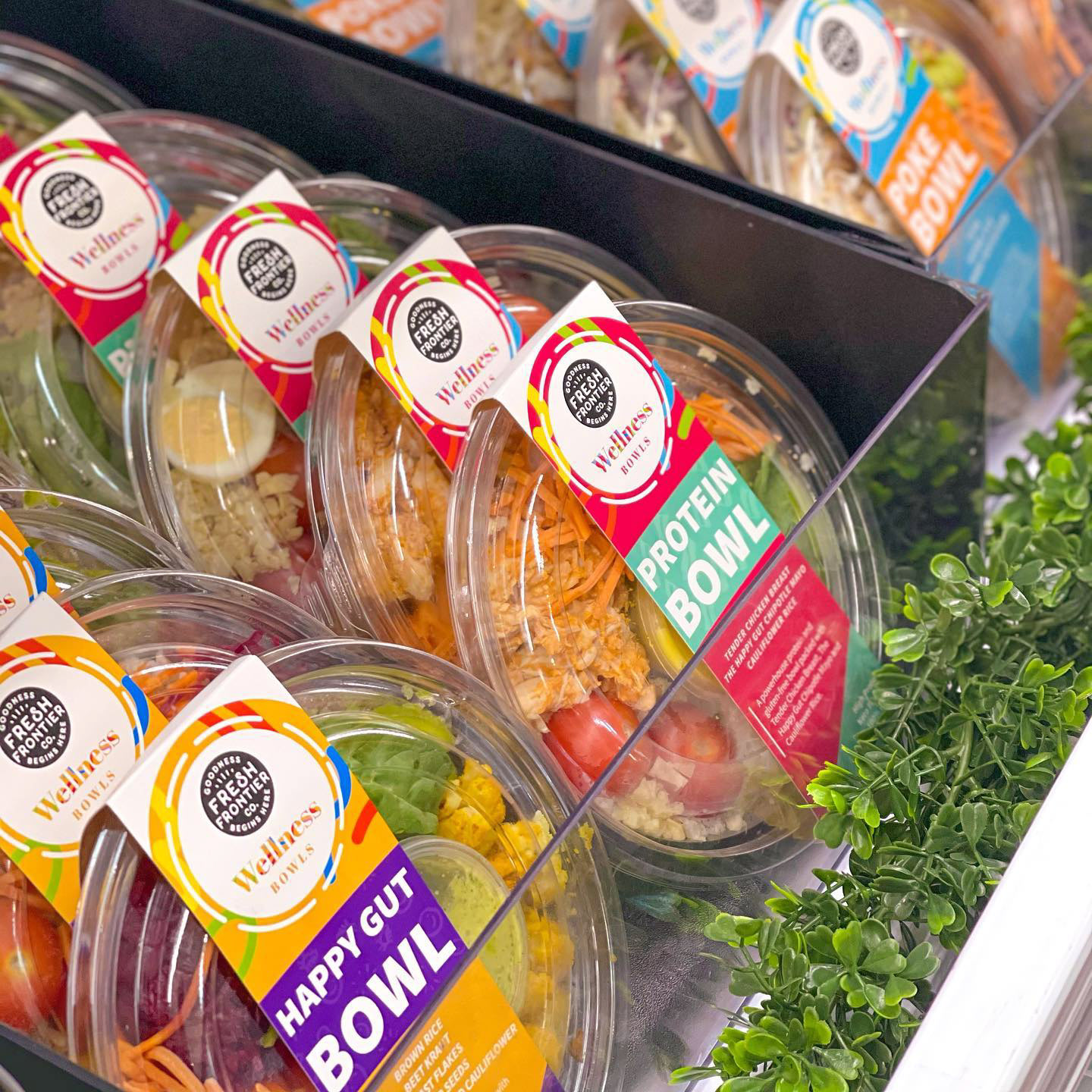
Check out the awesome promotional images and social media images from Fresh Frontier! All images belong to Fresh Frontier and was found on their social media pages!
So why post this project even if my design wasn't actually chosen?
Another colleague of mine told me "no design is ever original". It's a remix of different designs over time. At the time when my design wasn't chosen, I was bummed, not gonna lie. I had a bit of jealousy too because Ann Marie had never eaten or heard of Fresh Frontier in contrast to me being a fan of their products. Plus she spent less time than I did because I was a crazy fool making assets. But looking back now, nothing can take away my learning process that came with me after this project. Maybe my concepts weren't chosen, but in the end, I was able to learn about how important it is to understand a company's vision and realised Ann Marie understood them better than I did. I realised that I still learned how to make labels and learned that it's not me personally they're rejecting - it's just that my work didn't align with their vision. This was a great learning step and I wanted to document it here as something for myself to remember.
To rephrase a failure as part of my learning journey as a creative.
Not all rejections are bad, and I'm definitely going to share more cases where I was rejected in the end, but those are also just as important as the ones where my design does succeed.
And....It's not so bad in the end, I mean some of my ideas did get integrated!
And yes, this was the beginning of a new era for Fresh Frontier. One where they would start using these same colours throughout future products! ;)
I wanted to post this because this would lead into my next project I'll be posting about: my work with COSTCO & Fresh Frontier.
Please be sure to check out Fresh Frontier if you'd like to learn more about them!
Plus their wellness bowls are amazing!
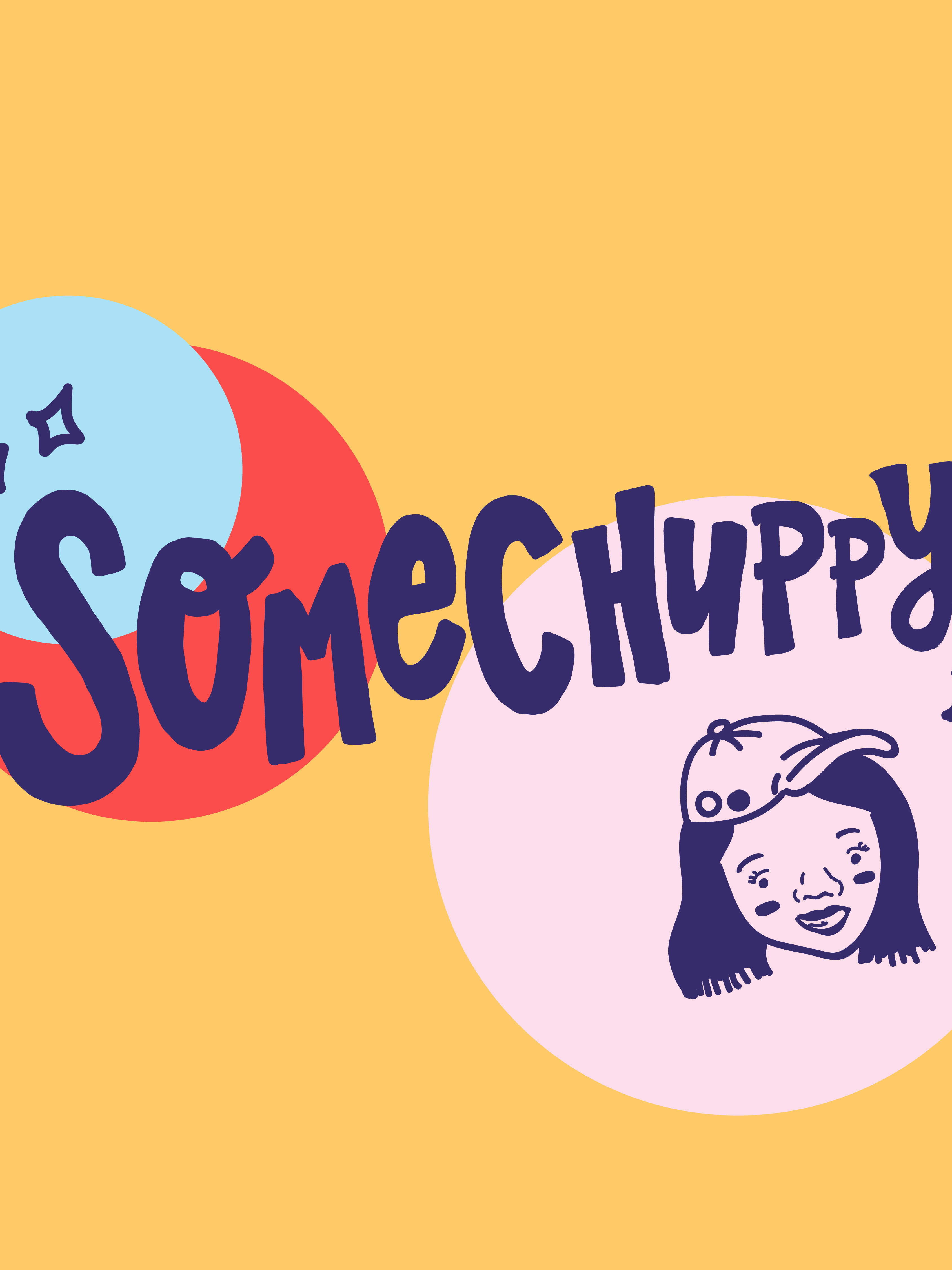
Oh.... this? Yeah, my assets might not ever be used, why not make them into nice graphic posts anyway! Wishing where ever you are in the world to stay safe & creative!