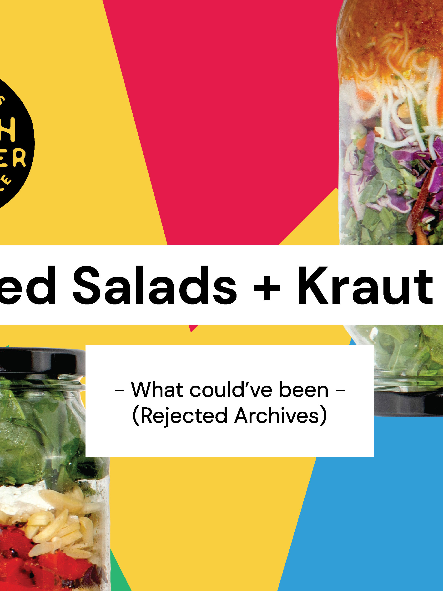
So this a bit of a fast-forward to this year, but I figure my profile needs a bit of a break from Fresh Frontier projects which I'm going to be uploading a lot more often after this (there is just a huge backlog of work that I'd like to showcase...)
Anywho.... this is the first time, I've ever worked with a client over east. Because I'm based in Perth, Australia, I usually work with local businesses mainly in WA or Perth. This time, to my surprise, a company called AI FOODS from Melbourne contacted me requesting a refresh for their curry labels. When I called them to discuss the labels, I had asked where they knew me from and it was actually from my previous COSTCO project. Turns out, the people who manage COSTCO Perth also manages COSTCO Melbourne and they had recommend me to AI FOODS.
So AI FOODS took me out for a test drive - this project, which would give them an idea of what it's like to work with me (but it also gives me a test drive of them too!).
To confirm everything on the phone, I had created a proposal to send over to AI FOODS. This was to ensure we're both on the same page and the proposal would include my process, quote and a timeframe I can get the work done by. You can see a bit of more of my proposal through my branding project.
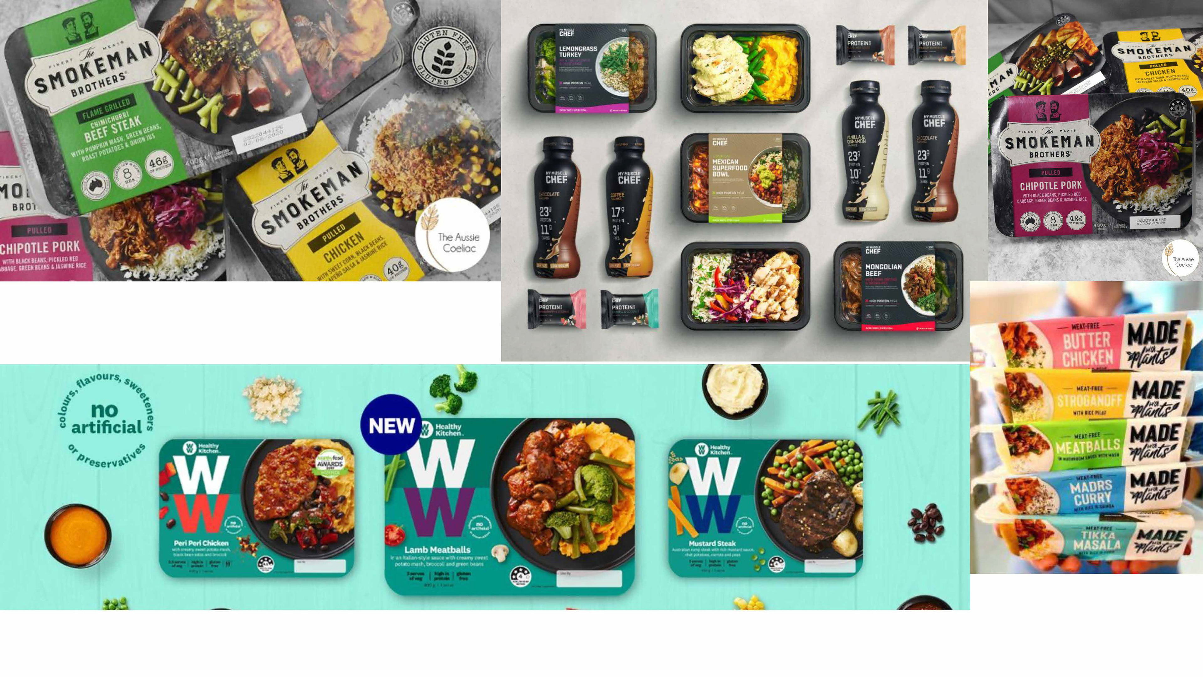
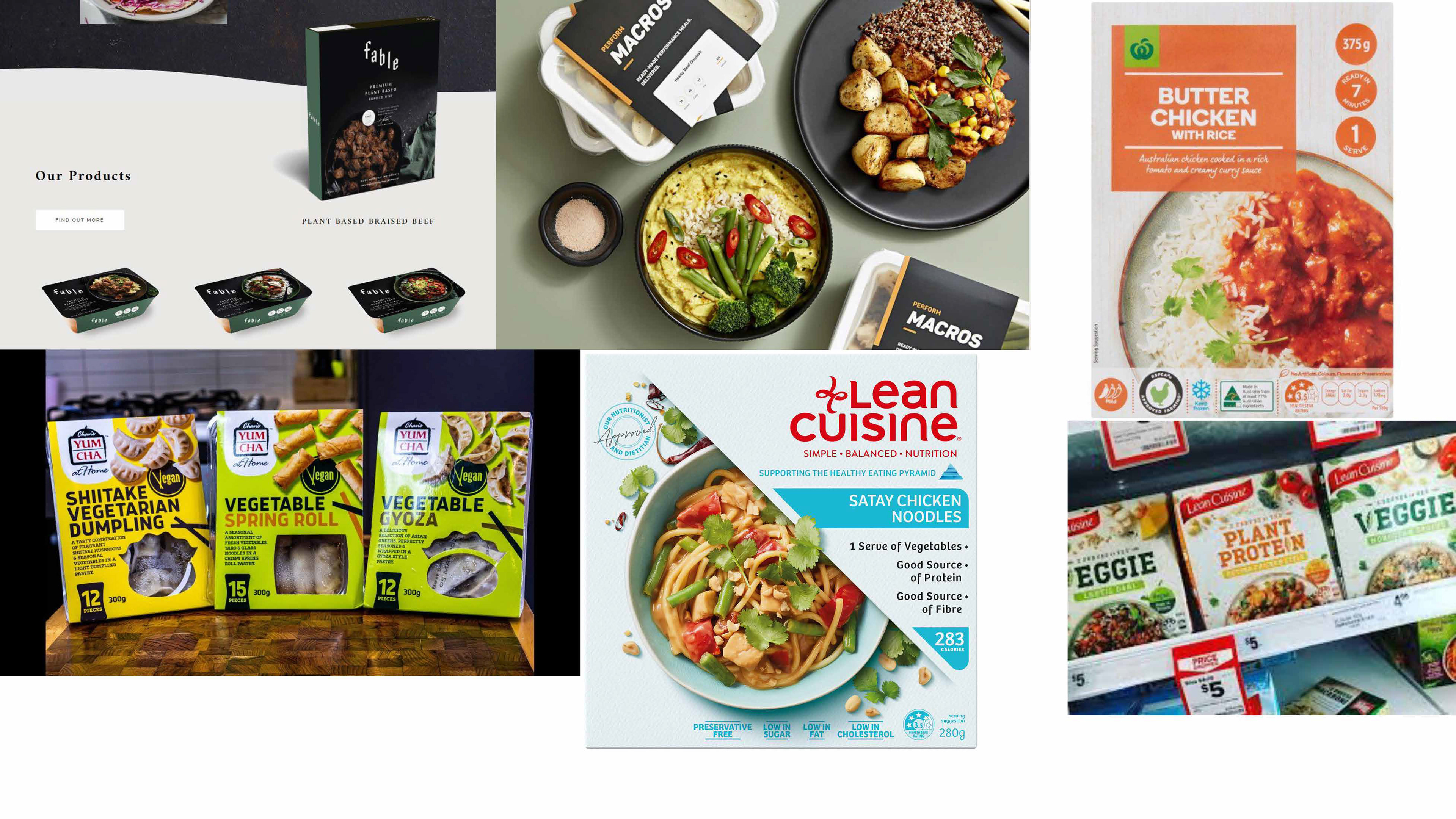
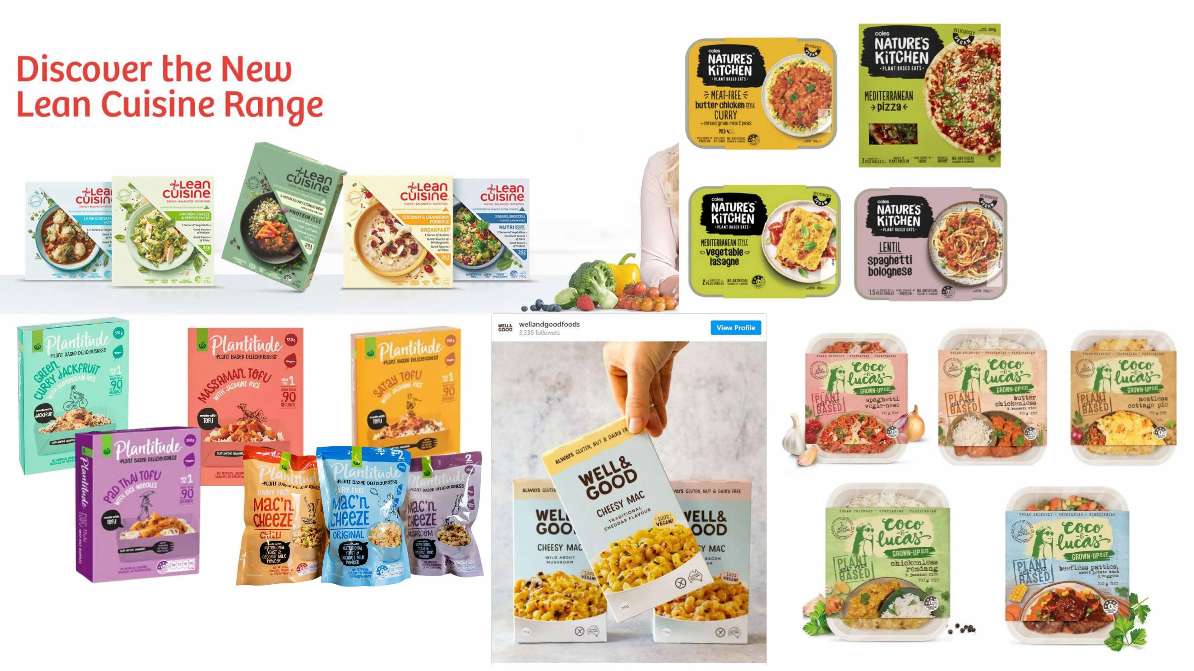
As always, you start out doing a bunch of research and preparation for the project. This includes looking at their current competitors/shelf-mates and any other companies who have done similar meal kits. I also put in a couple of inspiration in there too. That's just some of the research. AI FOODS didn't really give me much idea of what they really wanted, it was more.. "please refresh our current design! and give us options!" so it was an open book. As long as it had the photo of the product, everything was pretty much open book for me to explore. And I am very, very grateful!
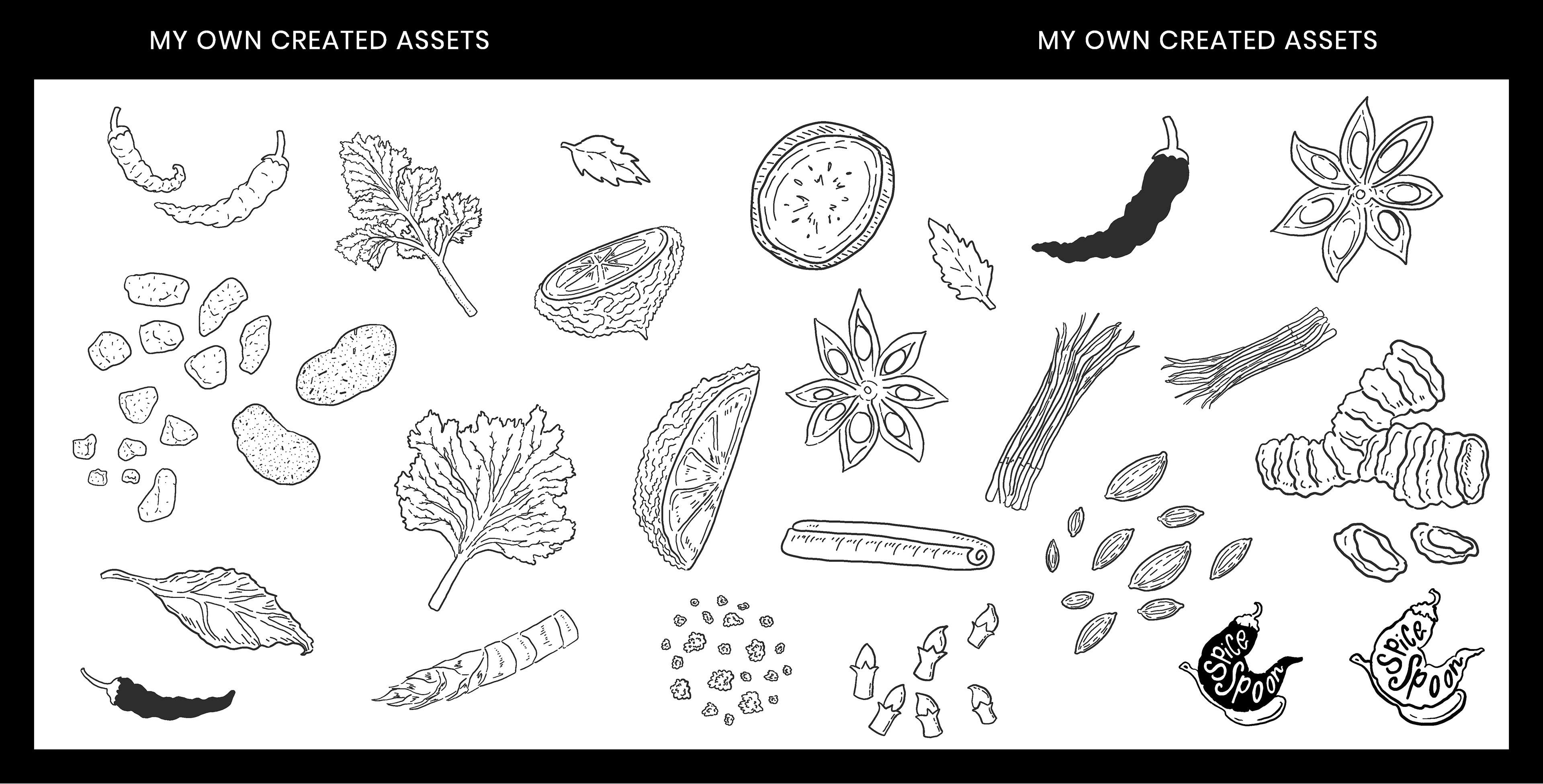
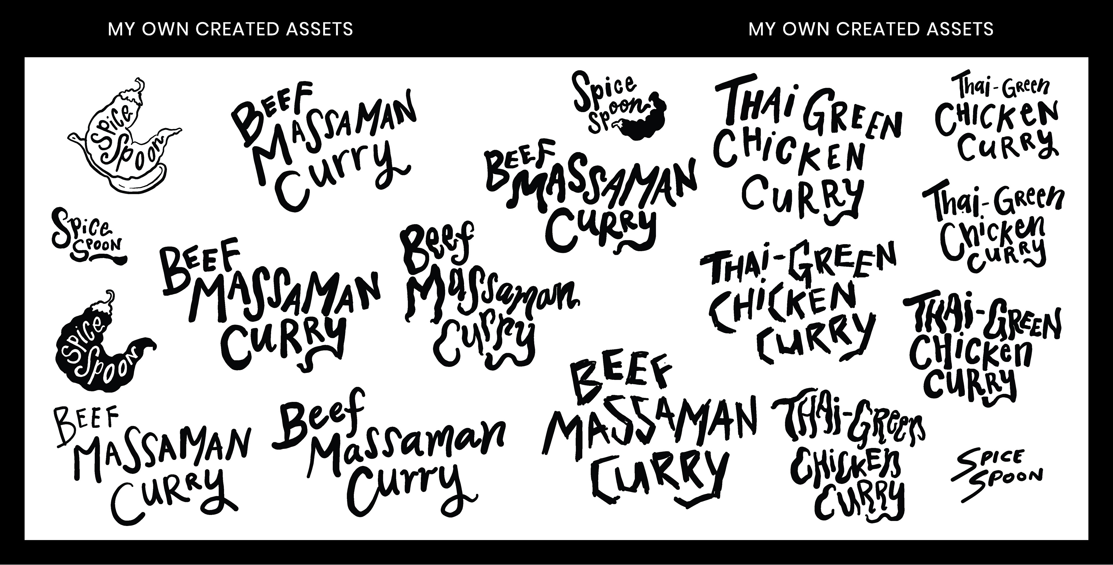
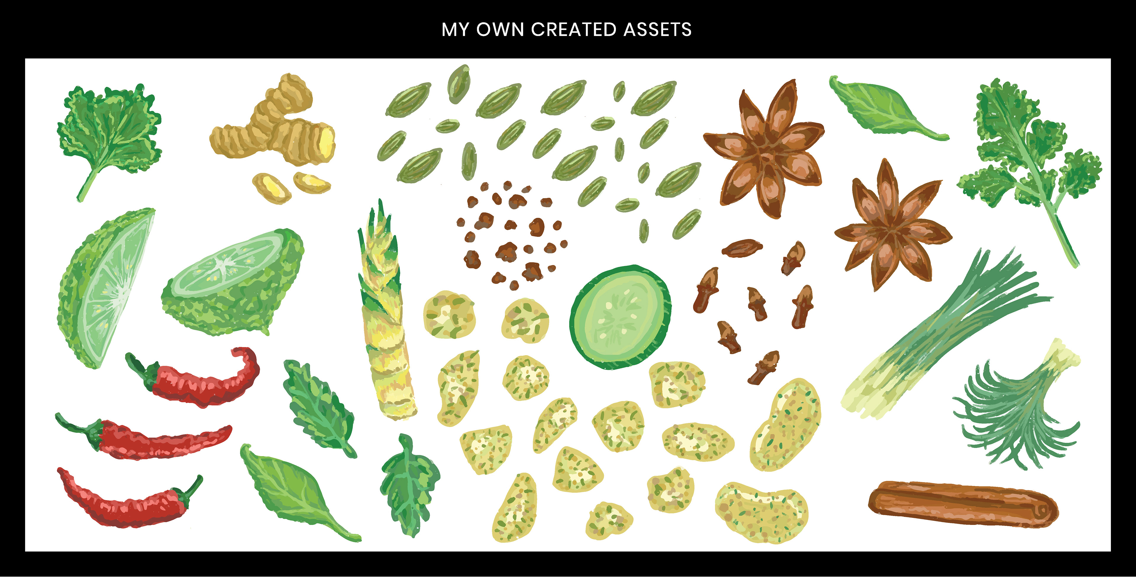
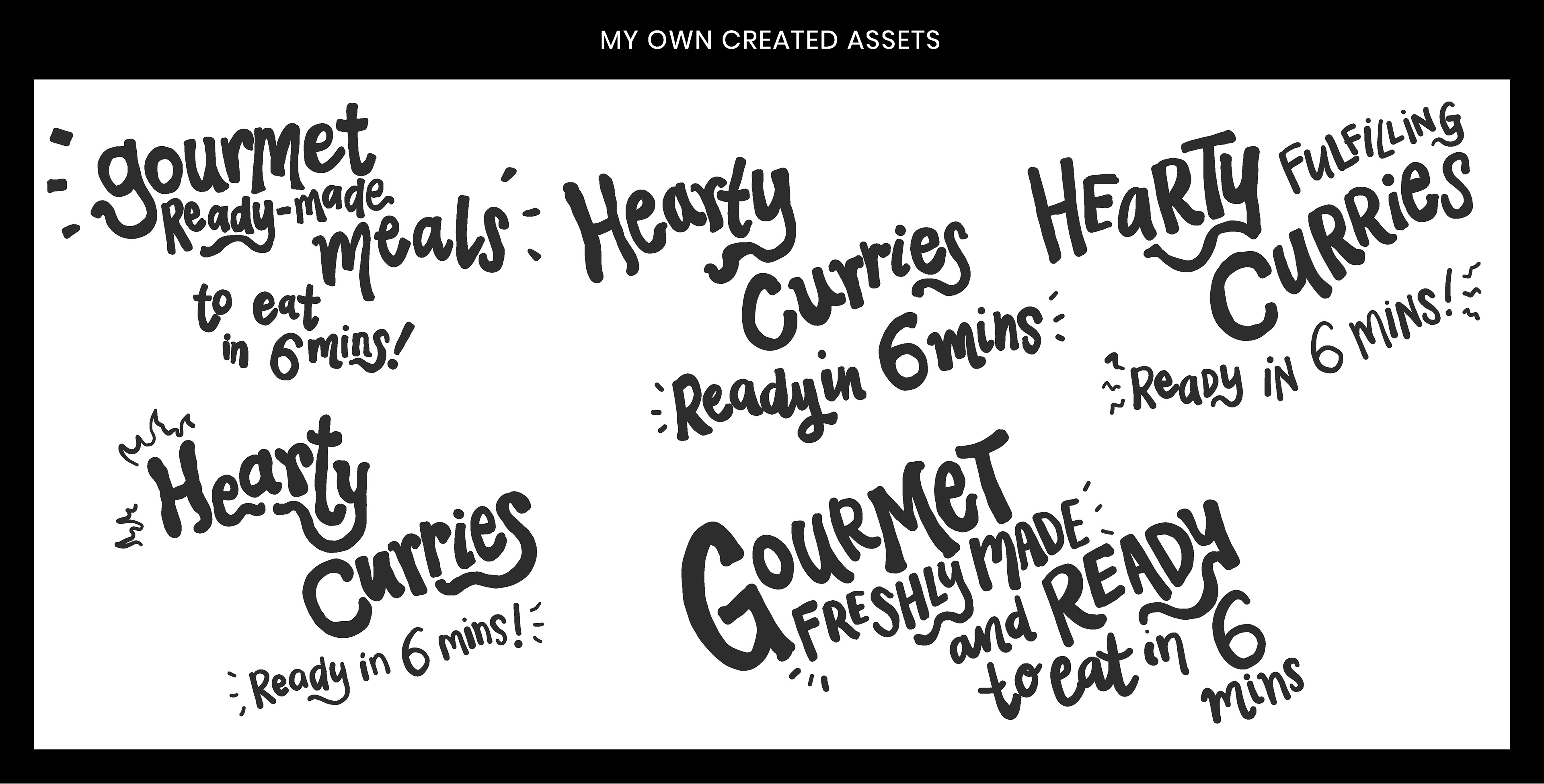
I started out preparing assets like I used to. Making a bunch of assets and then having the ability to pick and choose, mix and match when I start conceptualising. I realised after this project, that what I should have done is create assets after conceptualising. Part of it is a confidence issue, "If I make a bunch of assets, I've covered myself all over for different ideas", whereas if I actually planned it out and put time into the assets that I will actually use, it would be time-well spent. It's just a matter of being confident that I could actually execute it. Anywho, I think the learning lesson came after a couple more projects from this, but I'm writing this project because I'm from the future. ;) (or this project is not too distant from the past....)
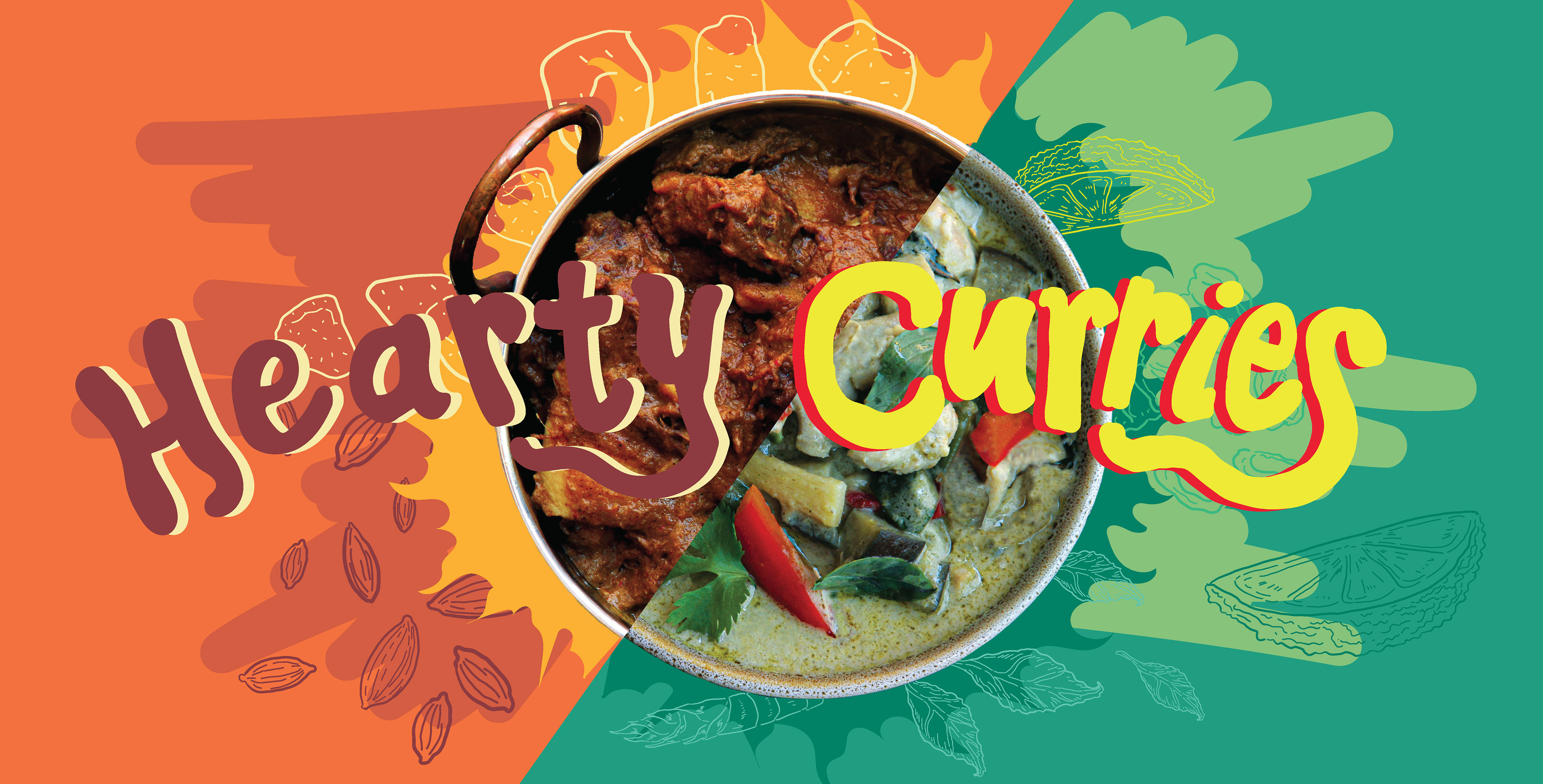
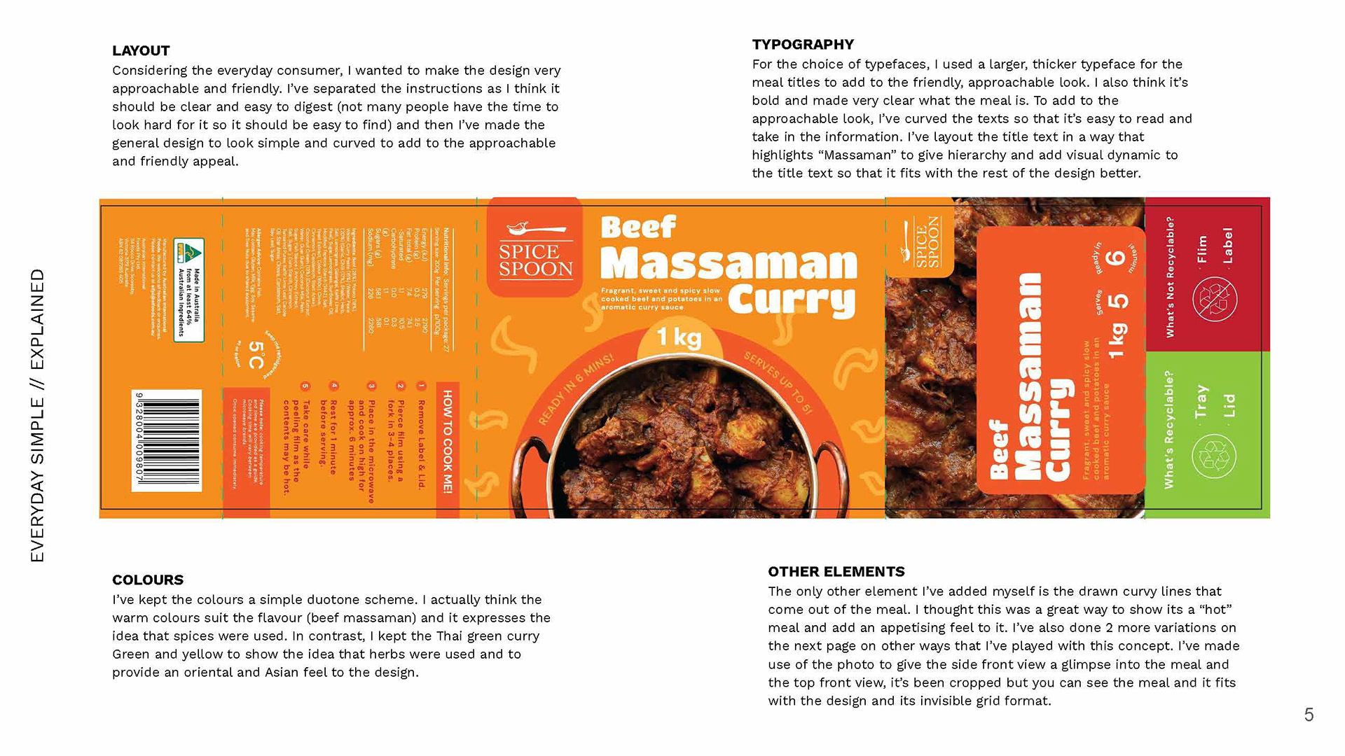
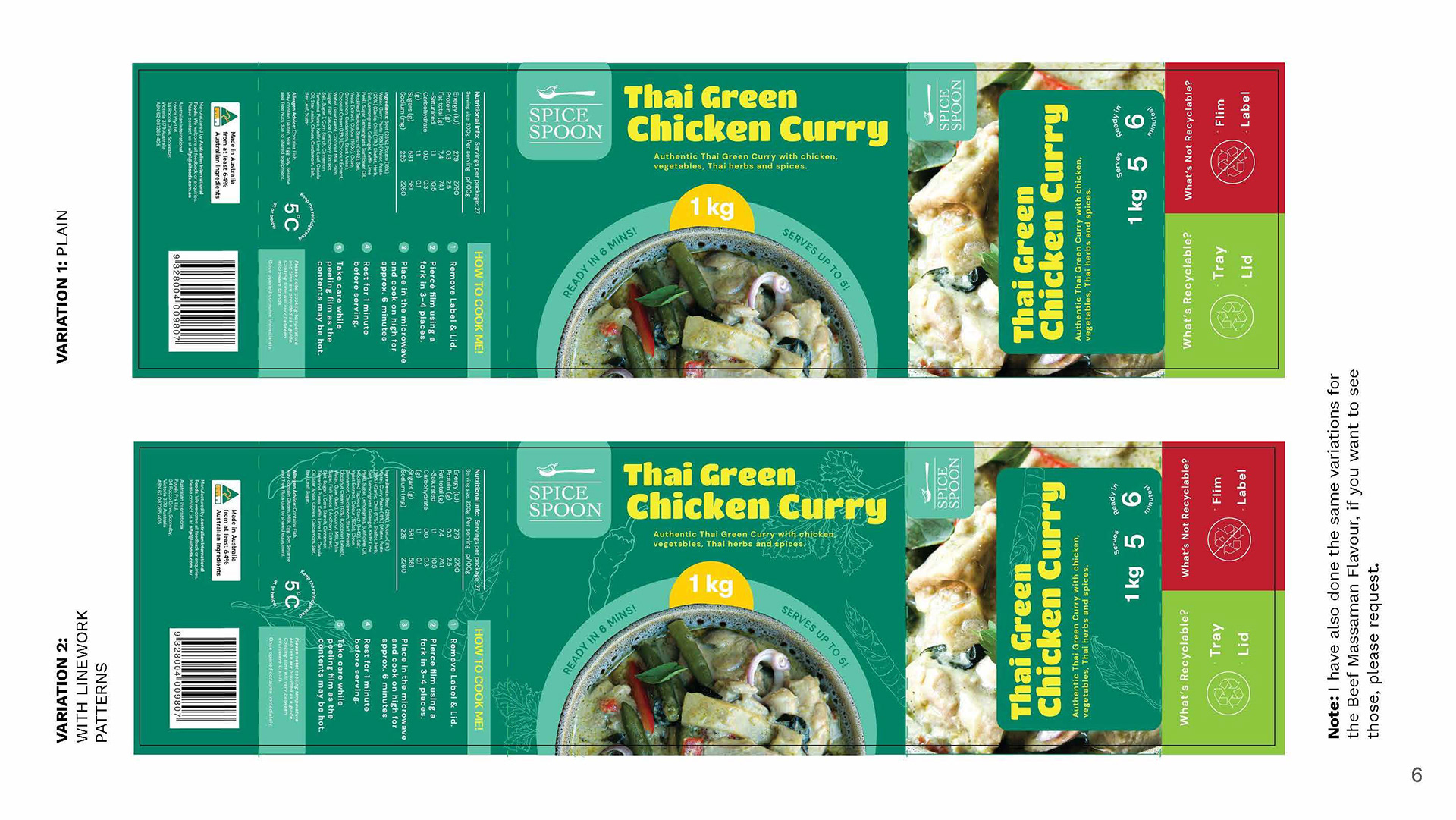
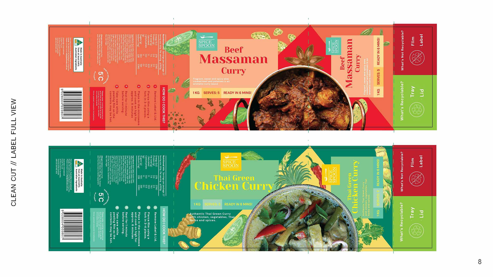
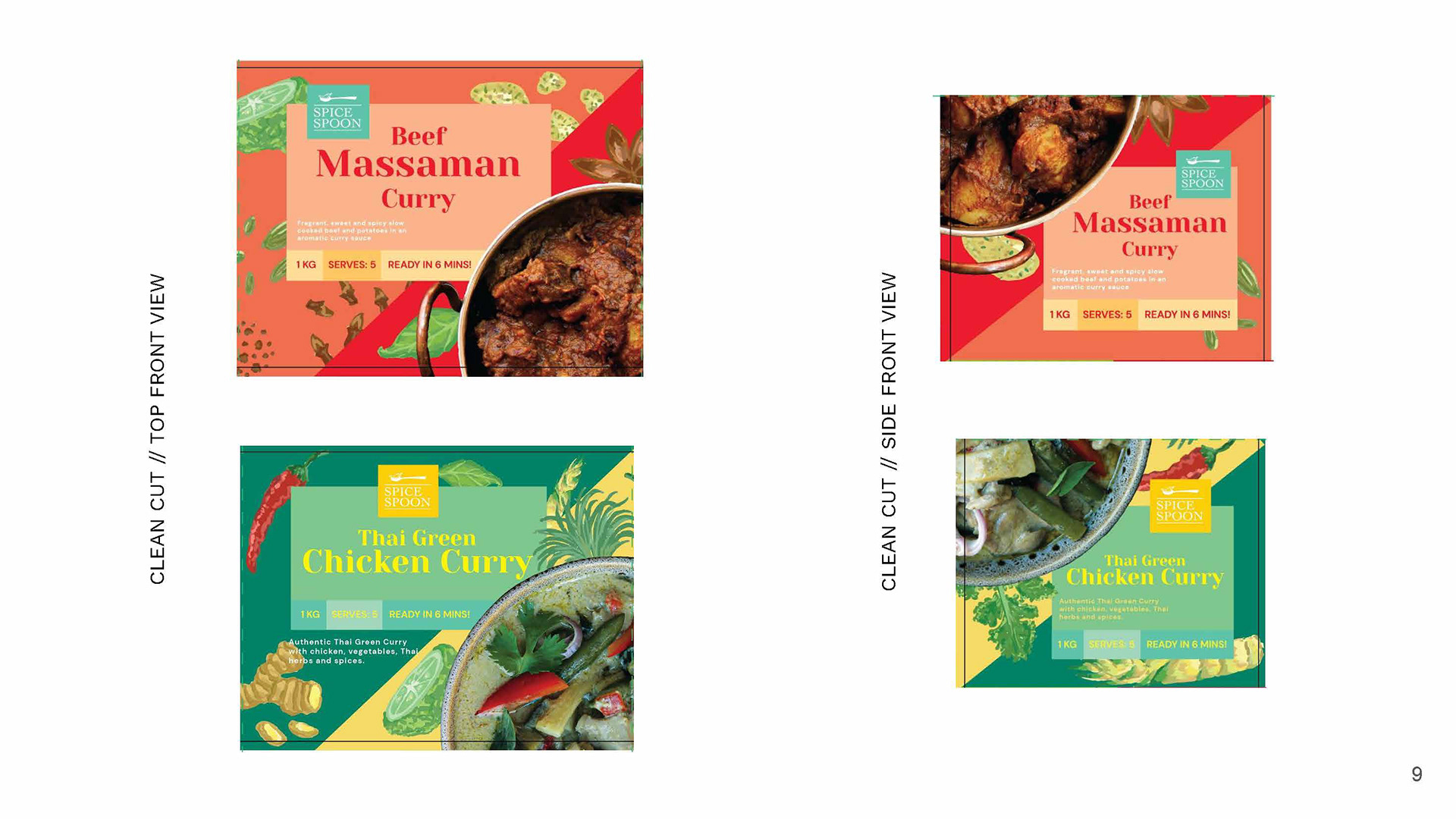
The first concept - that jumps quite a bit, but I thought I'd send something simple over to begin with. They asked for a refresh, so I just started breaking up information - like the cooking information to be more clear, and the packaging to feel simple, direct and clean.
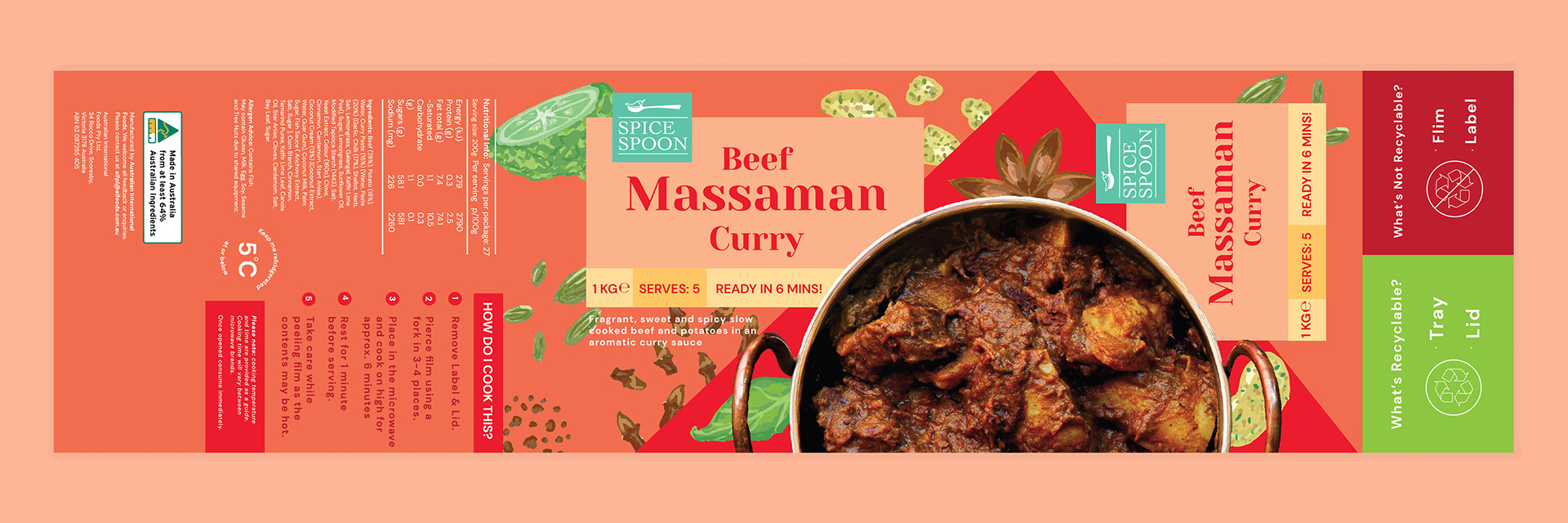
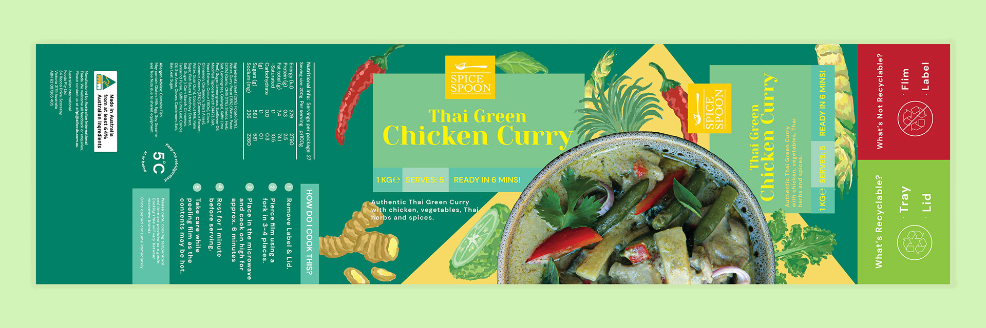
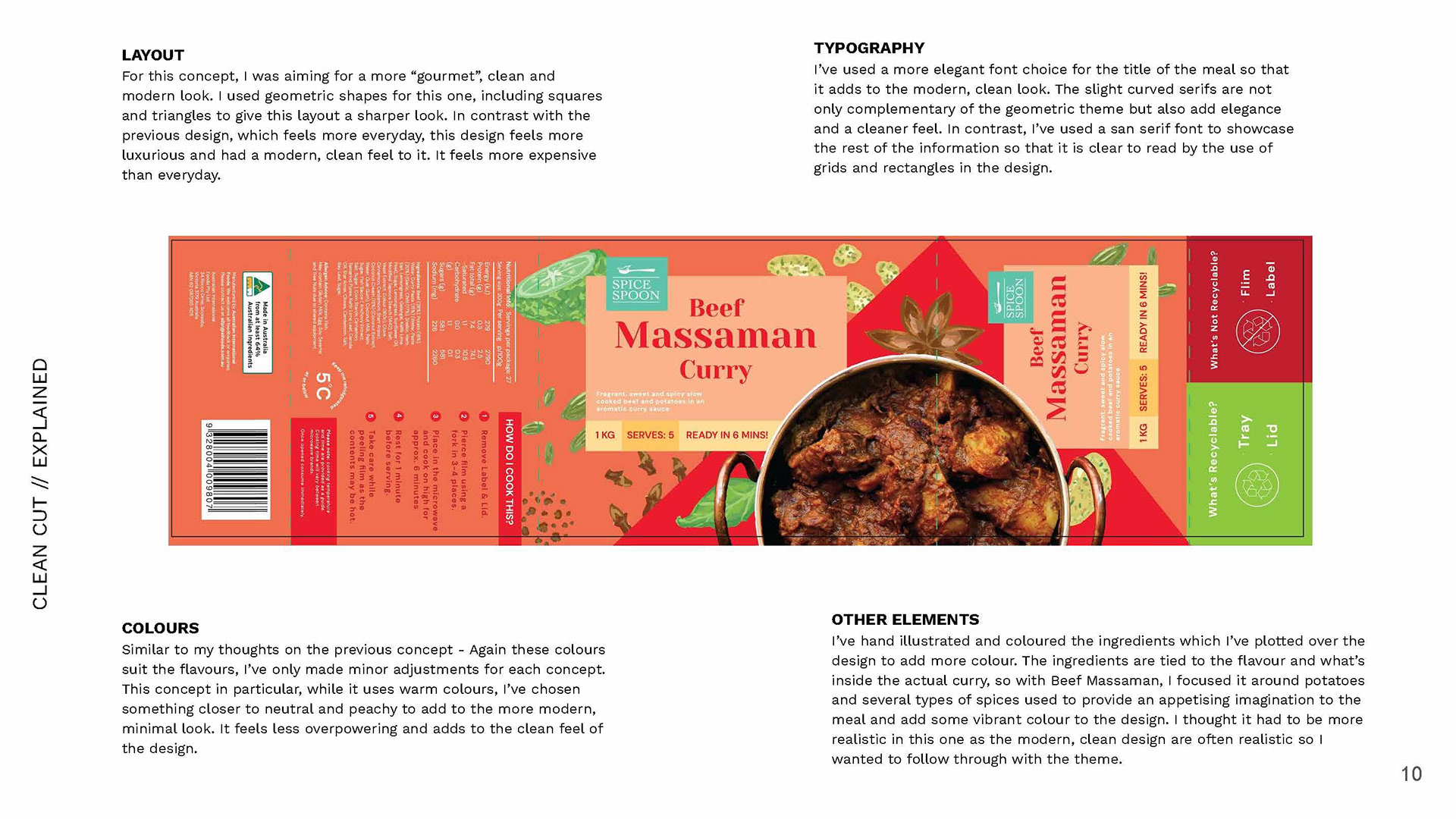
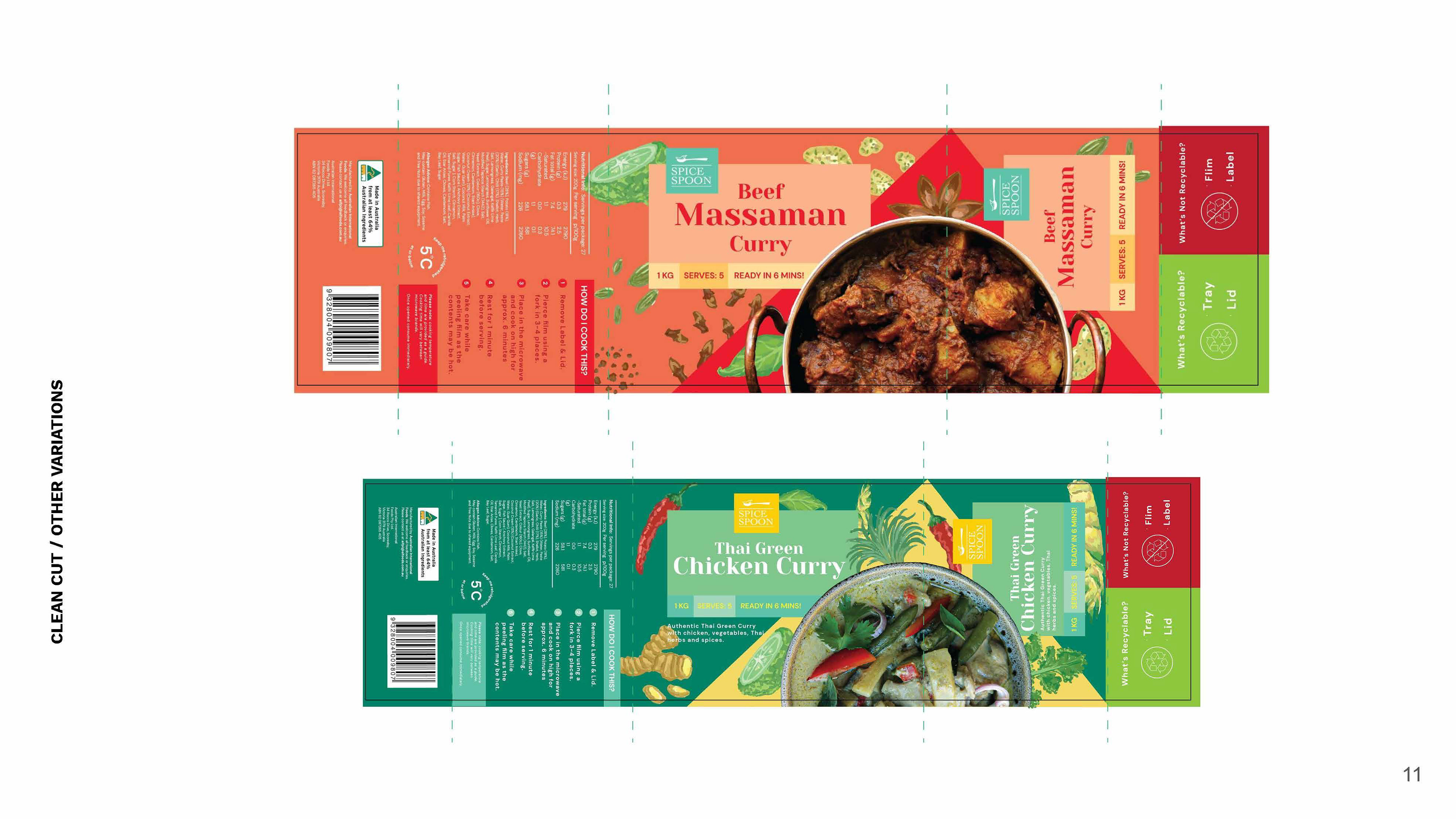
The second concept takes another turn. I decided to go for a more clean yet premium, geometric look. While the first concept was more simple and almost home-brandy or value-based, I thought why not do something a little more luxurious? Plus I had made some realistic-style assets so I thought, why not use them?
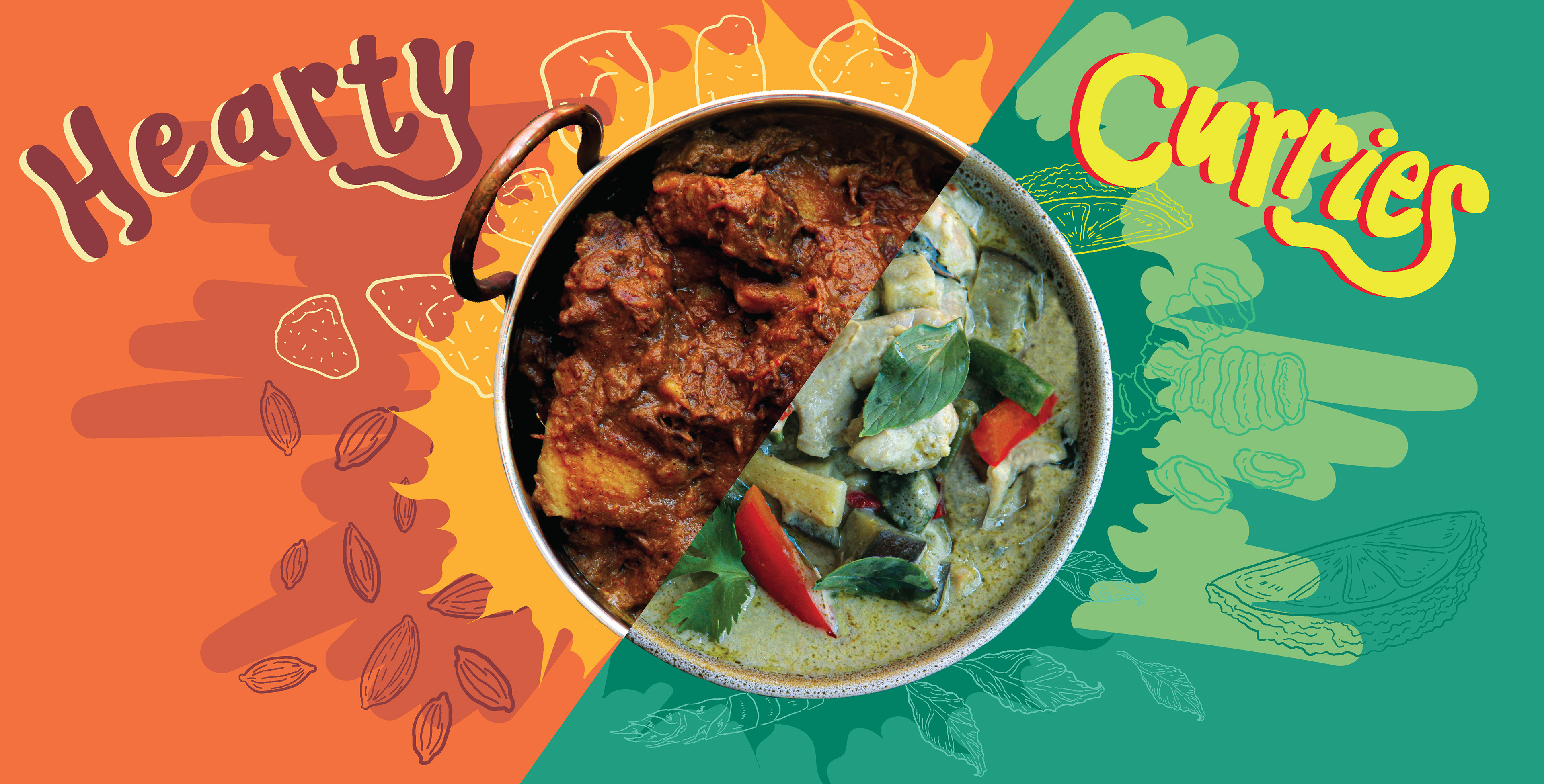
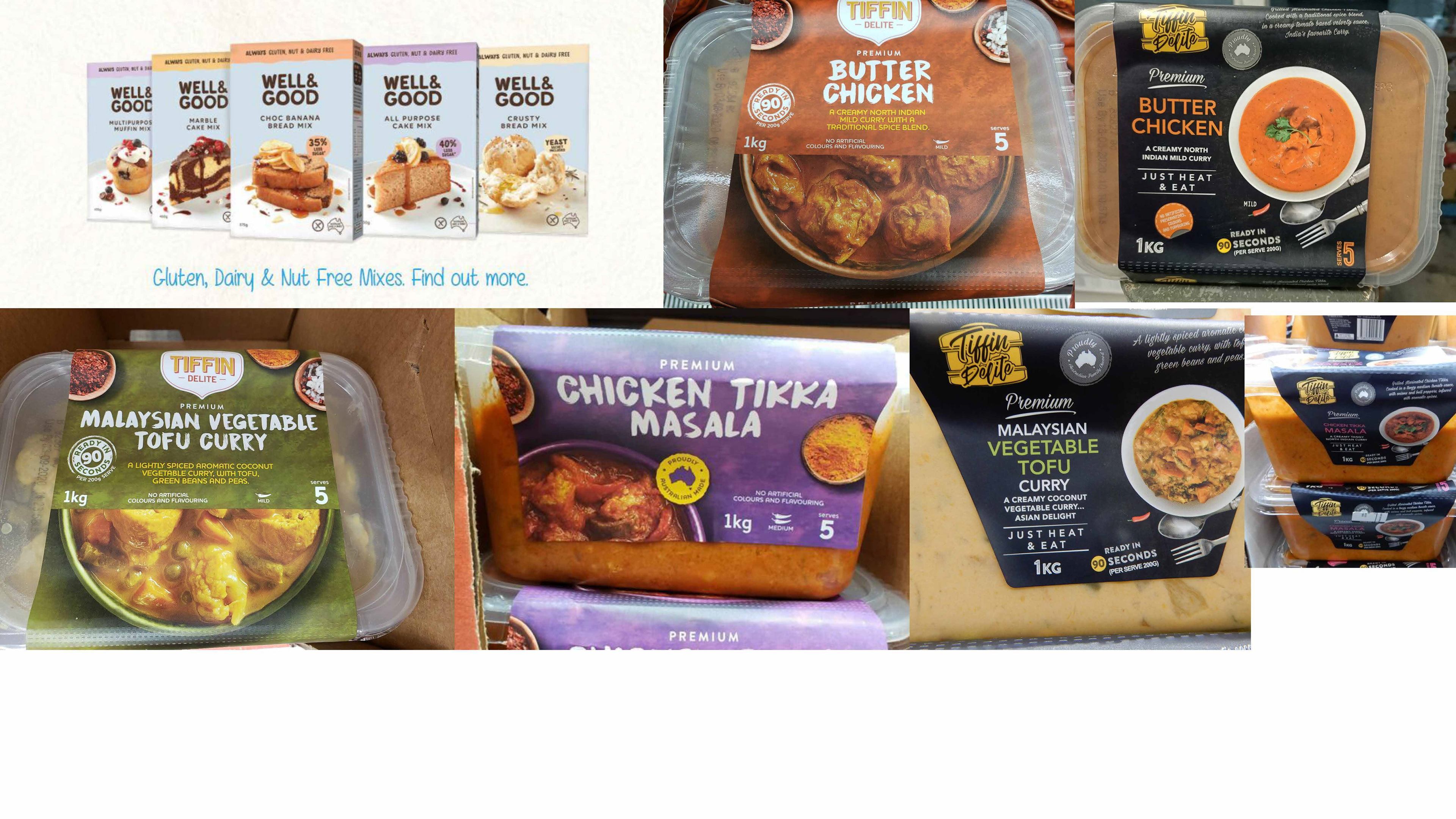
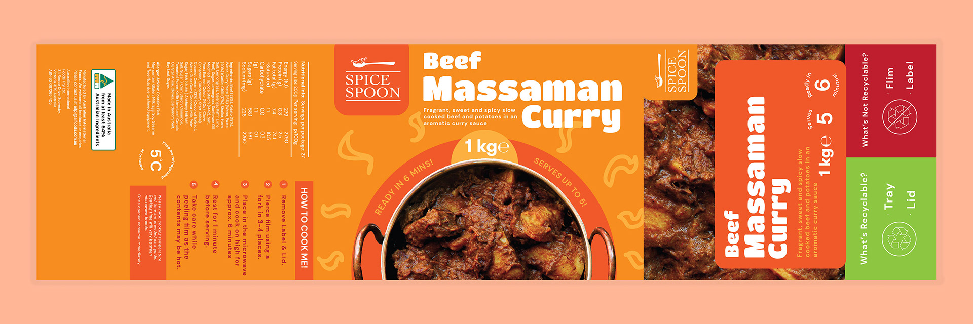
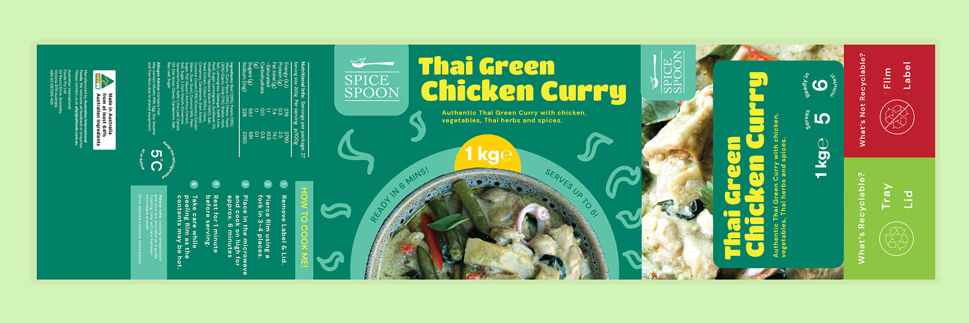
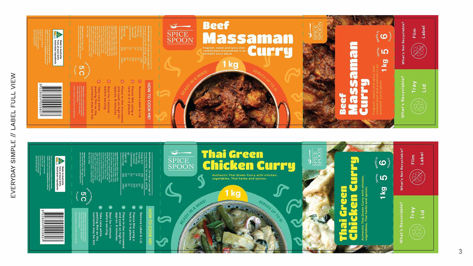
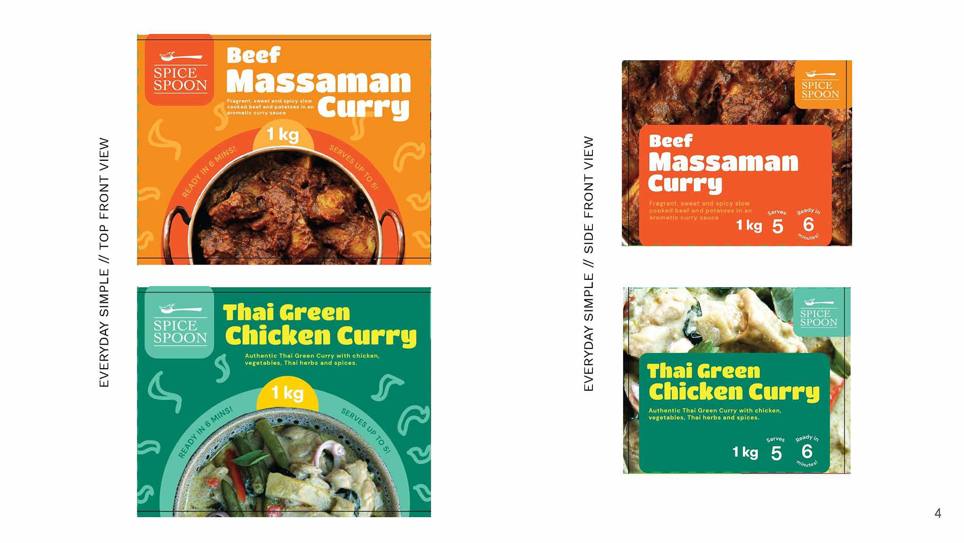
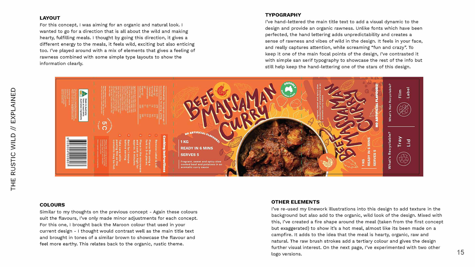
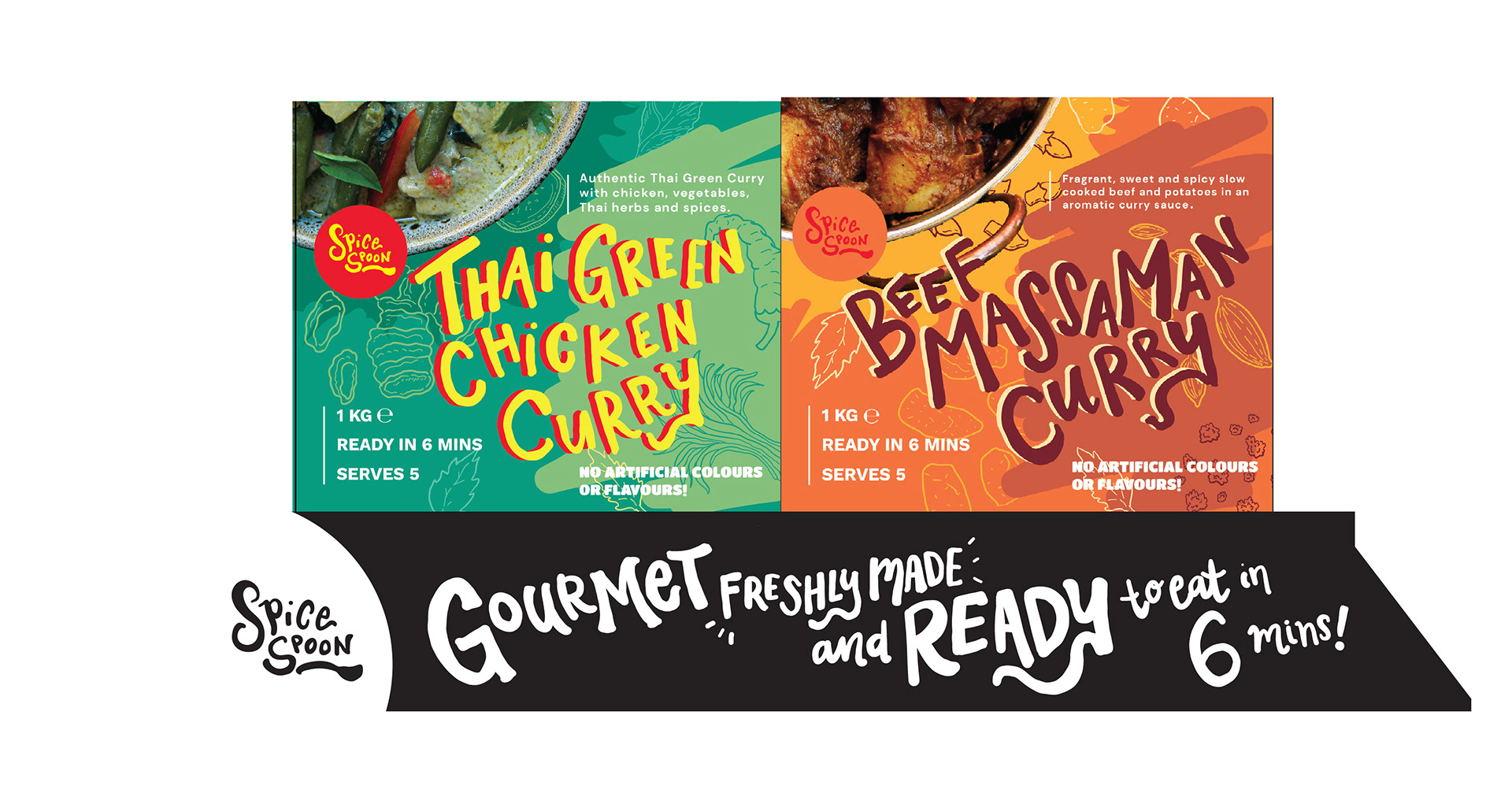
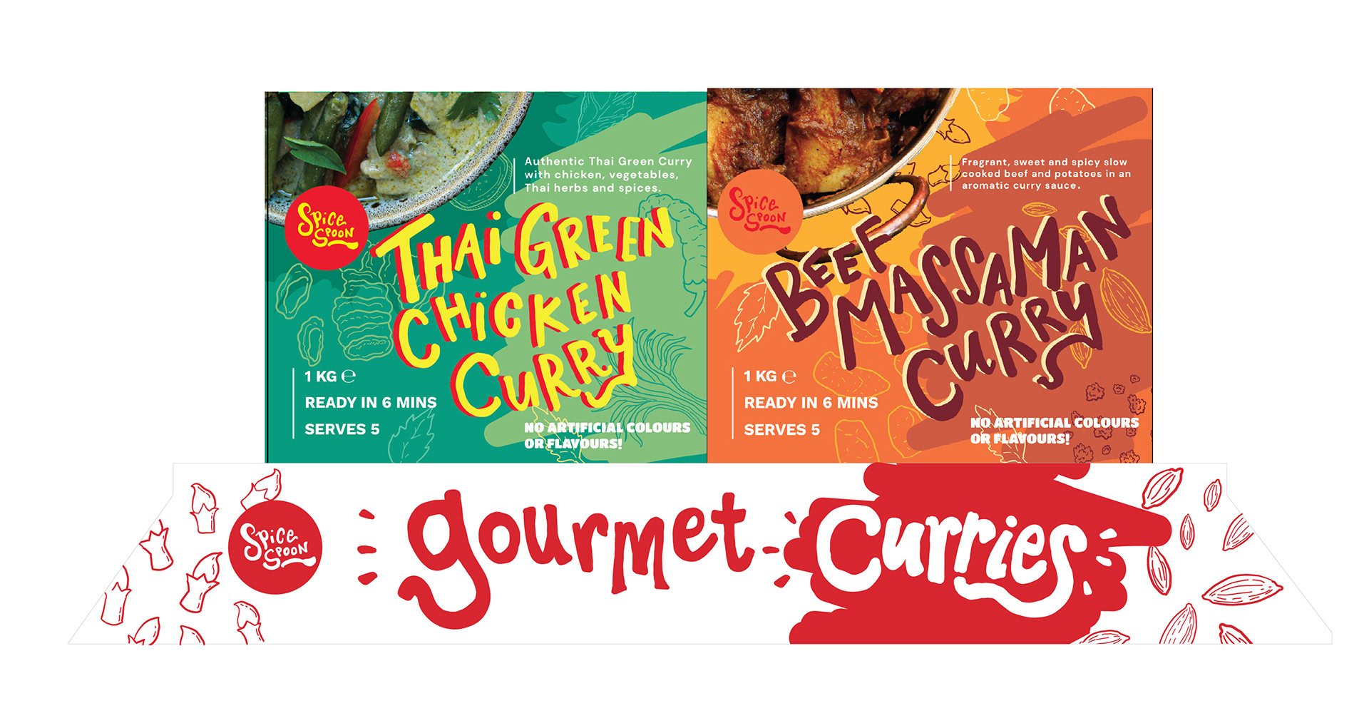
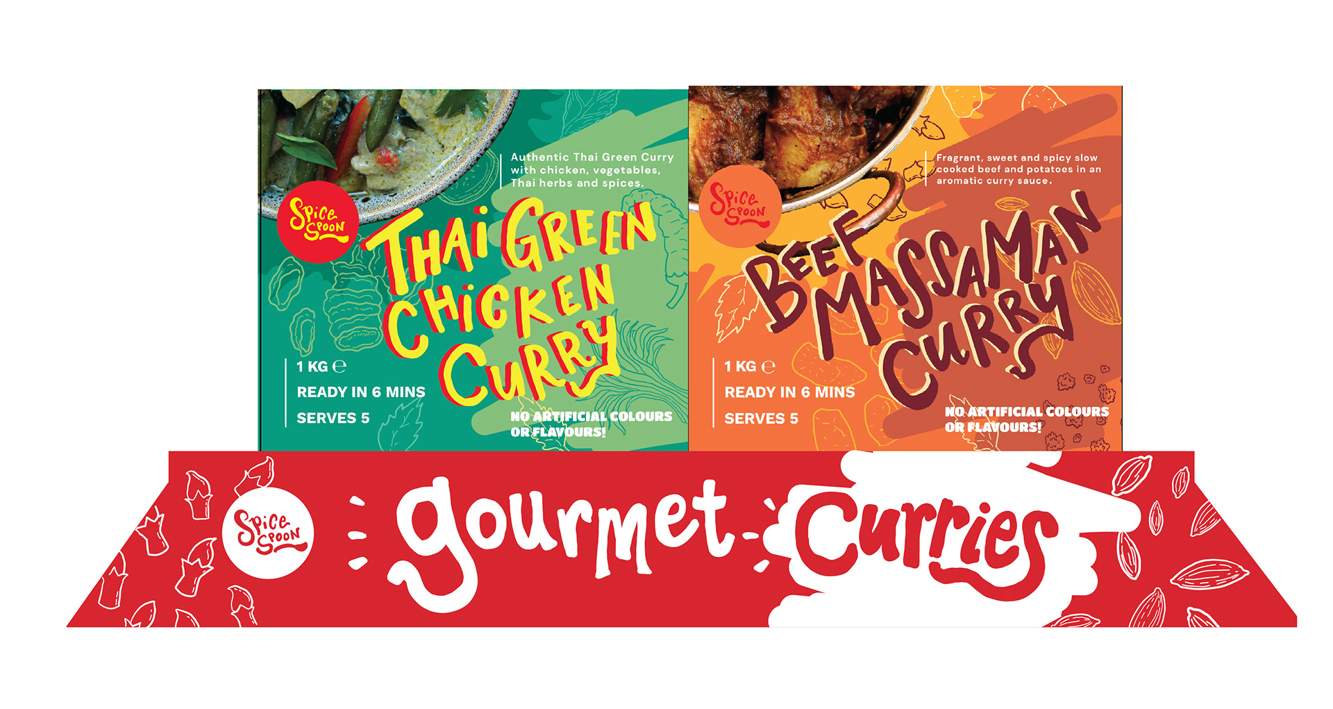
The third concept, I decided to go with a more rustic, wild look. In my head, I was envisioning something like a funky, pop culture cereal box design and it came out that way. Perhaps looking back, I think the design could really rock a cardboard sleeve than a sticker but it was the client's choice to keep it a sticker as it more economical being that they mass-produce the curries. So I completely understand their decision. This time, I integrated my own versions of the Spice Spoon logo, which is what their curry and Asian inspired hot meals are under.
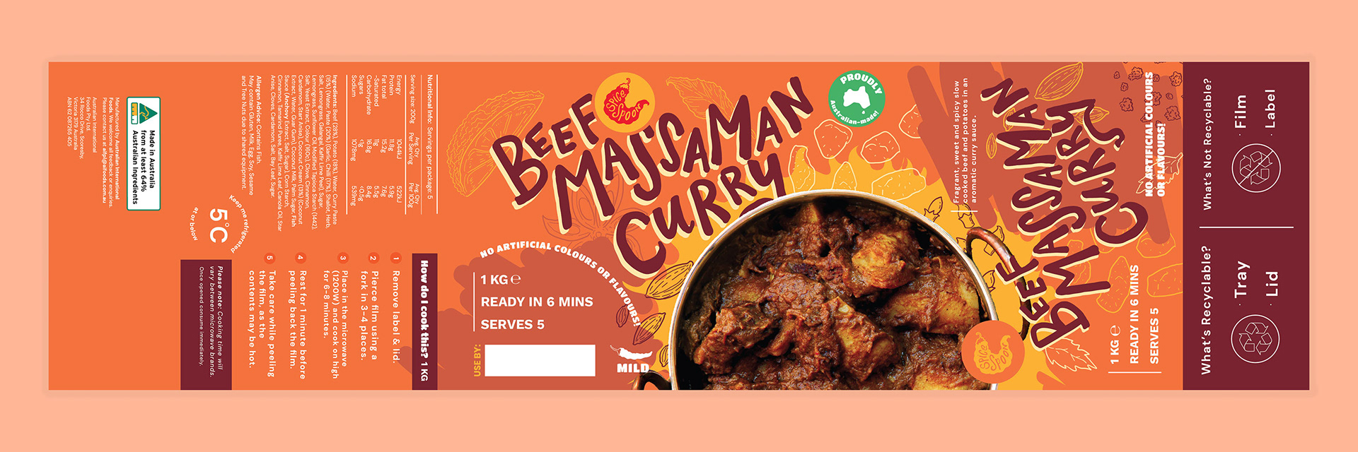
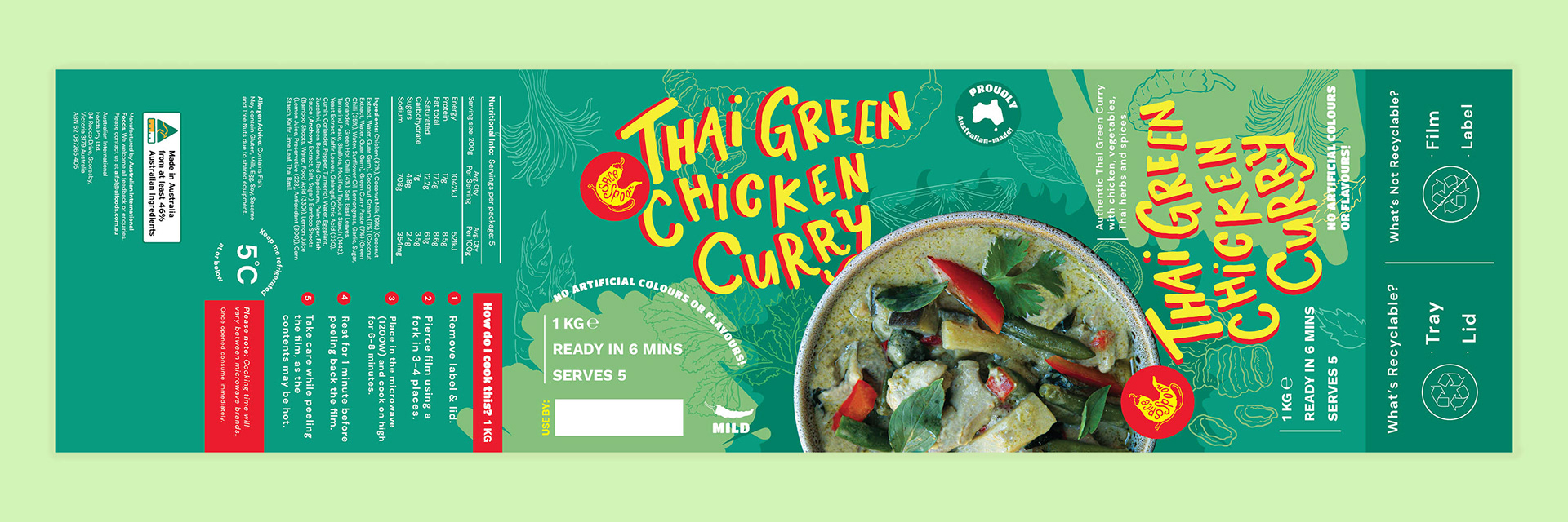
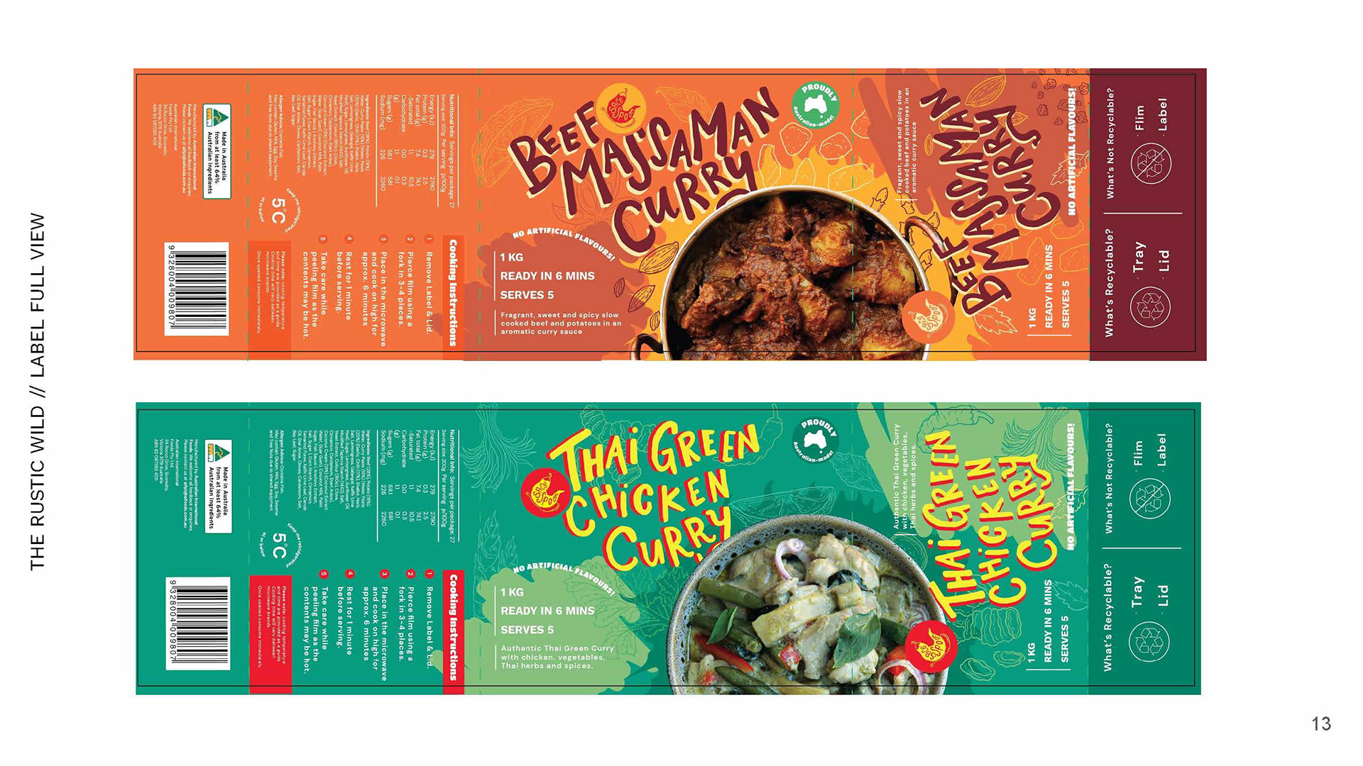
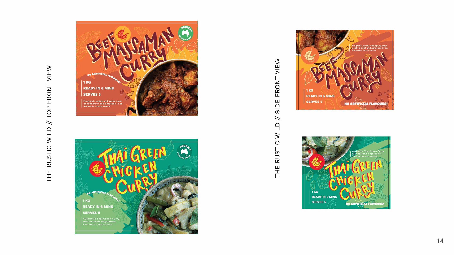
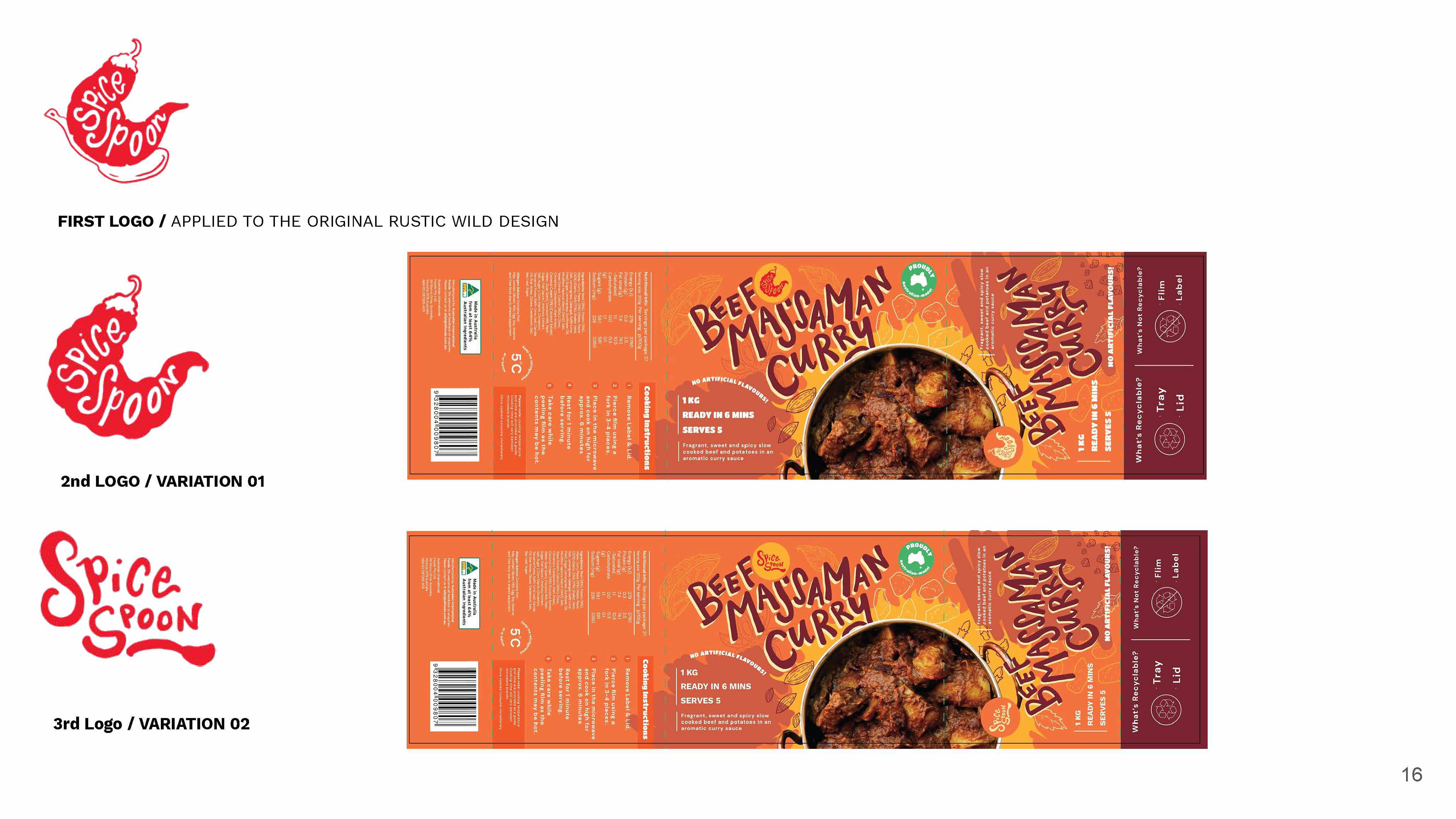
To my surprise, they actually went with the 3rd concept. This was debated between the 2nd and 3rd concept, and it turned out the 1st was a bit too plain for them, which tells me how different Melbourne is to Perth. It demonstrates how Melbourne prefers and appreciates more creative concepts over the simpler looks. What could I expect from the cultural city of Australia themselves! But working with a Melbourne comes with a lot more needs for approval. They only settled with the 3rd concept because COSTCO Australia wanted to go with that. It is their buyer after all so I don't blame them, but it goes to show, it's not just AI FOODs but also COSTCO that I would have to get the approval of. Imagine, the bigger the companies, the more approval you'd have to go through. That's just how it works, the responsibility and stakes are that much higher the bigger the business. Luckily, I'm grateful to be working with medium sized businesses and getting the best of both worlds.
I won't put you through my revision phase, but I know that it took weeks before I got to this approved version. Plenty of back and forth and for minor changes, spelling and corrections. Finally we got a point where the design was approved by both COSTCO and AI FOODS. Yay!
But... it's not over... because afterwards the printing would prove to be the next obstacle.
The printers over east were super friendly, but because they were working with PMS colours (solid+ coated), they had limited stations and a handful selection of available PMS colours. We had to substitute some of the colours and I actually had to do some research on PMS! Luckily I found this PMS colour matching website, which helped immensely. From there, it was just testing the colours and suggesting it to the printer. So I left it to the printer and AI FOODS to work it out and they managed to get it all sorted. Great, because I realised printing has it's own entire language....
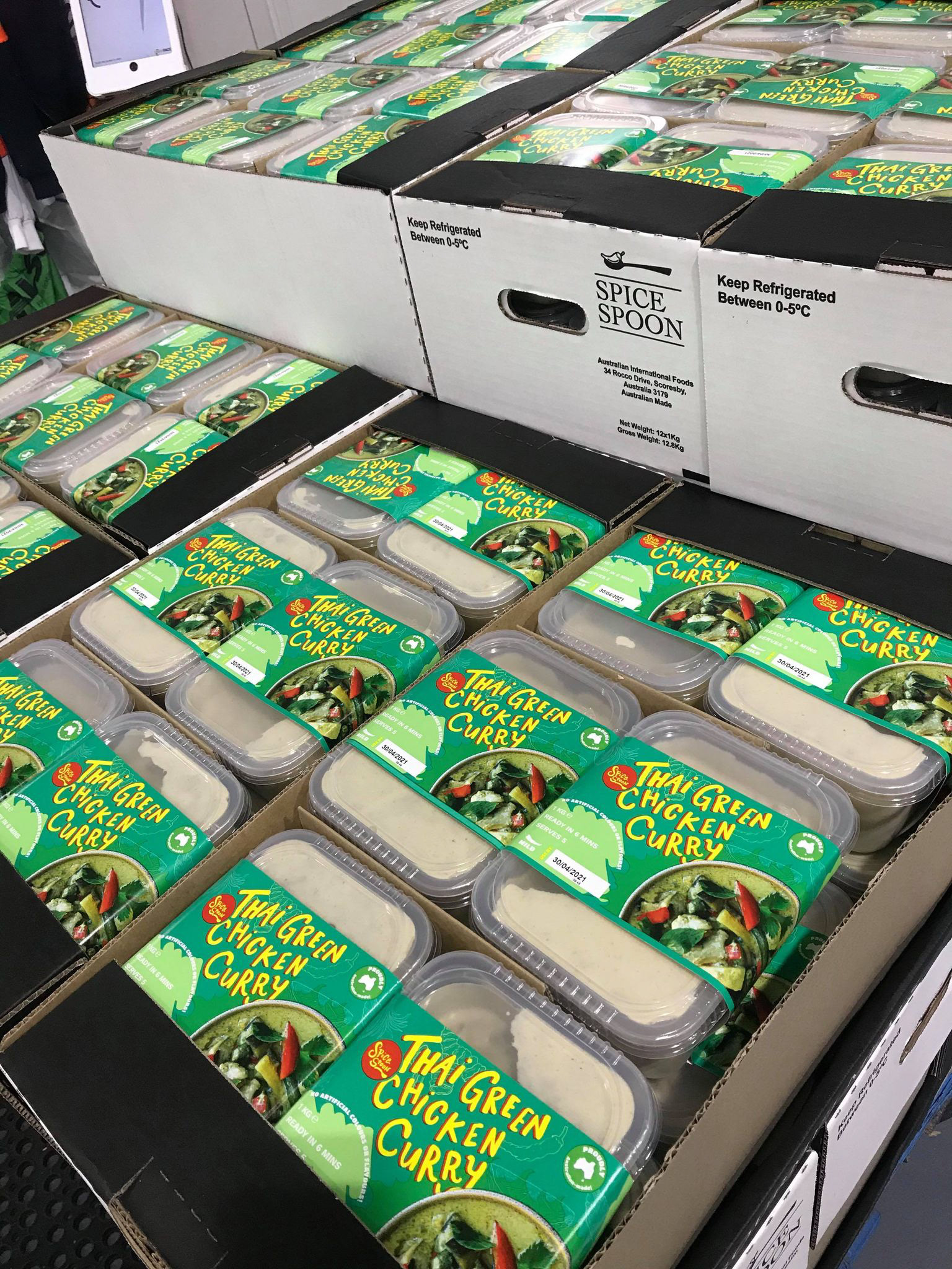
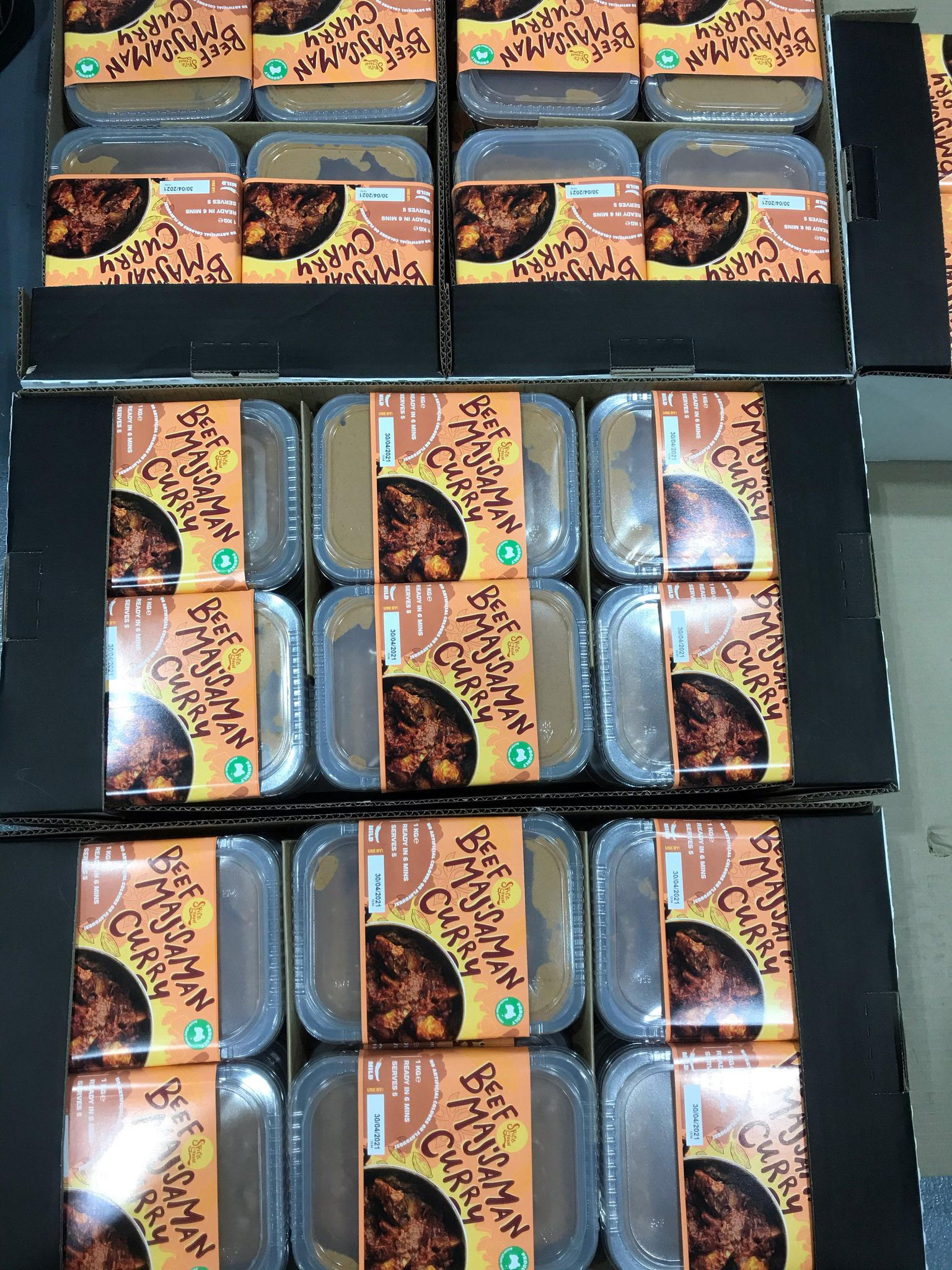

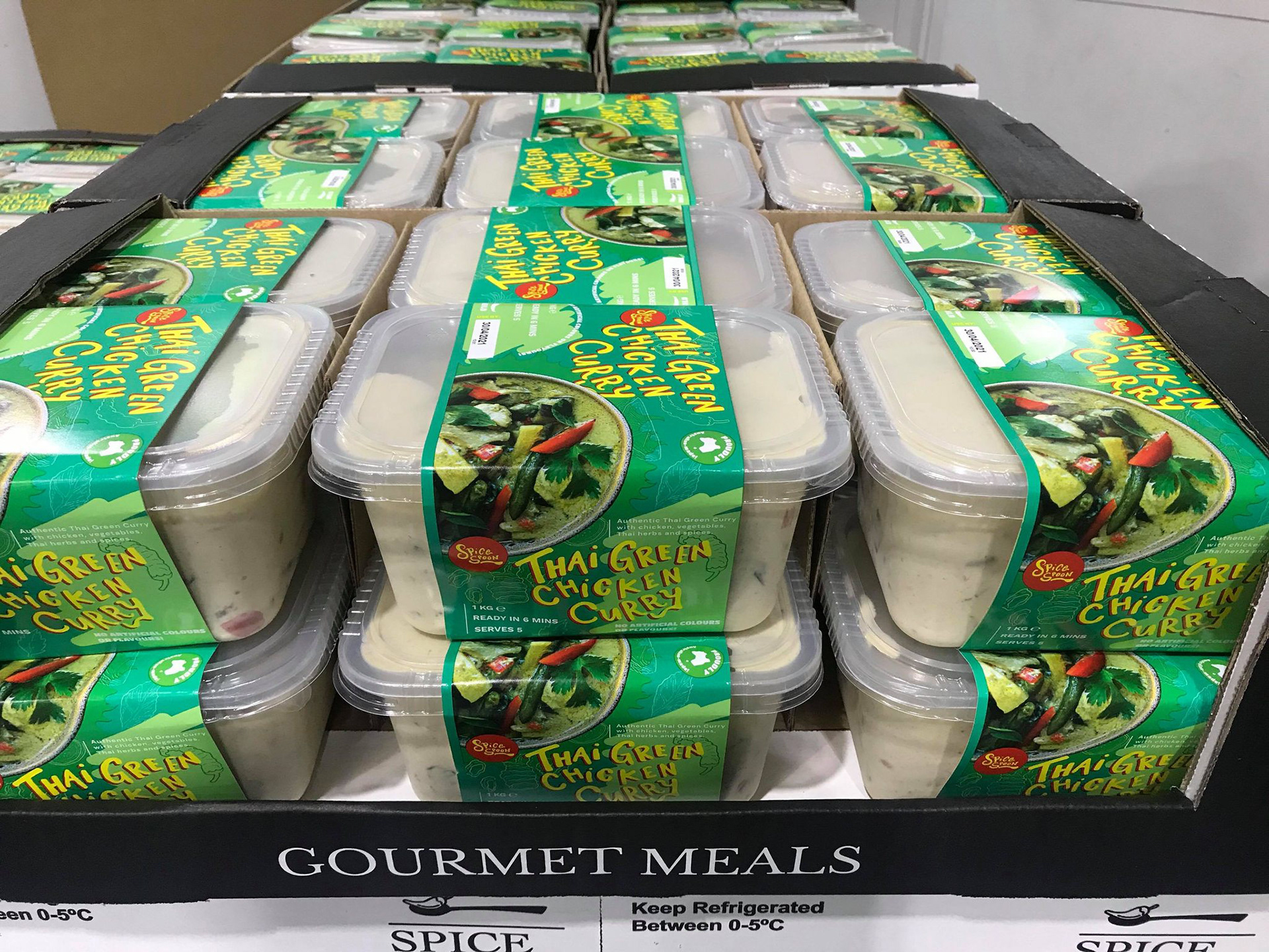
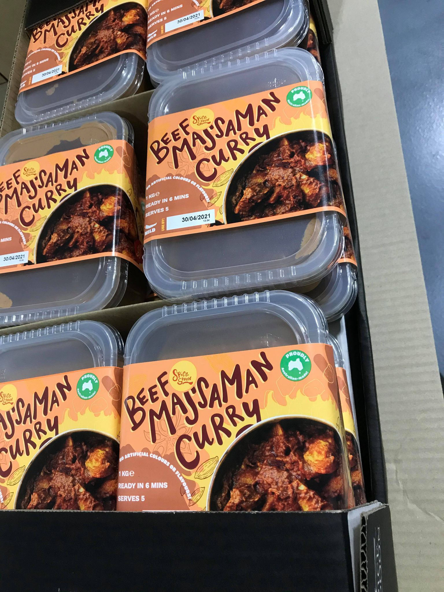
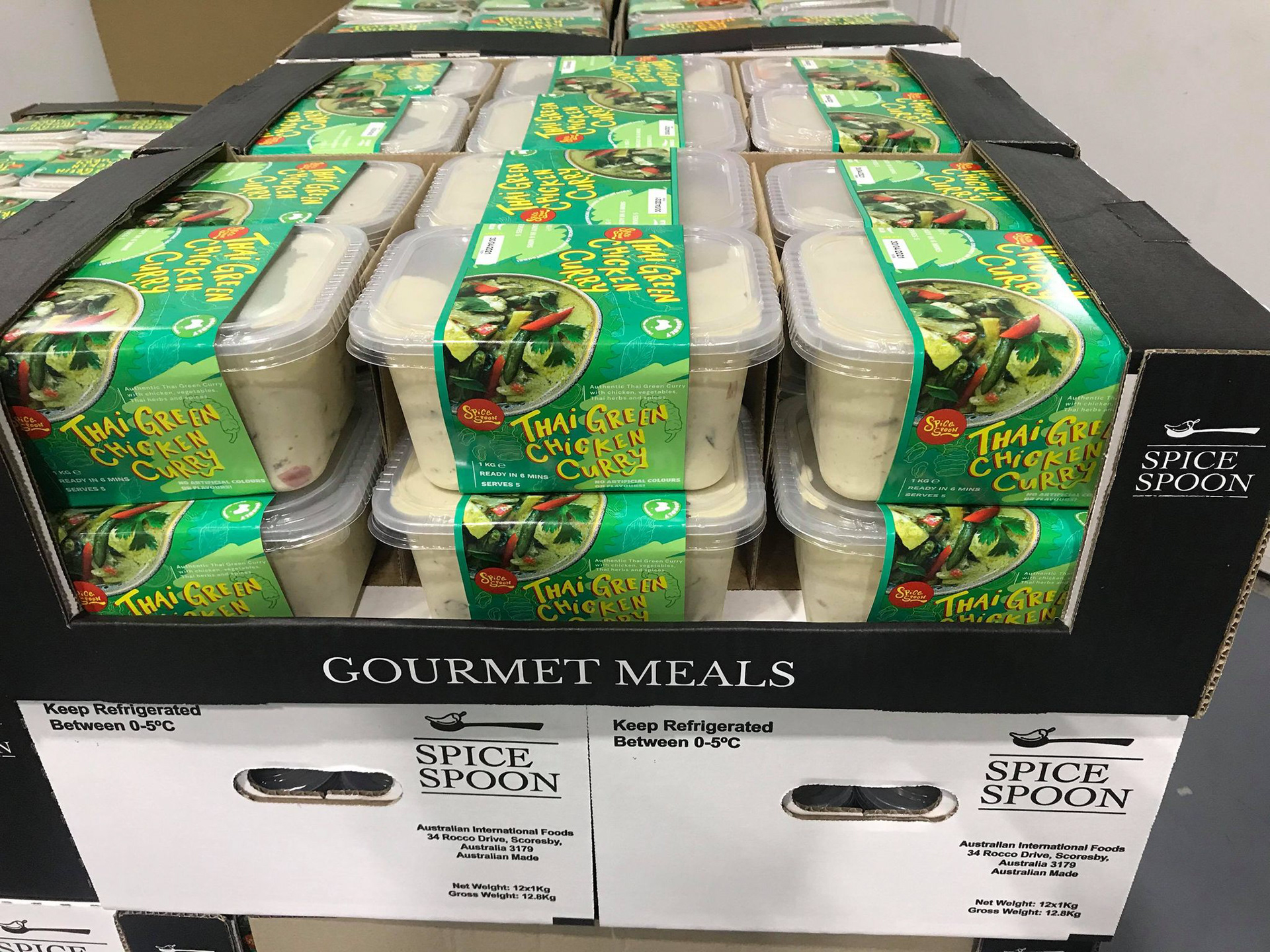
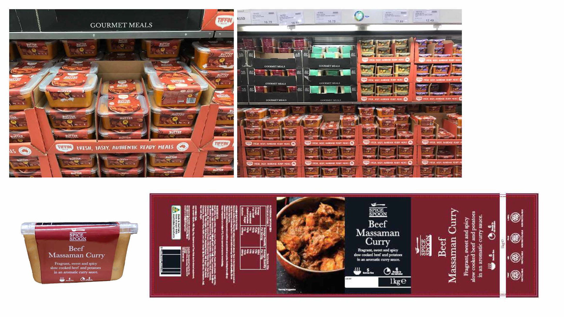
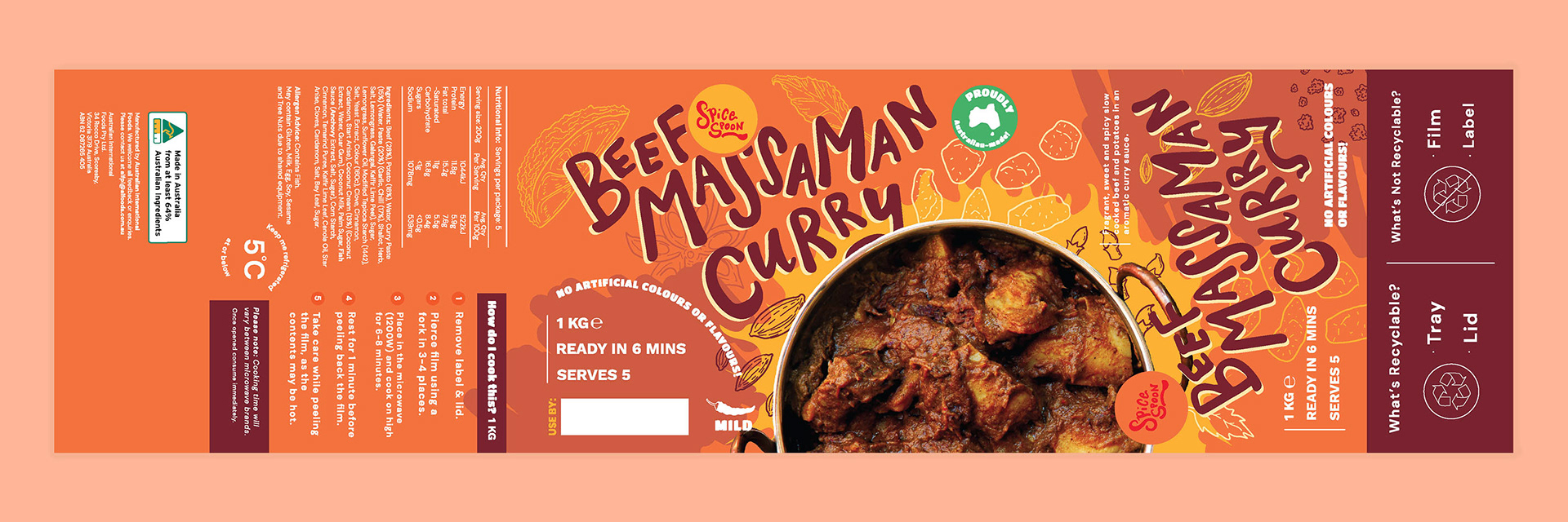
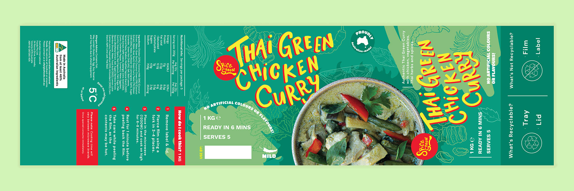
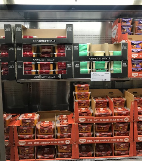
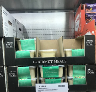
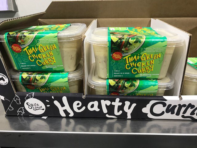
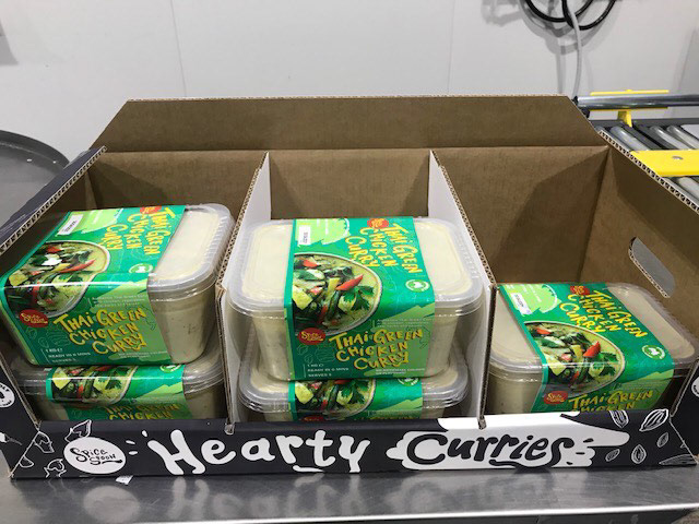
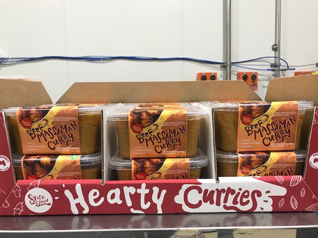
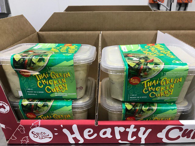
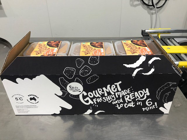
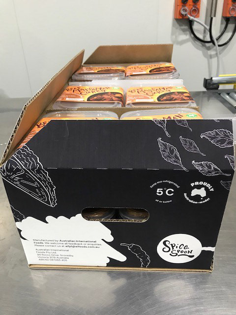
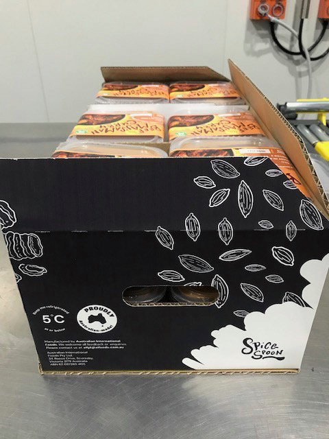
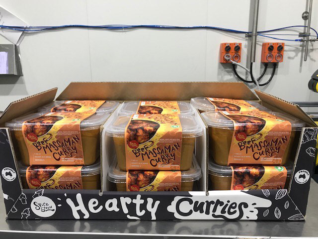
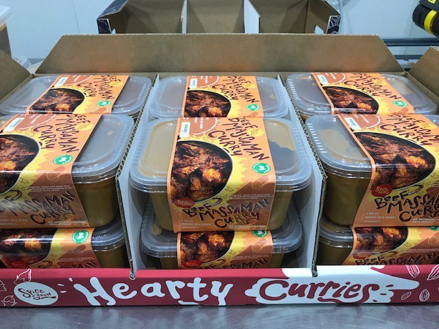
These images are courtesy of AI FOODS who sent these to me to show me everything is all sorted.
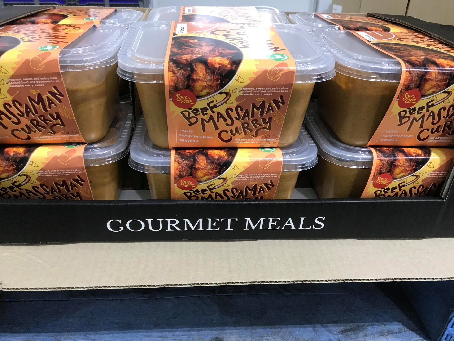
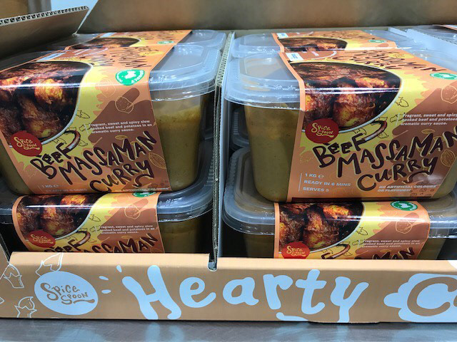
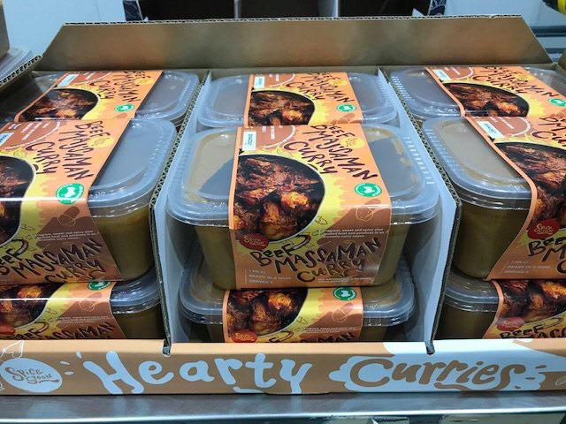
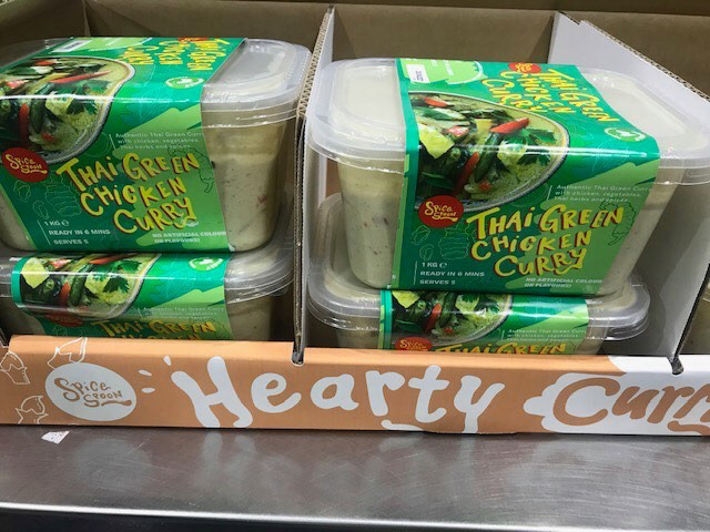
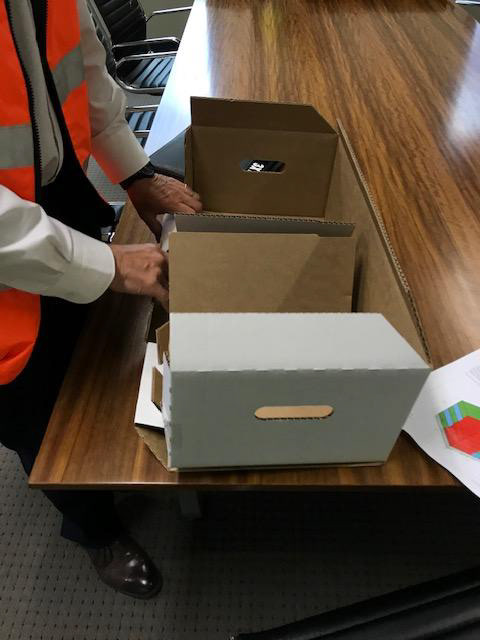
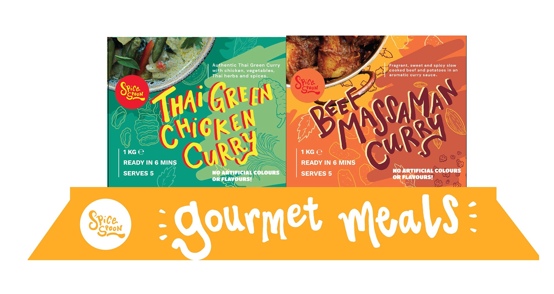
So you might have noticed there is a box that says "Gourmet Meals" and a box that says "Hearty Curries". Well that leads us into the next part of this project... the box re-design!
Yep! So AI FOODS was quite happy with the work I did for their curry labels, we continued on to give the box a refresh too! Luckily with the already established design, it wasn't too hard to think of a design to match up. (mind you, box and labels were separately quoted.)

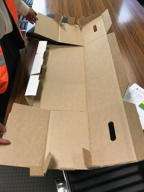
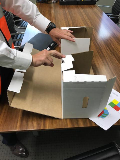
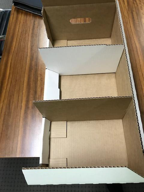
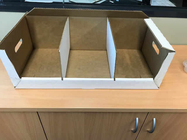
The biggest challenge was trying to figure out how the box worked without actually seeing it. I'm over West, and they're over East, so it's not like I could go into their office and see the box in person or even take a sample for myself. I'm sure it's not uncommon to work remotely, but it was the first time for me so I had requested plenty of photos as well as the net/flat dieline to see what the box looked like.
Videos can also be found on my Instagram reels and stories!
Again for the concepts, I decided to deliver two concepts and do lettering assets to match up with the chosen design of the curries.
The limitation of this box though was that it could only feature one colour (PMS) and white. So I needed to give it a refresh and make it pop without having too much colour.
I decided to deliver two concepts, one you saw above in the video and another that changes up the composition of the white and colour versions.
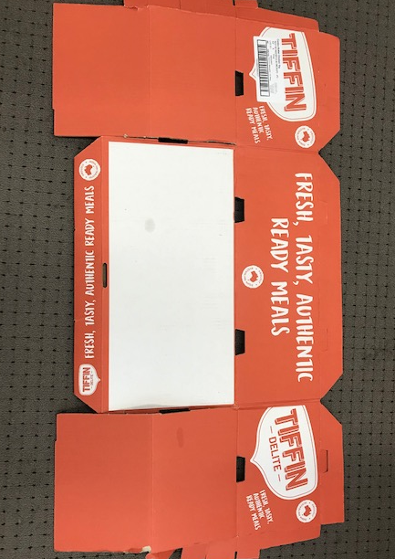
Although I think the colour that Tiffin Delites chose for their box suits AI Food's box best, I also felt like I didn't want the shelf to look washed out nor did I want AI FOODS to blend in or look similar to their competitor. So I suggested to go for colours like yellow or bright red, or just stick with the black they had.
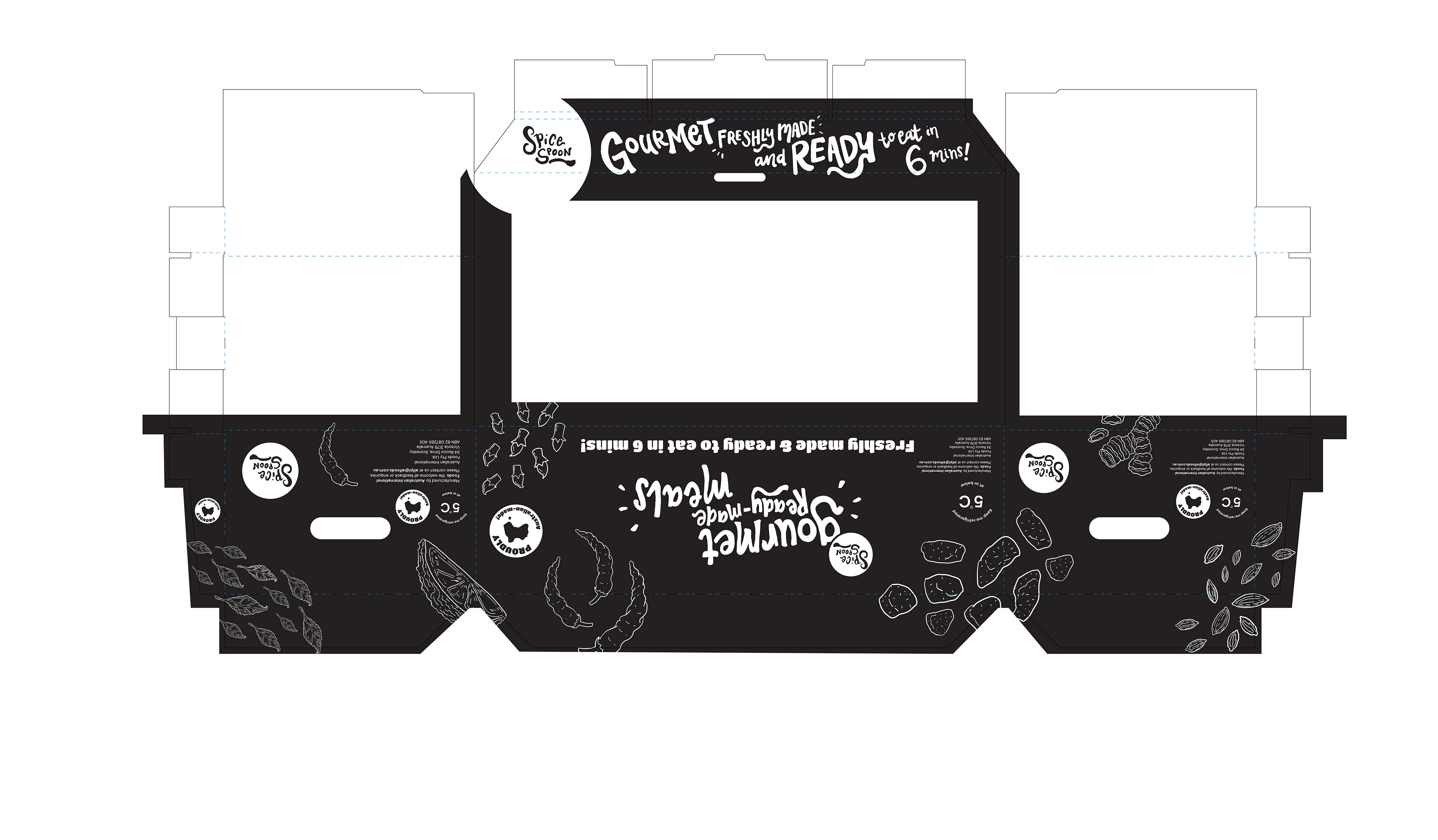

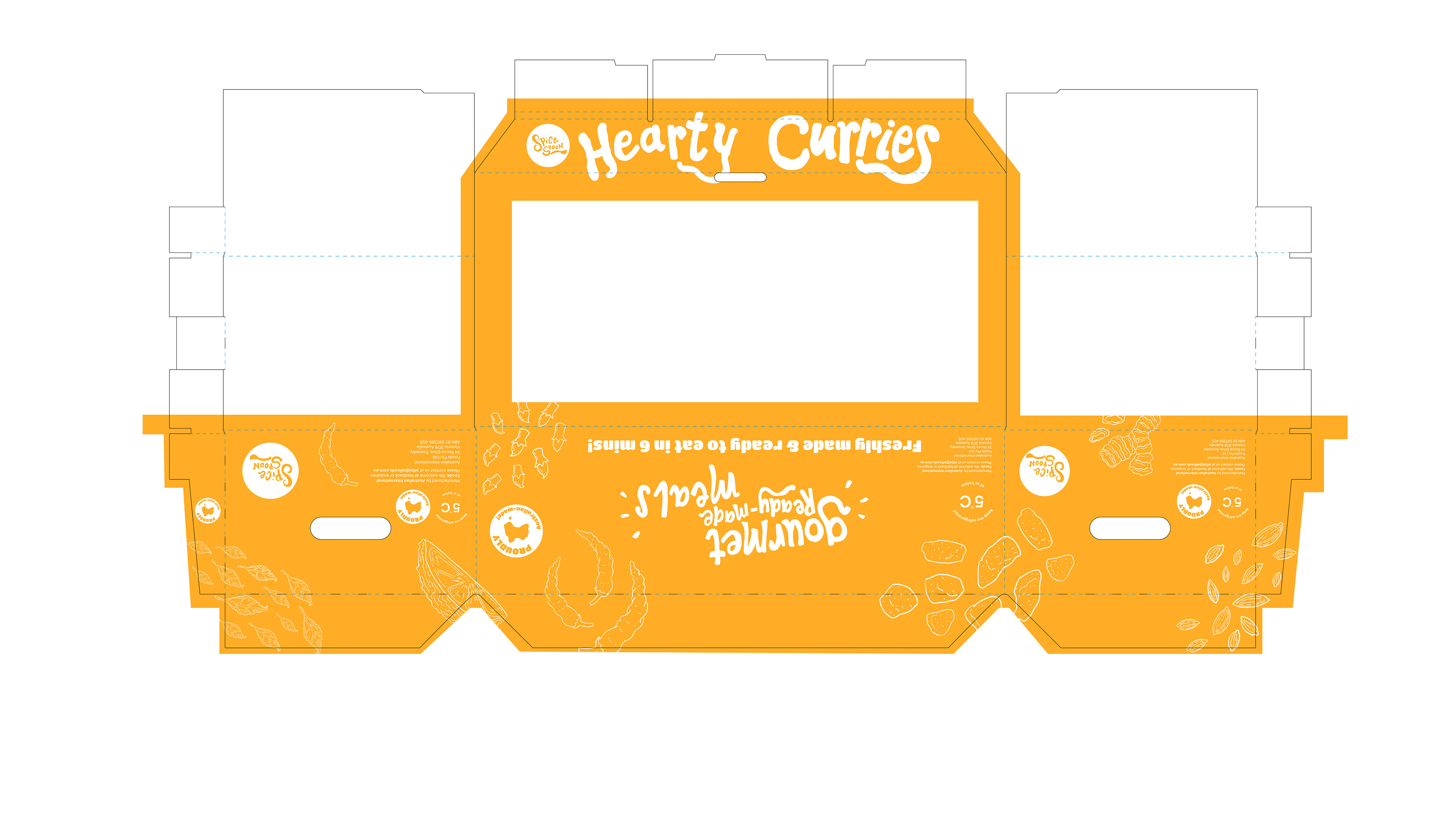
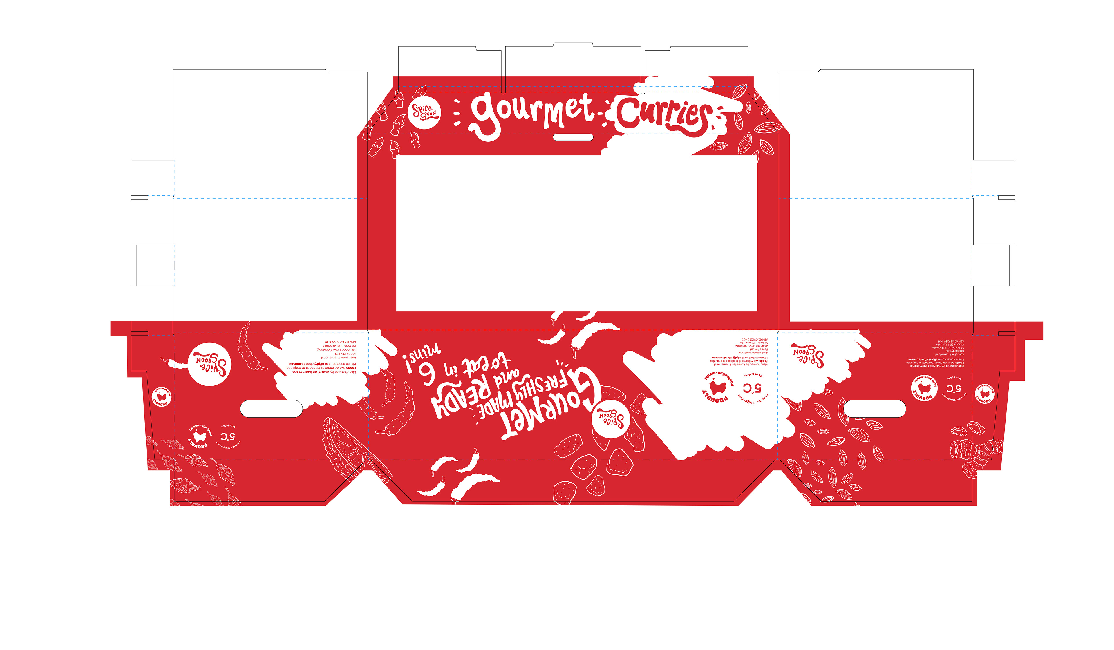
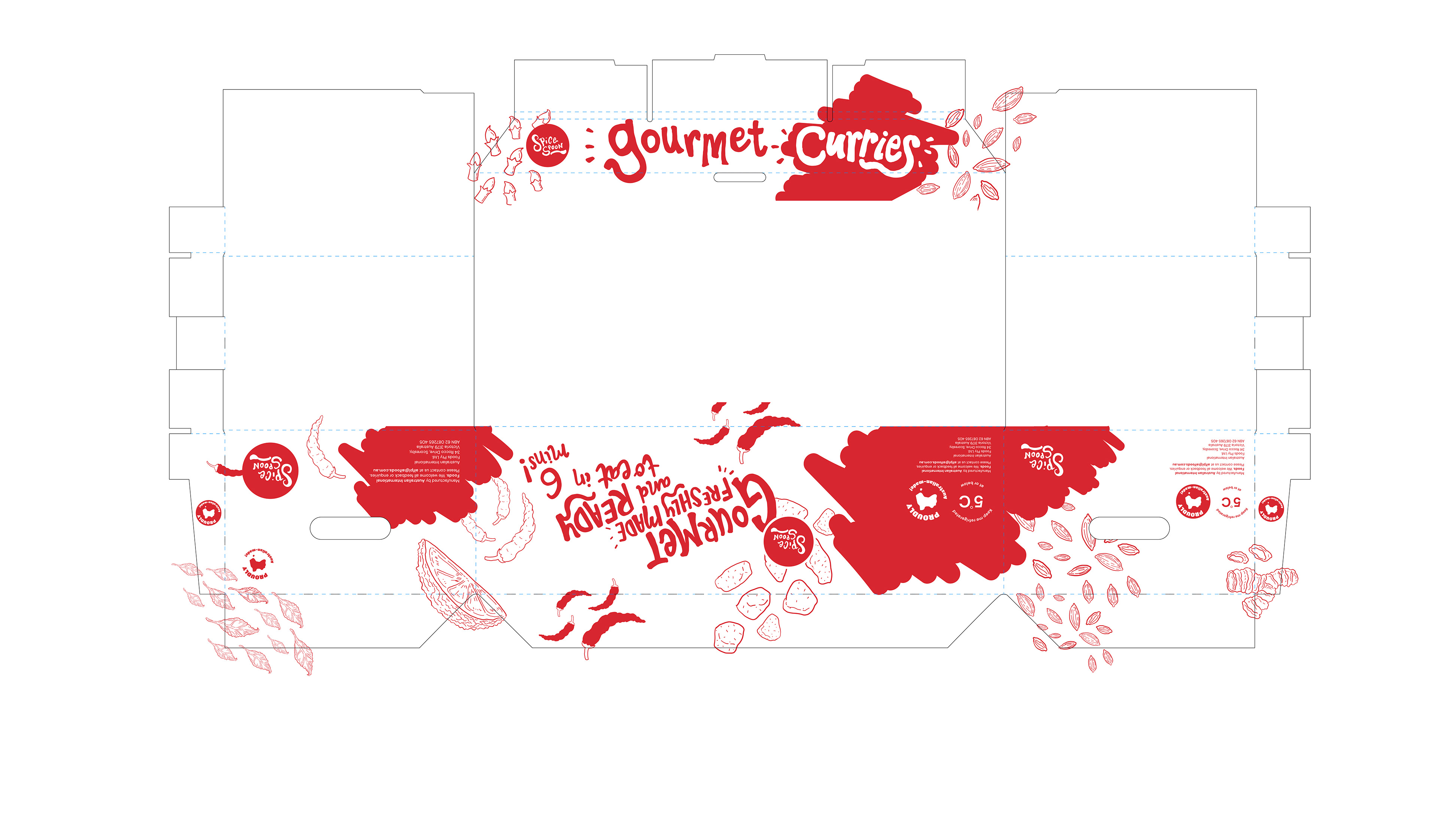
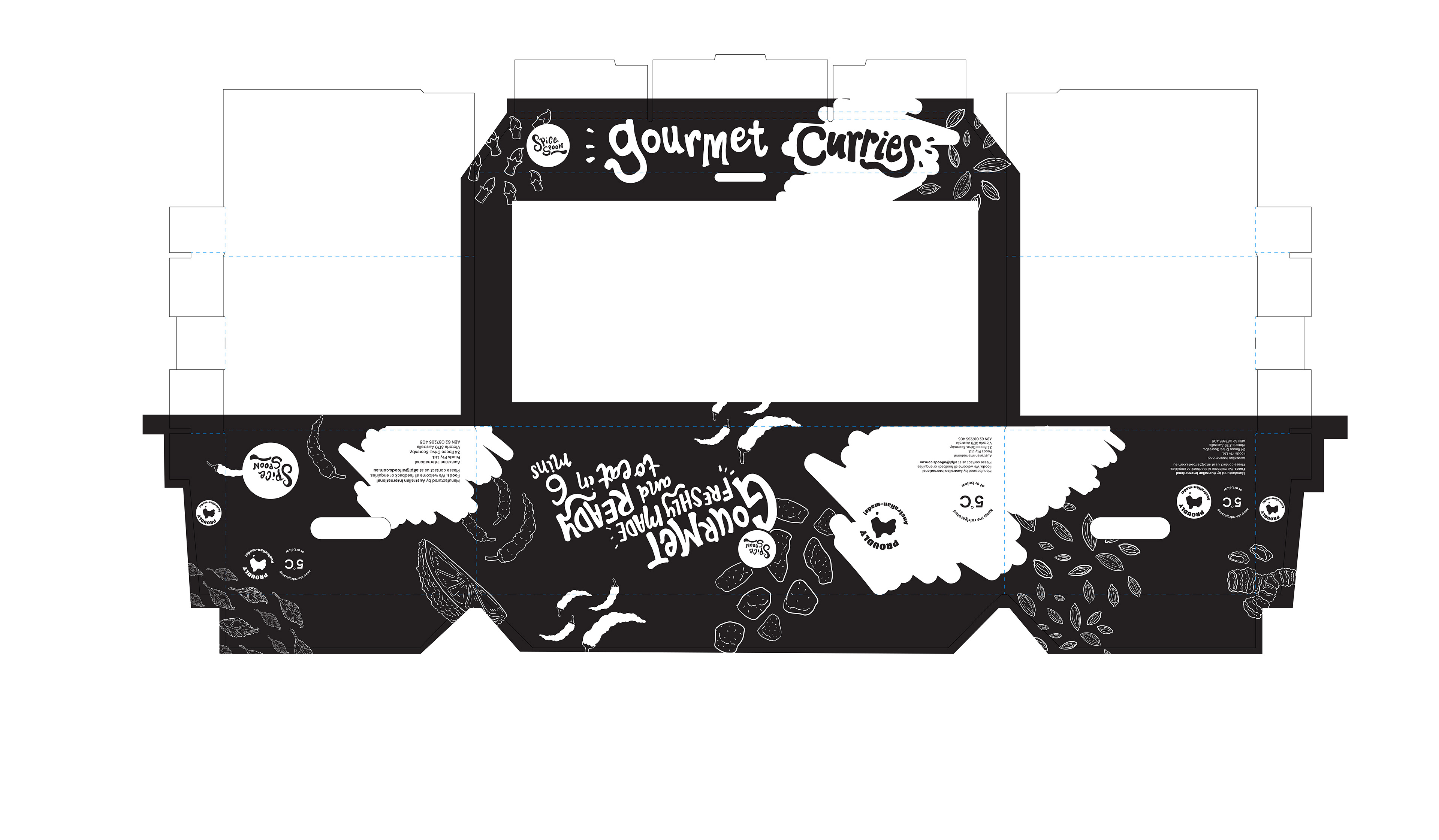
The client and COSTCO enjoyed the concept that had a more balanced composition of white and the colour so I guess that's going ahead! The next thing was that the client wanted to test out the colours and get box previews which in the end, they had decided going with black would suit best.
Seeing the previews made me melt, it was amazing to see the designs all come together!
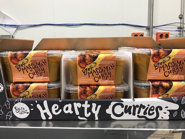

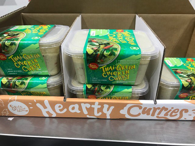
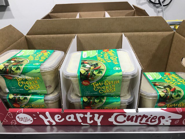


Once again--These are images are courtesy of AI FOODS who sent these to me to show me everything is all sorted.
Thank you for viewing this length portfolio entry and I hope it's given you insight into the journey of this project and how it ended!
Hopefully in the future, I can update you on how it looks in the COSTCO stores themselves, of course, I would have to wait for the client to snap a few pics when they're at COSTCO.
If you're at Melbourne, be sure to visit your local COSTCO for these awesome curries!
And why not check out what AI FOODS are like? Unfortunately they don't have social media yet but will update the page, once they do!