Rewind to 2019, (as I'm still uploading a backlog of design work that's part of my design journey...), after the Wellness Bowls but before the COSTCO project with Fresh Frontier, existed the "Water Kefir" project. It was a time where Fresh Frontier had launch their first drinks product, 4 flavours of Water Kefir. To give context, I've provided a picture below.
I know it's a rule of mine to not usually show the former design (ok, new rule - I won't name the designer), but for context, I decided to show what the design looks like as Fresh Frontier was looking to re-brand the design to work alongside the newly launched Wellness Bowls.
They wanted the colours to match up and basically complement the wellness bowl products. The target market would be the same as the wellness bowls - those who are health conscious, specifically towards millennial-gen x females. Water Kefir is often known for it's good gut health benefits as well as a good substitute to soda being a fruity, summer beverage.
This project was still under the Plus 4 Creative era, meaning I was still working alongside Ann Marie and under Plus 4 Creative. (to note, Plus 4 Creative concluded in October 2020 and from there, I started my own design business onwards).
To start off with, Ann Marie and I took heaps of pictures in Fresh Frontier's stockist stores. Images of potential competitors - from kombucha, other water kefir products, even milk/yogurt kefir products as they could be considered secondary competitors. There was plenty of inspiration from looking locally but we also ventured and looked online to see what other designs has been done.
These inspiration images are taken from my Pinterest account where I created plenty of boards to explore different references images. From there, Ann Marie and I brainstormed a couple of different ideas and concepts to present to the client.
This first concept is entirely Ann Marie's work and the credit goes back to her. Her rationale is included in one of the images.
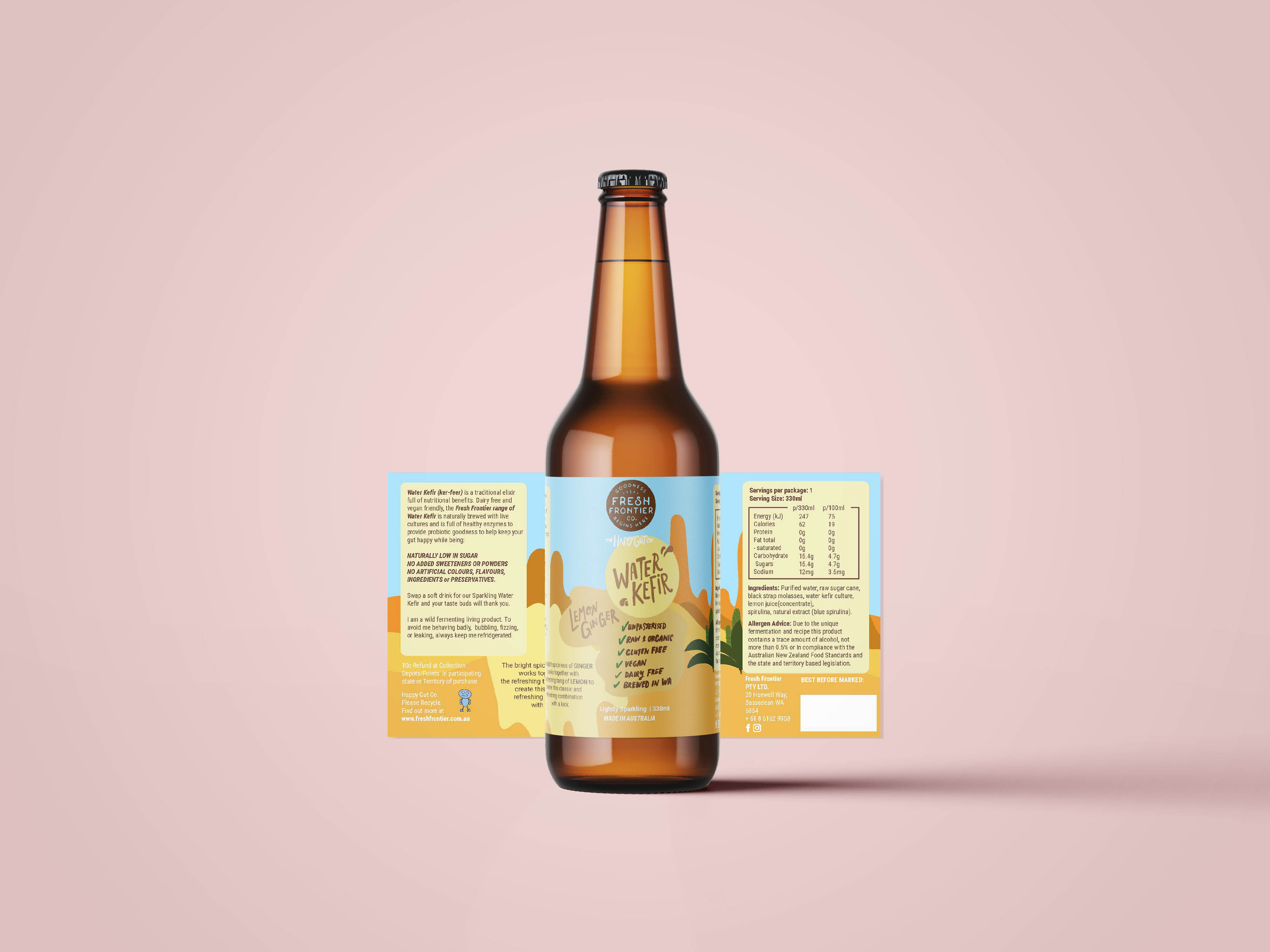
The next two concepts are my own. This next one I had a play making my own assets again - this time, a little more calmer than the Wellness Bowl. I had a play with lettering and trying different styles. I still went overboard and was excited to try them out in a concept. I mean, this was a time where I was still learning and it took me a while to grasp that not all clients want my assets.
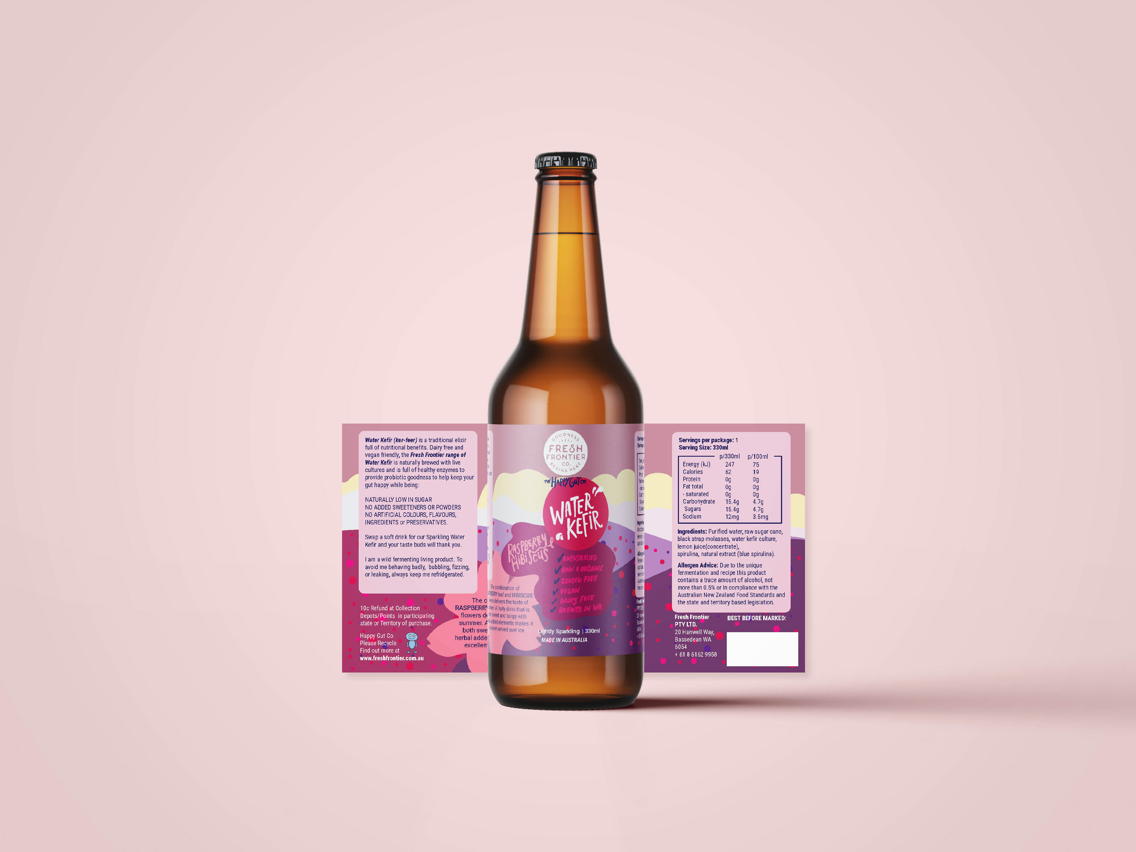
The second concept explores this idea of landscapes and that a drink flavour can take you to a location. I wanted to entice the customer's imagination with this idea. I may have gone overboard on the assets for this one looking back. It does seem like it could do with less assets, but I thought why not upload it as I remember it. Many of my designs looking back, there's so many things I'd love to change if I was doing it now but that's the beauty of looking back -- you realise how much you've changed. I can now acknowledge the design for what it is and that's part of my journey as a designing continuing to grow and develop.
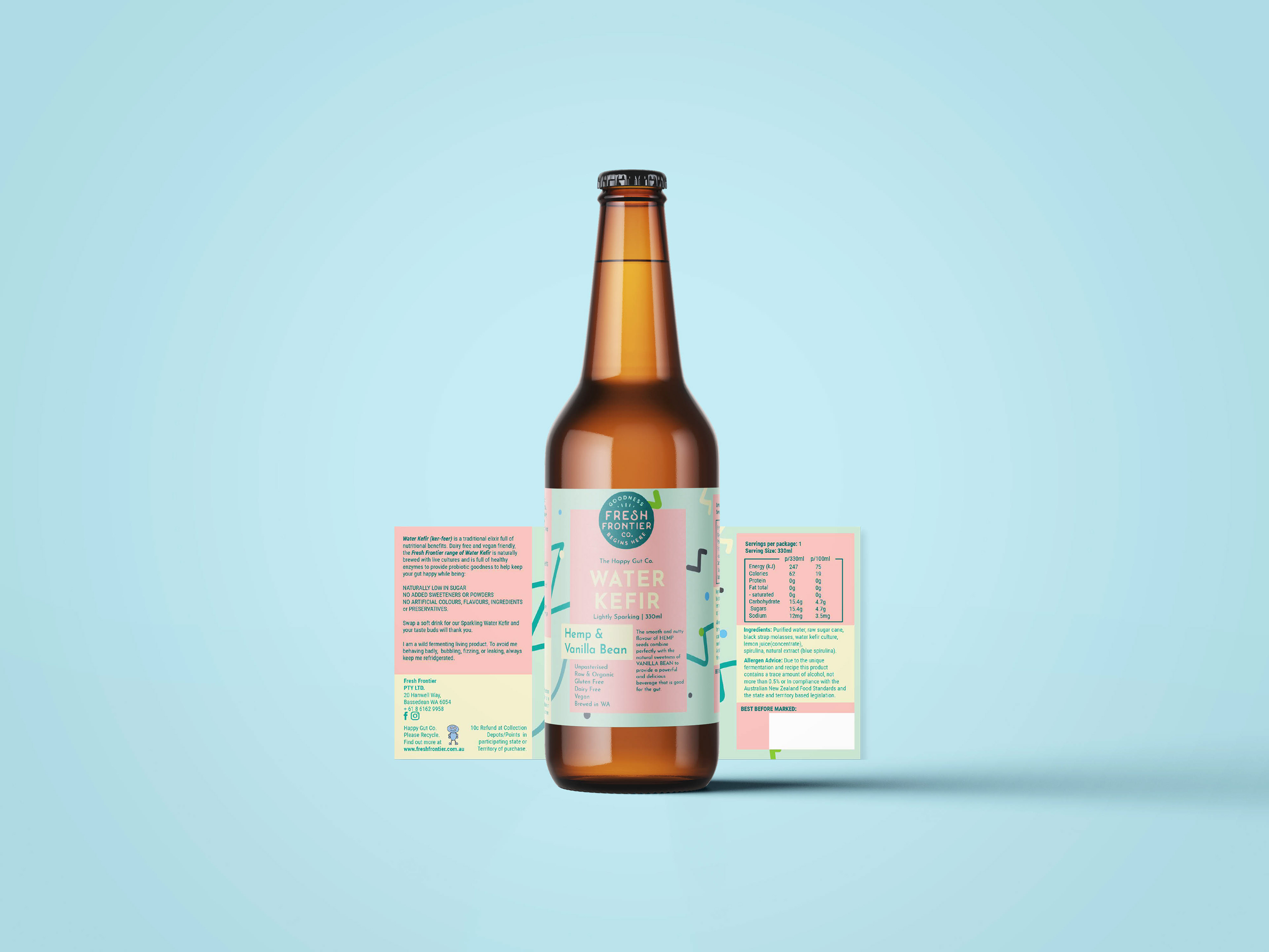
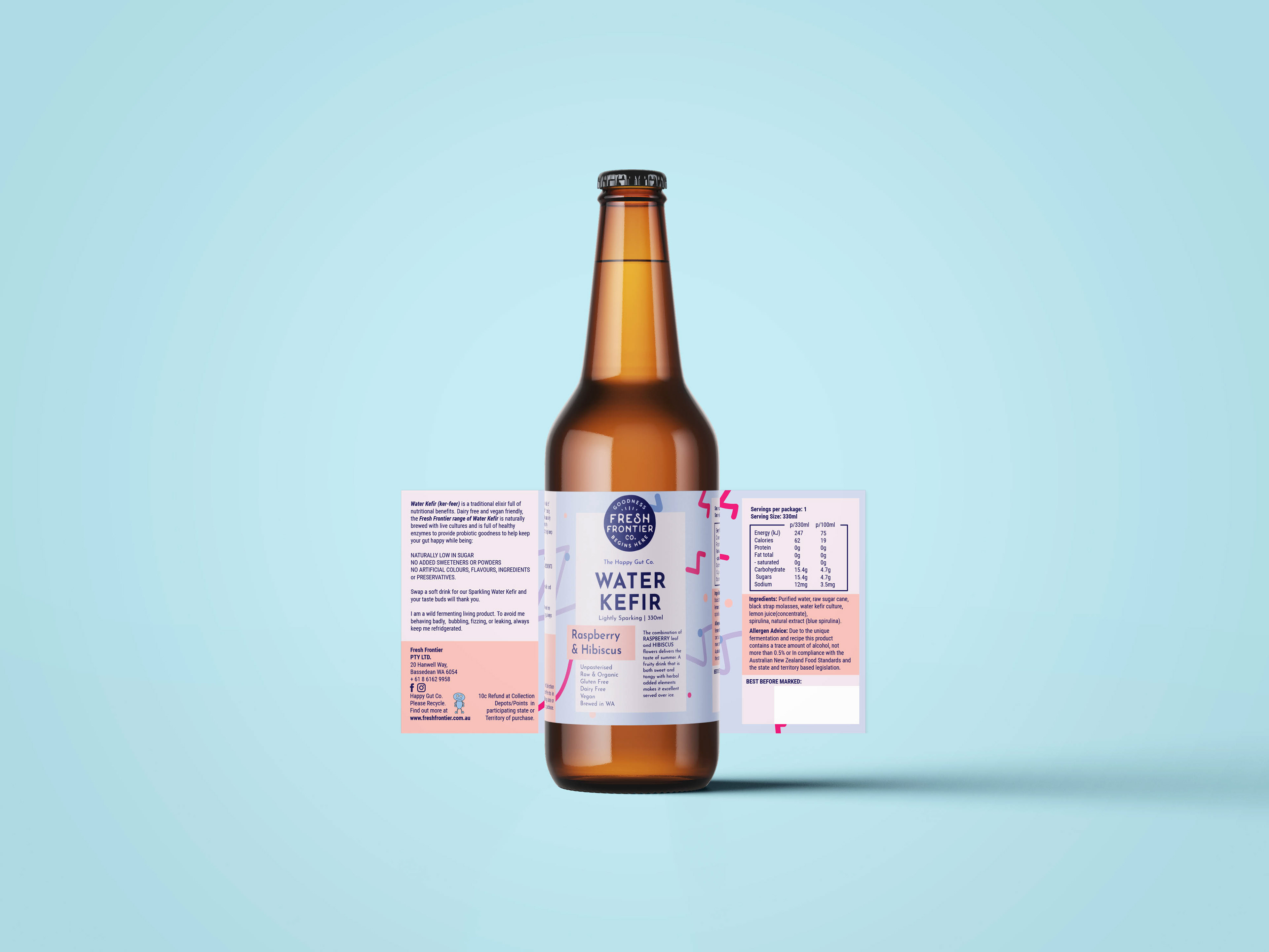
This third concept had the intentional reference of the wellness bowls more particularly the squiggly lines Ann Marie applied into her design. I thought I'd try that similar effect but have it more zig zag to give a "buzz" feel because the drink is carbonated. The intention was to make this design feel more clean and geometric, similar to the layout of the wellness bowls. Except this time, I wanted to showcase a more pastel palette as I think it's quite light-hearted and would compliment with the wellness bowls as it's counterpart.
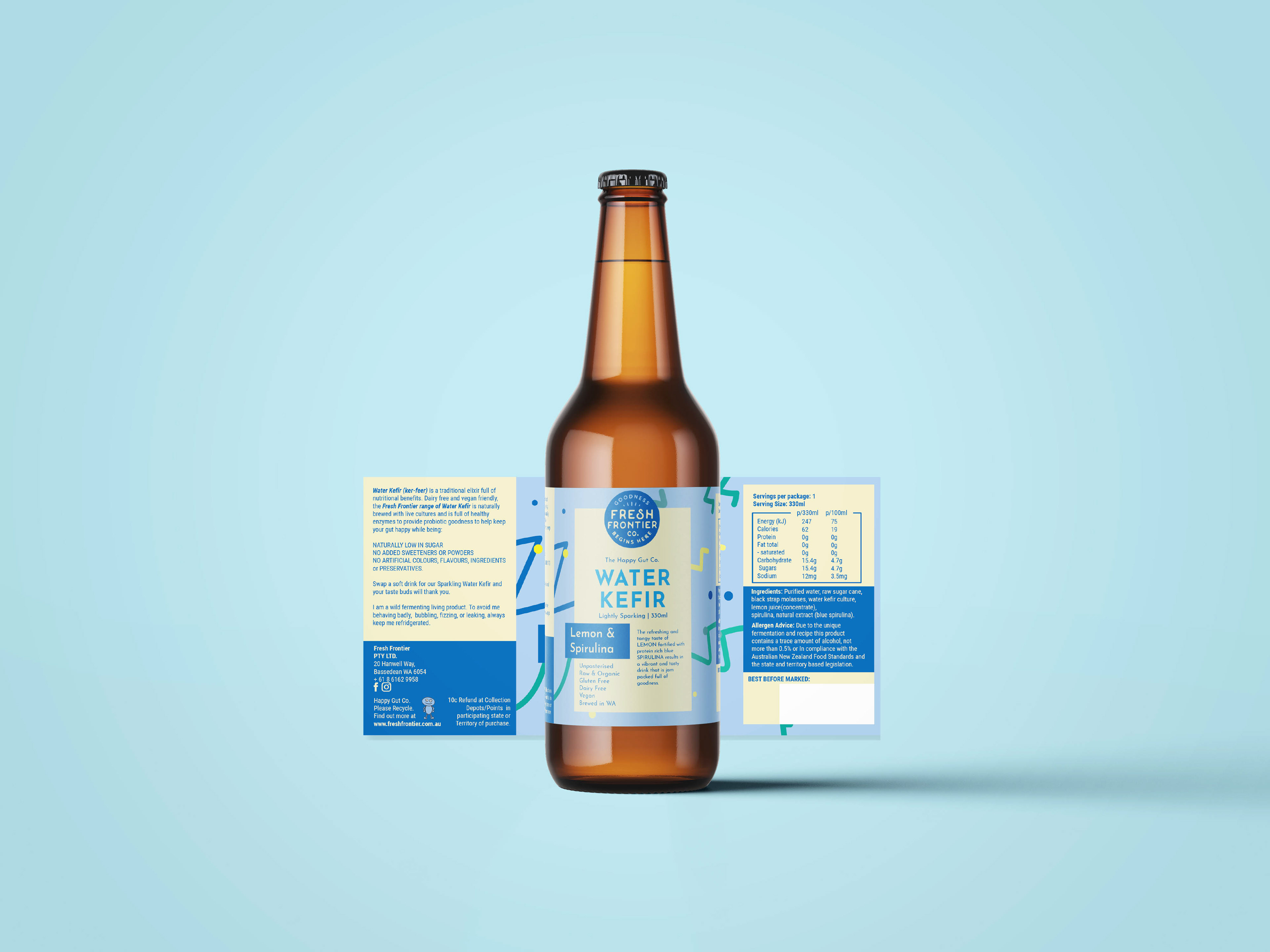
So what did the client choose in the end? Fresh Frontier was super happy with the 3rd concept! Woohoo! I finally got one of my designs to align with their vision! The only thing that they felt was missing was the fact the colours needed to match with the wellness bowls. So they had insisted the colours be vibrant and bold as they wanted that to be the new Fresh Frontier branding appeal. Ann Marie ended up making the changes to my design as I ended up working on new projects at the time (Jan 2020).
But you know what's the real bummer? After making this change, a week or two later, Fresh Frontier tells us they had a falling out with their brewer (he, who shall not be named...) and they cancelled the entire Water Kefir product altogether.
So this means this design project got cancelled as a result.
I've debated whether posting this project is worthy of posting, but I thought, if it never got any limelight, it'd be like a forgotten project. Hence, the name "Not Forgotten Series", dedicated to projects of mine that got cancelled but still deserve it's own recognition and acknowledgement.
Here's to the Water Kefir project which was fun, challenging and interesting. I felt my first win as a designer getting the brief right through a mini friendly competition between myself and Ann Marie. Bit of a bummer, it got cancelled, but I still remember it as my first drink label and part of my learning journey as a designer.
Thank you for viewing my project - if you enjoy the content, leave an appreciation or comment away if you got something to say! Both is much appreciated!
See you next time as I plan to upload more from my backlog (lots to catch up on...)
Next time will be from my loss folder, the rejected archives and what I've learned from those experiences.
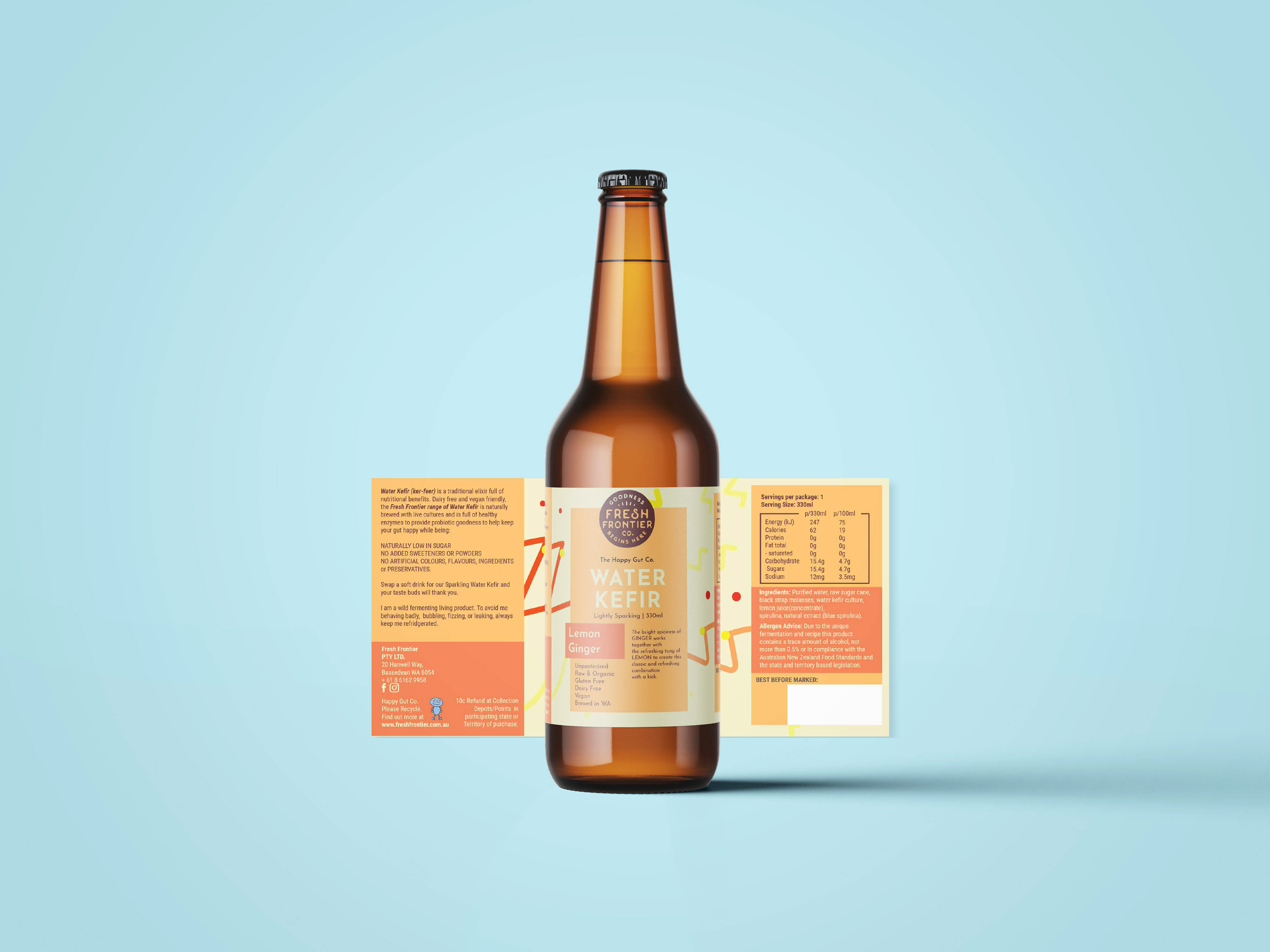
Below: my concepts as mock-ups. You won't be forgotten, water kefir project!
