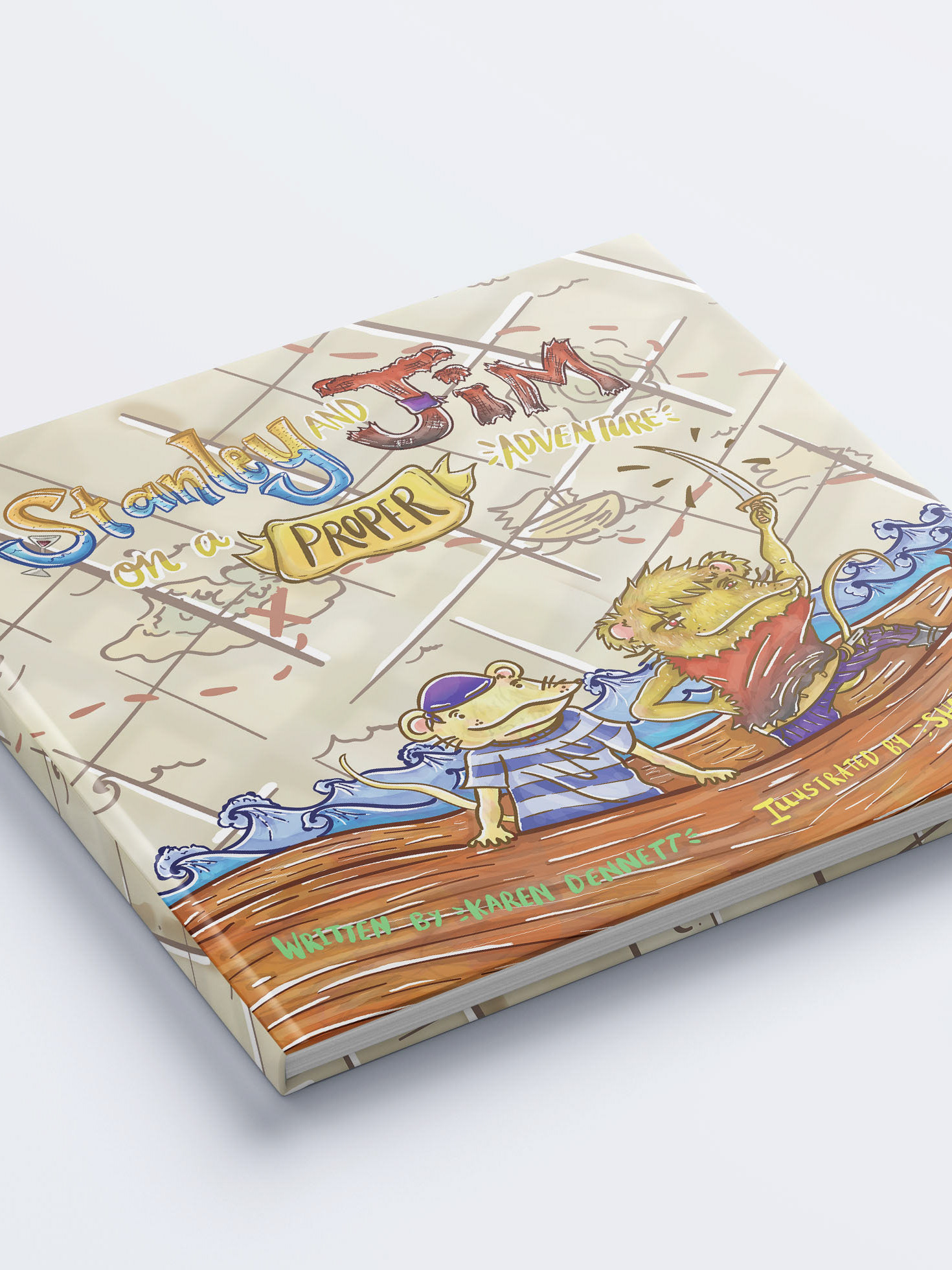
This project is in correlation to the Naked Salads & Kraut project as all these projects were assigned at the same time. This is also a rewind to late 2020, when I worked on multiple Fresh Frontier projects. I think it's a vital part of my design journey as I really started to get a hang of how to layout labels.
The schedule worked like this:
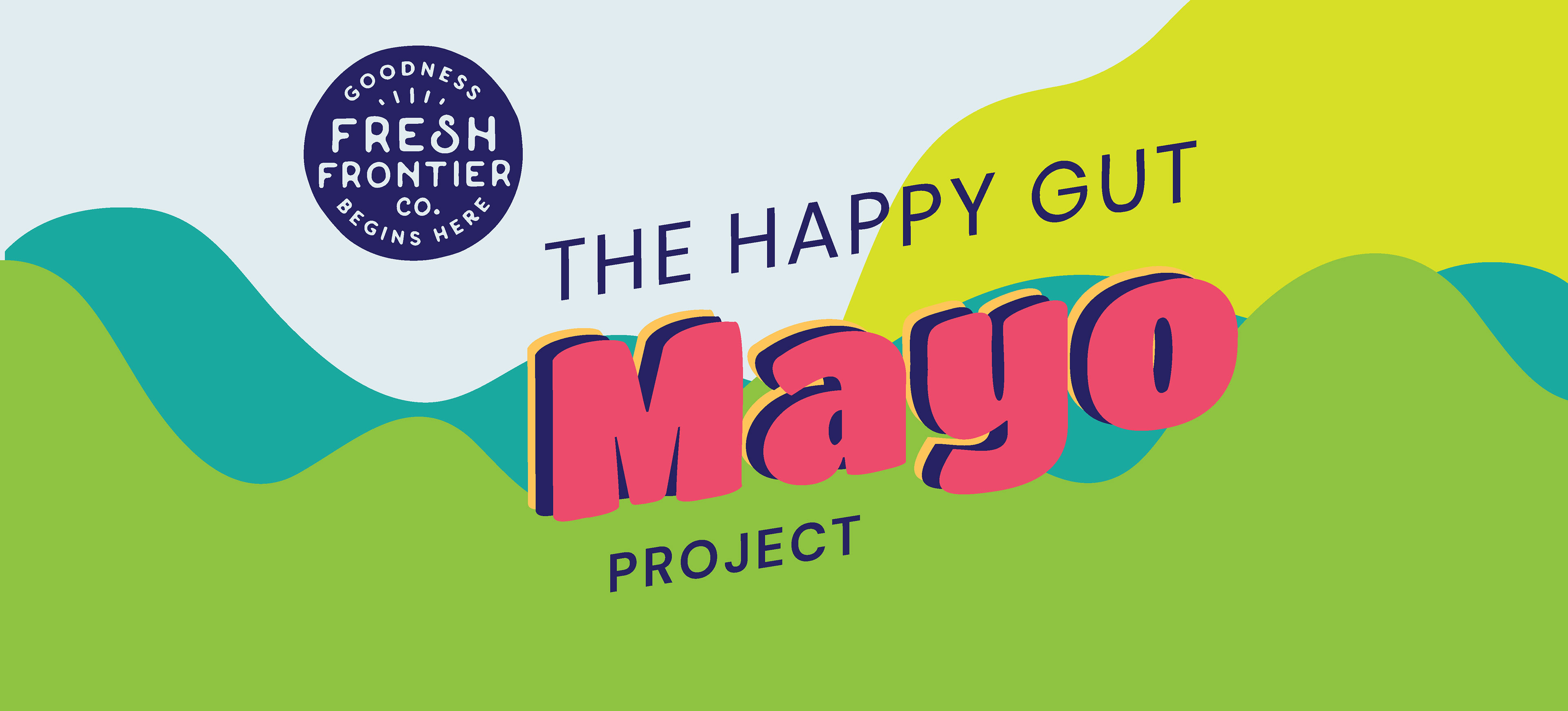
3rd week: Happy Gut Mayo Conceptual designs (I did 1 concept, and this is the project you're looking at)
From there they'd give us feedback for all and it would be a back and forth to finalise the design for print. This took several weeks after because of the waiting time for Fresh Frontier to get back to us.
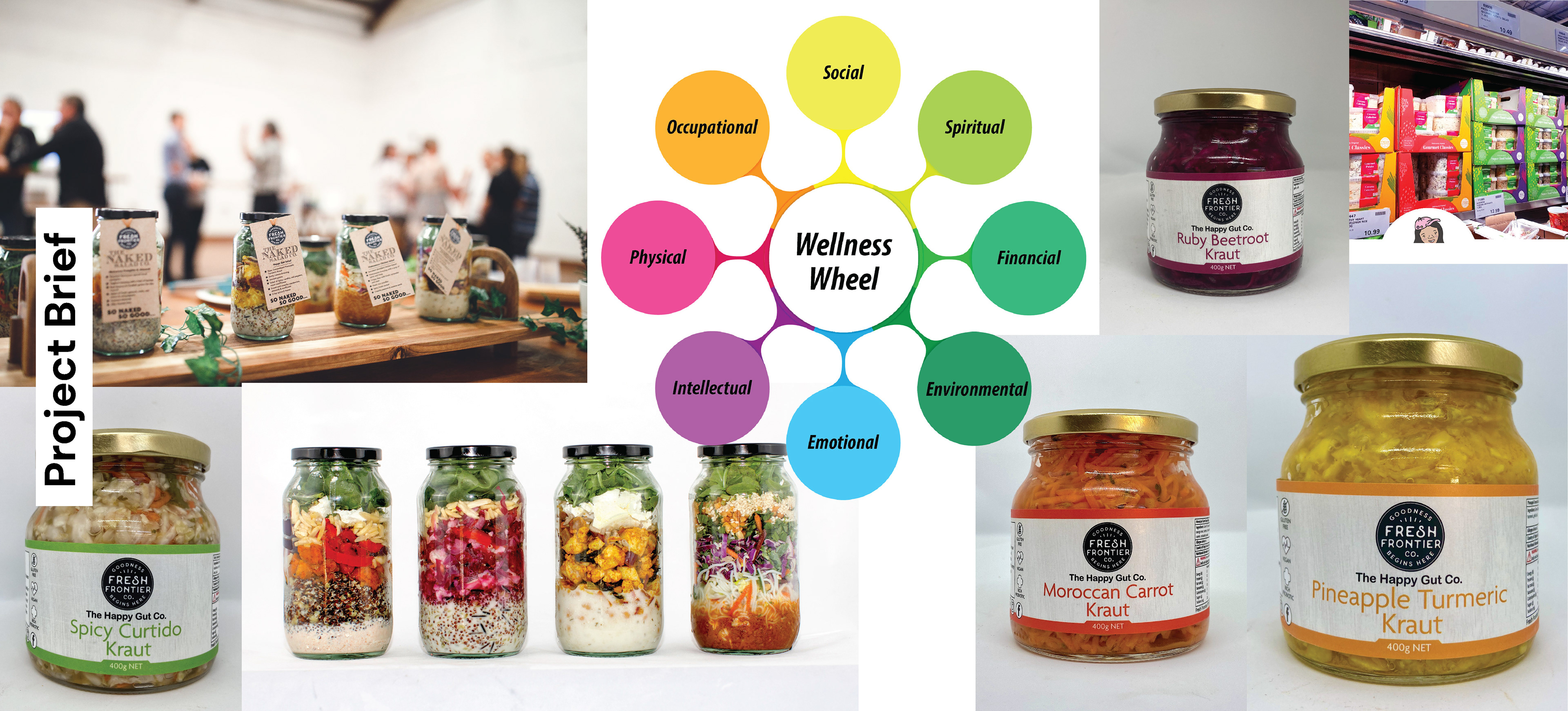
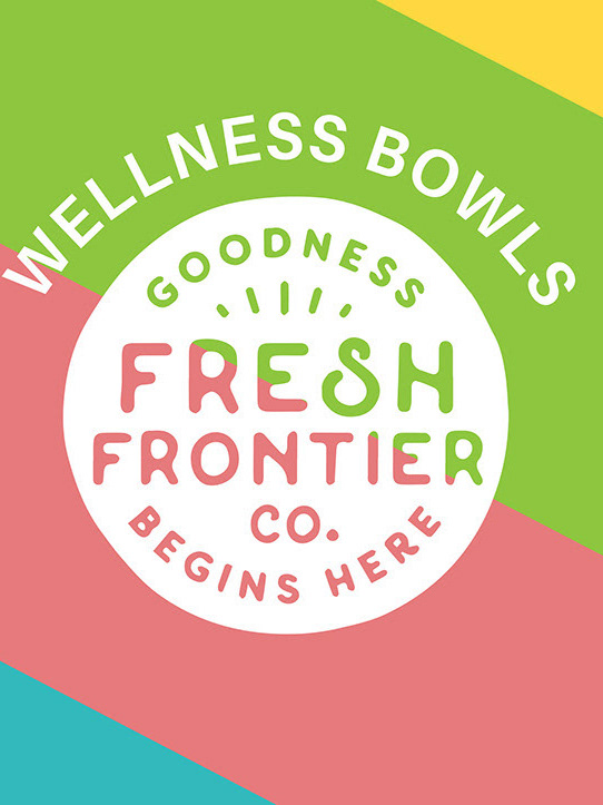
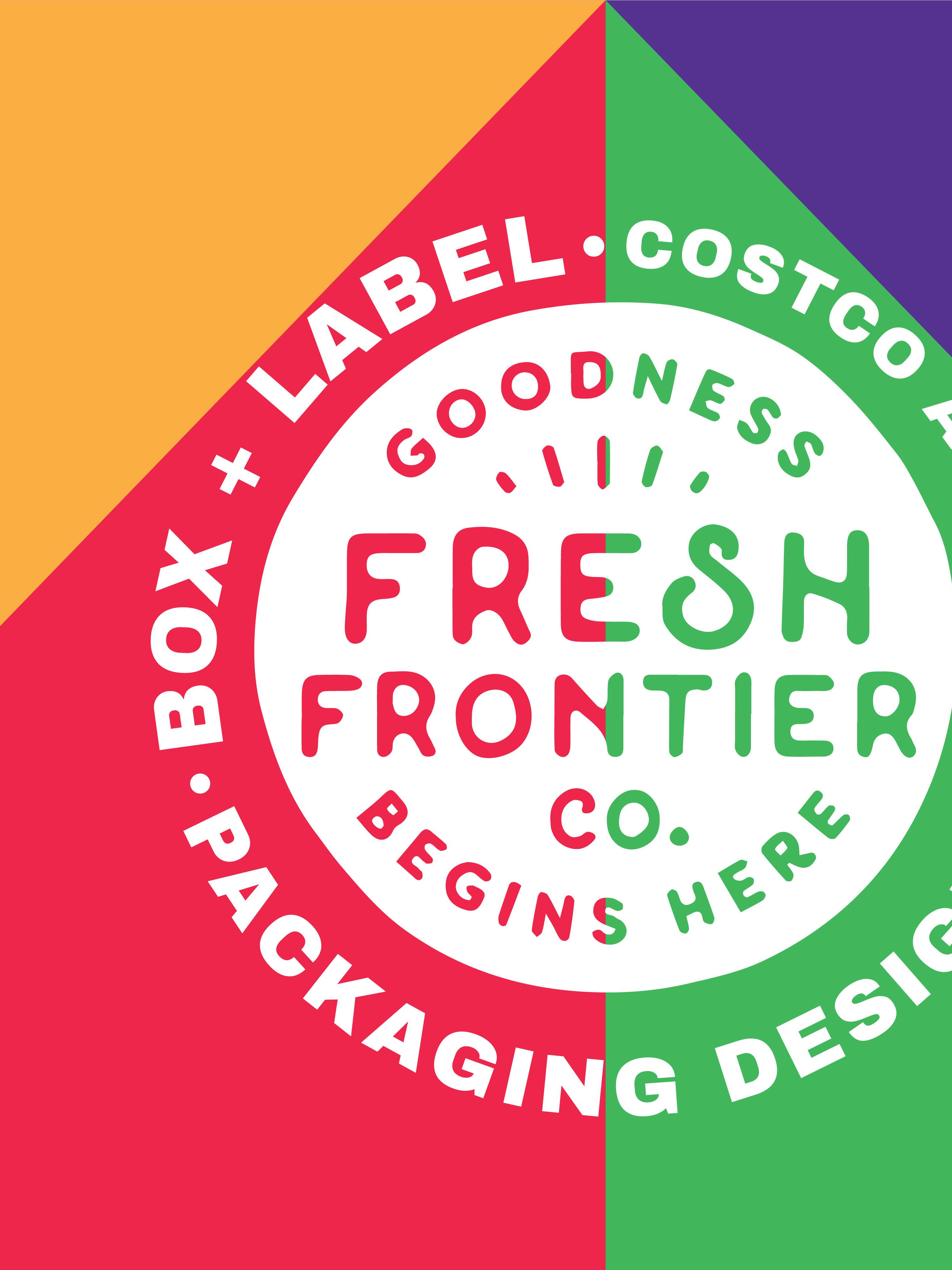
To recap, Fresh Frontier wanted to reinforce the "wellness wheel" into their retail packaging as a way to show the various benefits that wellness brings. It brings vitality and vibrancy to life and that is shown through the bright colours. They also think it helps them to stand out from their competitors as many of them tend to go for a minimal look.
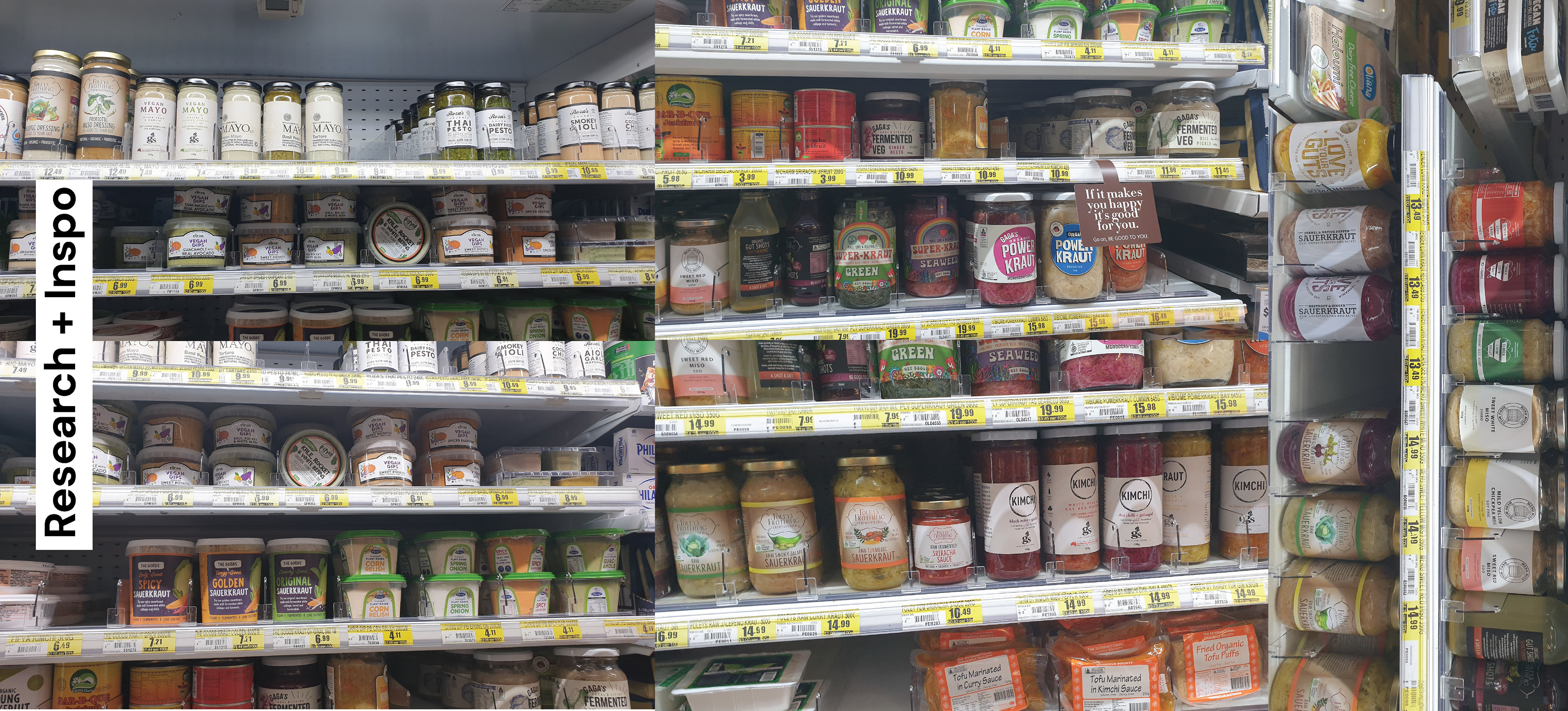
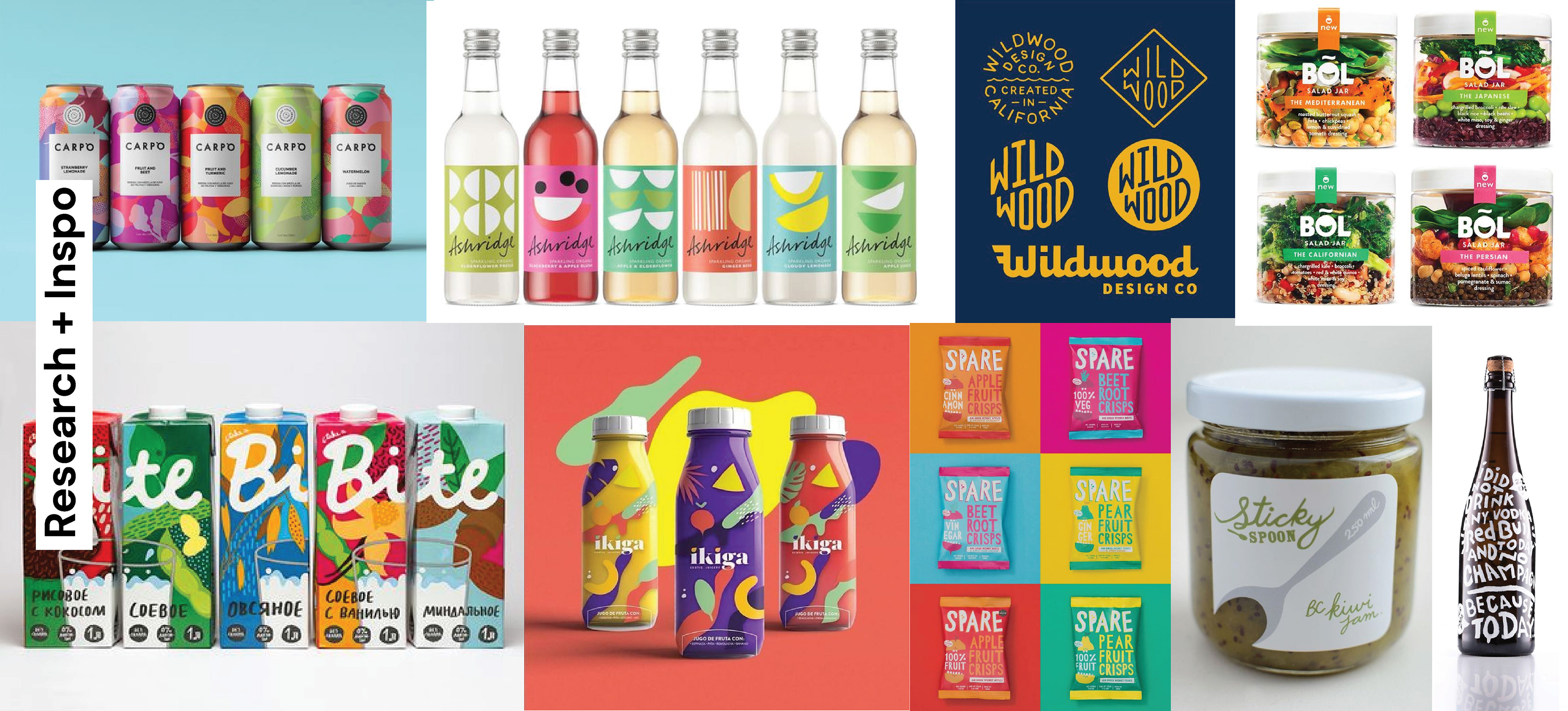
You might notice these banners from the previous project (Naked Salads/Kraut Jars) as the research correspond with this project too, the aim is to integrate colour, boldness and vitality to reflect the "wellness wheel" idea. This was specifically requested by the client. Previously, they wanted something similar to their wellness bowl, yet not exactly the same. Something to show it's still different from the other product ranges and have it's own unique look but still tie together with the "wellness wheel".
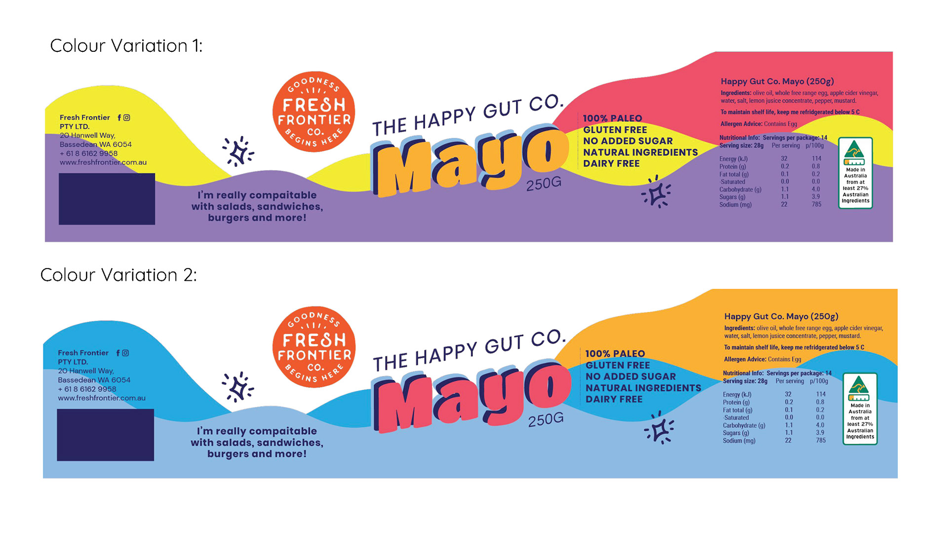
My initial concept was quite simple and I had fun experimenting with the typography which I wanted to be the main star of the label. I have put a more detailed rationale below for you to read if you want to see the why's of my design.

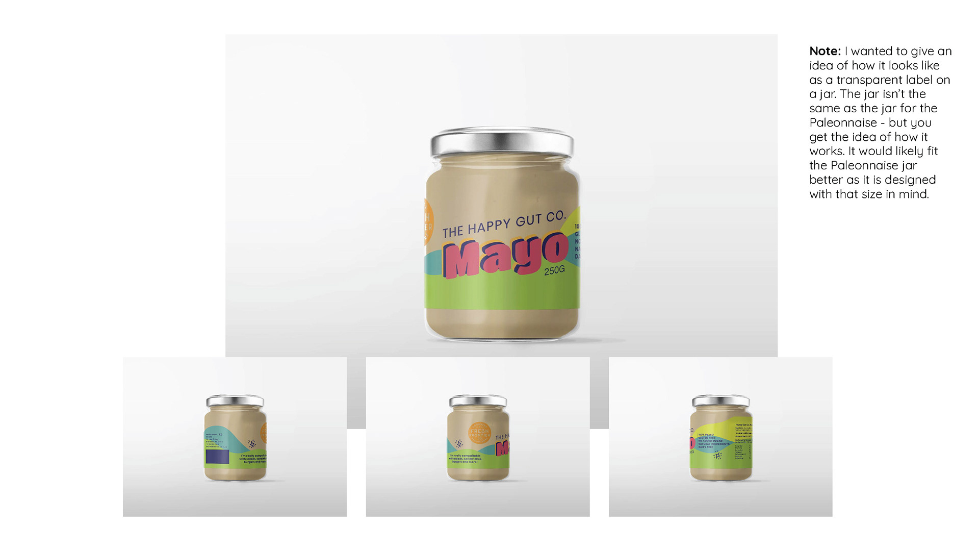
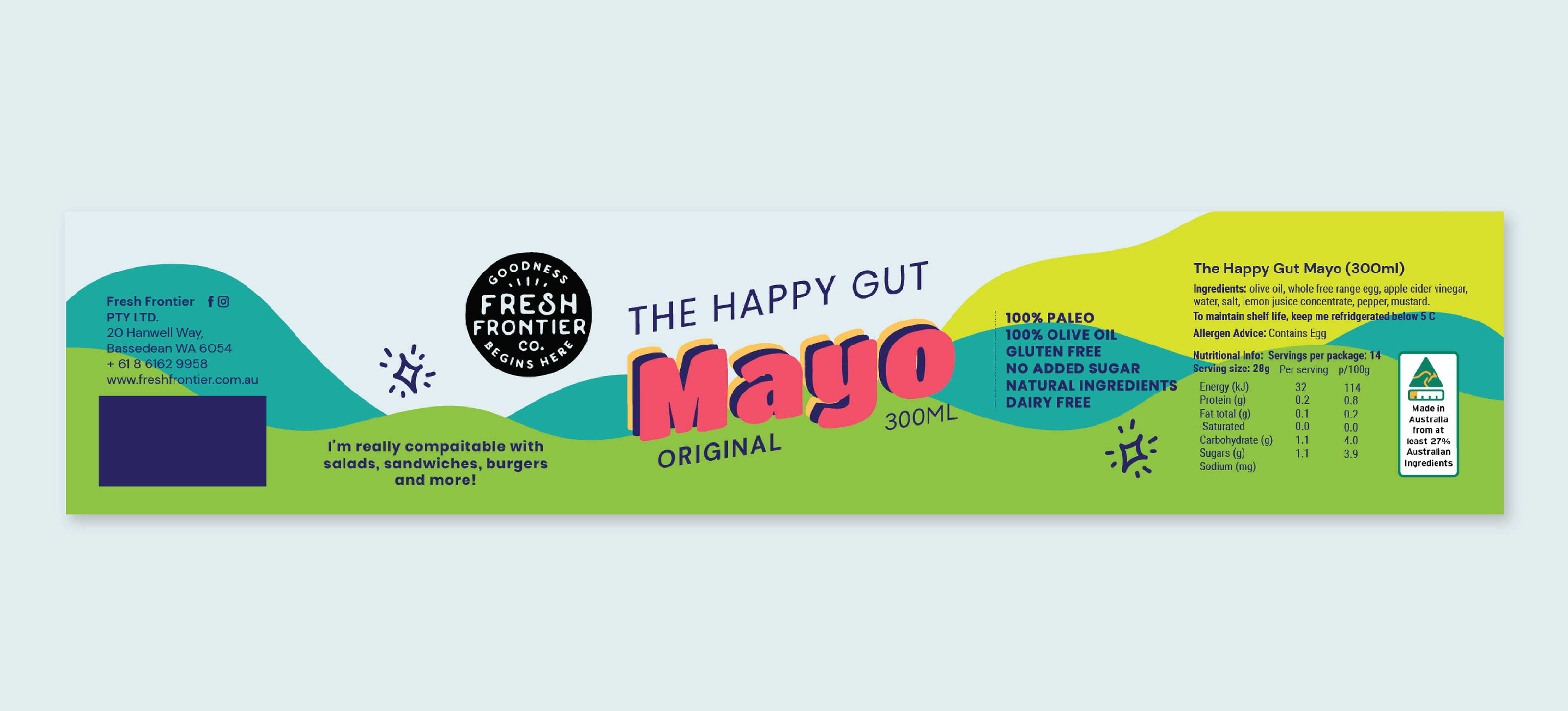
This design is originally made with the idea that the background would be transparent and the mayo inside would be the background. I had also supplied a couple of colour ideas in case they weren't happy with the colour choice I originally went with.
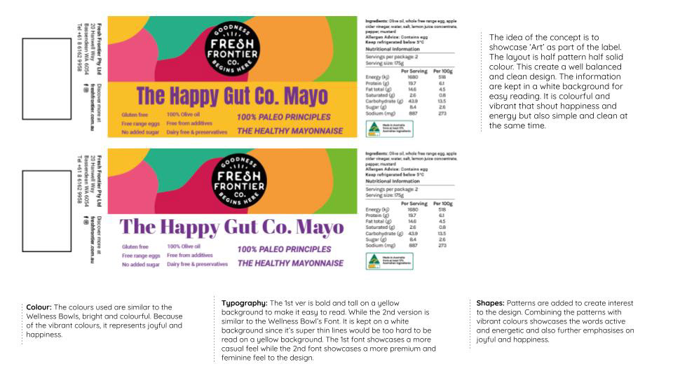
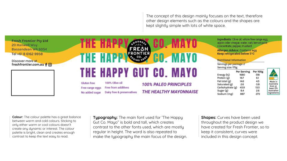
So I mentioned that I did 1 concept (above) but we (Plus 4 Creative at the time) delivered 3 concepts to the client in total. I worked with Ann Marie throughout the whole project so while I did 2 concepts for the Naked Salads & Kraut Jar projects, she did 2 concepts for this project. All credit goes back to Ann Marie for these concepts.
Fast forward, the client made their decision and woo hoo, your girl got this round! Jokes, but I was glad to hear my concept had some recognition. But with good reason, looking through all the work they've chosen, I can see why since it there's a common theme they enjoy. Still I had uncertainty whether mine would be chosen or not since I wasn't sure if I was hitting the mark. I felt reassured that I was able to capture the brief.
There was a few changes, albeit minor.
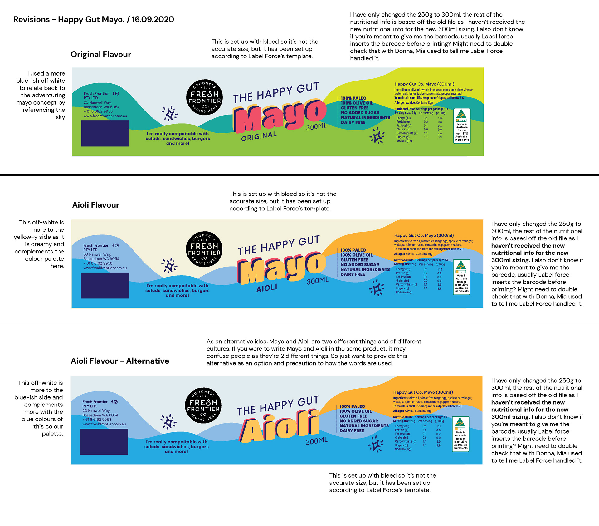
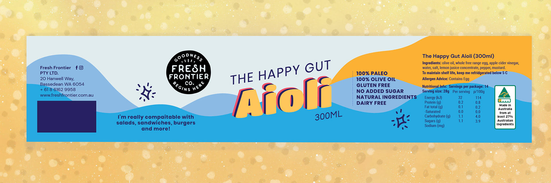
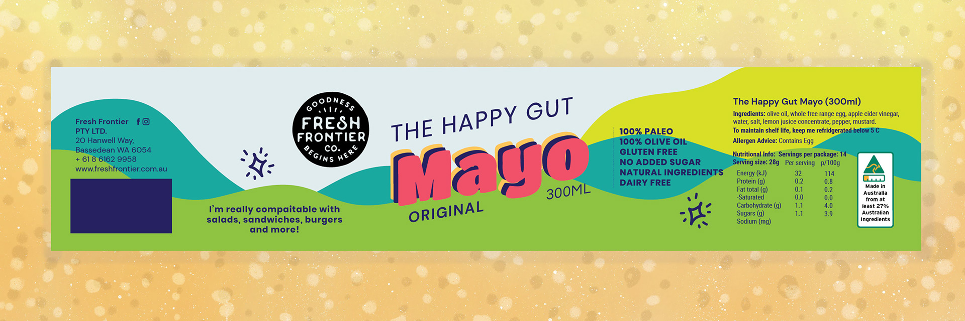
Unfortunately, they couldn't afford the transparent label, so they decided to request an off-white colour as the background. I came up with a few ideas which I also ended up sharing with Ann Marie so she could update the revised Naked Salads/Kraut Jars.
The one thing I suggested was that originally they wanted to have Happy Gut Mayo - Chipotle or Happy Gut Mayo - Aioli, which I suggested it is better to call it Aioli then Mayo - Aioli as some people are quite pedantic that there's a difference between the two. They were happy with my suggestion and ended up with the blue-off white.
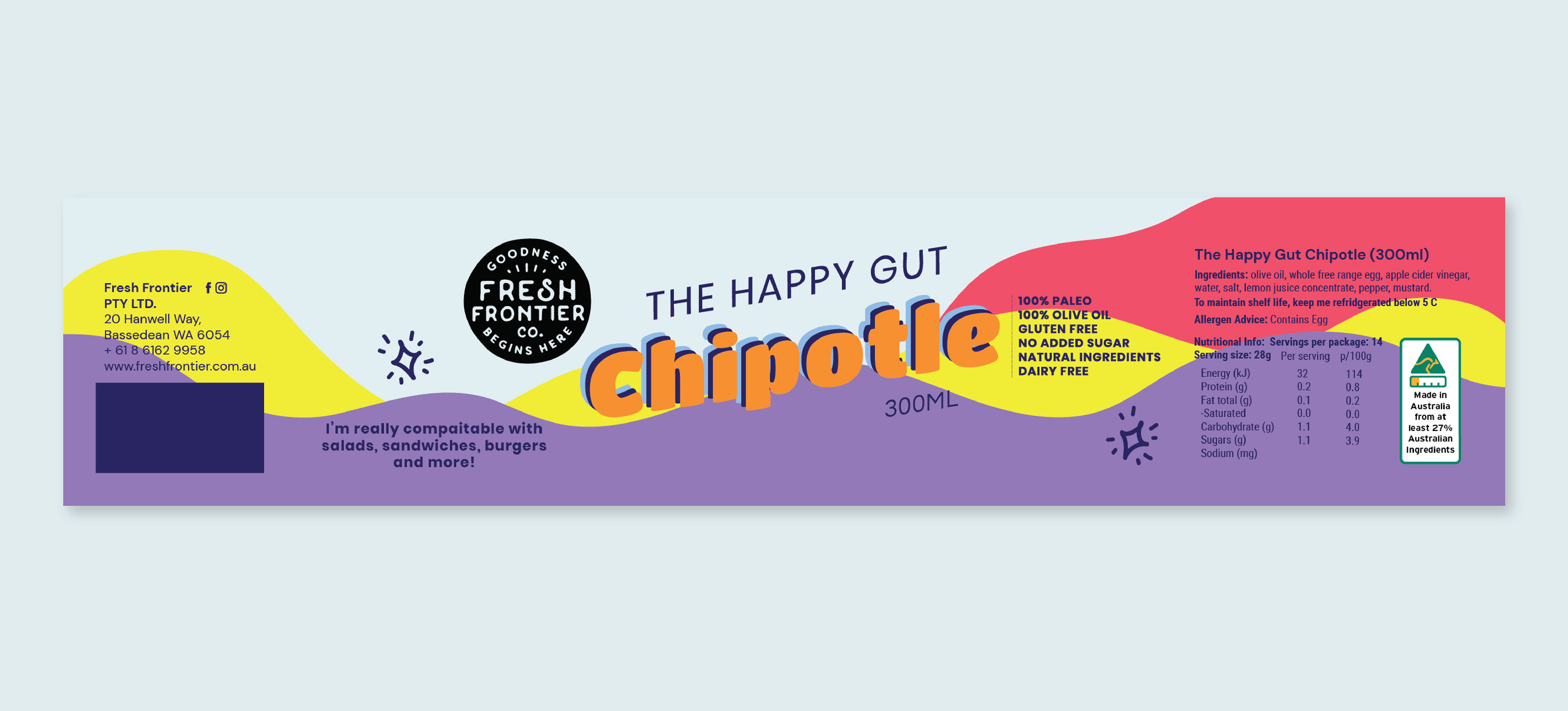

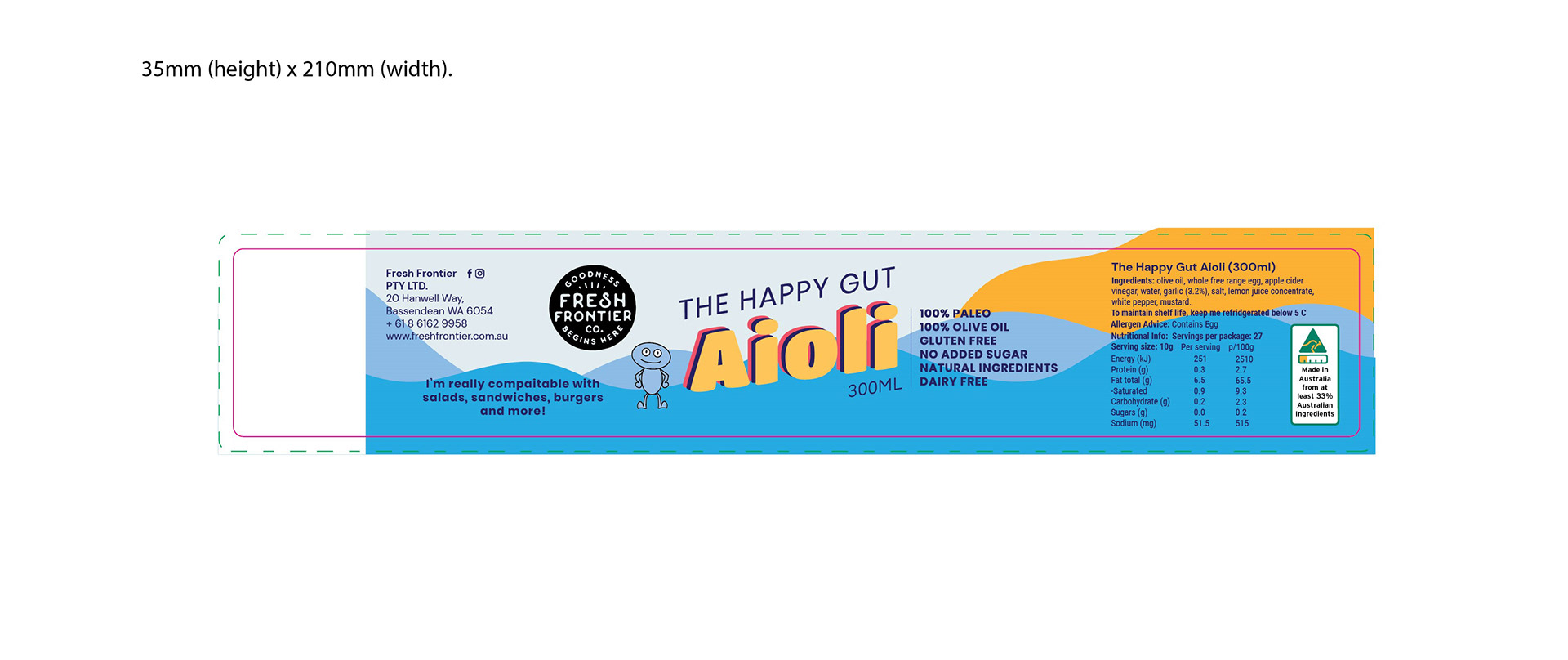
Above were the final revised designs for the label. The last revision was to squeeze the design smaller and have one whole side for the barcode. I also added their happy gut man (blue character) as it was the client's request that is added to all their "happy gut" products.
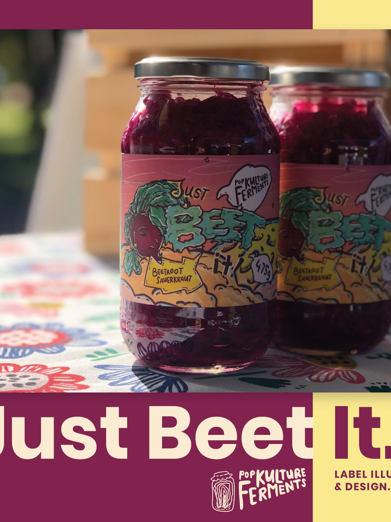
Some of these images belong to me and some are taken from Fresh Frontier's social media.
The stop motion video is made by me. You can see more content on my social media.
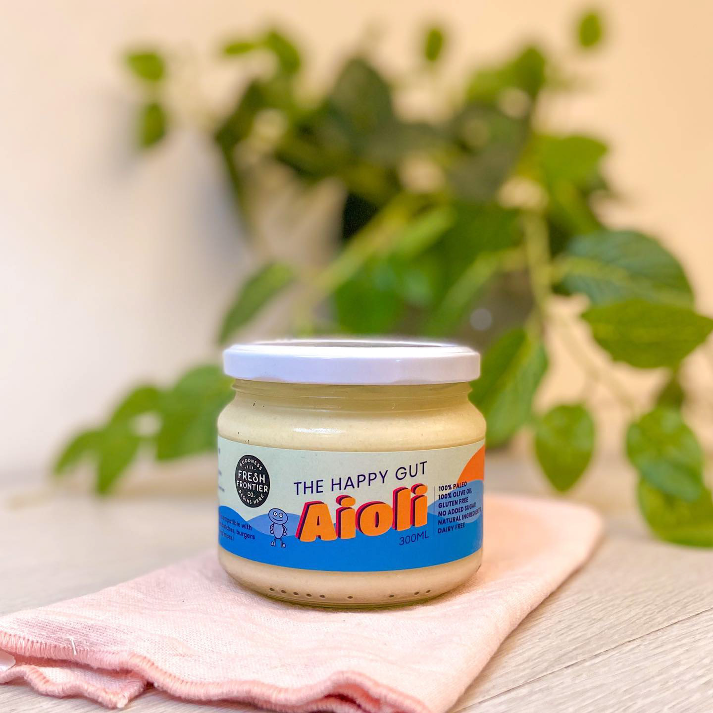
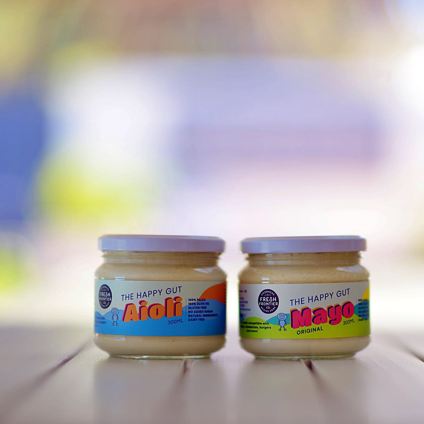

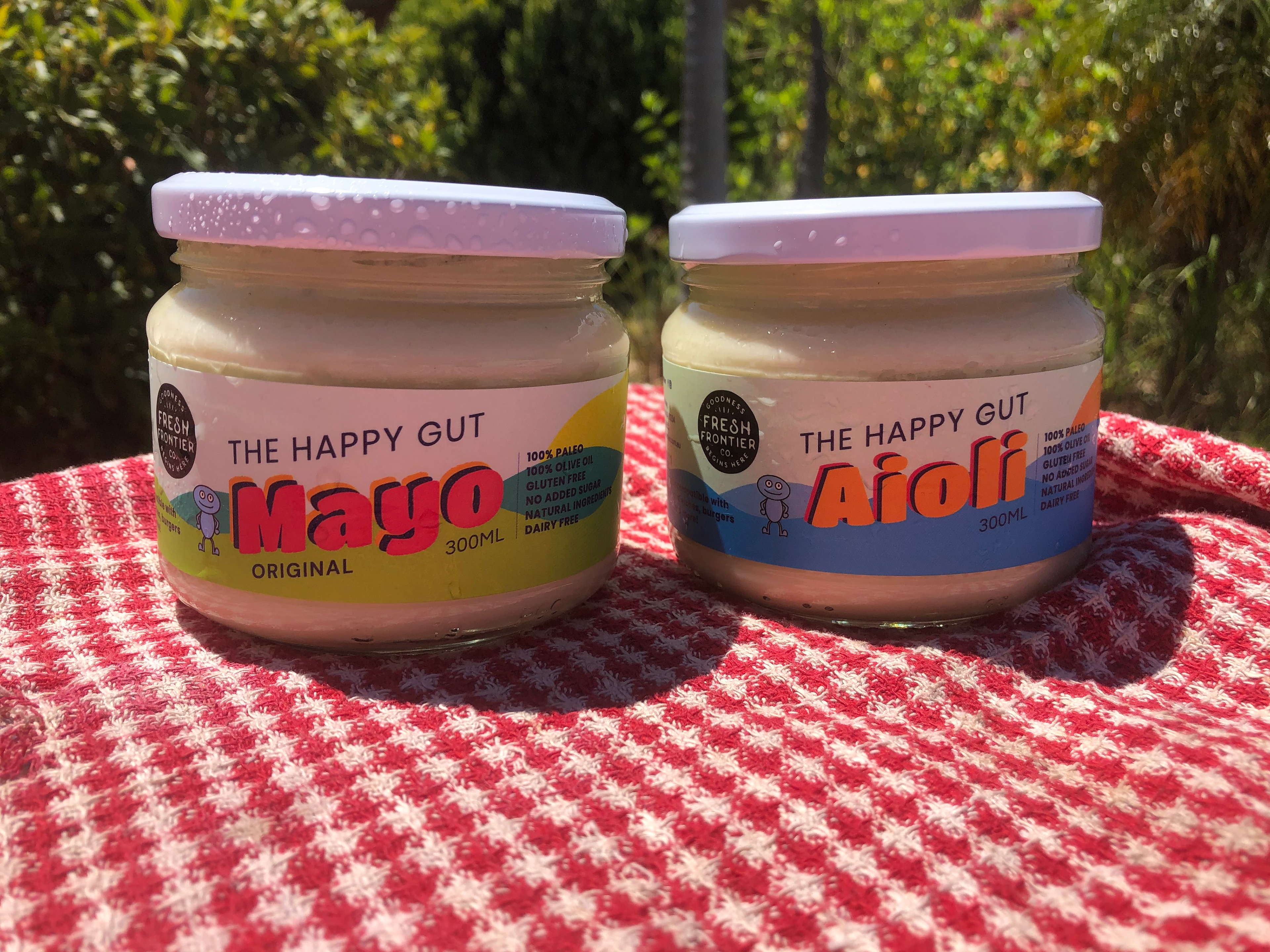
It's exciting to see the labels printed and used, but more so as a collection together.
Again, Fresh Frontier loves this idea of the wellness wheel and integrating that into their retail packaging.
The imagery below is from Fresh Frontier's social media.

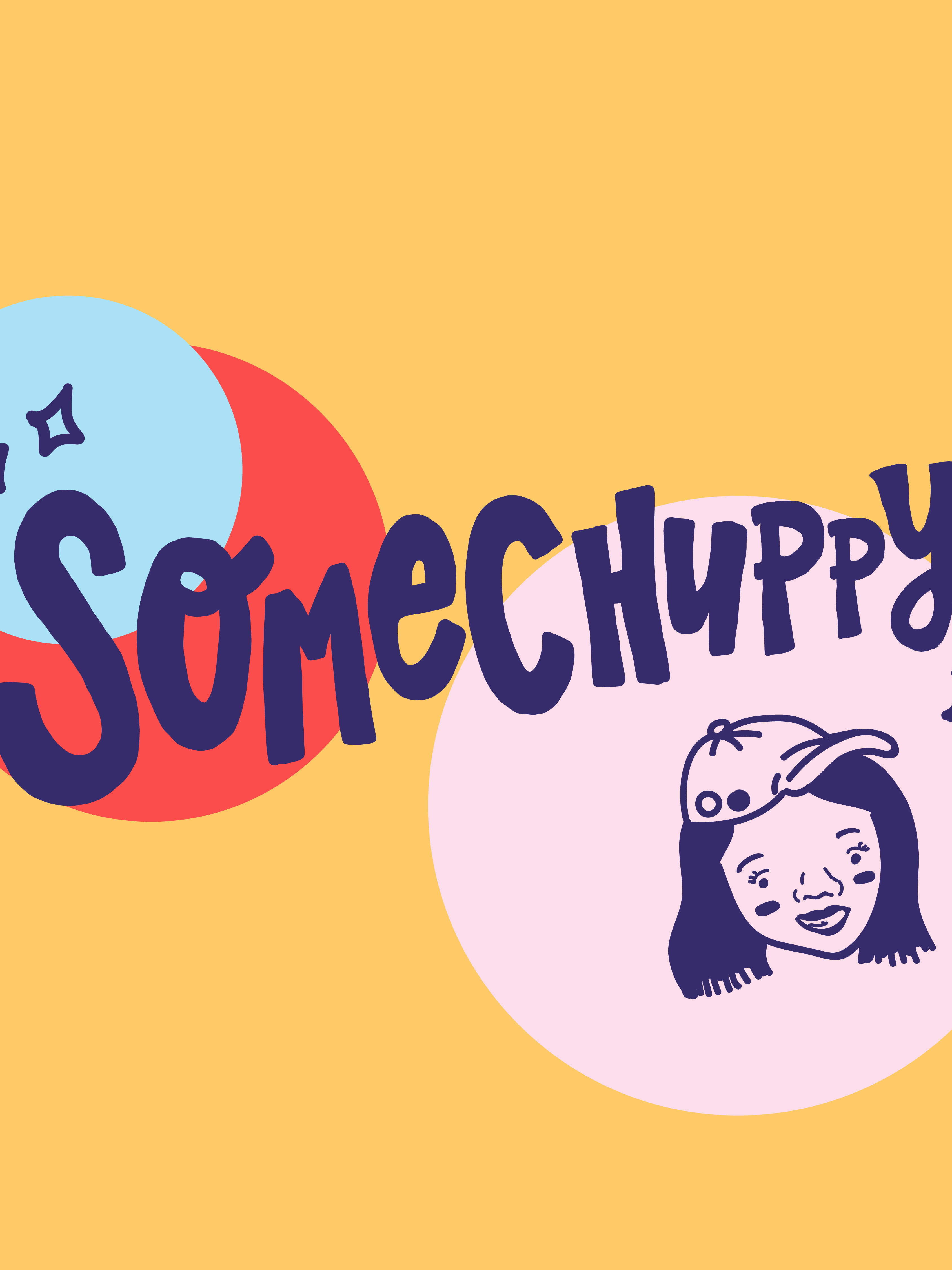
Below: social media imagery I made for presenting this project.

Thanks for viewing this project! I'll be sharing a couple more projects from the backlog, especially there are some where I've done some fun collaborations with other creatives!
Look forward to the next one!~