This is a continuation from working on the Pop Kulture Ferments project.
Who is Pop Kulture Fements, you may ask?
Pop Kulture Ferments is about sharing nourishing plant-based food and the spreading awareness about the benefits of fermentation. As a start-up business, Pop Kulture needed help with their brand identity, website, and social media marketing materials.
Tessa is the founder and sole trader of Pop Kulture Ferments, where she shares her passion for gut health and fermentation. A true believer in its benefits, she educates other people through fermentation workshops while continuously experimenting new funky flavours for the public to enjoy so they can benefit from amazing gut health.
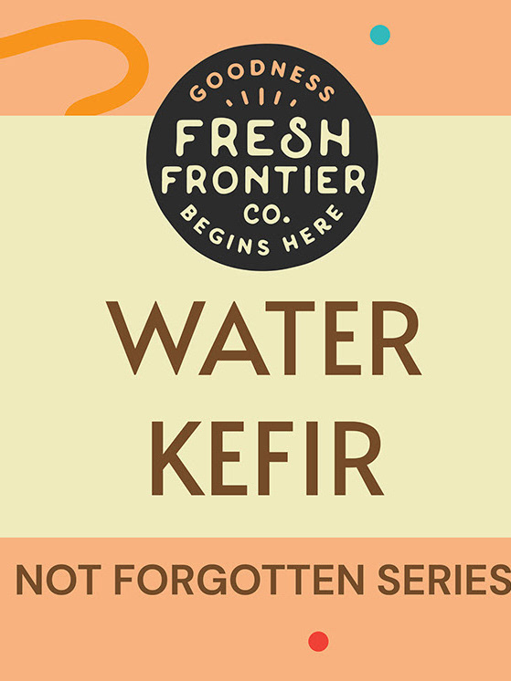
What was next on the agenda? Labels.

What's the issue here?
The design was created when Tessa first started her business. Since the completion of her new branding, she wanted her labels to represent her personality more accurately and found the previous designs to be too clean missing an organic feel about it. She also wanted to add more expression through the labels and reference it back to the ideas of "pop culture". The last major issues included essential info being too small to read and that the designer she worked with was based in another state making communication difficult.
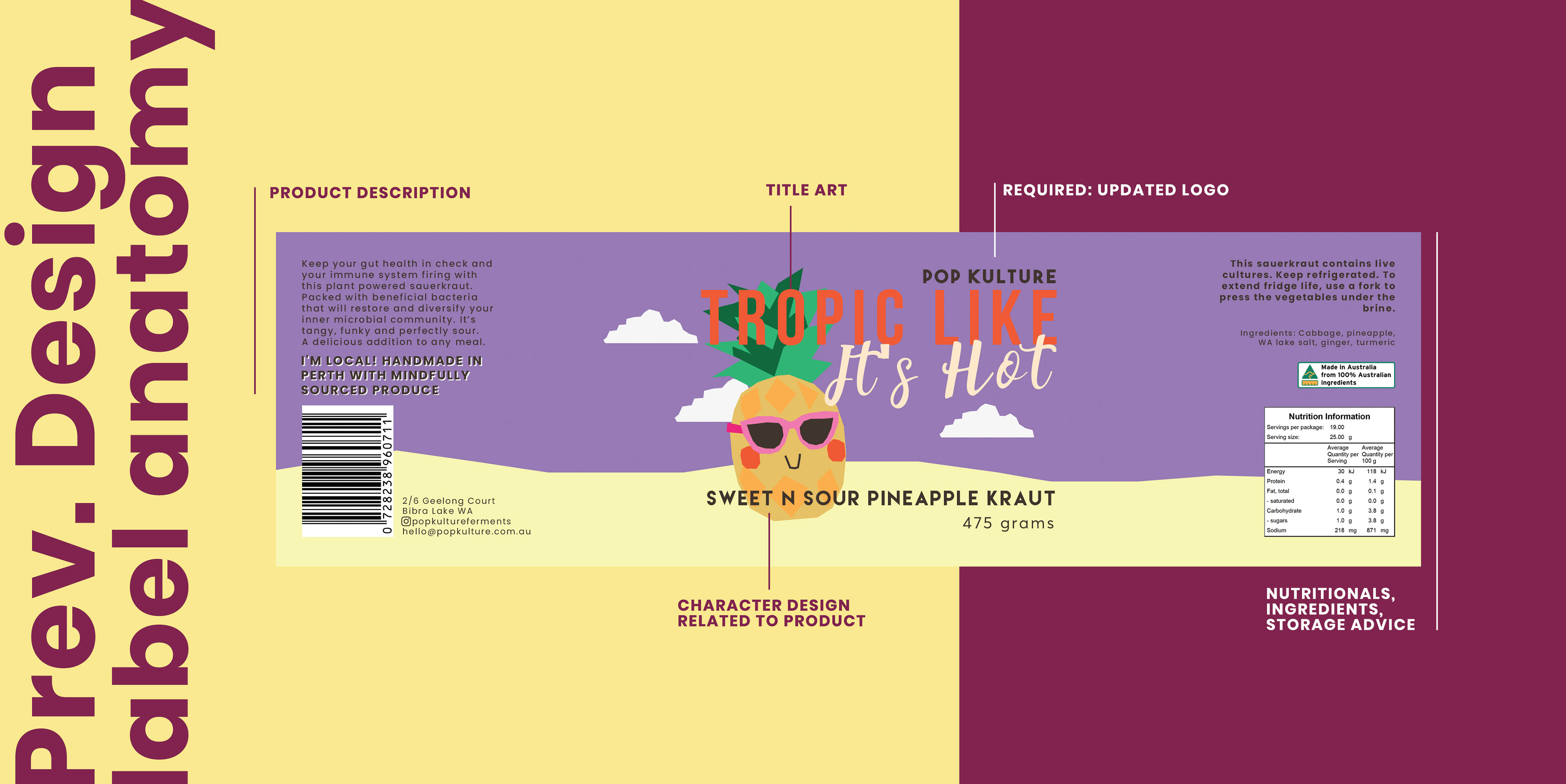
There are a few things that was requested to keep the same. This included the character design that represented the product, title art related to the product and structure of the information being on each side. At this time Tessa was on the fence on whether she wanted this style or a new illustration style for her labels. She just knew that she wanted the label colours to contrast and go well with the kraut ingredient colours.
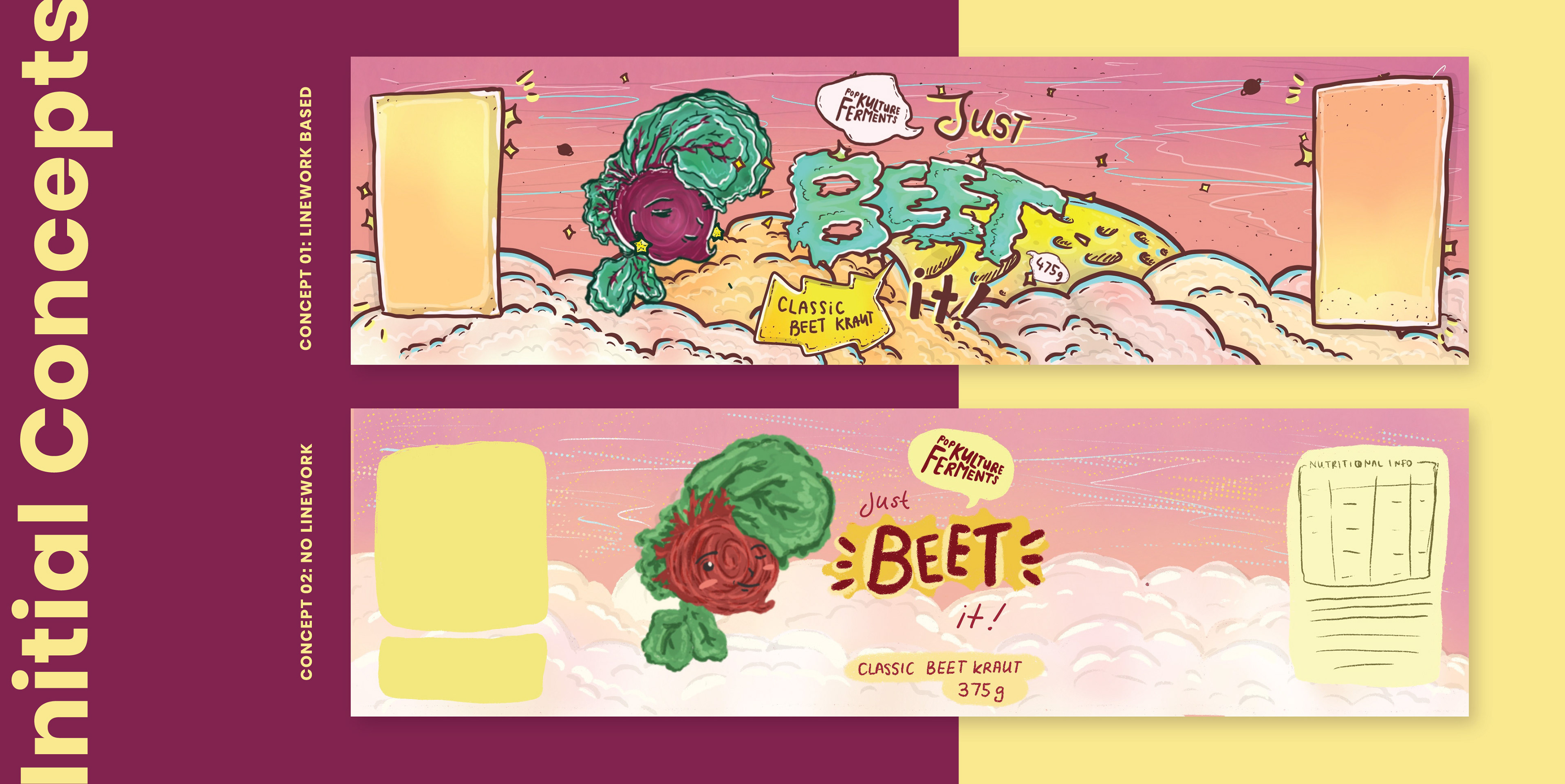
I decided to provide her 2 concepts, one concept was similar and close to the previous designs (concept 02) however featured a gritty texture to give an organic feel. The other was more comical and featured heavy linework (concept 01). At that time, this was considered my main illustration style and decided to suggest the style as I felt it provides boldness allowing the design to pop and stand out, but also feels down to earth and grounded.
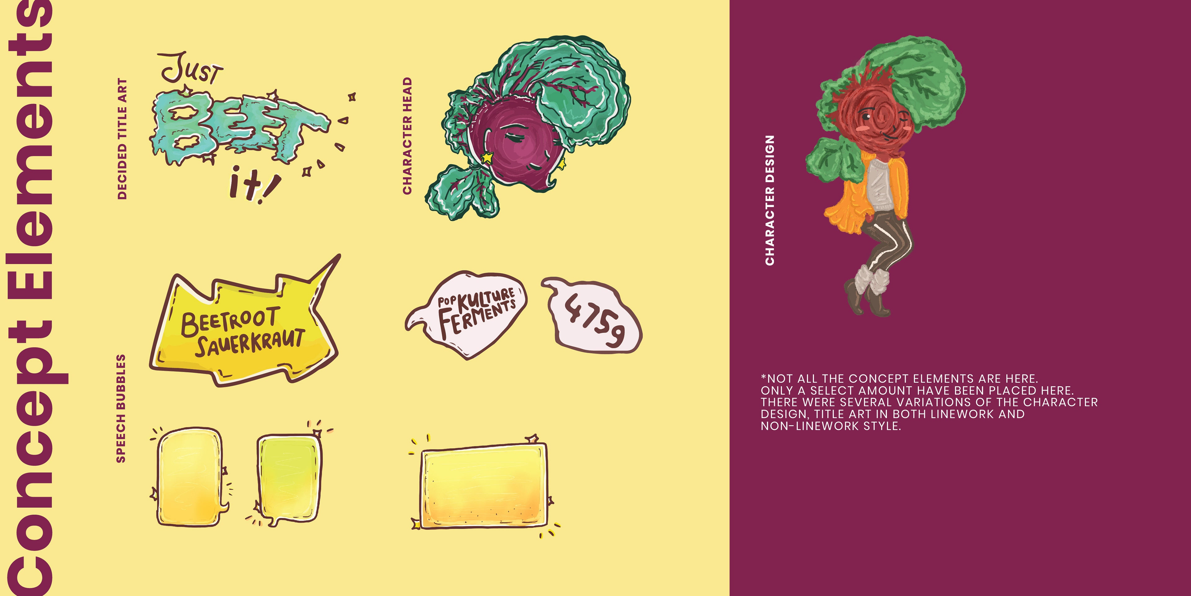
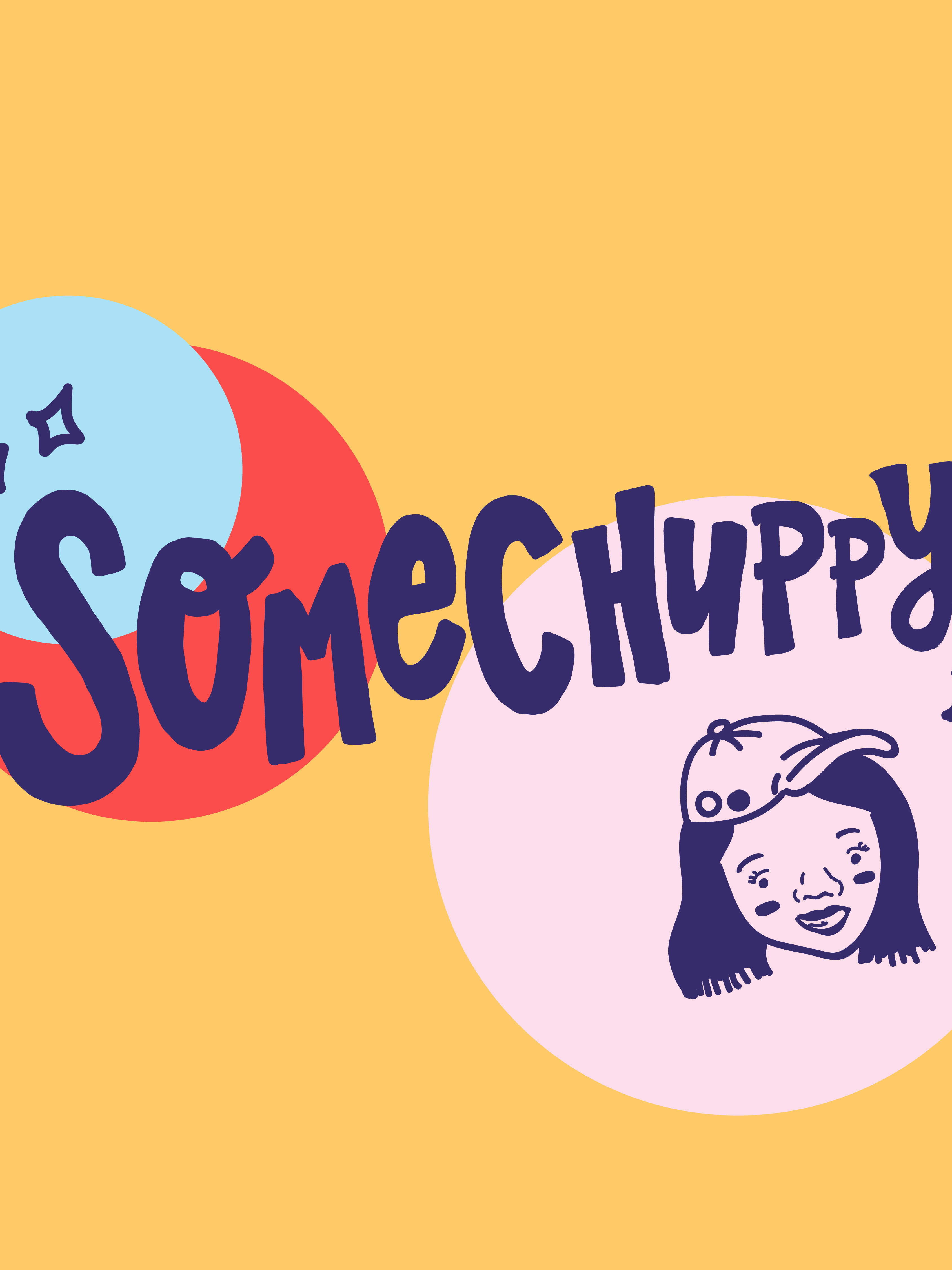
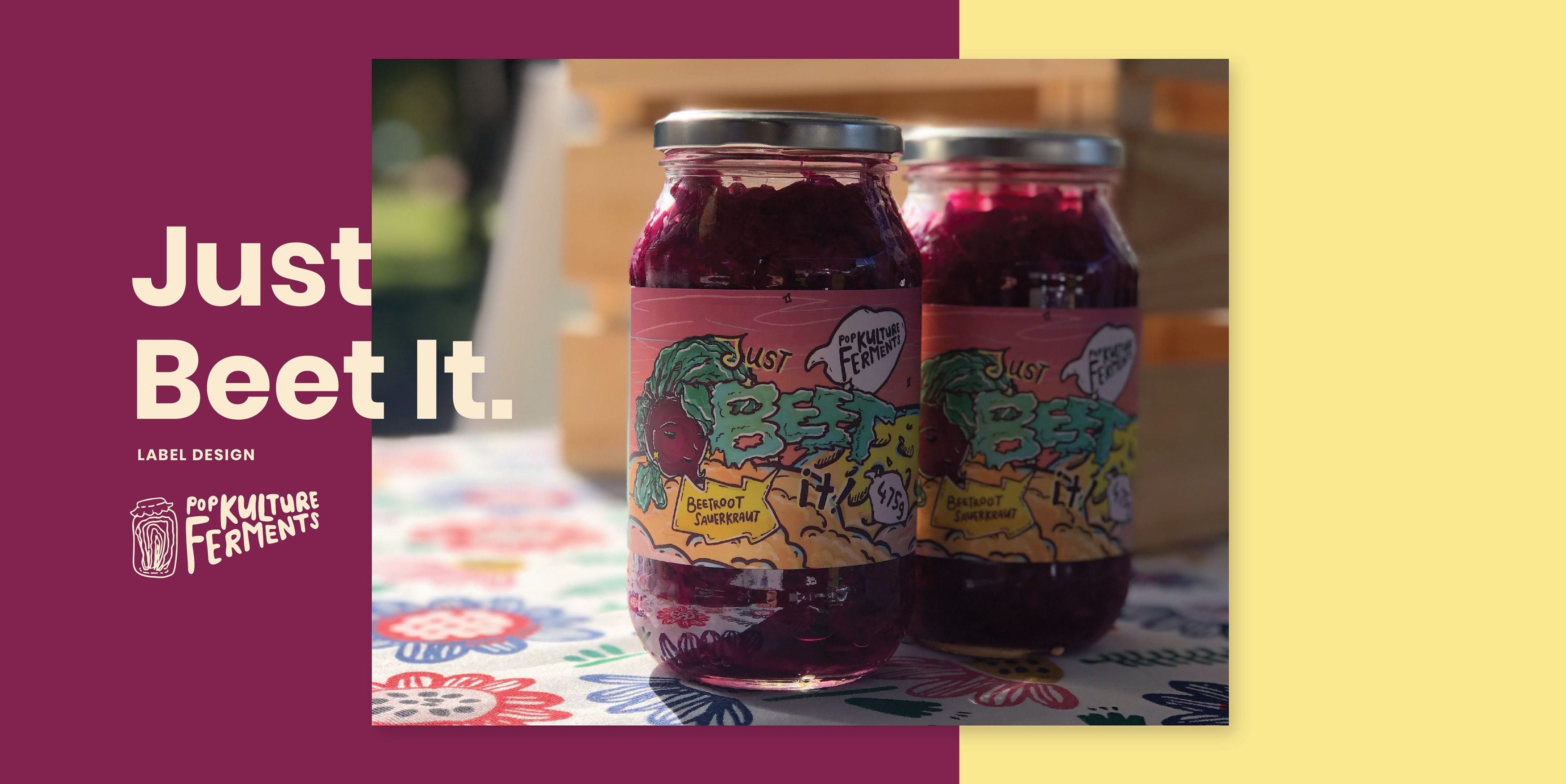
This is an added bonus, showcasing the separate illustration elements involved. Not all are present here, but you get the picture. Originally the beet character was inspired by Michael Jackson (a reference to his song Beat it!) , however at the time MJ was facing huge controversies in the media and we mutually decided to cut the body and just use the head of the beet. This keeps things open to interpretation and somewhat ambiguous, yet it's clear it's related to the product. As for the dreamy sky, disco-themed look, this was suggested by Tessa as she wanted each label to have a different mood/vibe. Almost like a landscape to take you somewhere. I decided to bring it back to the title art so that it has a fun, dancing theme to it.
So.... what does the design look like now?
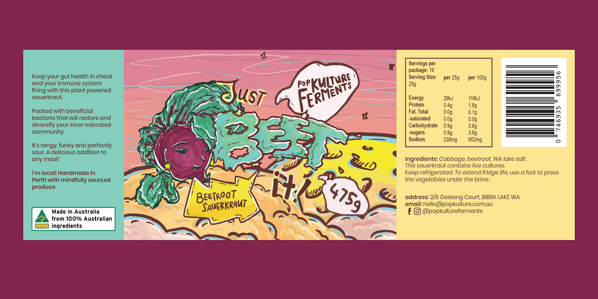
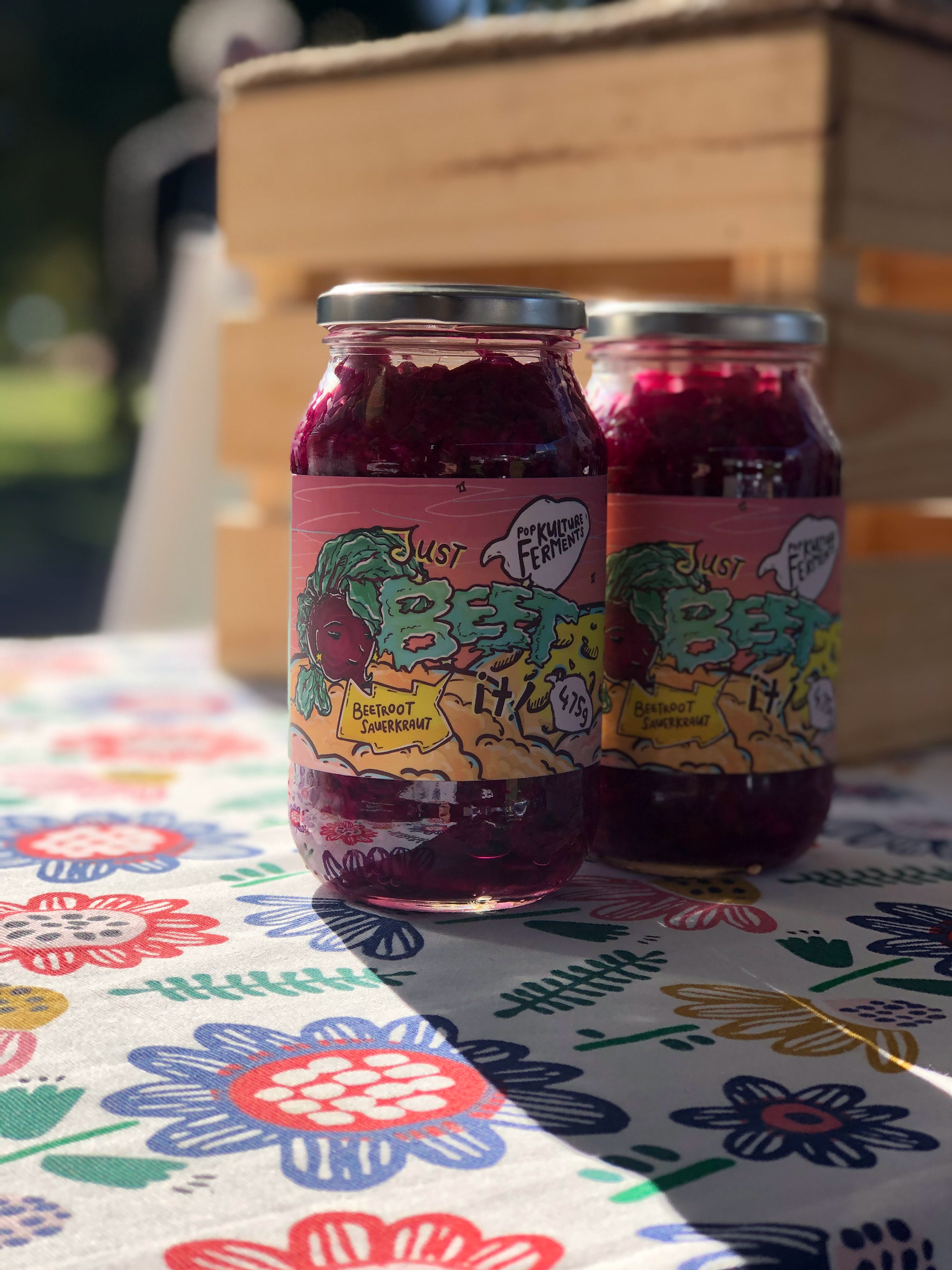
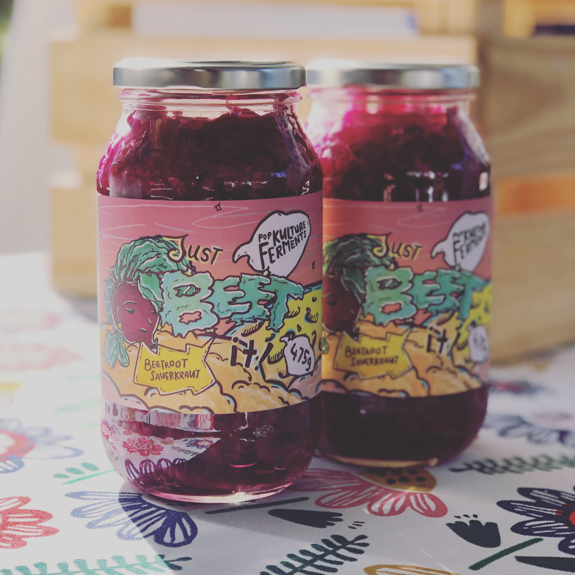
In the end, Tessa chose concept 01. After a couple of test prints, I re-arrange the layout so that the text is legible. It meant that some of the illustration may have been cut away, but it's very important to have the essential information be legible for Tessa's customers.
The final product is exciting, because I never thought it would go so well with the dark red beetroot inside! It's great to see it out in my local farmer's markets!
This video was created when I was in Plus 4 Creative with the help of my colleagues.
Get to know Pop Kulture Ferments more at her website, www.popkulture.com.au
and check out her products at her online shop: shop.popkulture.com.au
and check out her products at her online shop: shop.popkulture.com.au