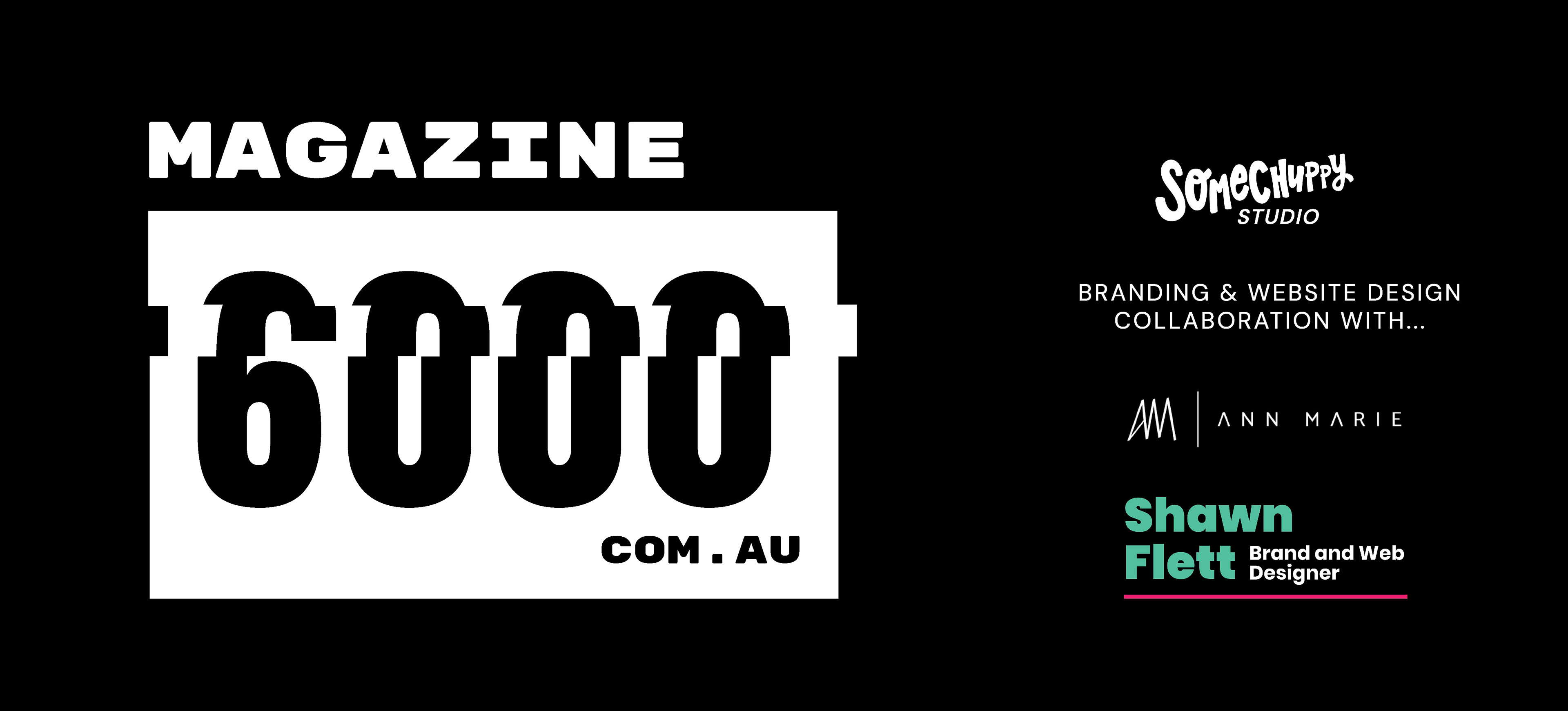
Magazine 6000 is the first project I took on as SomeChuppy Studio and right after the closing of Plus 4 Creative (the partnership business I was formerly part of).
I decided to work alongside some of my former business partners from Plus 4 Creative for this project. Ann Marie, because this project wanted to achieve a minimal, black and white, edgy and sophisticated look, which was definitely up Ann Marie's alley and Shawn Flett because he could do both web design and web development, which is perfect for this project since the client was looking to open an editorial website.
Before you enter.... this is a disclaimer that this project entry goes through the journey of this project from drafts to finished piece. It only includes my process work and not the collaborators.
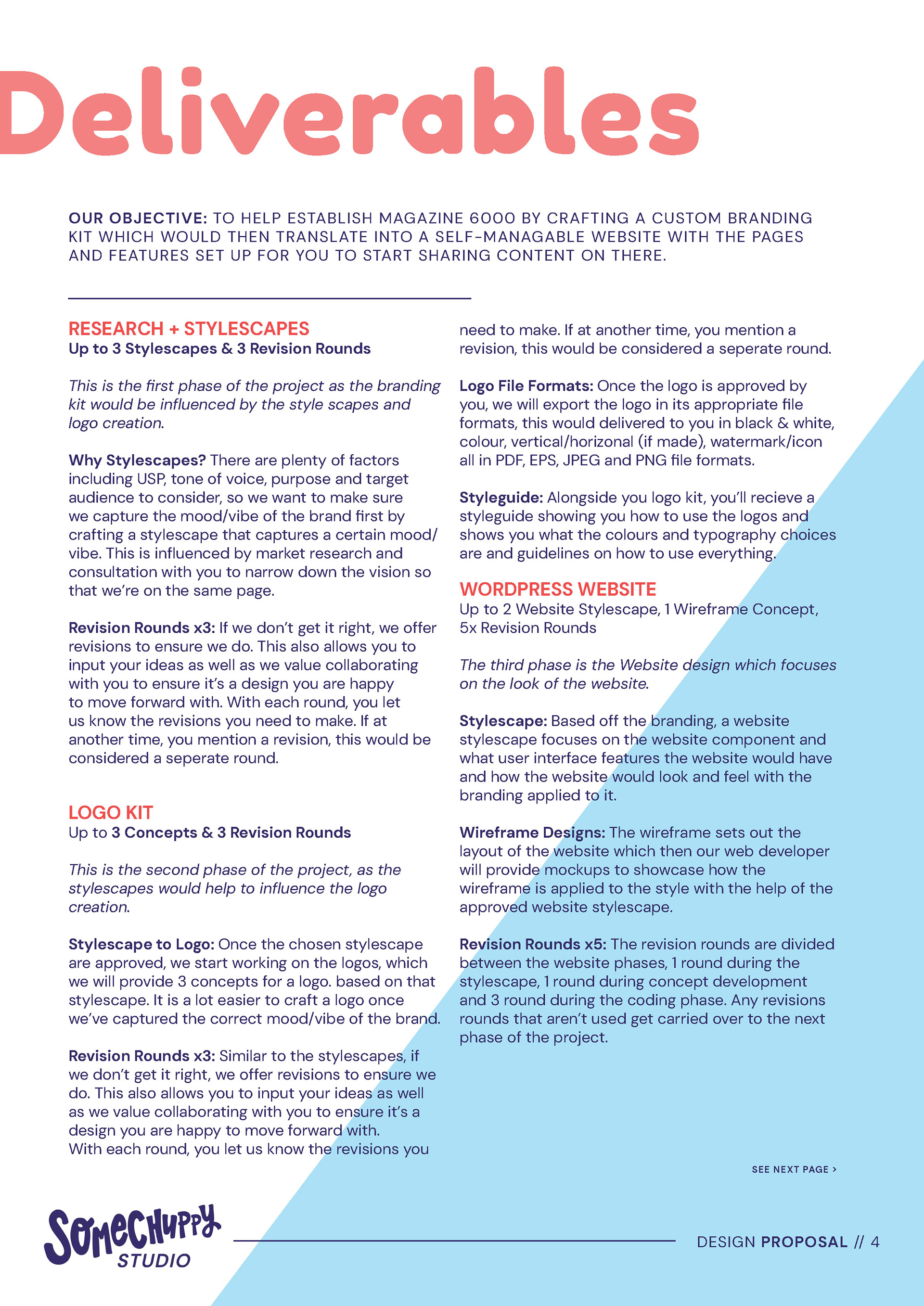
This was the initial brief, which I condensed multiple meeting notes into one proposal brief to confirm that the client and I were on the same page. I have cropped out the client's details for their privacy reasons, but there will be a link to their website and social media to check out at the bottom of this project entry!
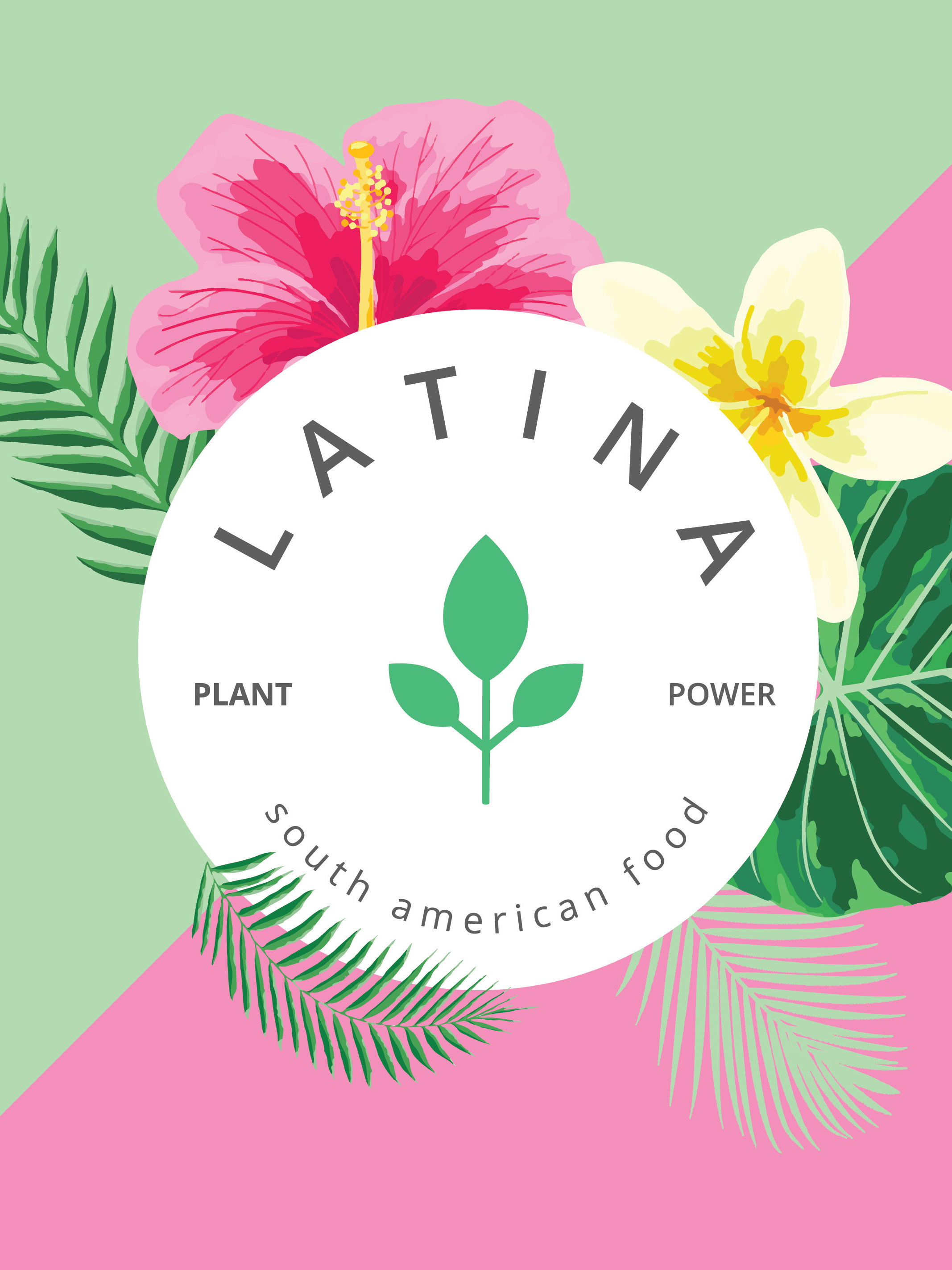
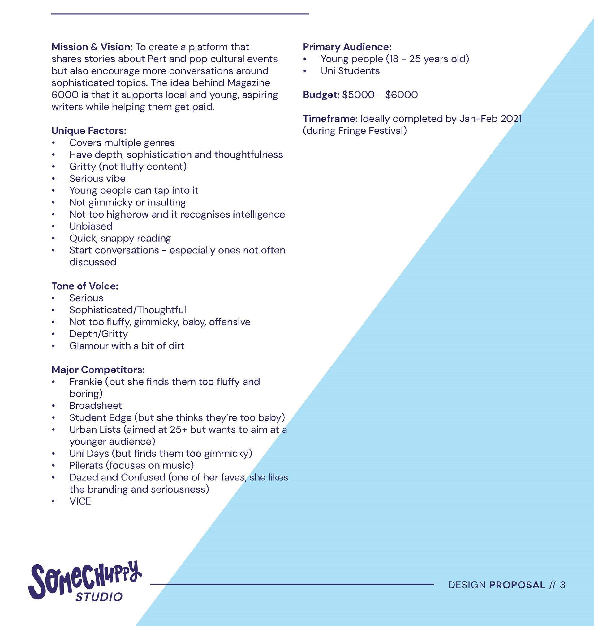
In a nutshell, the client, Holly, wanted to open an editorial website that was inspired by DAZED & CONFUSED, VICE, Complex, Broadsheet, etc. as she wanted to share local journalism and start conversations with her platform. She was looking for branding and an editable website from us. A non-negotiable was that it definitely had to be a black and white design. My initial reaction was that this was going to be a challenge since I had always been designing with colour, at the same time, I was excited to try something different.
I decided to include more pages of the original proposal because as I was managing this project (the client went through me) and I hired Ann Marie and Shawn on the basis that they would be the right fit for the project, I did want to try a new process different to Plus 4 Creative. This new process would trial a "stylescape" phase, something I picked up from The Futur.
The Futur has a good video showing how the stylescape was useful. (If you don't know what a stylescape is, click the links!)
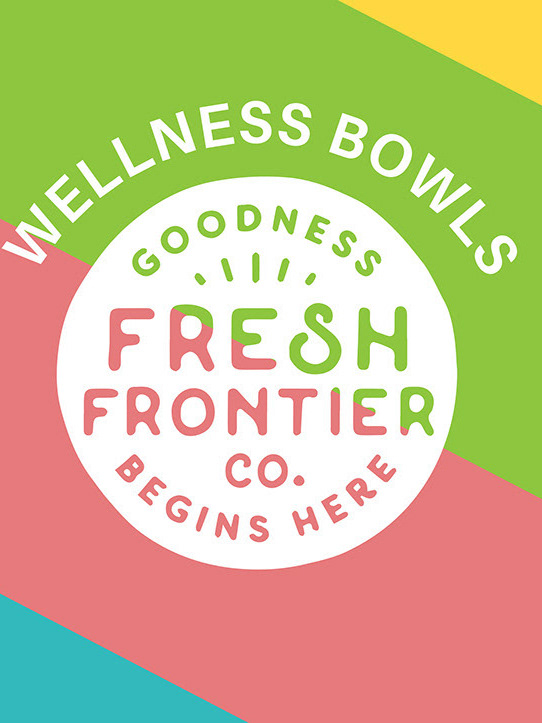
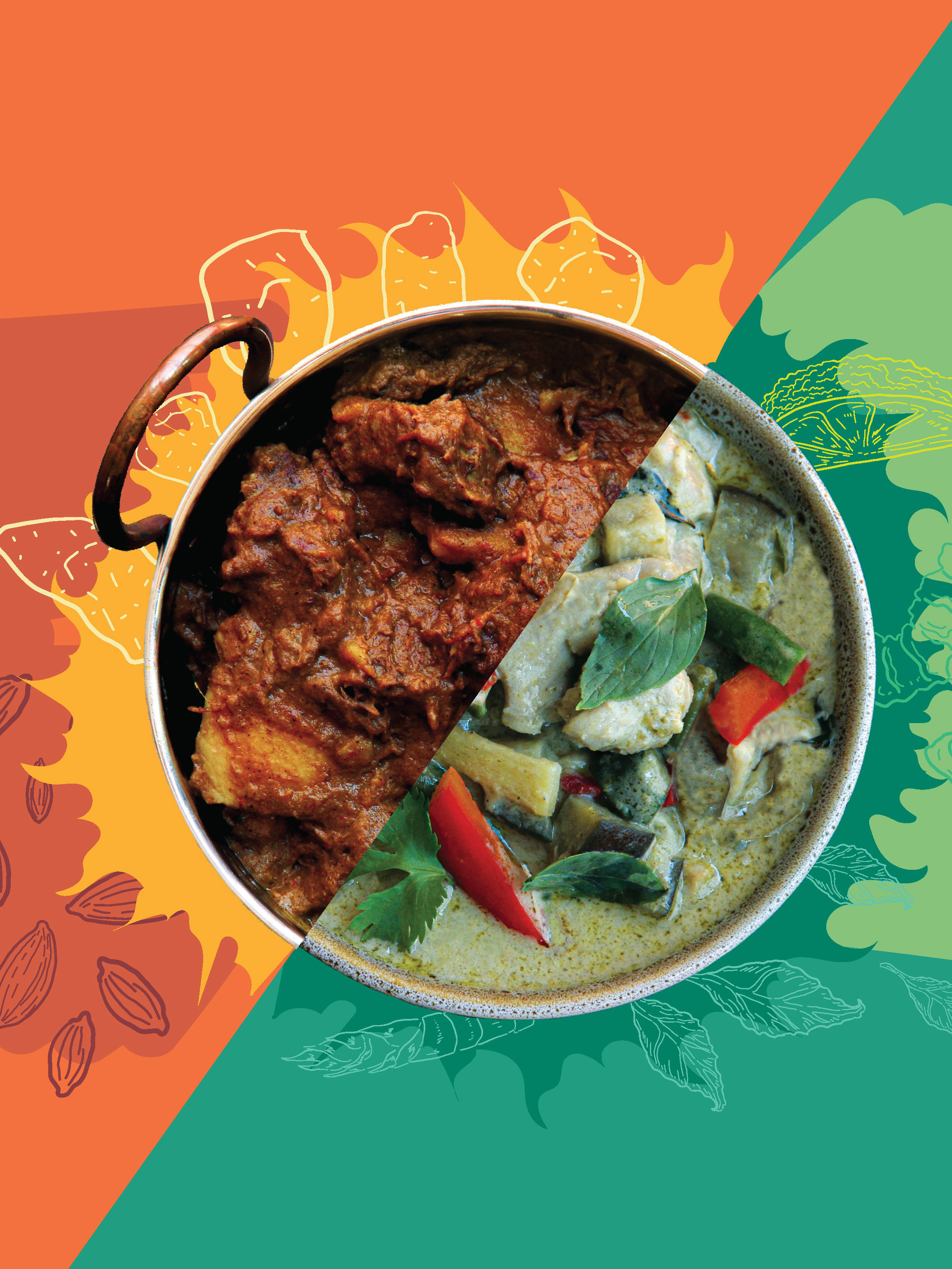
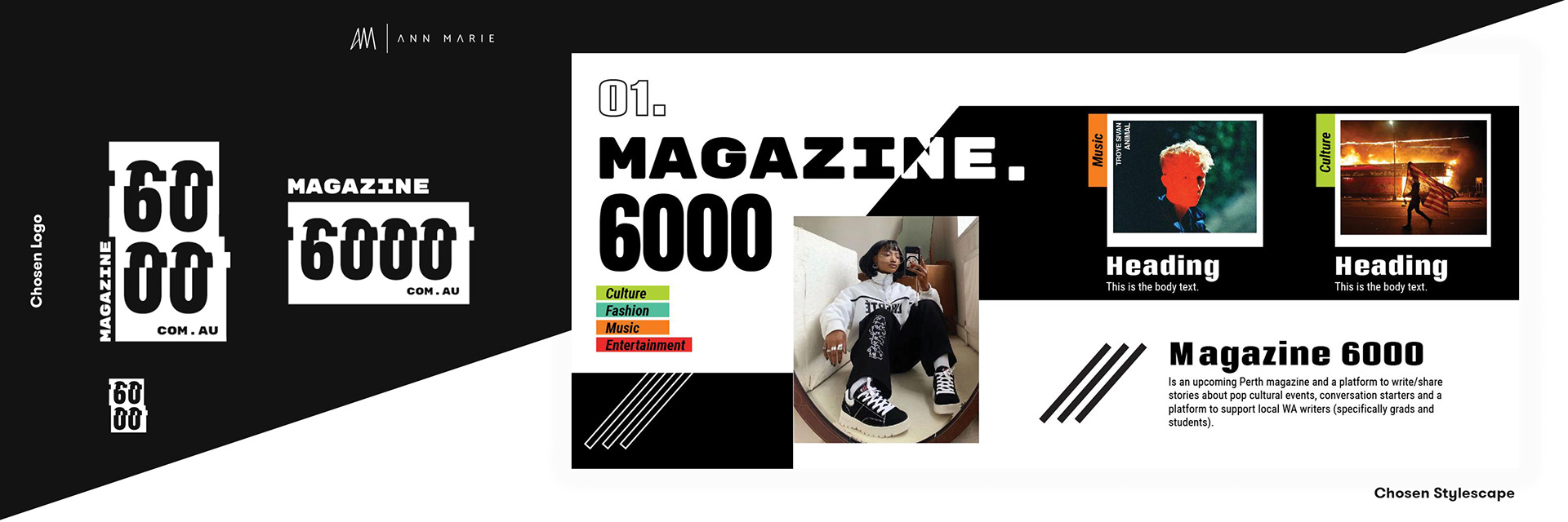
Back to the project... So the stylescape.... in a nutshell, would help to narrow down the vision of the client because what Holly told me was so broad and open, I didn't know where to start for her branding. From that, the stylescape would influence the logos and then the styleguide would wrap everything up. The stylescape can also be handy for the website too.
The examples don't belong to me, but belong to Shawn & Plus 4 Creative as we tried out our own stylescapes for our own Plus 4 branding but never trailed the process it with a client.
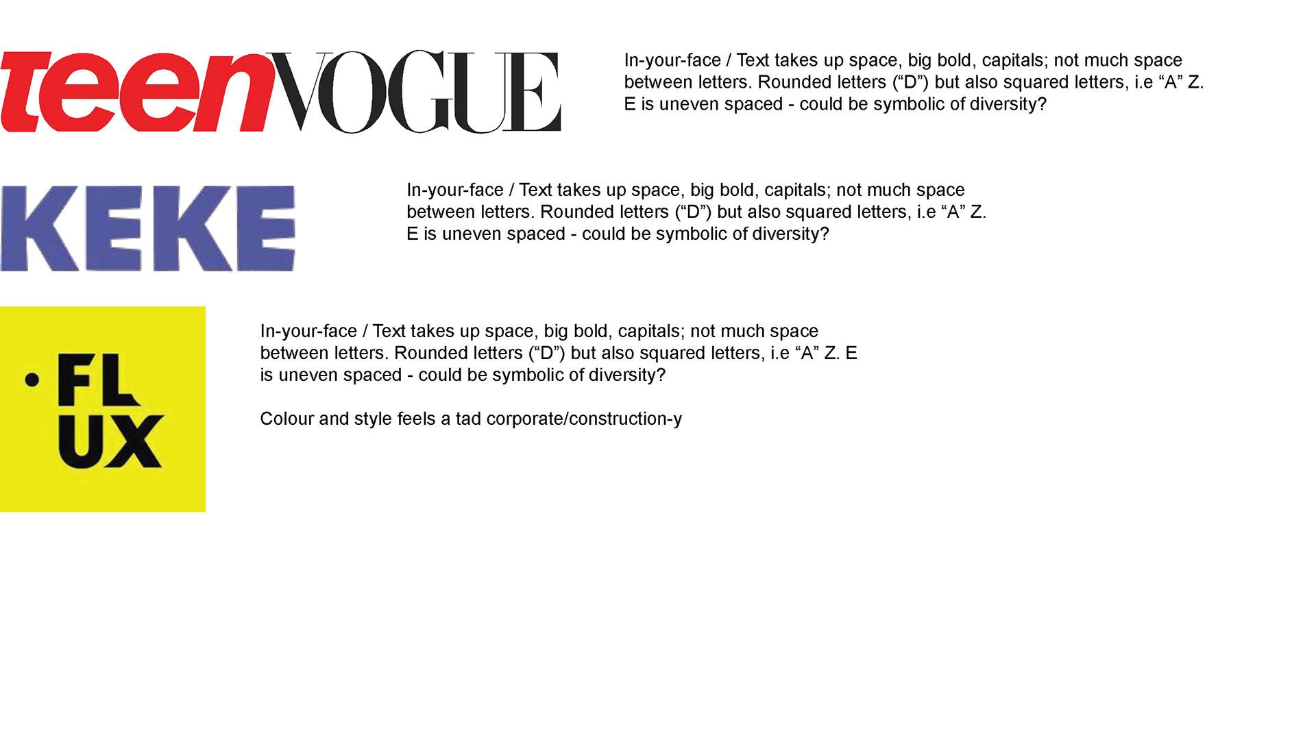
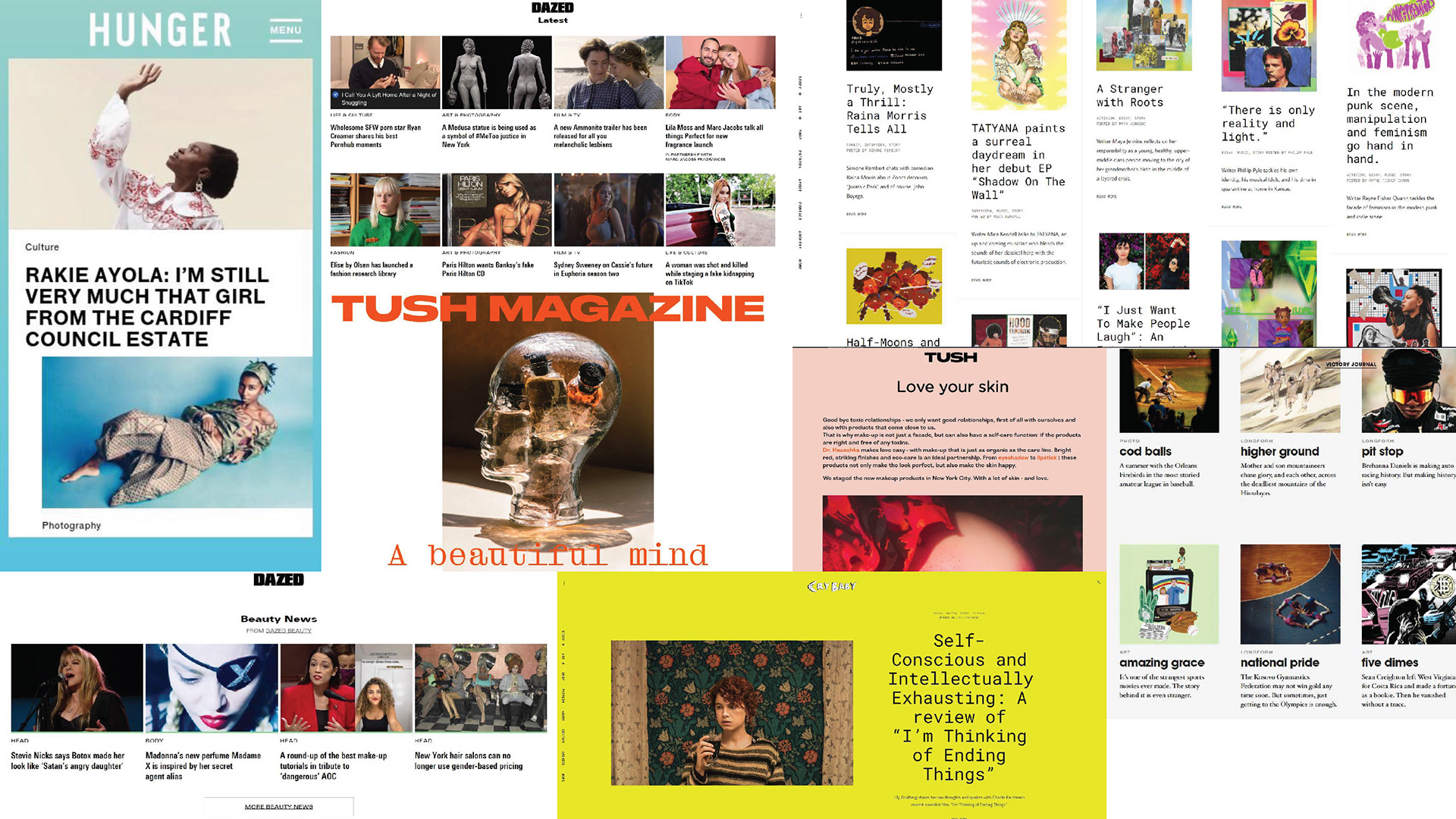
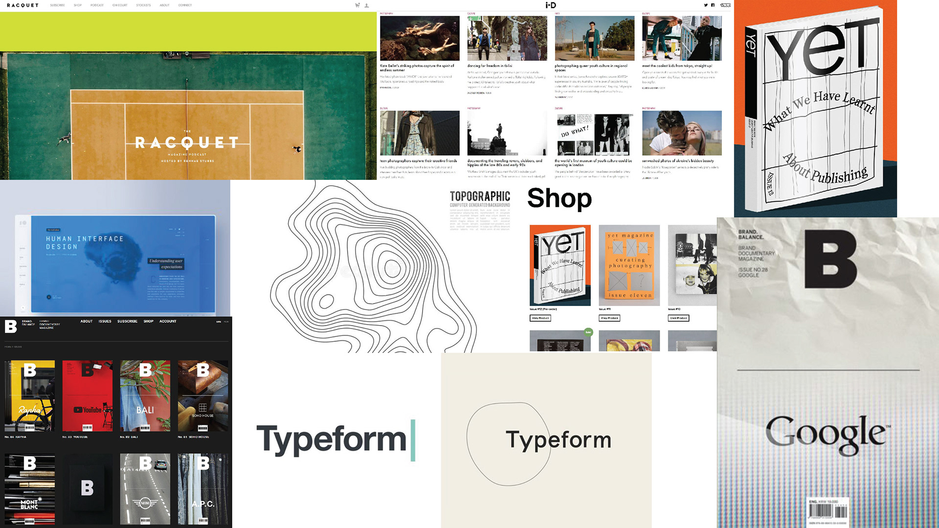
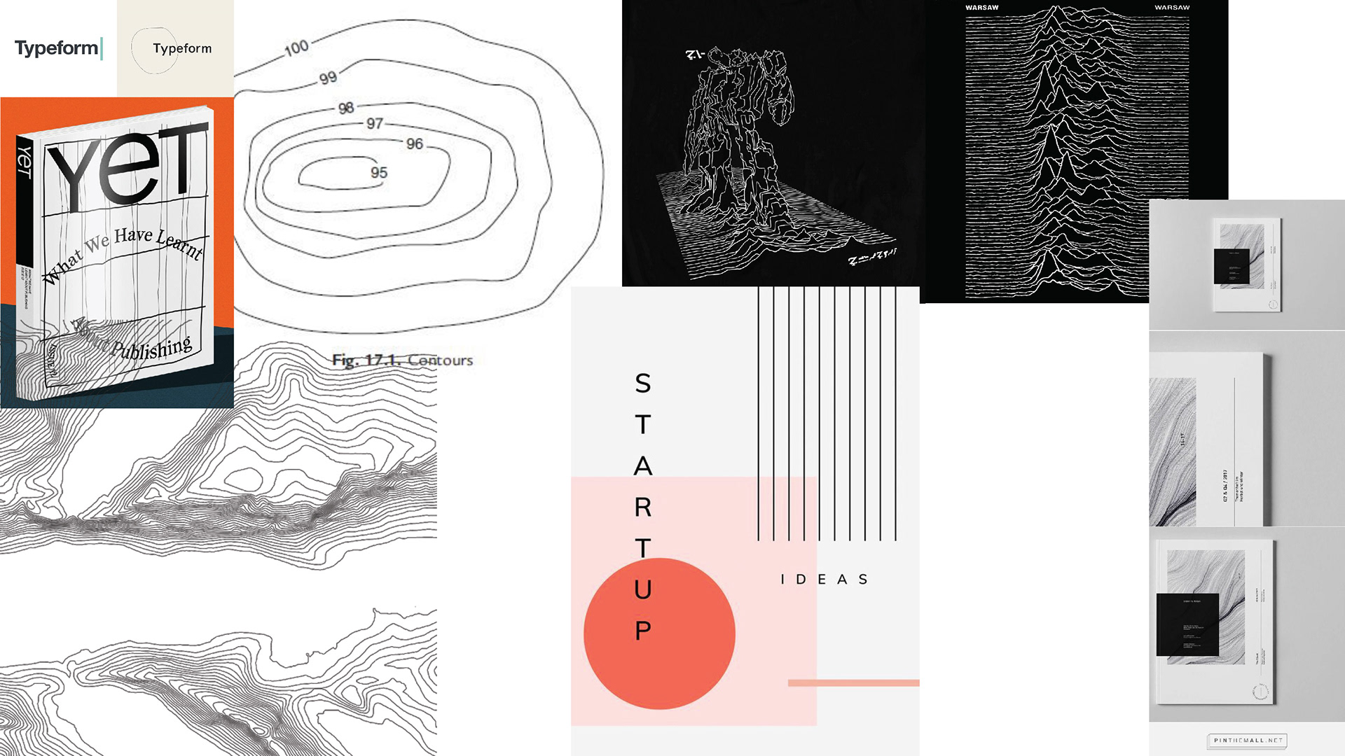
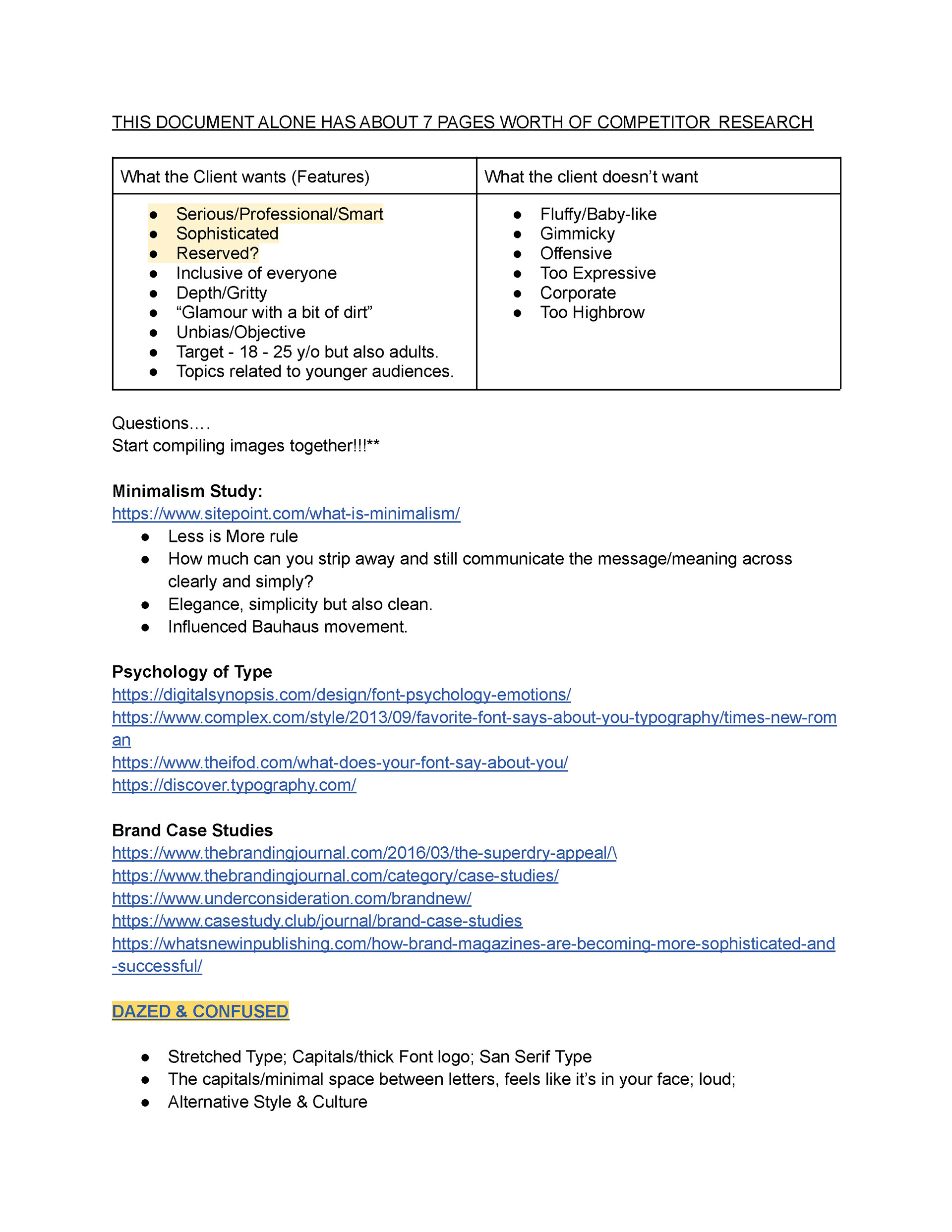
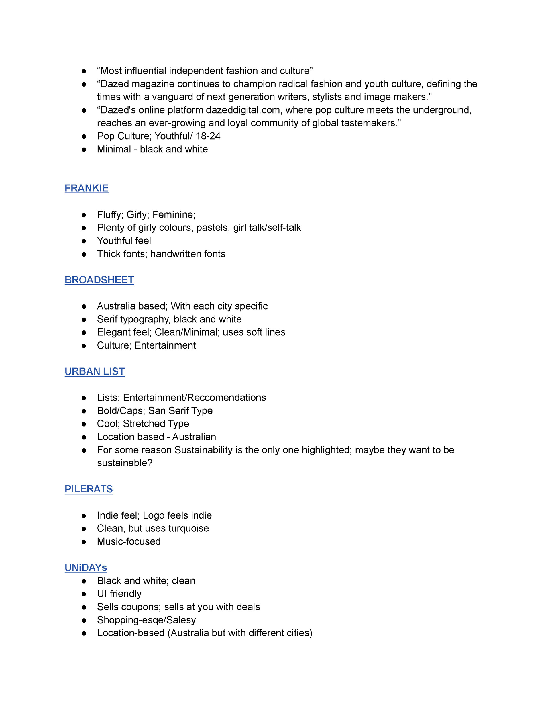
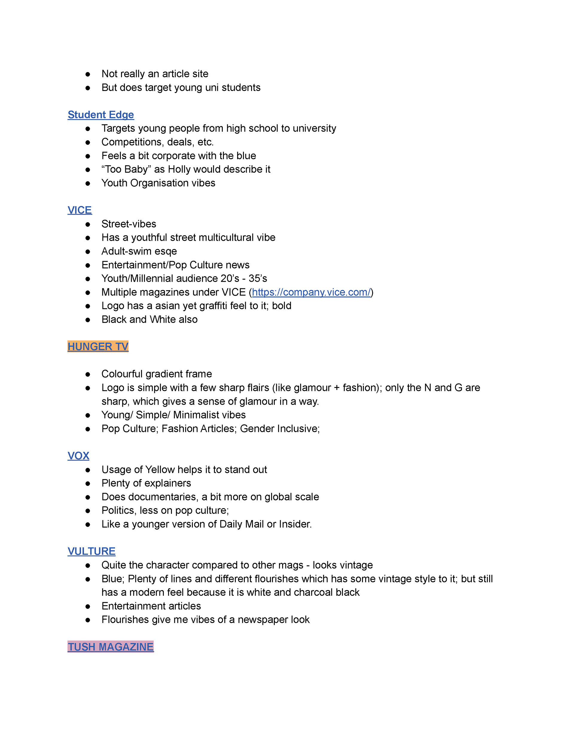
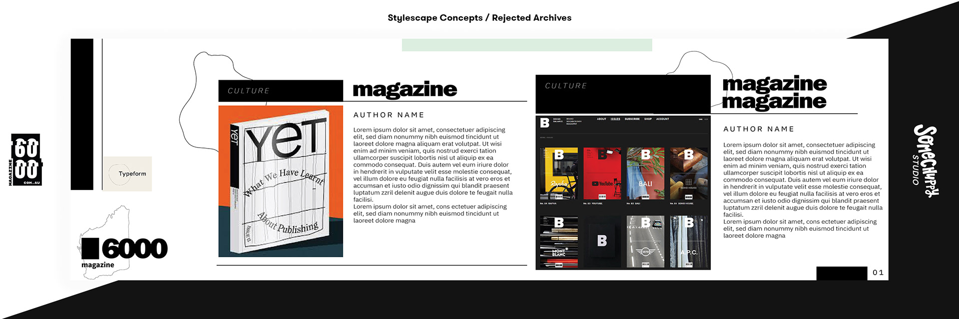
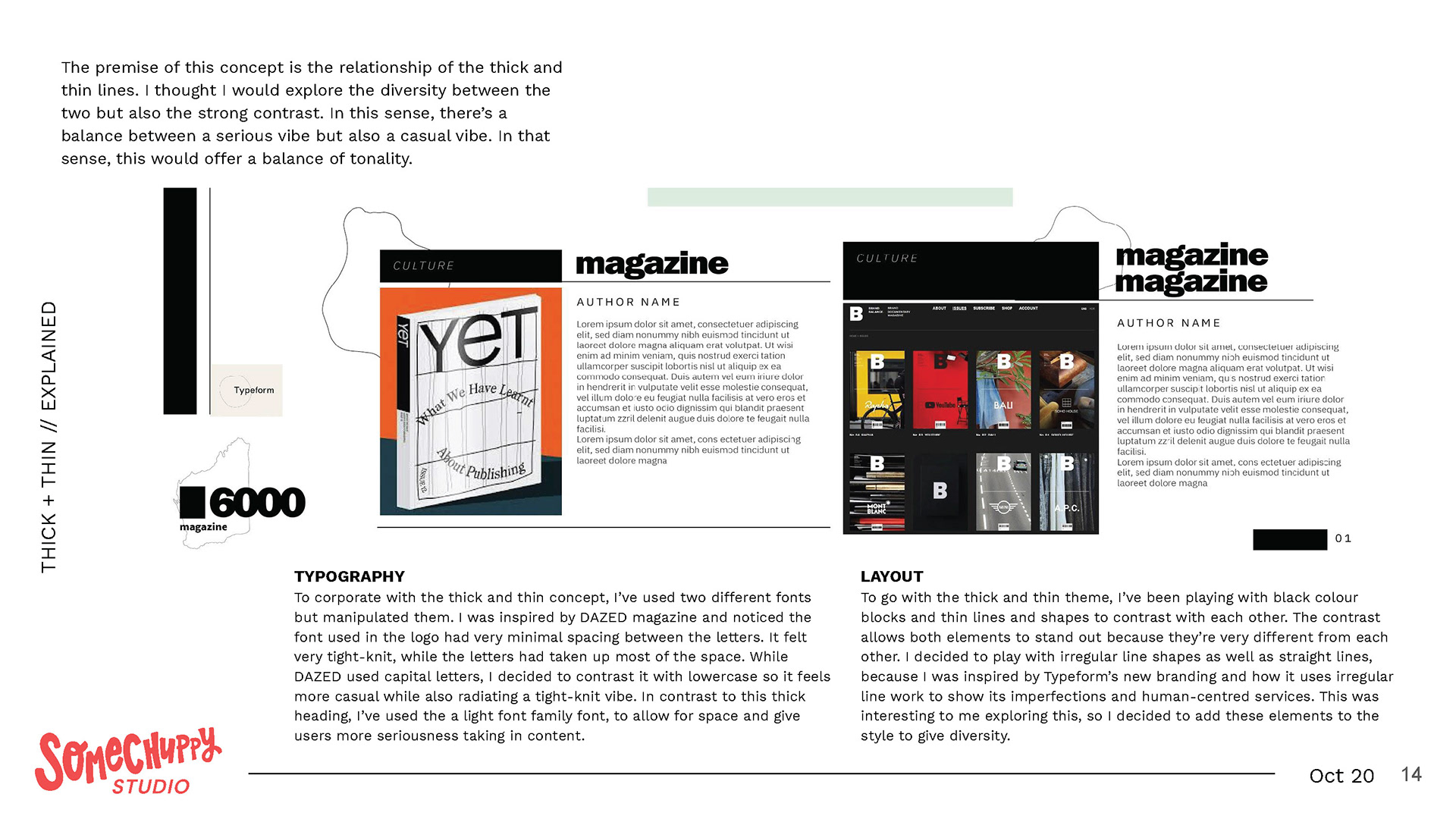
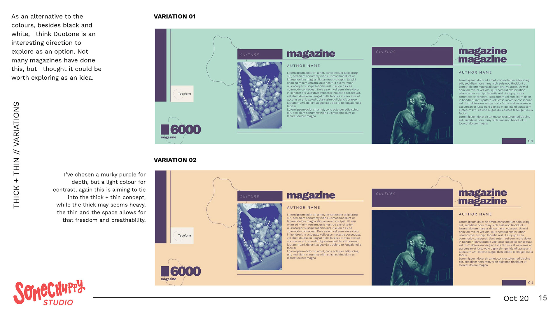
Because I didn't feel confident in what I was doing and whether I knew anything about minimal, black and white, edgy designs, I researched really hard at it. The 3 pages of research at the end of that photo grid isn't everything as I had a total of 7 pages altogether. You can read about it if you want to be nosy ;)
I looked at multiple sites to get an idea of the what the client wants and is inspired by.
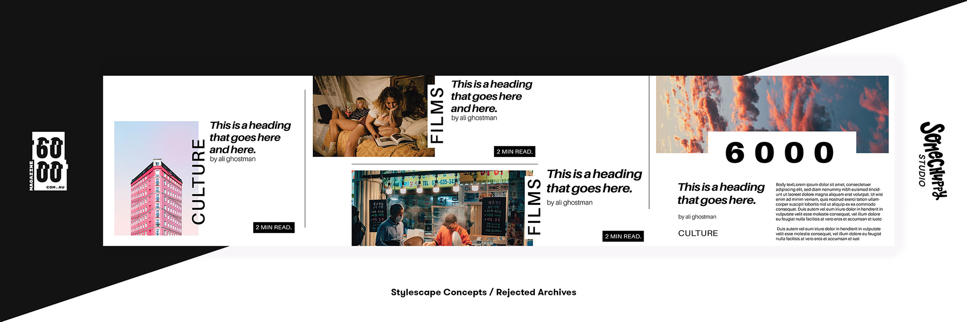
The task was to come up with stylescapes to pitch an idea look to the client. Since the proposal and quote only covers delivering 3, I asked Ann Marie to make 2 since she was comfortable with this style. I did, however, end up making more than 2 but filtered down to choosing just 2 that I thought worked best.
Here are my prototypes:
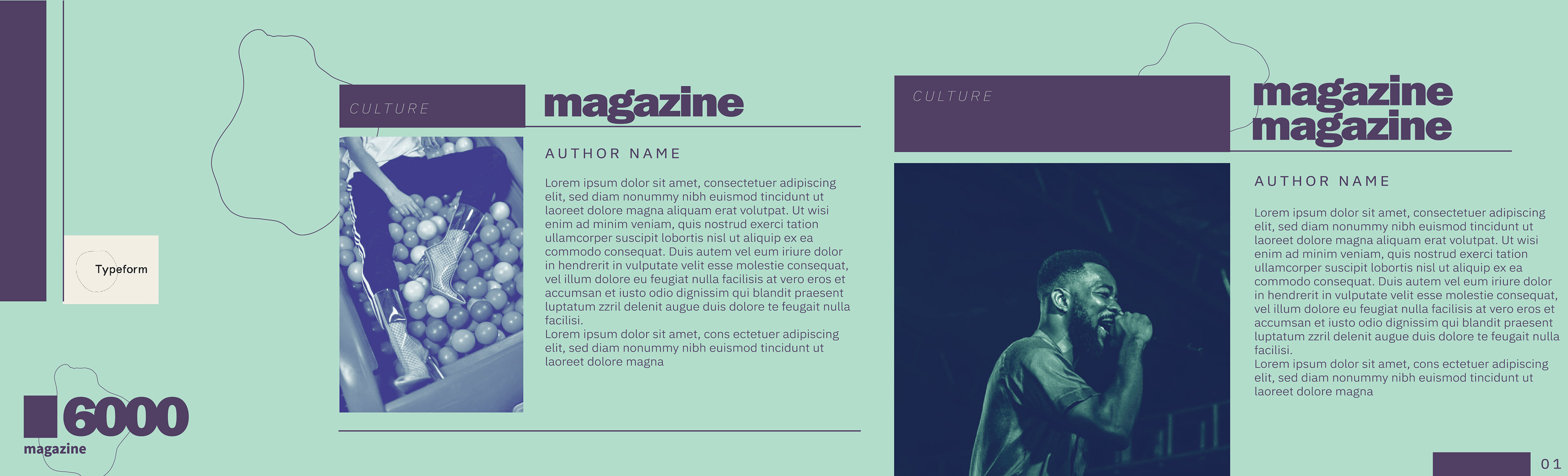
I ended up going with 2 stylescape designs to show the client which I've put below.
I don't have Ann Marie's research or prototyping as that is her own copyright to her works, but I do have what she decided to show the client as I hired her as a sub-contractor.
See below.
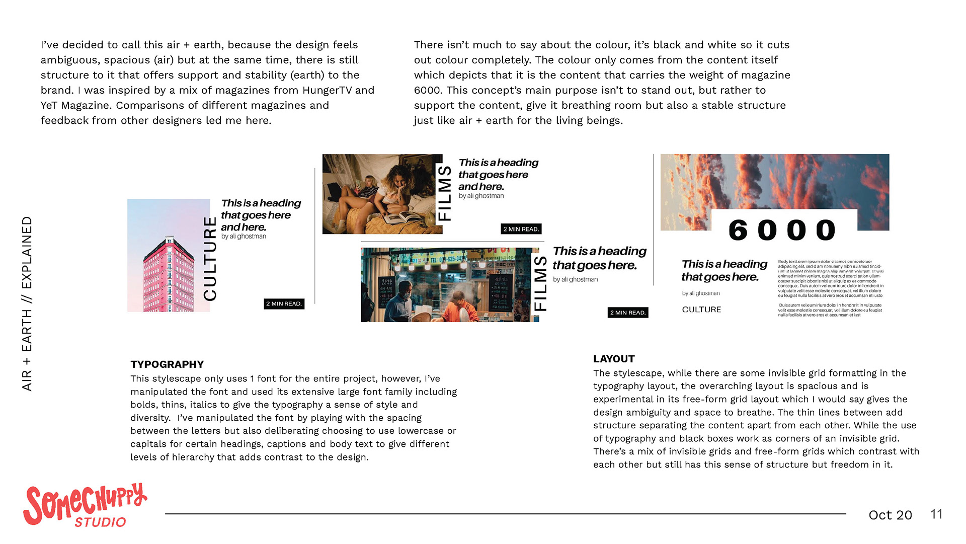
Ann Marie's 2nd Concept:
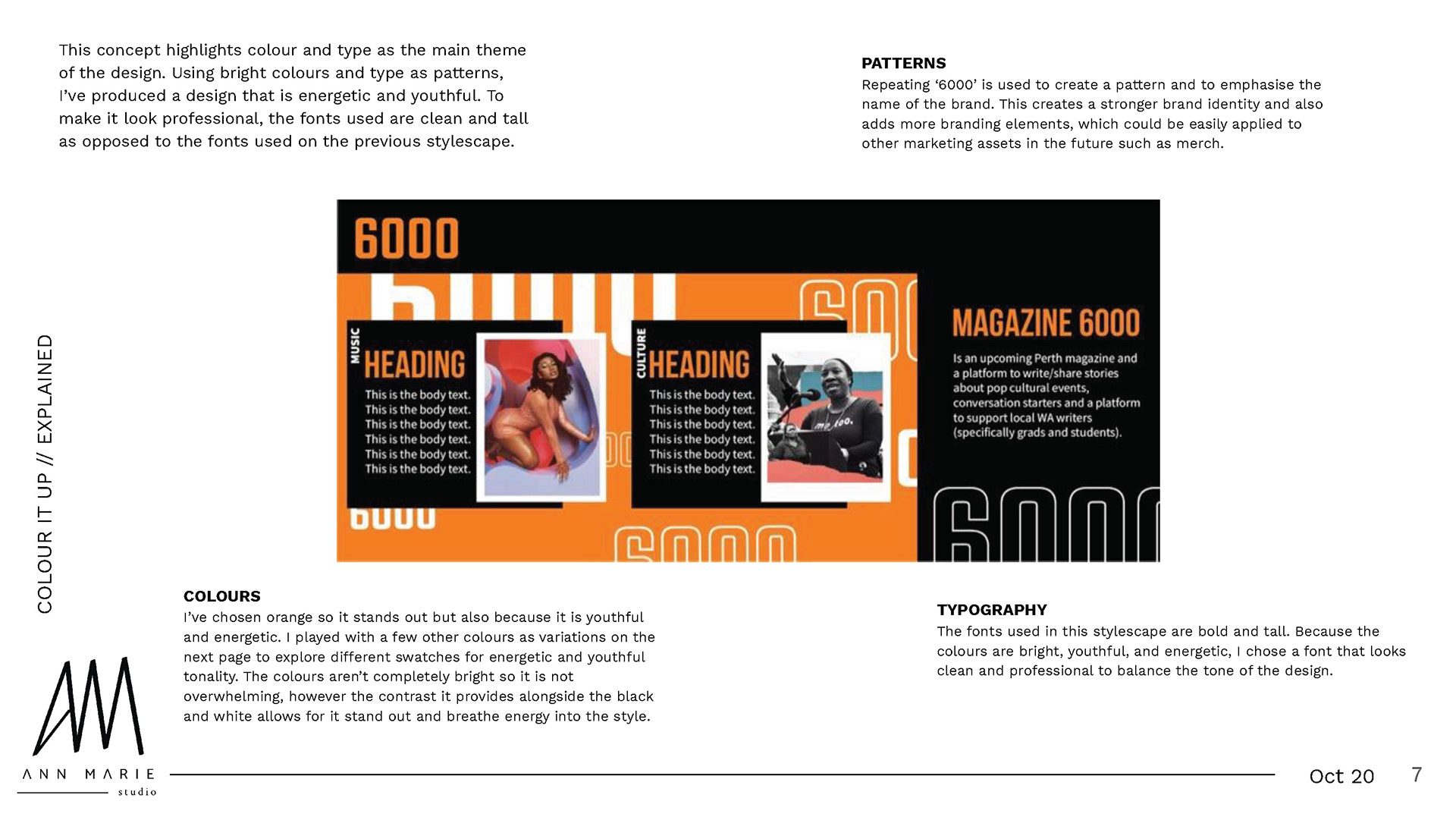

After I had compiled all the rationales and stylescape presentation together, it was time to meet with the client. The verdict came out and Ann Marie's design was the winner! The client however, wanted a minor change, to add a border to the image which was inspired by Ann Marie's second concept.
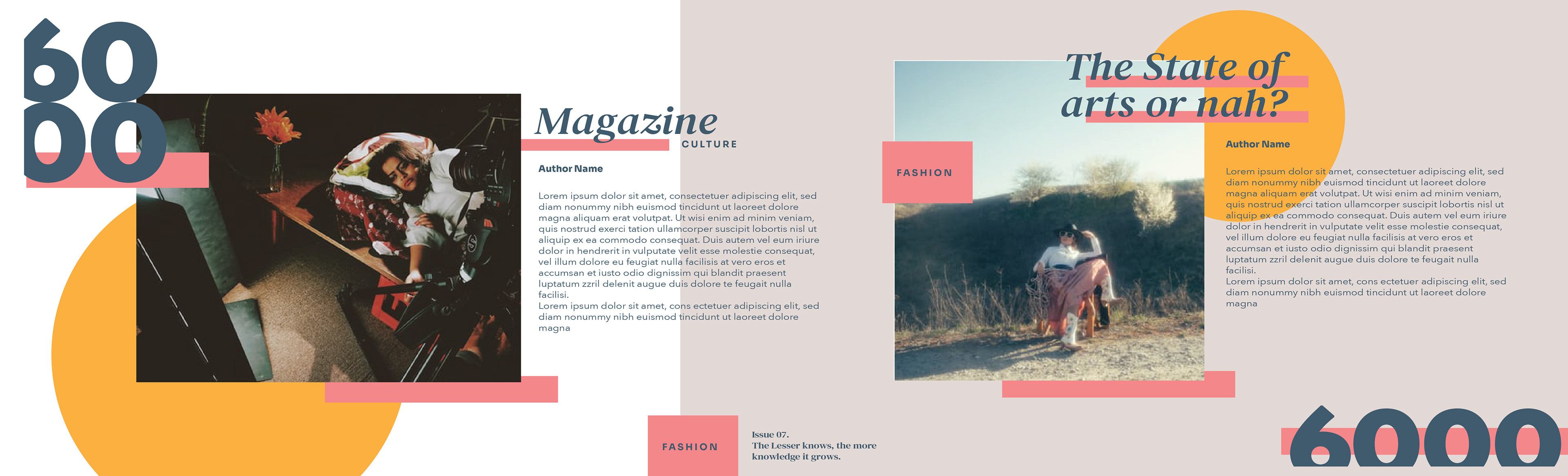
Ann Marie delivered 2 revisions to explore the client's request.
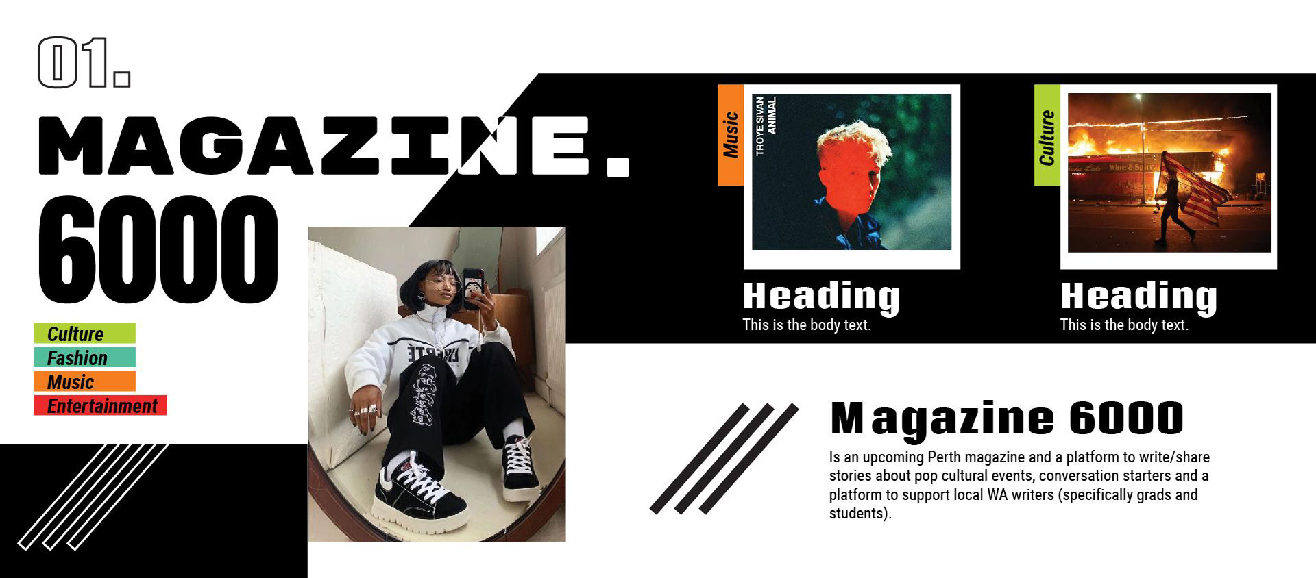
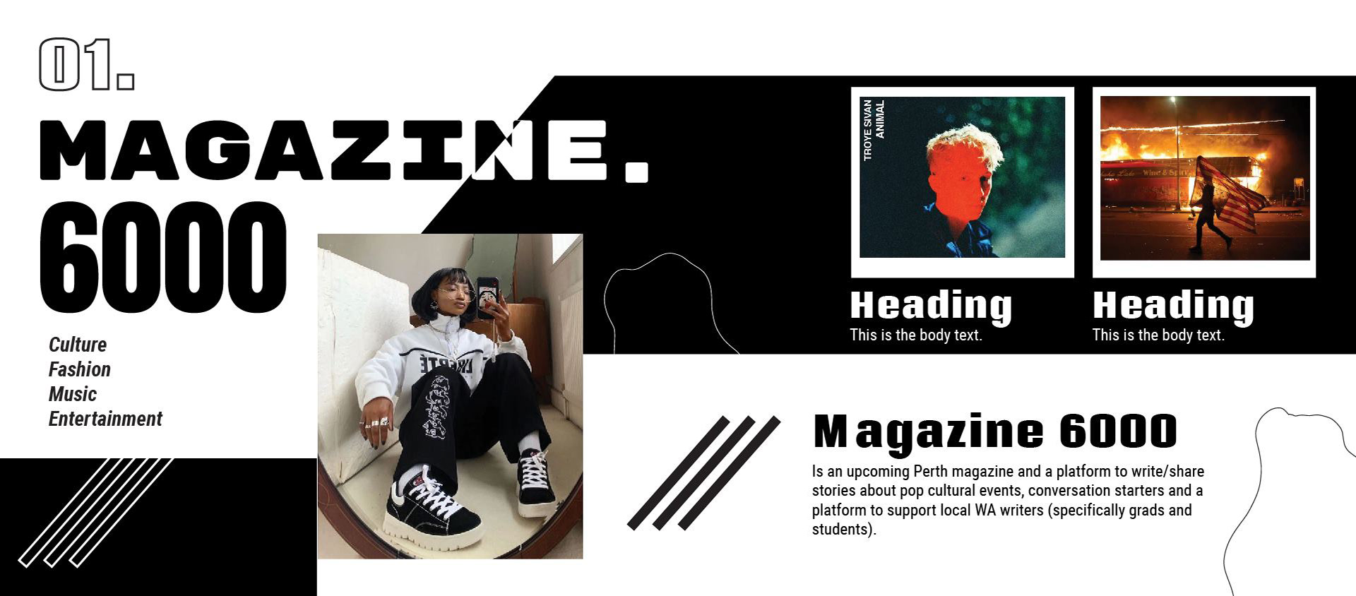
Luckily, Ann Marie nailed it because the client ended up going with one of the revised designs and that was it - the chosen stylescape has emerged!
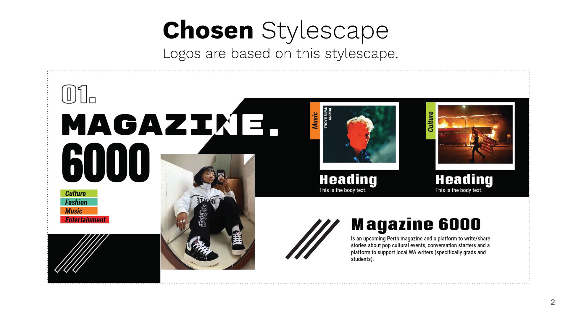
The next conquest was to work on the logos which would be influenced by the stylescape Ann Marie created. She would let me know the fonts and colours she used.
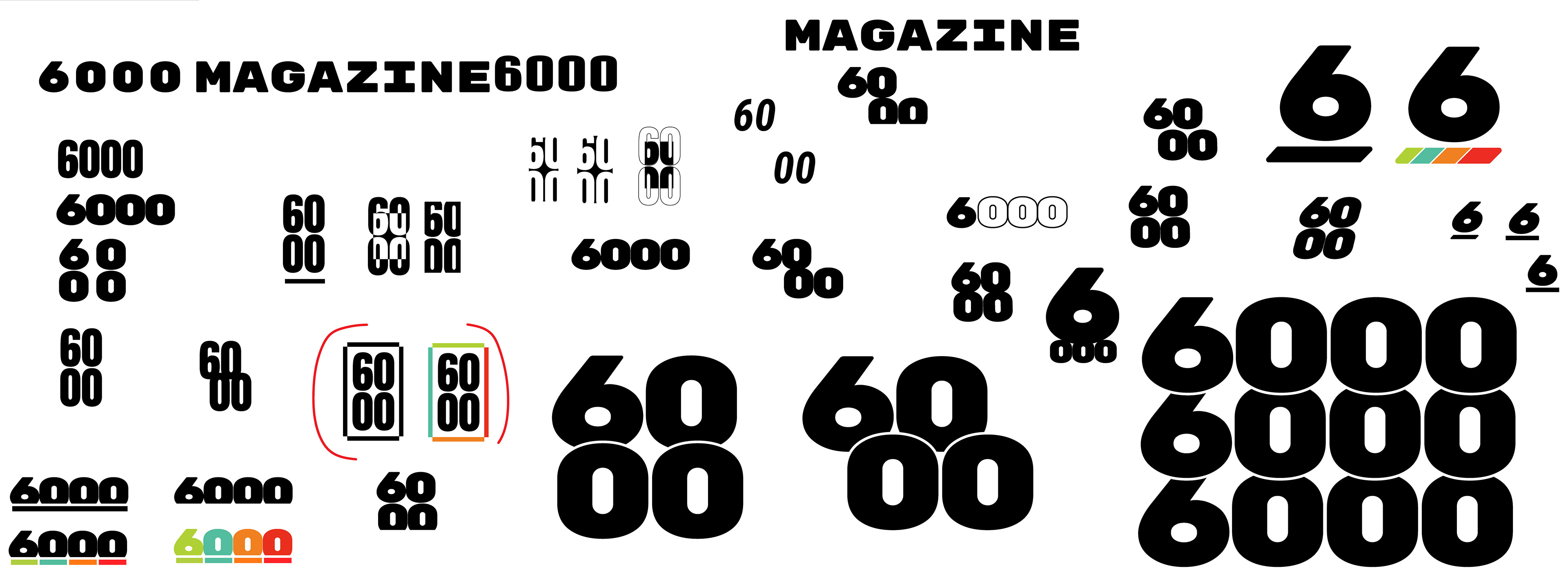
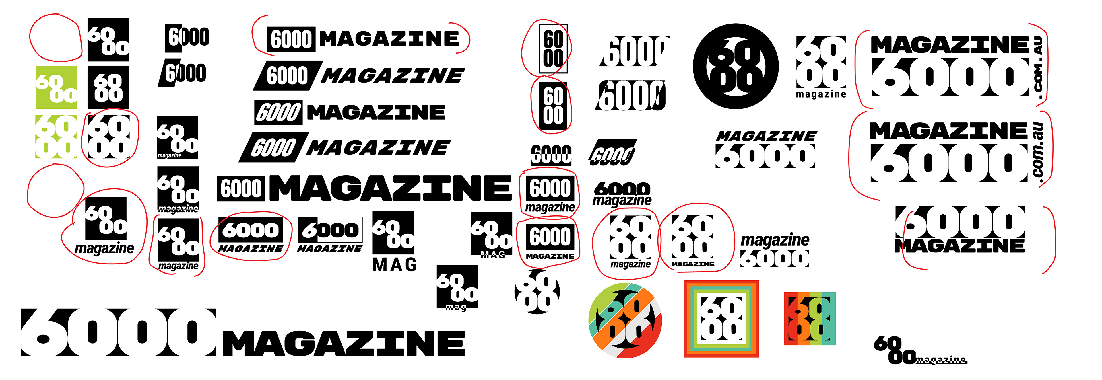
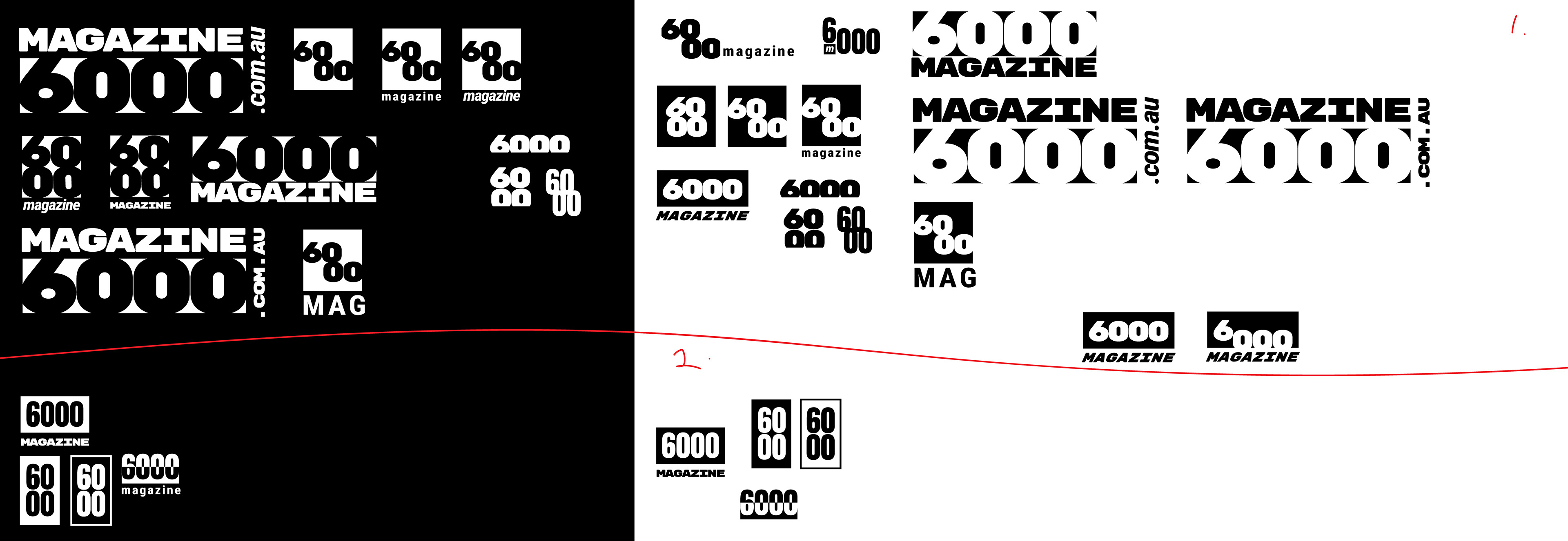

Again... I went a bit crazy and did a lot of prototyping before I settled on a couple of logo ideas to present to the client. I ended up with 2 concepts and Ann Marie had also made 2, similar to the stylescapes, we were meant to deliver only 3 but ended up giving 4 concepts, which we wrote it off as a bonus for the client.
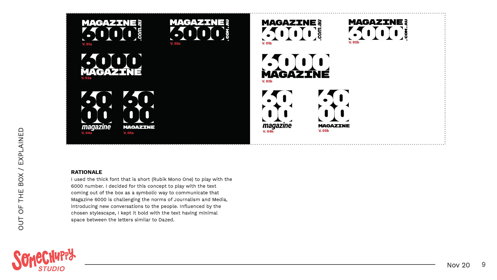
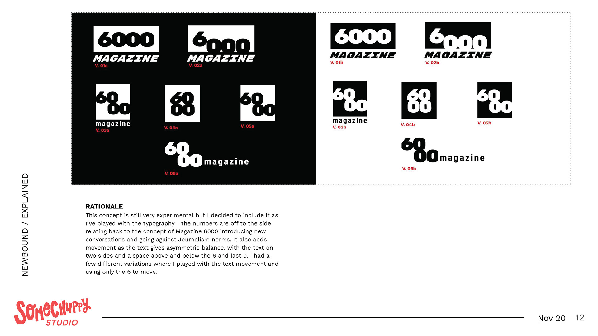
Logos are definitely not my strong point.... even though it's the forefront of being a graphic designer... one could say. In terms of research, I looked back at my notes and my analysis of other editorial websites and the chosen stylescape as a reference.
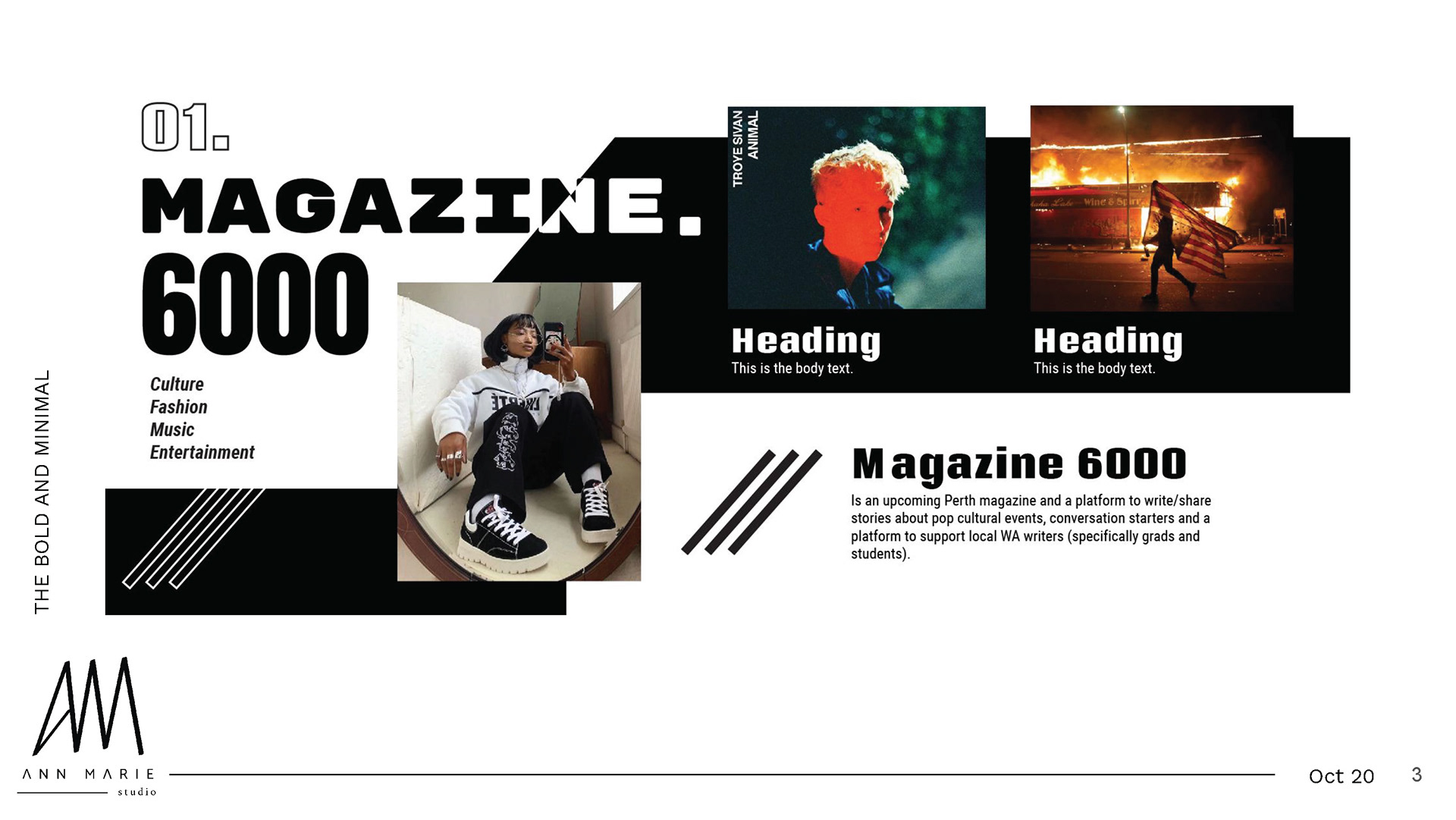
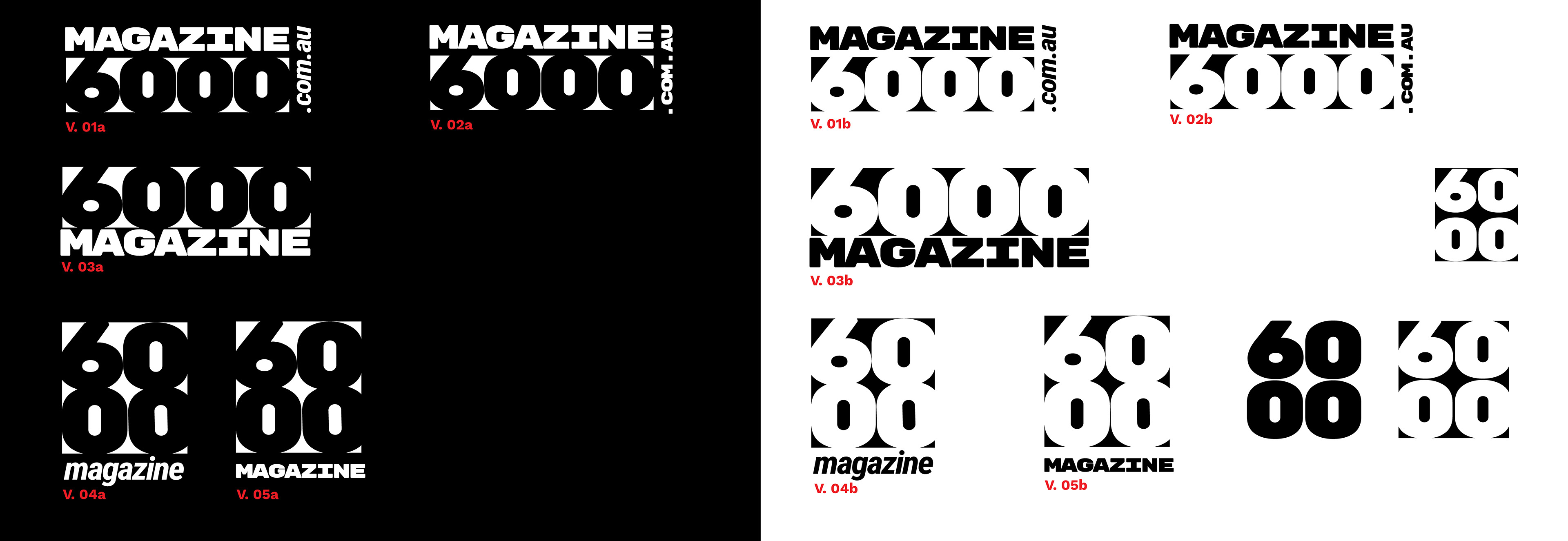
Below are my concepts to show the client and its rationales.
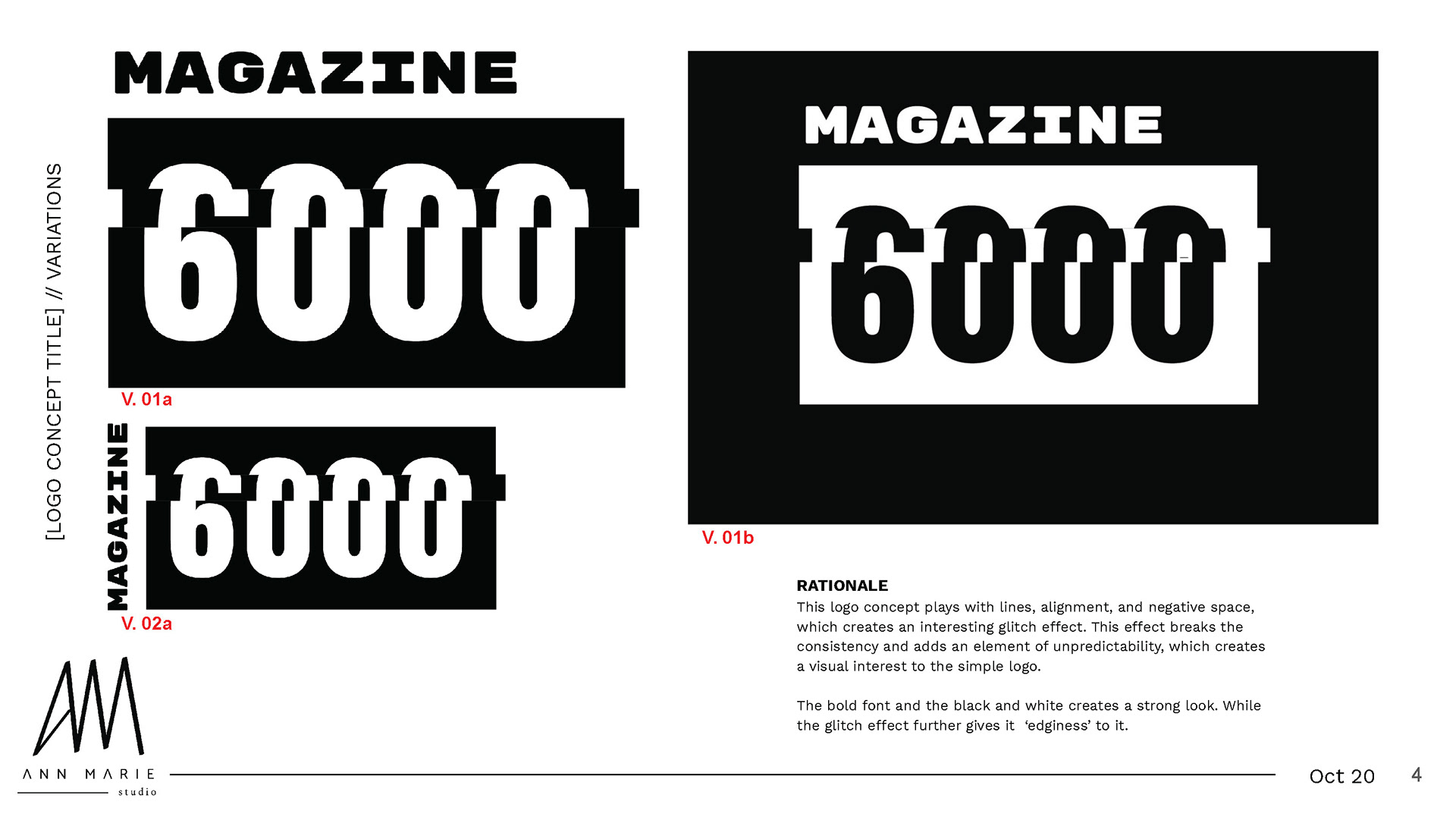
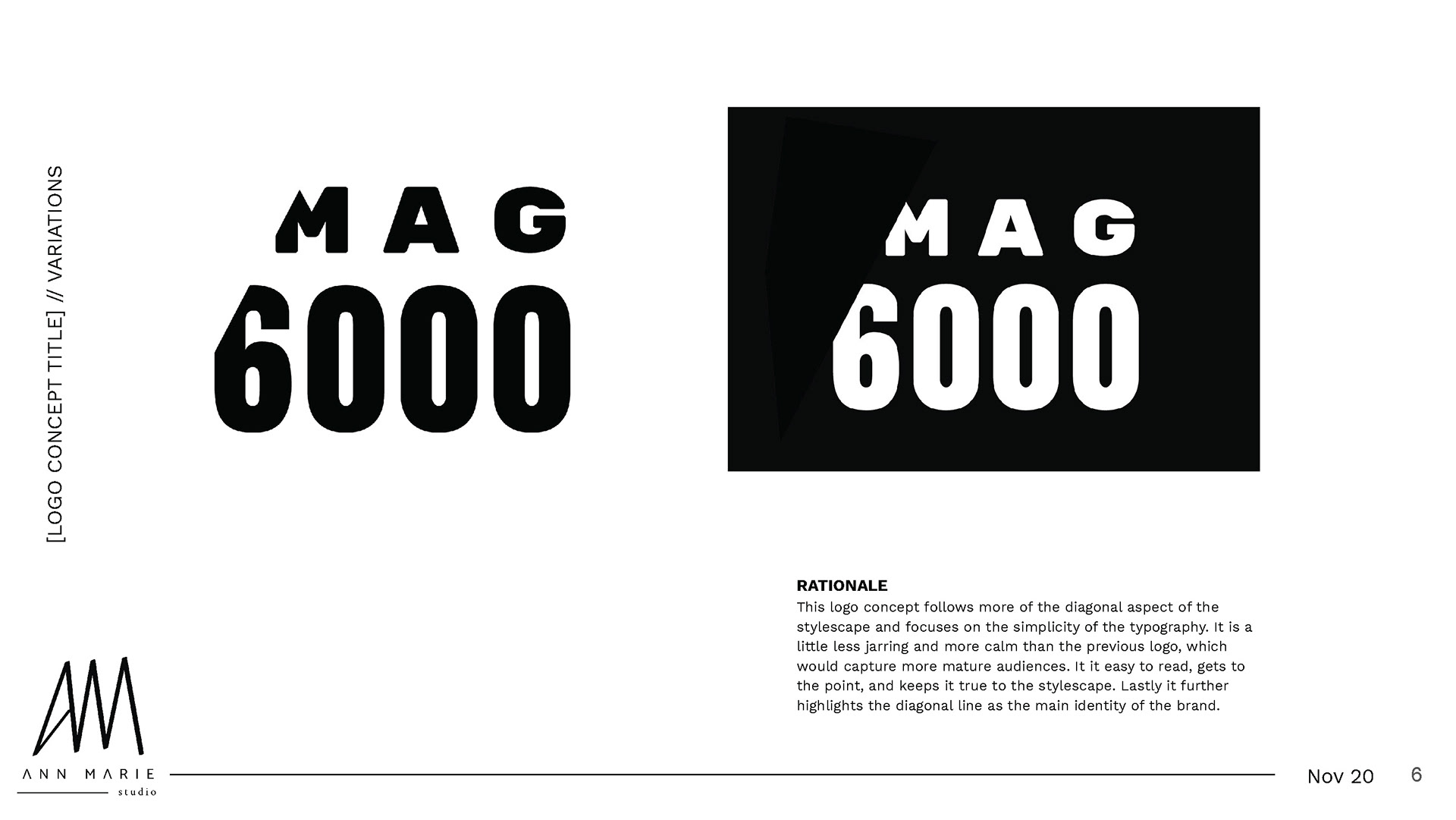
I don't have Ann Marie's prototyping or research, but below is her submitted concepts.
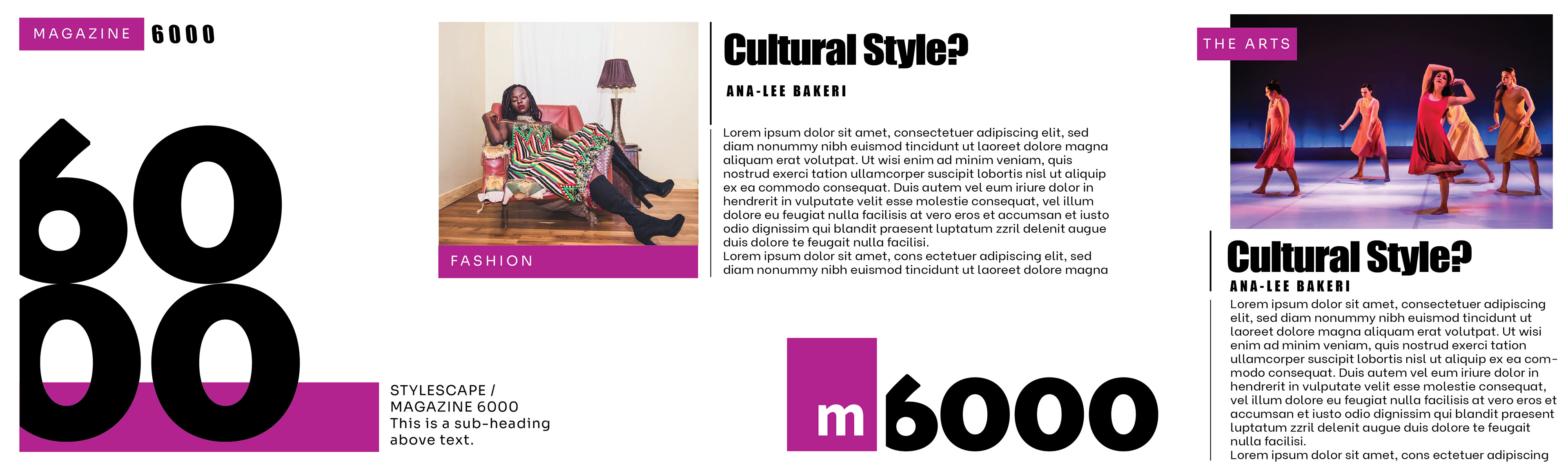
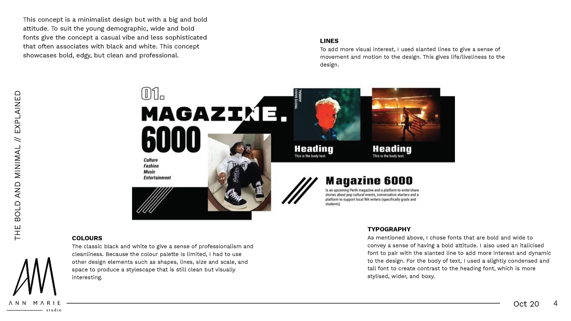
Ann Marie called this concept "There's a glitch".
Ann Marie's 2nd concept was called "Only the essential".
We started naming our concepts inspired from The Futur's Building a Brand Series.
As usual, we had a meeting and this time Holly was undecided on one of my concepts and Ann Marie's concepts. She had requested us to do a few mock-brand collateral for her to get an idea of how the logo would look like on different material.
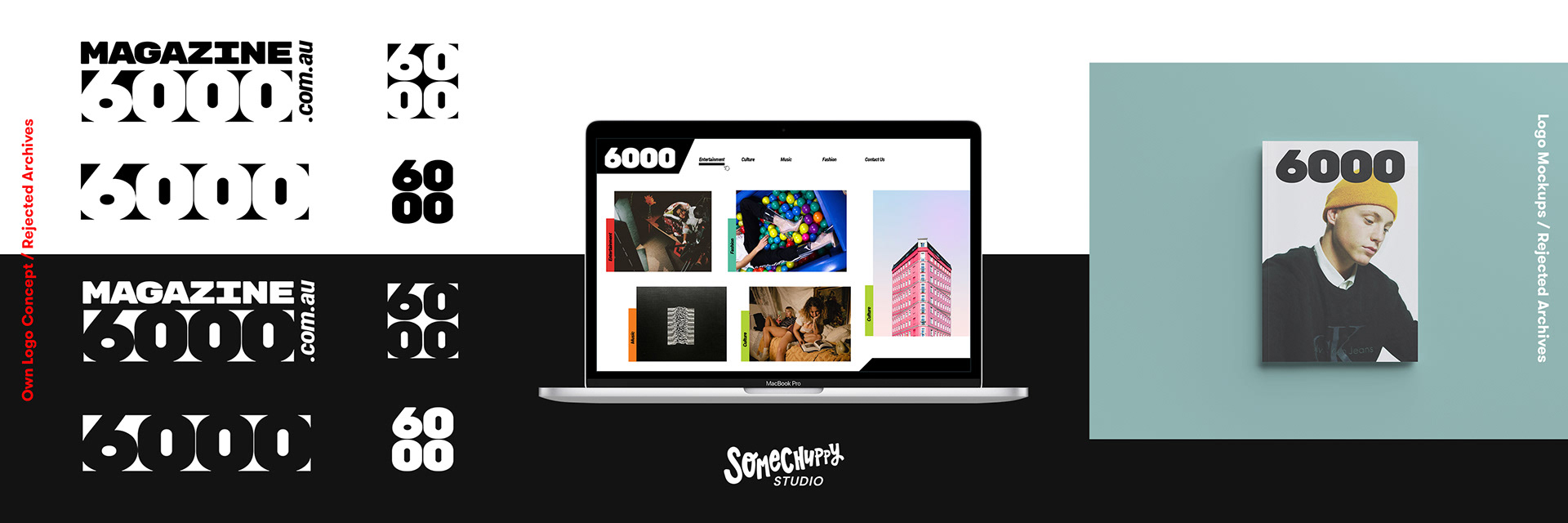
This is what I submitted:
(I had made my own website mockup as part of it to see how the logo works with a website).
Ann Marie's submission:
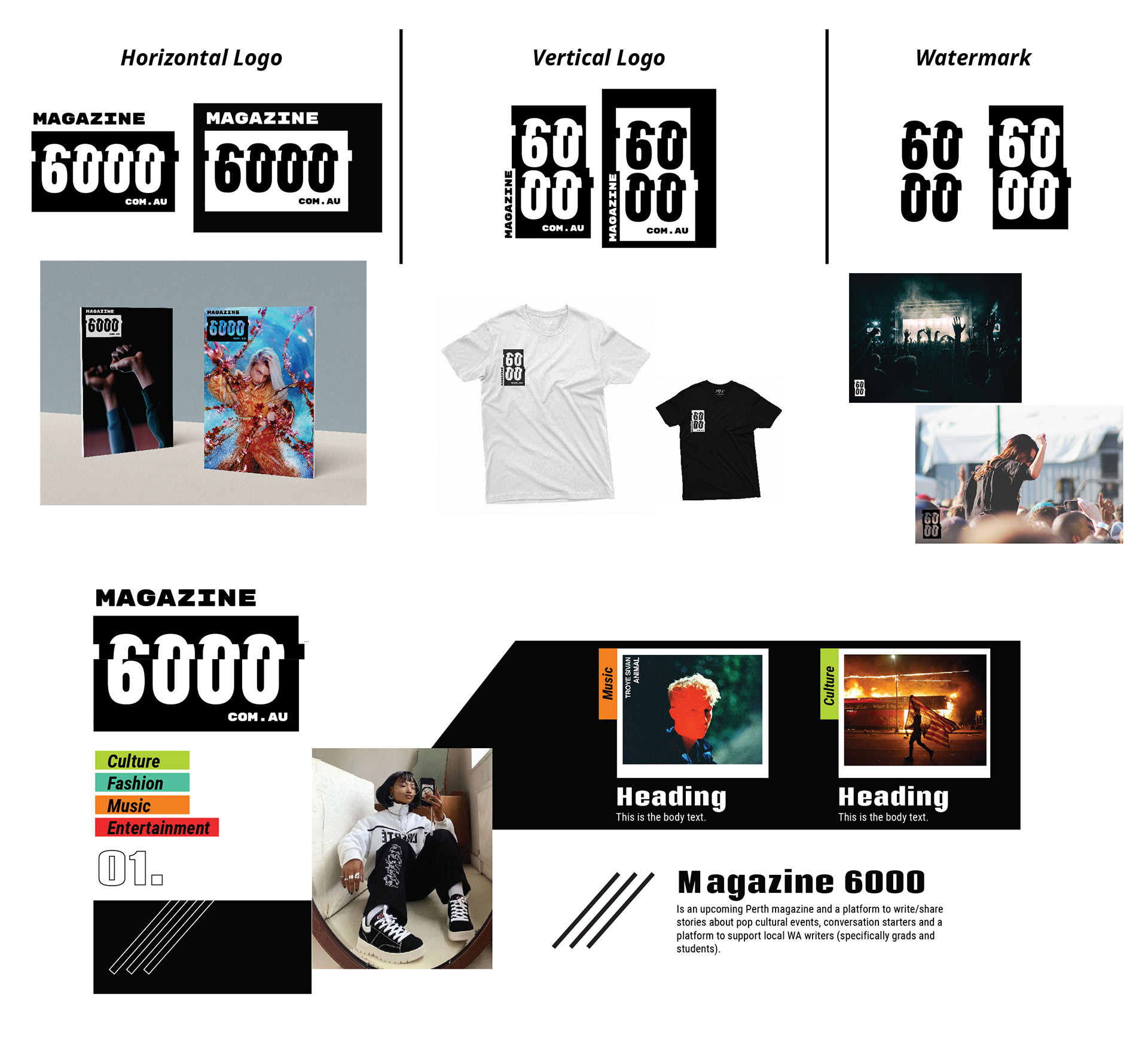
Holly ended up going with Ann Marie's design in the end as her final choice.
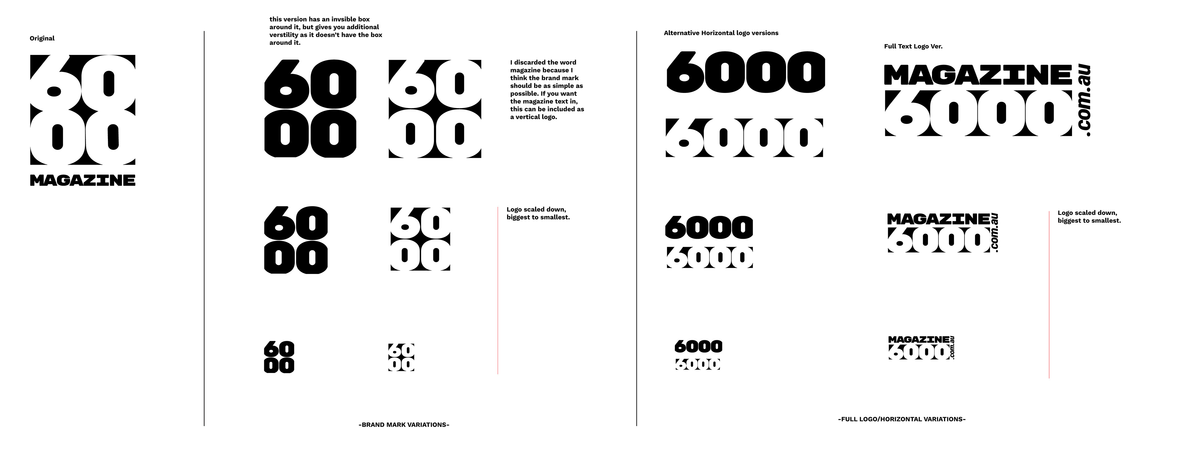
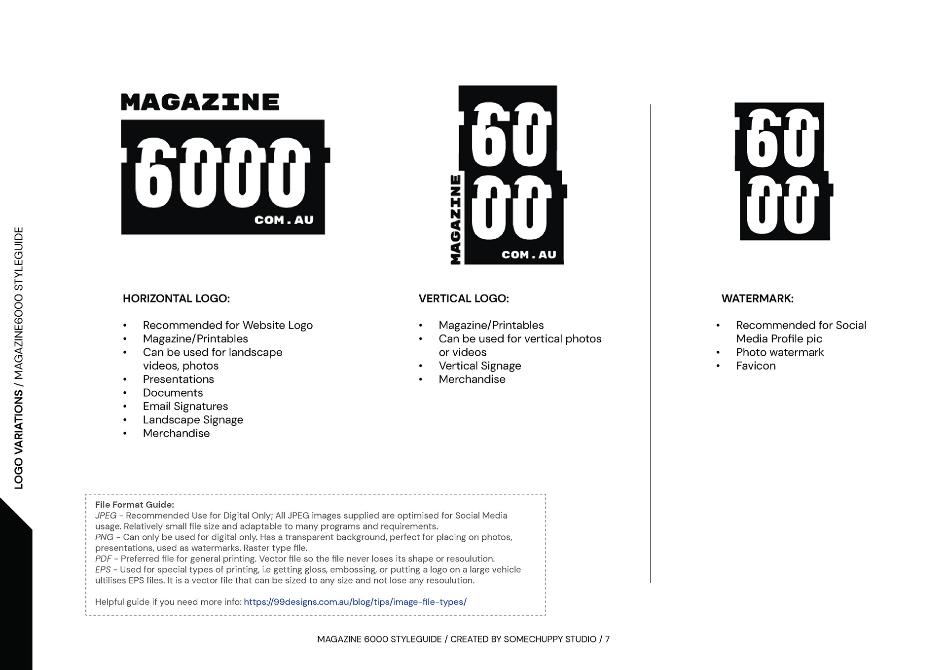
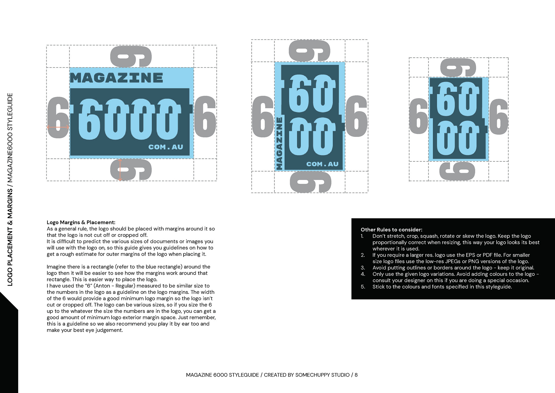
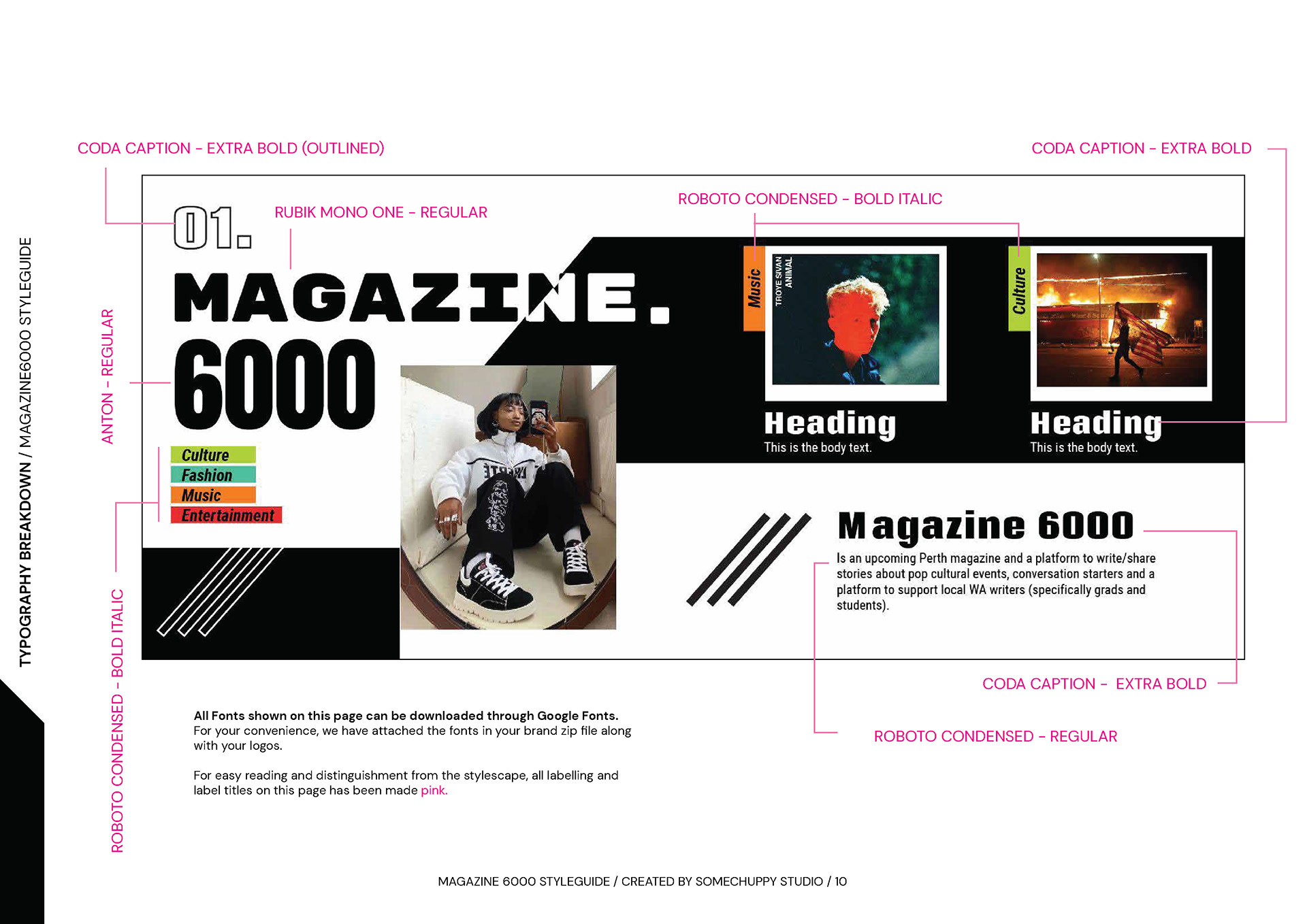
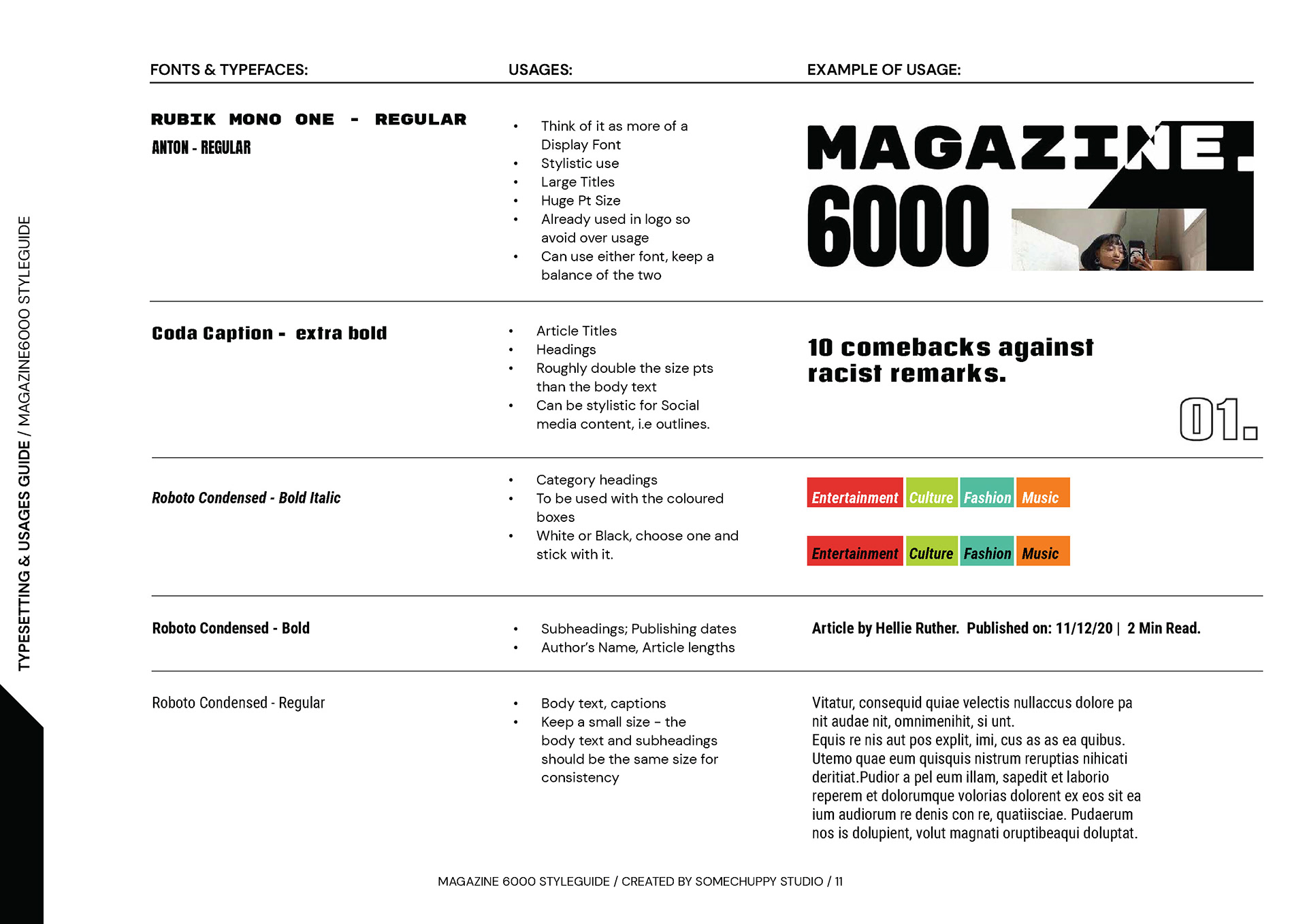
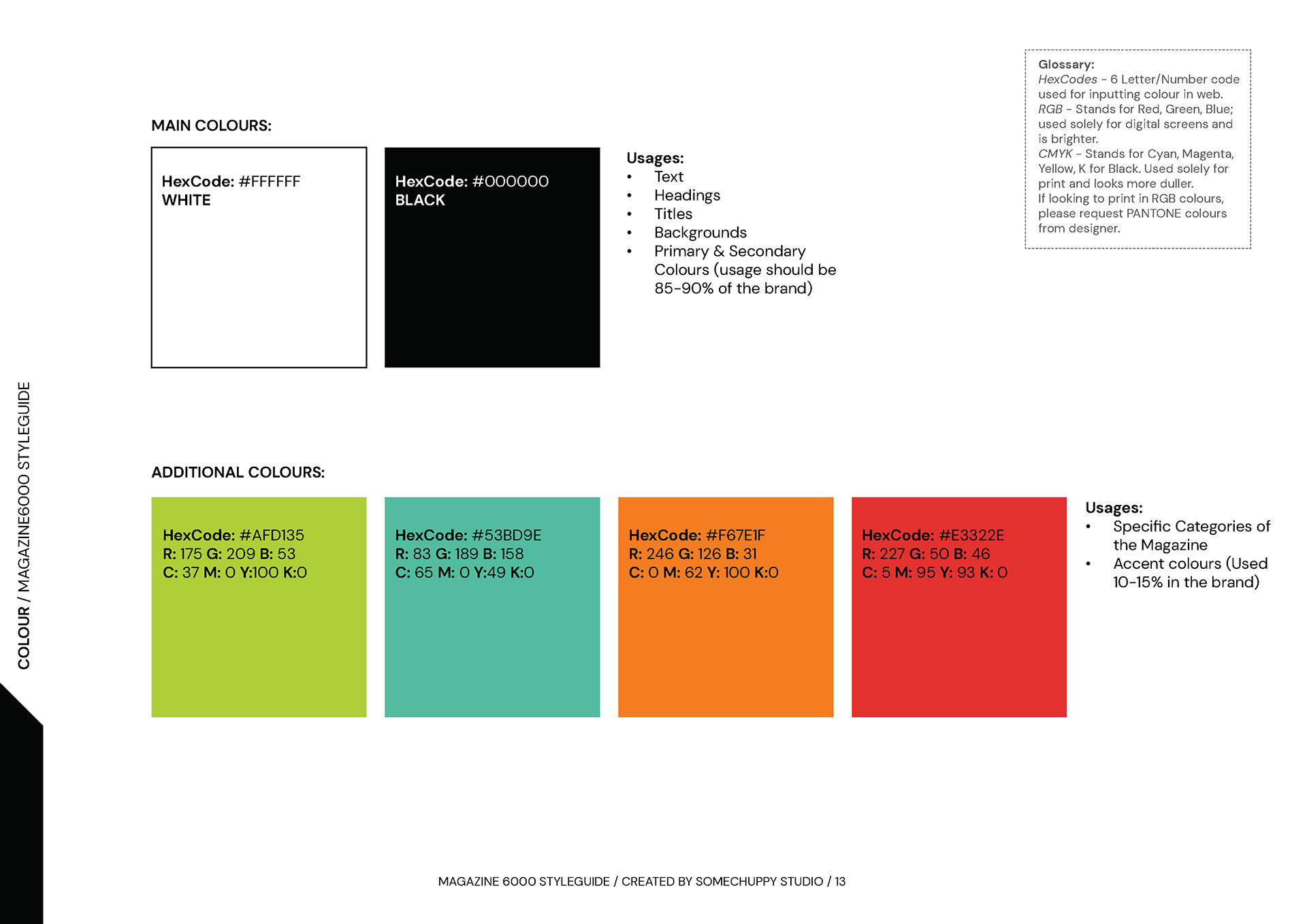
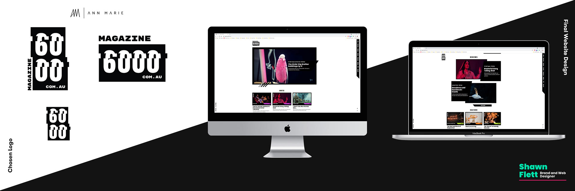
The last part of the branding was to create the styleguide and export the logos which I requested the client get black and white versions of a horizontal, vertical and watermark logo that would give the client versatility for both print and digital.
At this point, it was December 2020 and Ann Marie was looking to take a break, so I decided to give her a rest and take over compiling the styleguide.
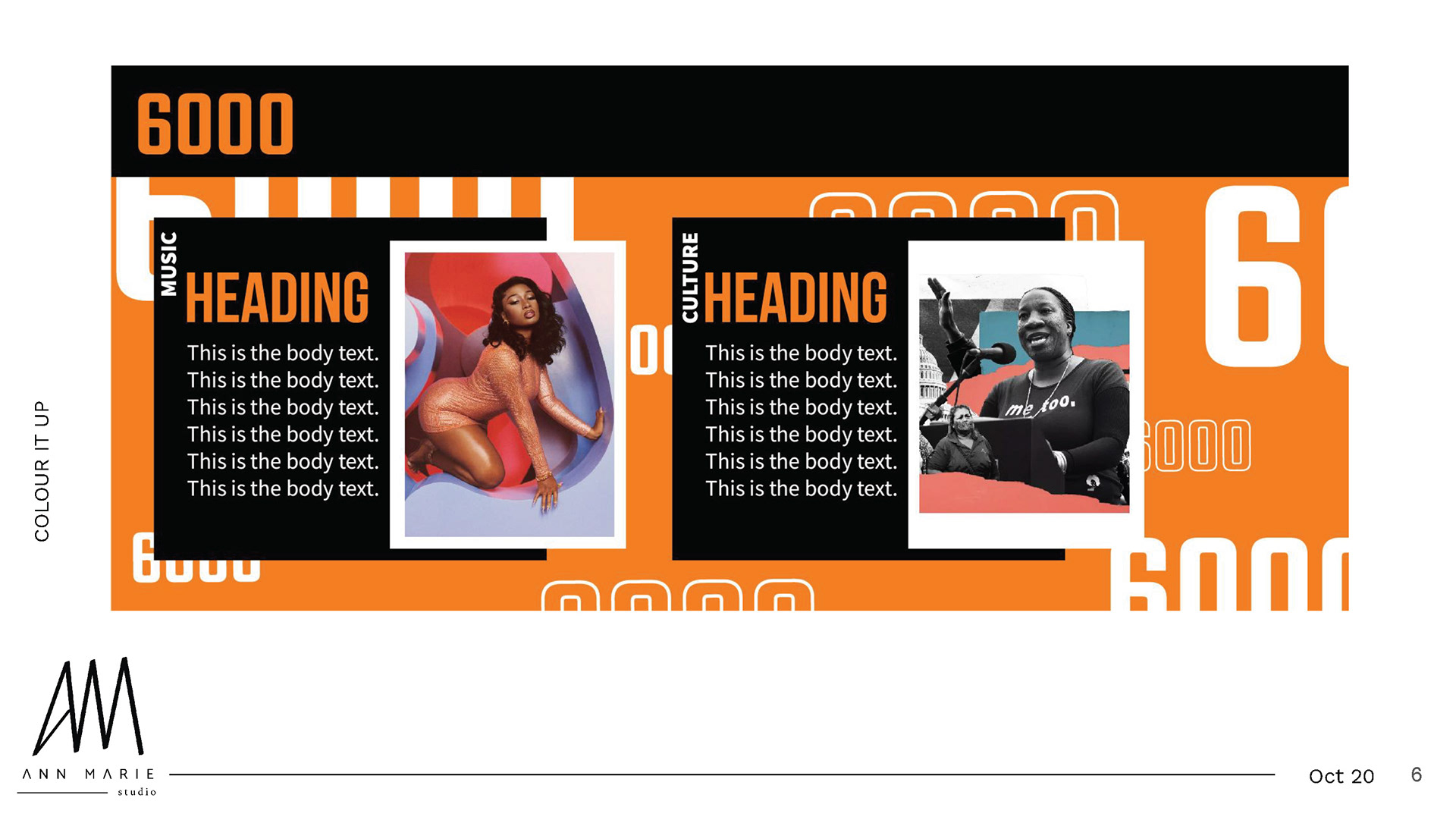
I put a couple of pages below.
With the stylescape, logo and styleguide completed, it was time for the website to be created. Shawn would start at the beginning of 2021 to work on the web design and then the coding and development of the website. At that point, I was more of an overseer of the project while Shawn liaised with Holly himself and organised his own meetings.
Although I create a styleguide, I did leave it open so that Shawn can develop the brand as he develops the website.
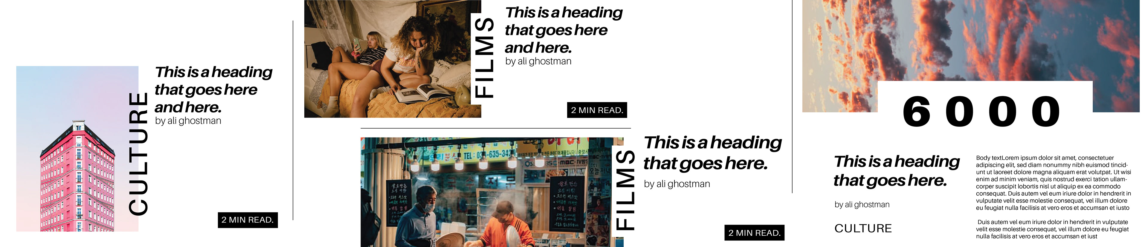
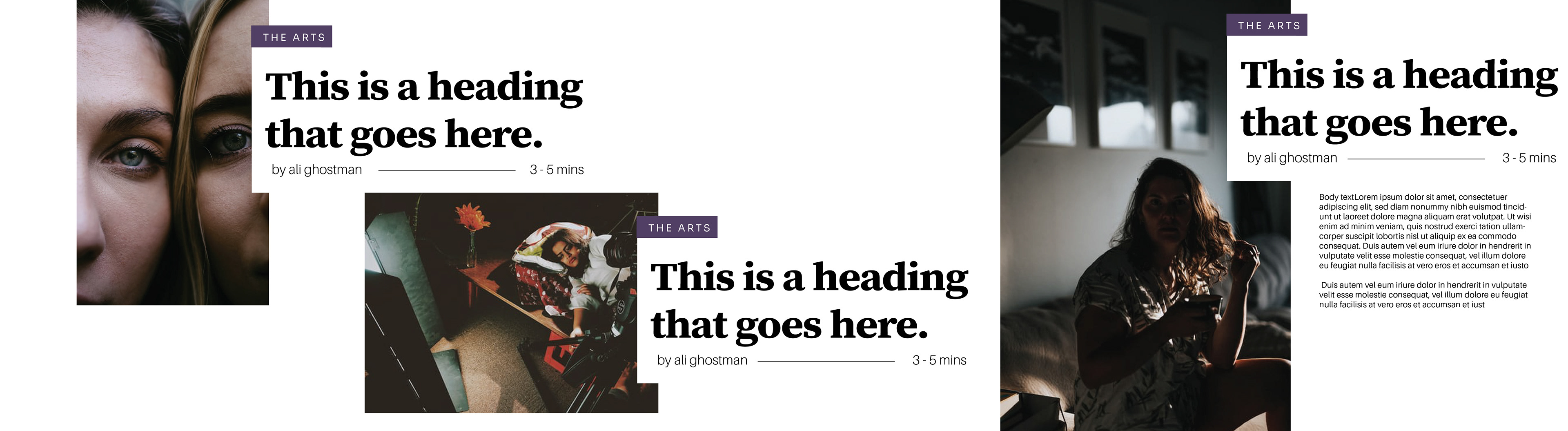
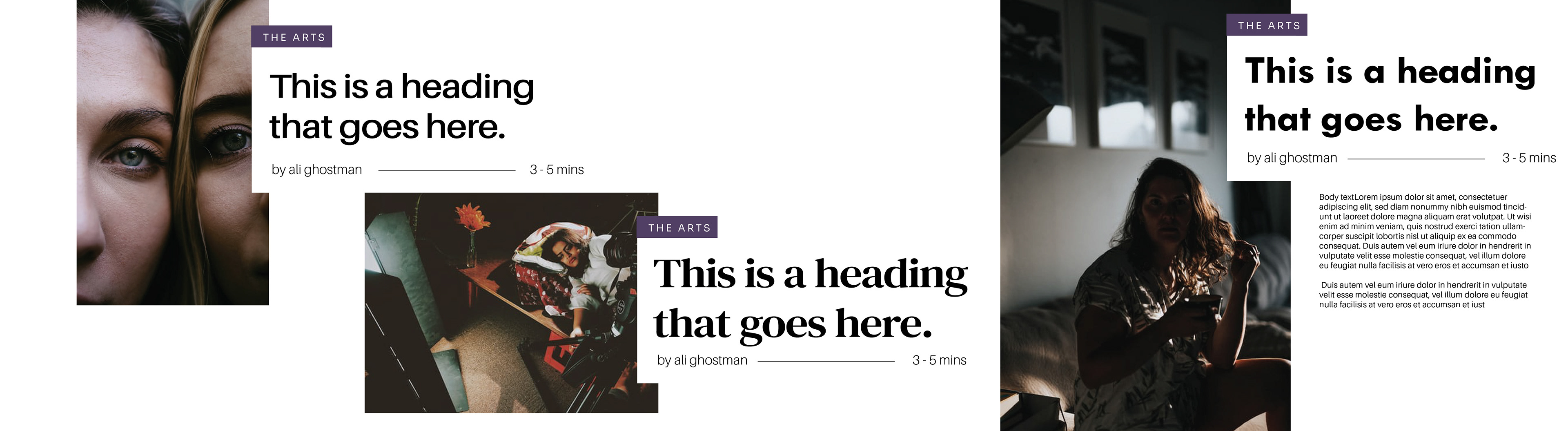
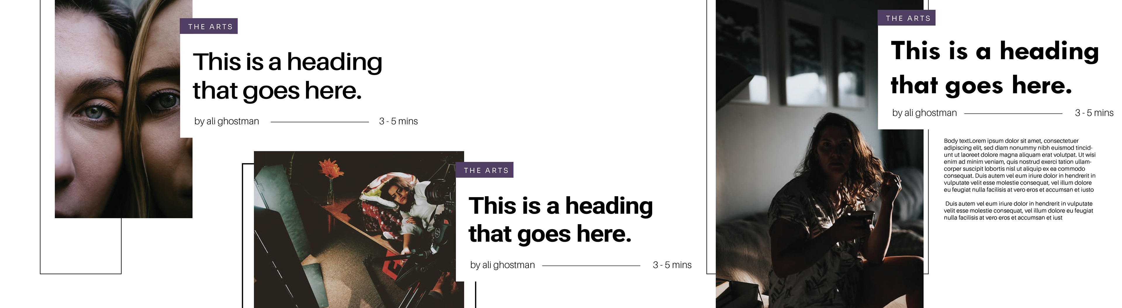
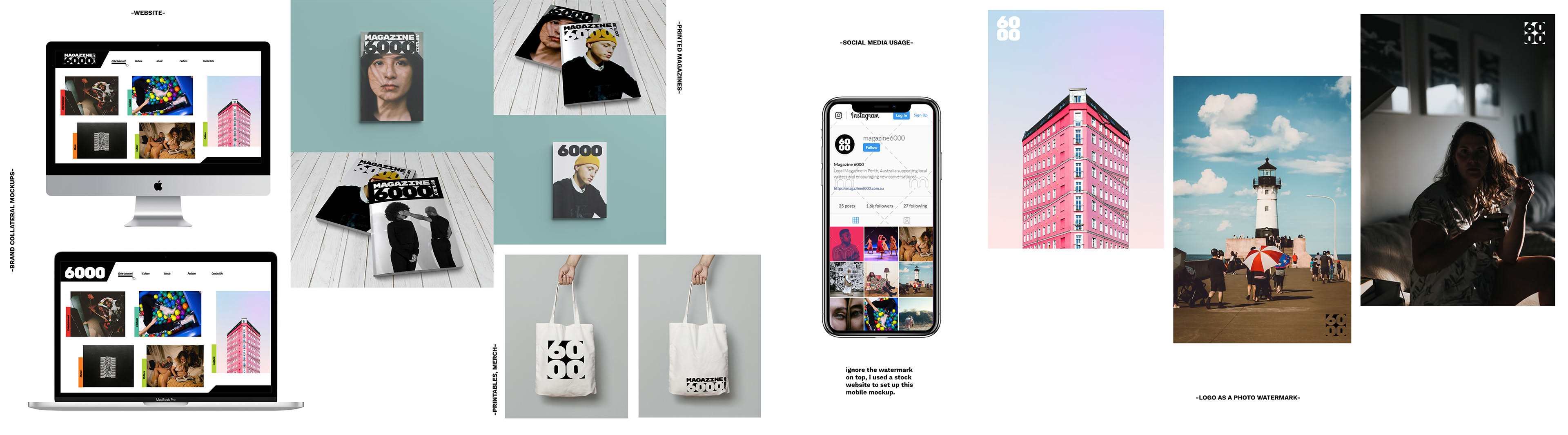
Here is some of the finished work as I don't have Shawn's process work to show (nor should it be my rights to show it since the credit and work belongs to Shawn.)
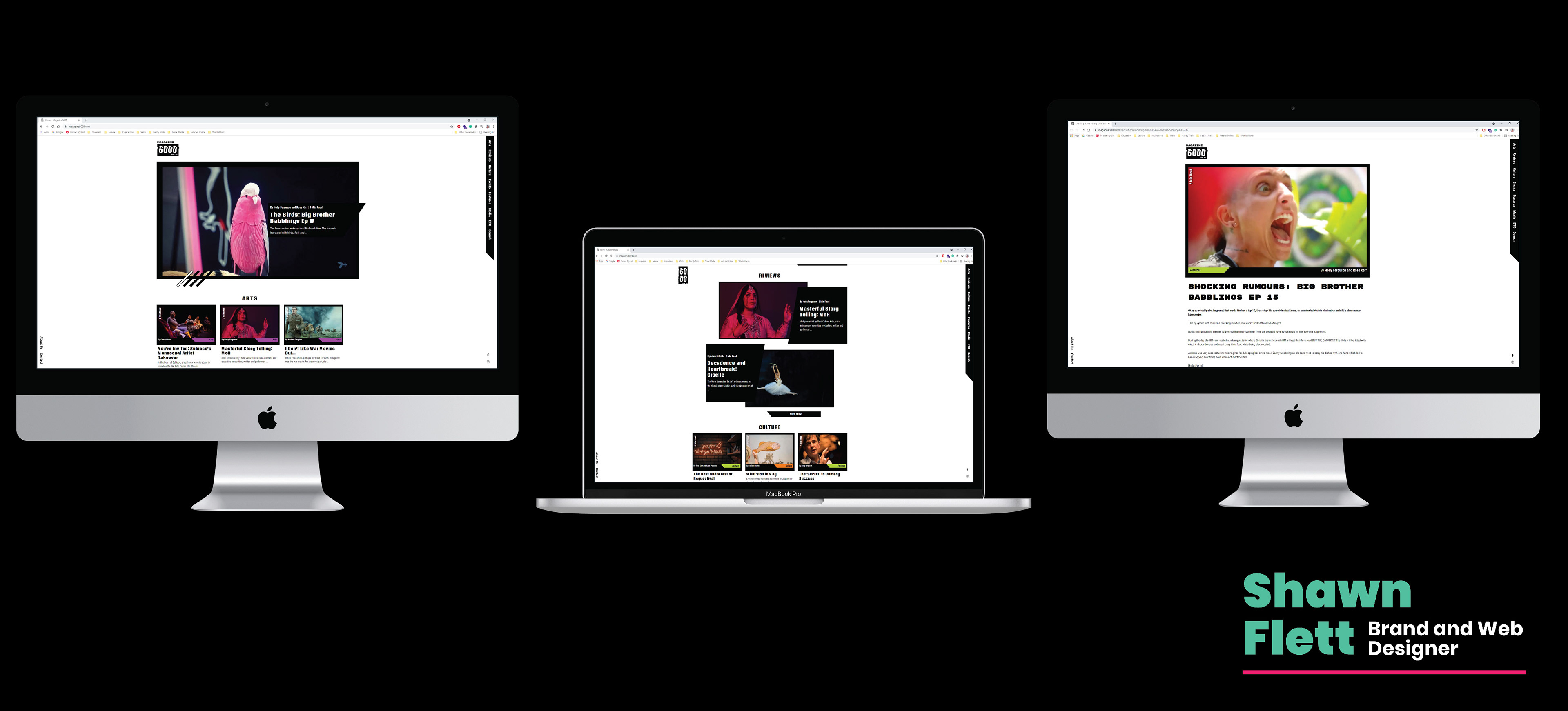
I'm writing this with the project being completed in April 2021.
The website is already live and so is Magazine 6000's social media!
Go check it out to see the full project in place!
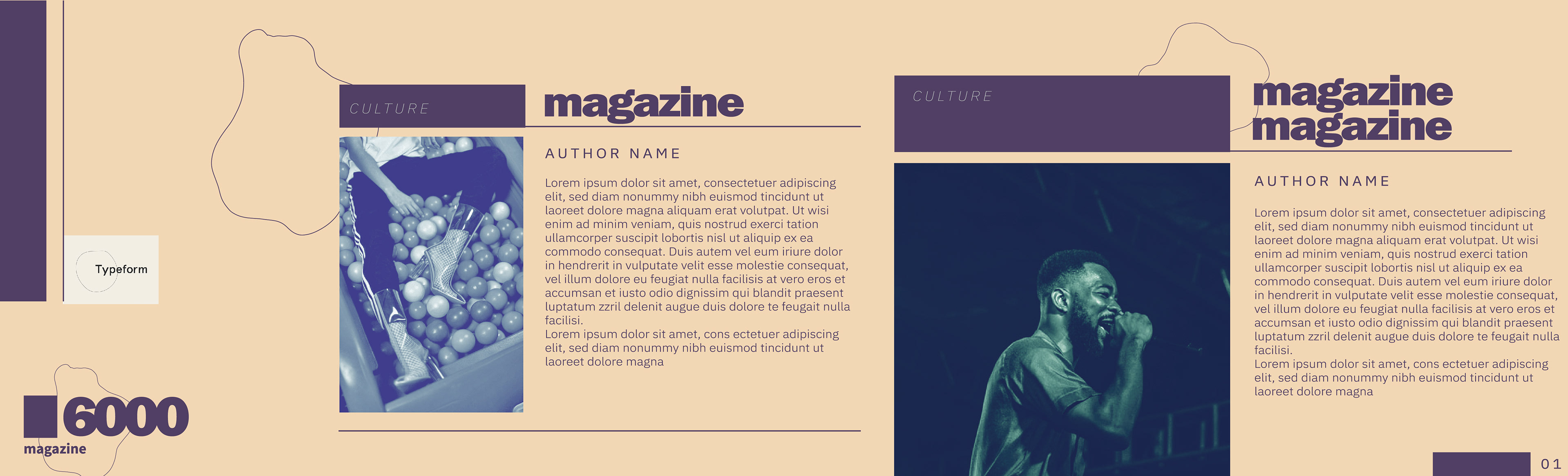
Above: Social media graphics I made for my own social media account.
So this is one of those projects while I collaborated with my former business partners, it's also a rejected archive project entry. I have to be honest, looking back I think the logo and stylescape Holly chose is great, and while I did get a little bit of jealousy towards Ann Marie for the one-up and being chosen over and over again, I realise I'm more mad at myself for my incompetence than I am at her.
I appreciated all her work, but deep down, I was sour at myself, for feeling envious because it didn't feel like she was that passionate about design while I was but also because the real confronting feeling was that I could only be chosen by the client if I wasn't competing with anyone in the first place. That made me sad thinking my skills are that incompetent. I can't lie about being depressed, although I can only keep challenging myself and pushing myself harder to be better.
Despite everything, I'm very, very grateful for the opportunities given to me.
Shawn & Ann Marie has since moved on freelancing and now work full-time under other design studios in Perth, Australia. Unfortunately, both Ann Marie & Shawn don't have Behance otherwise I would have tagged them. Although they're both not too active these days on social media, do check them out!