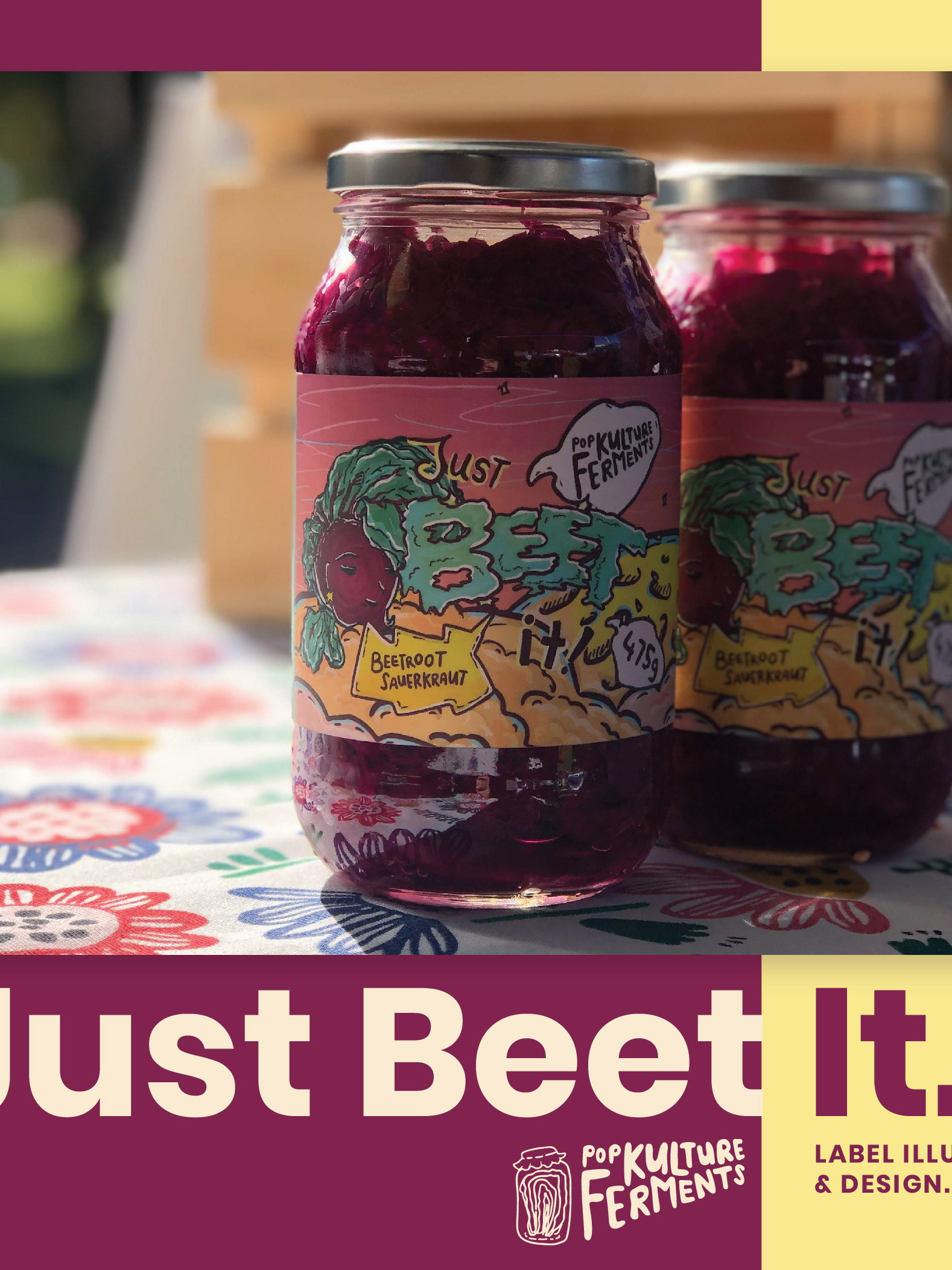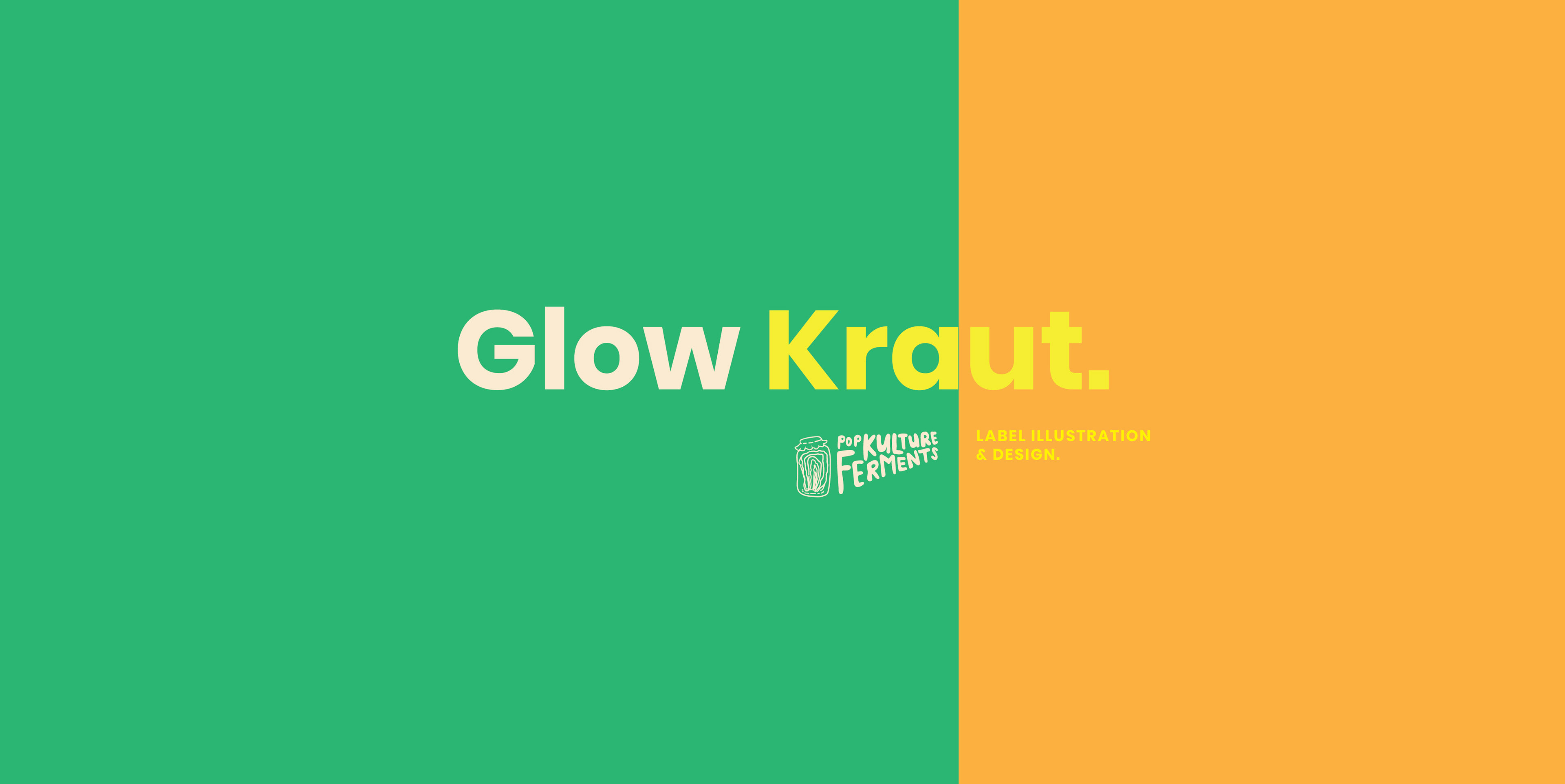
Remember the Just Beet It project? I was contracted by @popkultureferments (Tessa) again to work on a new project - illustrating and designing a popular product of hers -- the Glow Kraut. At this time, Pop Kulture Ferments is still a small local business in contrast to Fresh Frontier and COSTCO, but I never forget about my small business clients.
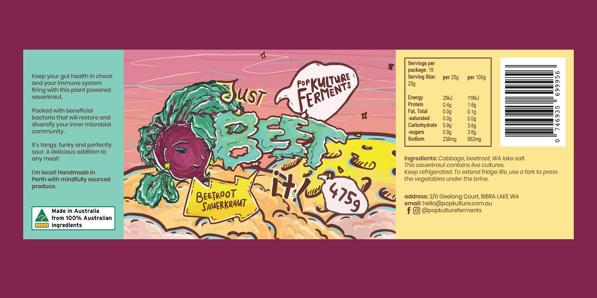
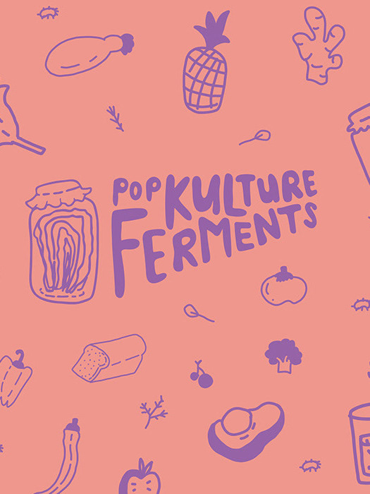
The Glow Kraut project is made easier thanks to the "Just Beet It" project where Tessa was already happy with the label layout and the chosen style and wanted to keep it consistent for the Glow Kraut design. The reasoning for this style was to be a point of difference and feel closer to her personality which is down-to-earth, organic and reference her interpretation of pop culture - where she grew up with skateboarding culture, thick cartoon linework and more.
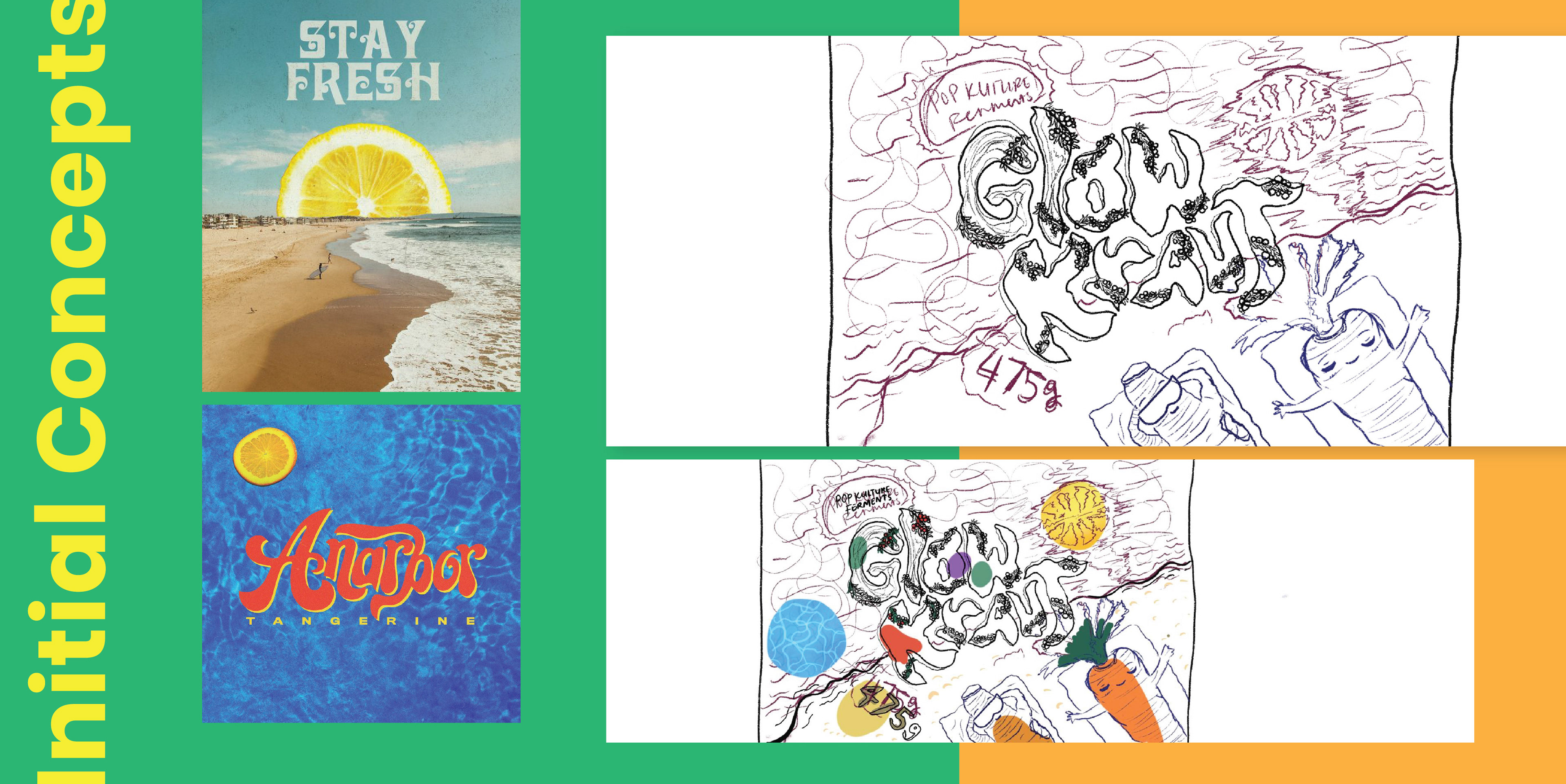
Tessa requested me to create 2 concepts. Previously I had made given her 2 different styles which I had coloured fully before showing her. Knowing now there is a certain style she is looking for, I split up my process and decided to show her only the sketch as the concept alongside possible colours that'll be used. I learnt this was good way to streamline the process as I used to just colour it all fully before showing the client. I had to work ion this way because at the time, I was working under Plus 4 Creative, and we had recently input rules that we'd have to work under a specific number of hours or we'd lose profit. Not wanting to let my team members at Plus 4 down, I tracked my hours and tried to find ways to streamline my process. Since Tessa is a small client but with a big vision, we had to find a middle pathway that would work for both of us.
Working under Plus 4, I wasn't allowed to be too ambitious because it also would costs my other team member's (or co-worker's) time. Tessa doesn't have a high budget in comparison to Fresh Frontier, and in contrast small business have visions that may require more detail and effort where as it seems as the more corporate the business is, the simpler the design is. Maybe that's just my view on it.
This concept, Tessa had given me a few images to work with which I put as references. The idea is to use the ingredients as the concept which I tried to play around in the sketch. Since the actual product was yellow in colour, Tessa had told me it was best the label contrasts with the product itself. Knowing that, I thought about having a blue to contrast with the orange-yellow colour of the product as they were complementary colours. The sun would be replaced by a lemon which was a core ingredient and worked in favour of colours and sunbathing, would be a carrot and turmeric, also core ingredients but referencing how people tan until they're orange. She had given me a beach image, so I tried to develop the concept around that, this idea of summer which she had said she wanted the Glow Kraut to give a sense of sun and this radiating happiness.
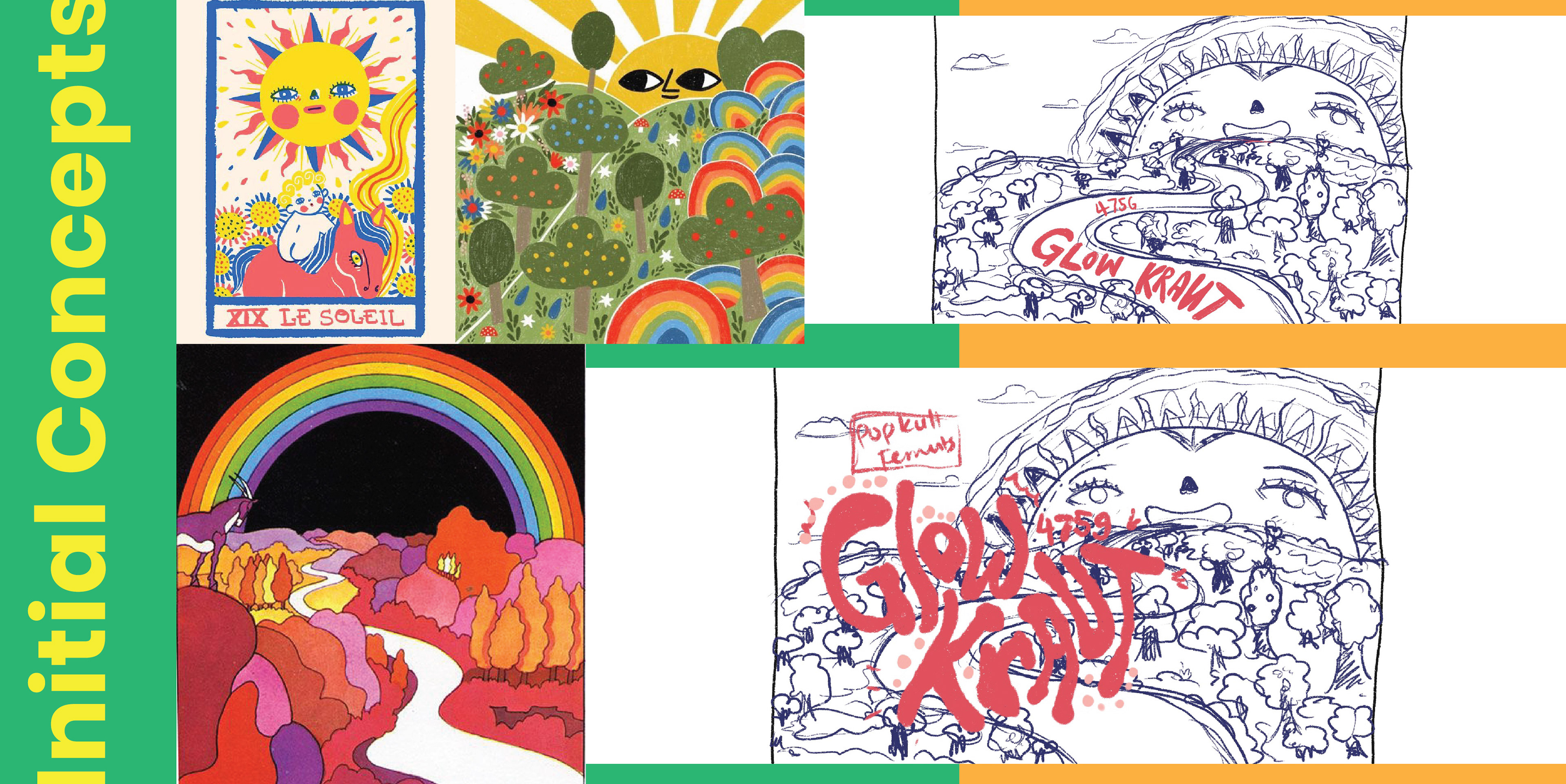
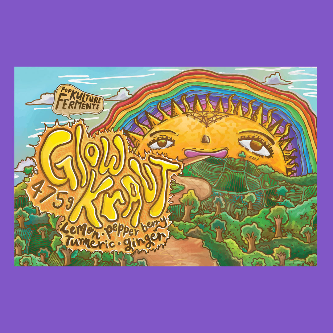
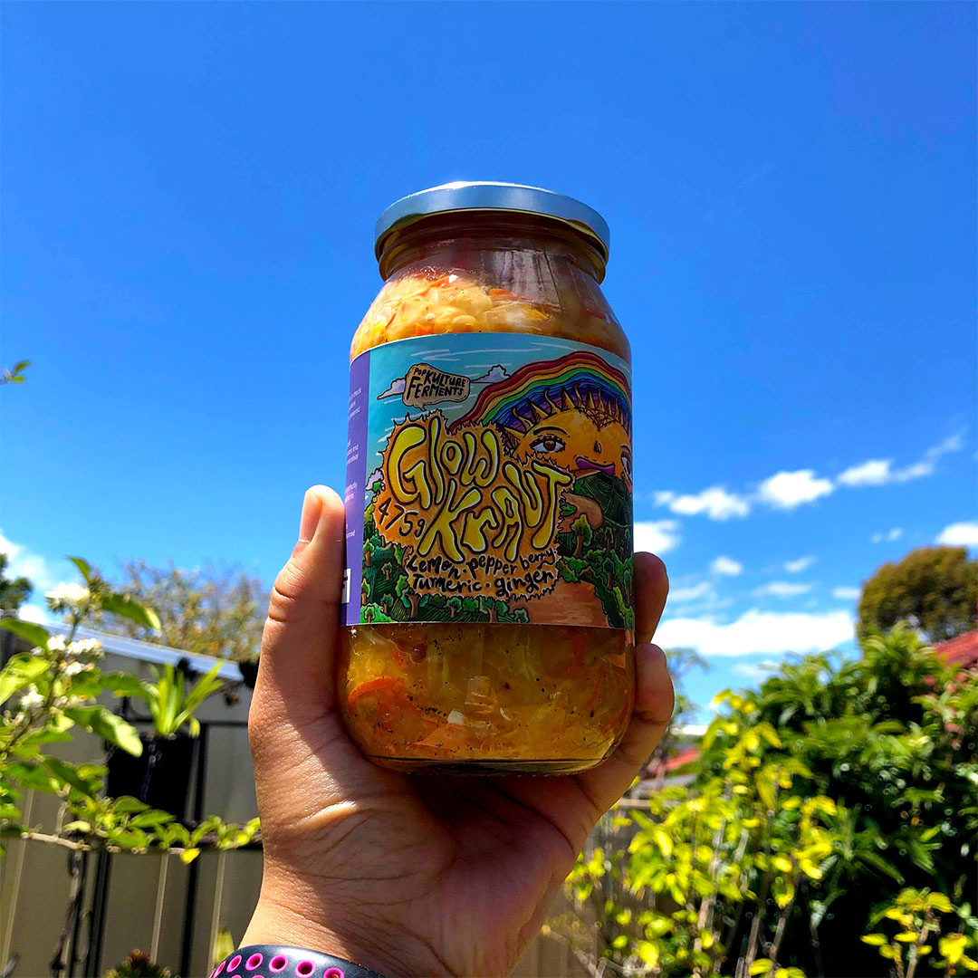
For this concept, she was looking to make something related to mountains, rainbows, and the sun having a face. She was inspired by celestial and tarot/spirituality references and really wanted to emphasise this idea of nature and happiness. I took what she had given as references and applied a similar layout as this was the commonalities, and merged the ideas together. Since it was so busy, it was tough to apply where the title art would go so I had the idea to have it off the side. Of course, I tried to make it so it was central but it would cover the path leading into the sun's mouth.
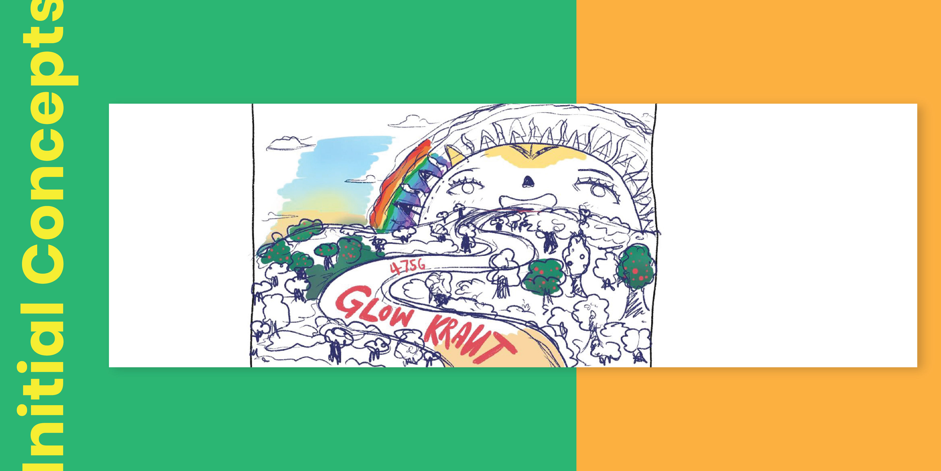
With colour, I thought it would be good to reference dawn, like waking up early and the sun is rising and happy. After a coffee and chat, Tessa made the decision to go with this second concept. She had told me that she had always lean towards this concept because she had always envision it this way. She just wanted to explore her other ideas and give them a chance. Fair enough, I do the same thing too.
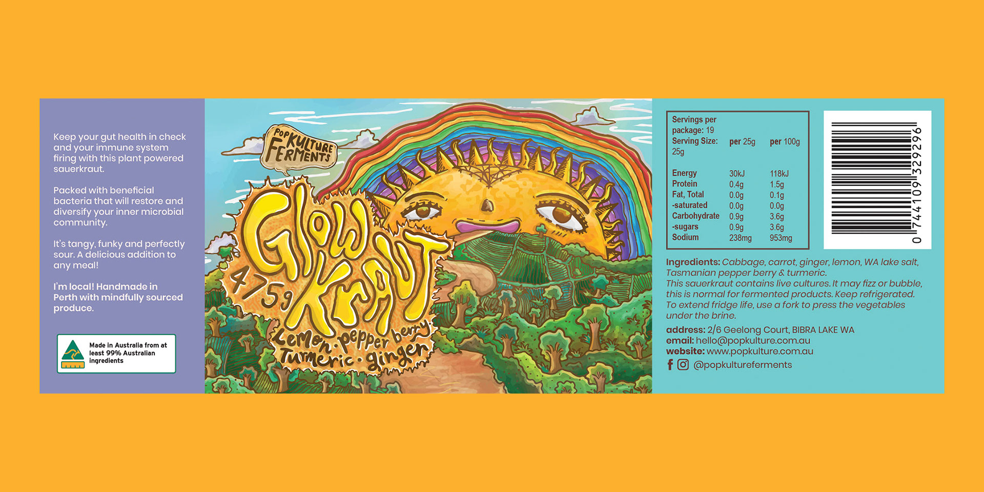
With that choice made, it was time to work on the assets and put my energy into refining the concept into an illustration and label design.
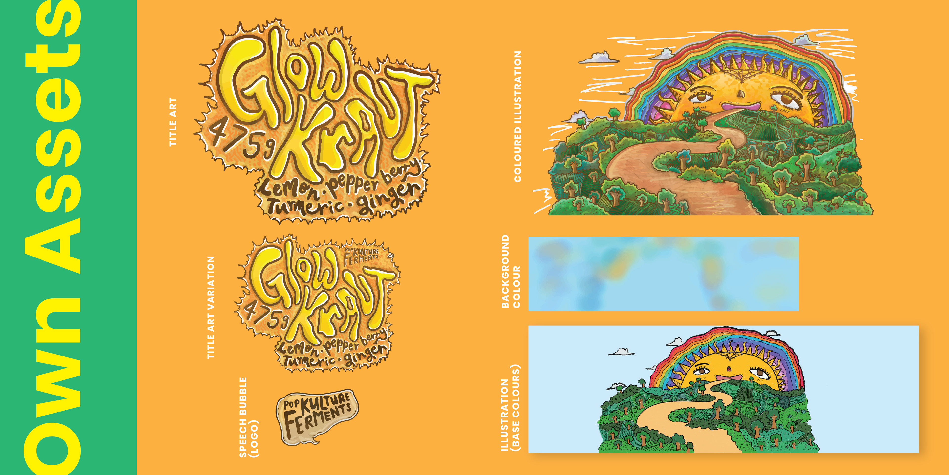
What isn't shown here was that initially I had done two different lineworks. At first I used a chalky linework, but after I coloured it, I realise it didn't work as well as I thought. That's when I decided to go with something more smooth and opaque. In the end, I tried to figure out what I wanted to do with the green areas as I sketched it out to be a bunch of shrubs. I decided it'll be a nice touch to do farm fields and shrubs. That gives the illustration texture and also some diversity so it's not just shrubs everywhere.
My biggest concern was definitely the title art. It was a fight between the title art and the illustration itself - how the glow kraut title art could be the main focus but still make everything else work together. I ended up talking about this with Tessa and we worked out that the title art would be best on the side and the other parts like the logo could be a speech bubble similar to Just Beet It.
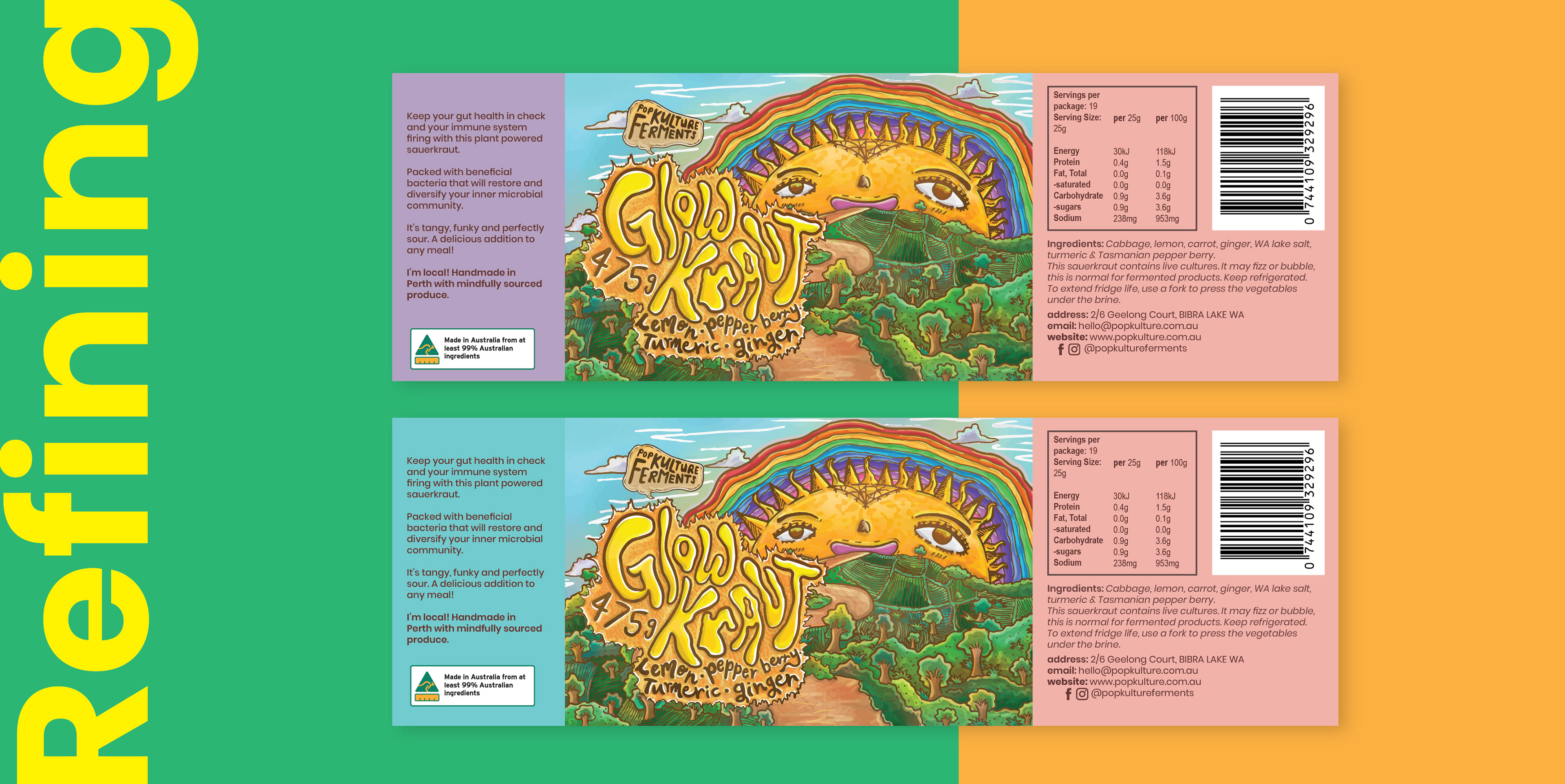
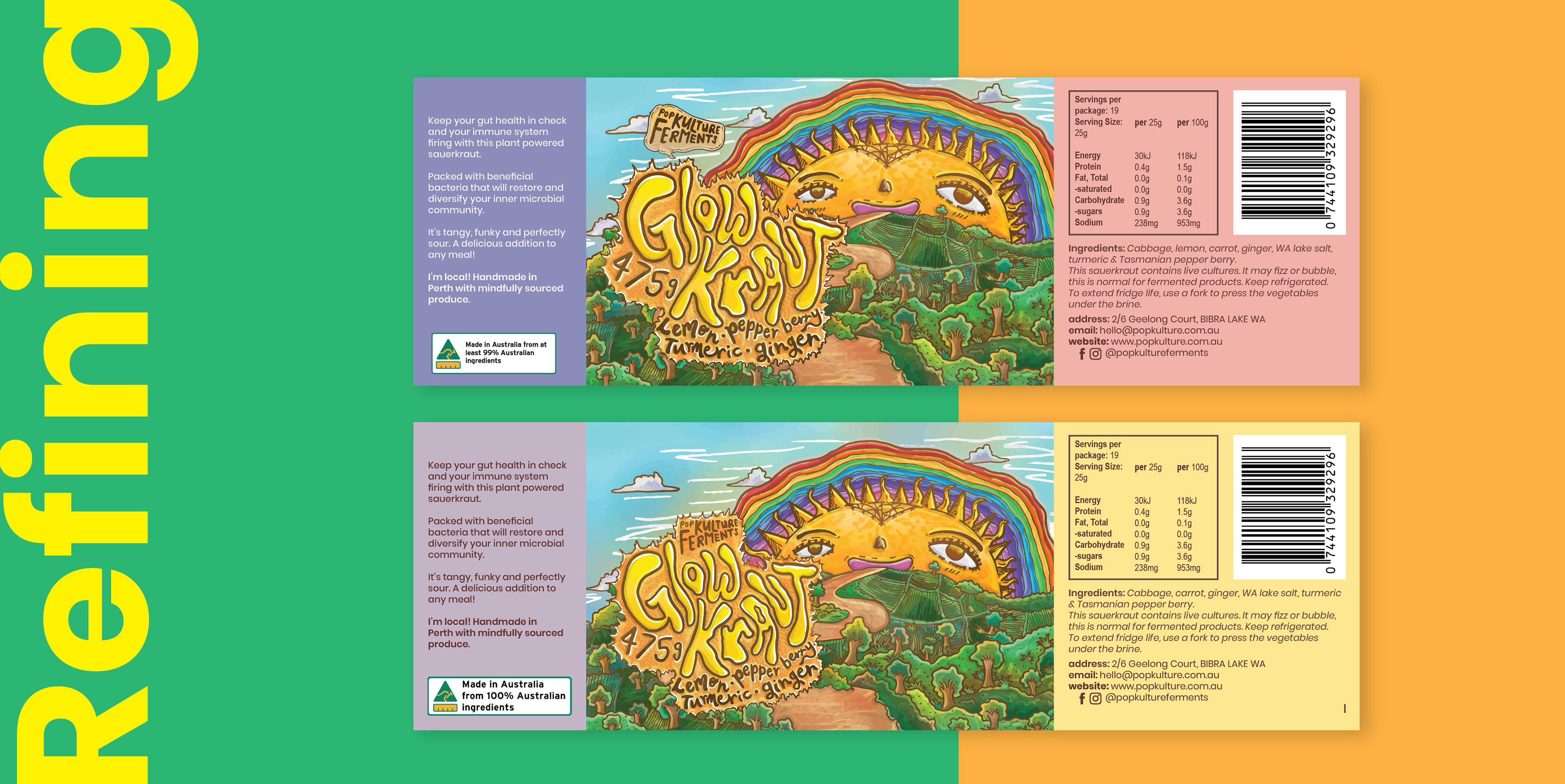
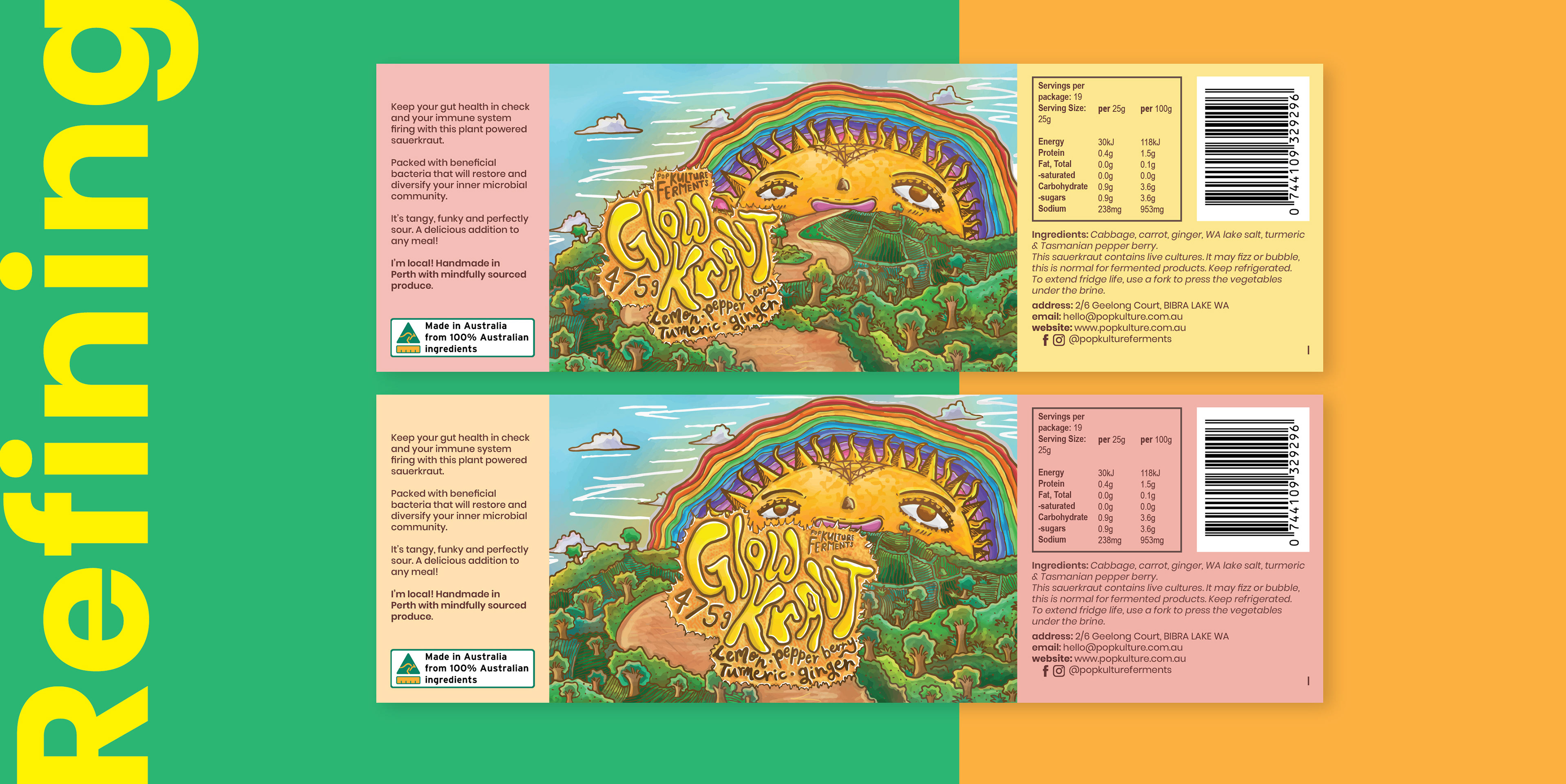
After working out that problem, the rest was simple. I had applied a similar layout to Just Beet It, and gave Tessa a couple of different swatches to choose from that I thought would contrast best with the kraut product. She ended up choosing a mix and match of swatches and decided to settle with one specific choice.


Thank you for viewing my project showcase for Glow Kraut!
You can check out more of works at @somechuppystudio and if you enjoy my illustration work, I upload personal arts @somechuppy!
Get to know Pop Kulture Ferments more at her website, www.popkulture.com.au
and check out her products at her online shop: shop.popkulture.com.au
and check out her products at her online shop: shop.popkulture.com.au