Another rewind project, another FF (Fresh Frontier) project! Rewind to late 2020, to Plus 4 Creative's last project: working on re-designing the Fresh Frontier's existing product ranges. This included Naked Salads, Kraut Jars and their Paleonnaise (aka Happy Gut Mayo). For this project entry, I'm only going to cover the Naked Salads and Kraut Jars while the Happy Gut Mayo will be the next project entry on the list.
To give you context, Fresh Frontier had already been working on re-branding since their Wellness Bowl project and COSTCO project with us. They always emphasised that they wanted a colourful look, as reference to the "wellness wheel" which represents 7 different areas of life wellness brings from eating, exercising and living a healthy life. Their story was to tell that Fresh Frontier provided food that would contribute to the wellness wheel and would bring positivity and vitality to their customers.
Imagery supplied by Fresh Frontier.
This project was a collaboration between myself and Ann Marie as we had already worked on the wellness bowl project and so the team from Plus 4 Creative thought it would be best appropriate if we take this Fresh Frontier project. The research and inspo is a collection of both Ann Marie's and mine's inspiration boards and collection of photos from visiting the stockist stores that Fresh Frontier's products were in. By seeing who shared the same shelves as Fresh Frontier, we could see direct competitors and get an idea of the existing designs. For ideas, we focused on colourful designs as requested by Fresh Frontier. I really loved the idea of doing a custom die-cut or a transparent sticker although it was uncertain if Fresh Frontier had the budget for it. However they were open to changing the original tag idea and for us to suggest a label shape.
Of course, I made my own illustration and lettering assets again. Looking back and reflecting now, I think that making assets helped me feel backed up - incase I had trouble with coming up with a concept, I felt like I could rely on my assets to help out experiment and prototype then the ideas will start to flow from there. In the end, I used a couple of my assets for a concept, although not all.
I took notes from the Wellness Bowl project and tried a concept with clean type that was simple yet bold. I also had plans to use the text to align to the layers of the salad.
The design was open to either being a white background or ideally a transparent background. The idea is that the top sticker would stick over the top and then this sticker would allow for the jar to be turned to easily see information. The idea was give consumers convenience by not having to turn the jar 180 degrees to see the nutritionals, they can just give it a slight turn and see everything.
You can read my rationale below.
This second concept I had used my assets and stemmed from the same structure as my first concept. The structure that would provide convenience by not having to turn the product as much for information. This time, the alignment wasn't planned to be exact but rather feature the ingredients in a ladder way - what was at the bottom to the top. I had also come up with the phrases "What you see is what you get" and "all goodness, no lies"; they previously had "so naked, so good" which I didn't think made sense nor did I think it represented the product well. The thing about their Naked Salad product was that it hasn't been done often in our market here in Perth so it's like a first market mover.
Again this label is designed with the idea it could be a white or transparent background with the use of text as texture in the background.
The last concept belongs to Ann Marie but I thought I'd show because it's important you see the full picture of the project.
Ann Marie borrowed my phrase idea which I didn't mind because we both agreed "so naked, so good" didn't make sense anyway. Ann Marie had a different sticker structure in mind, she wanted to keep it simple, one sticker at the back with the nutritionals and the front was the title and features of the product.


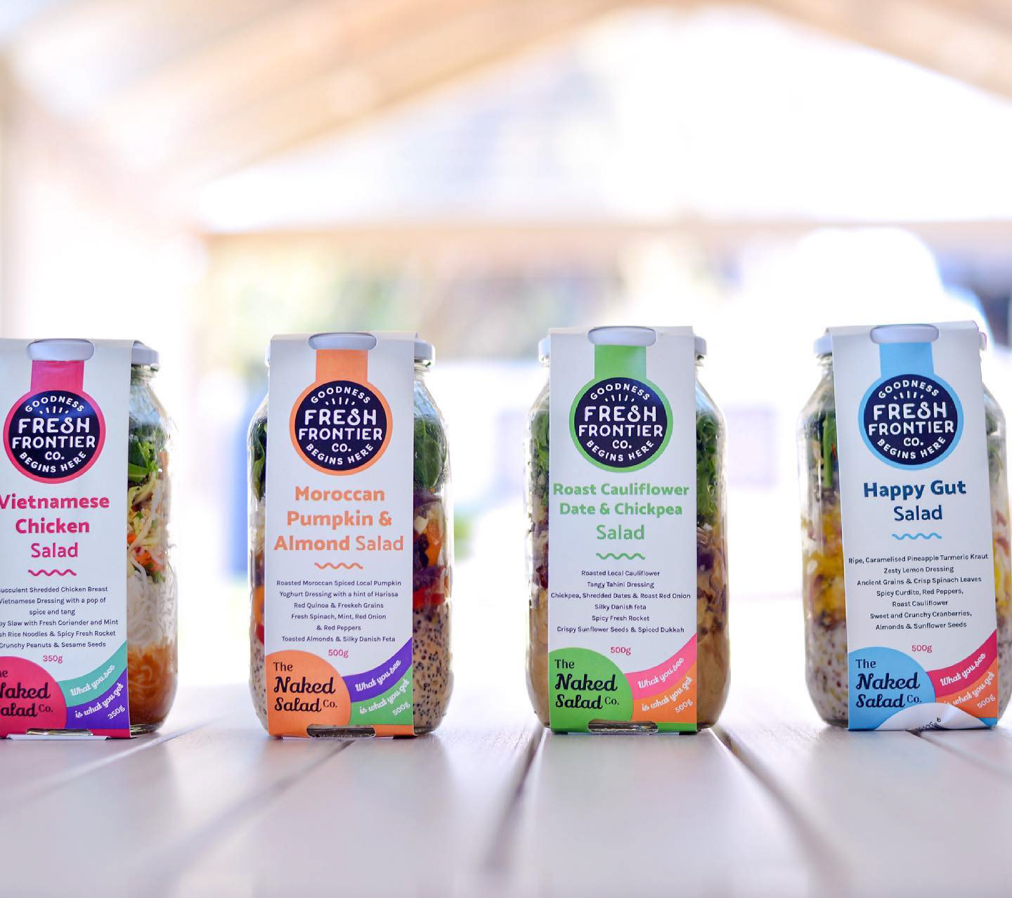

Maybe you've guessed it - but Ann Marie's design got chosen for the Naked Salads. What ended up happening was that they decided to change the label structure to a jar holder - similar to what you see above. Ann Marie's design looked the easiest to transfer to that concept but was also close to what Fresh Frontier wanted.
(Maybe you might be getting the hint to why this is called the "rejected archives"?)
Well, let's get on to the next project: The Kraut Jars.
Mind you, these projects were happening at the same time so we only knew what they decided on once we delivered initial concepts for all the product ranges: Naked Salads, Kraut and Happy Gut Mayo.
Introducing... candidate 1! For this design I wanted to bring back the lines from the Water Kefir and Wellness bowl projects. I knew that Fresh Frontier loved their circles and wanted to bring that in to reinforce their brand image. Overall the concepts I made for the kraut jar doesn't use any of my assets (but some new assets I made using my computer mouse...) but my focus was to try new things-- i.e playing with type and seeing how I can play with typesetting and type hierarchy. I also tried to pull back my design and play with the "less is more" rule. I think this was the start of me trying something more minimal.
My next concept, I decided to play with different geometric shapes - this time instead of the circle, I thought it'll be fun to play with squares and see what patterns I could come up with as means of adding colour, fun but also luxury since it was gourmet kraut after all.
Now... you wouldn't get the full picture if I didn't show you Ann Marie's concept for the kraut jars. So I've put it below and all credit goes to her. Because I was the one liaising with the client, I also tried to edit both her concept rationales to sound more appealing, so you might notice the writing style resembles how I write. She did mention she needed help rationalising and asked me to help out.
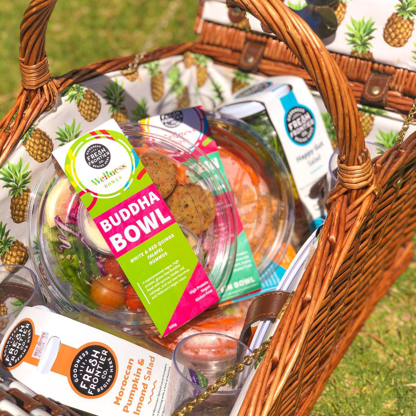
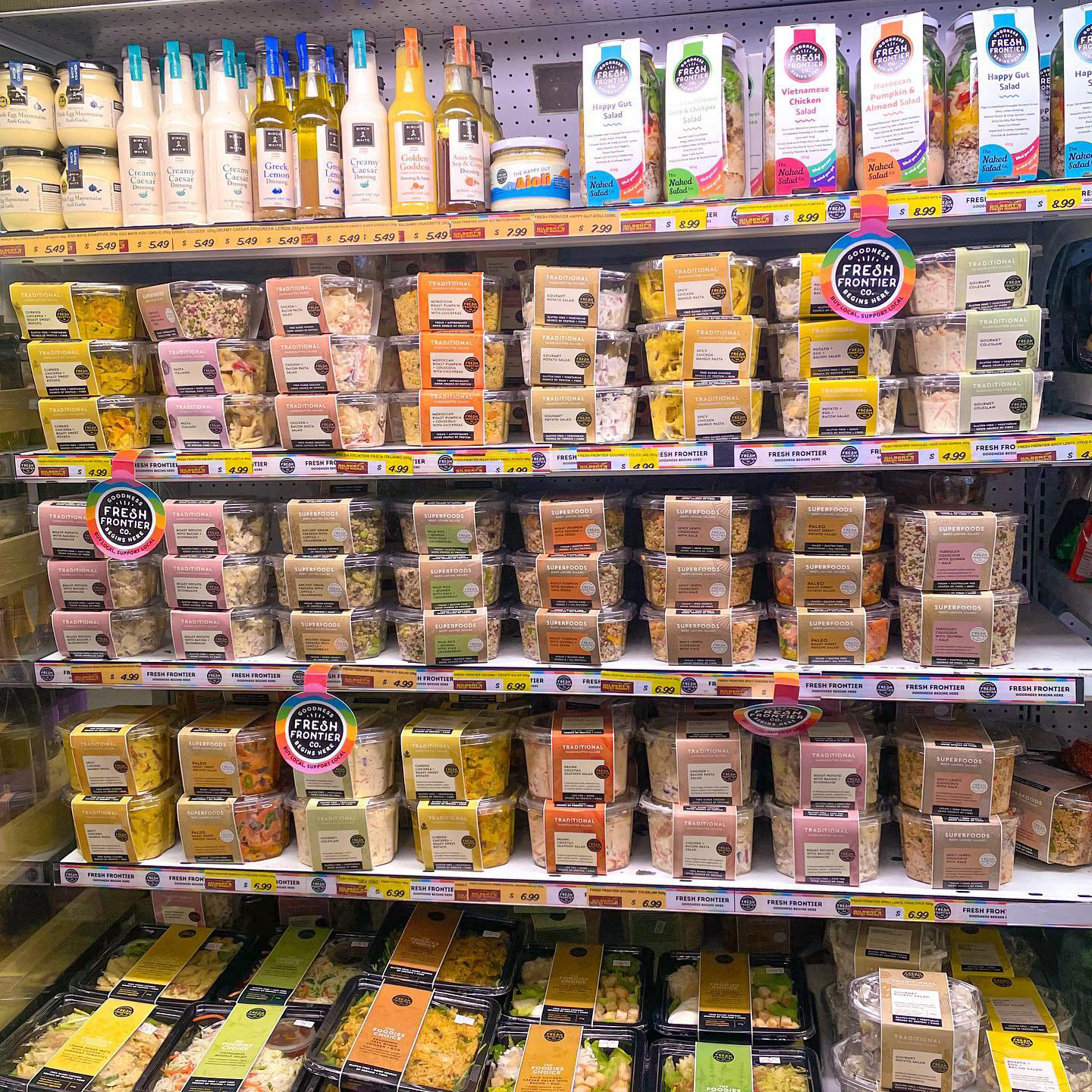
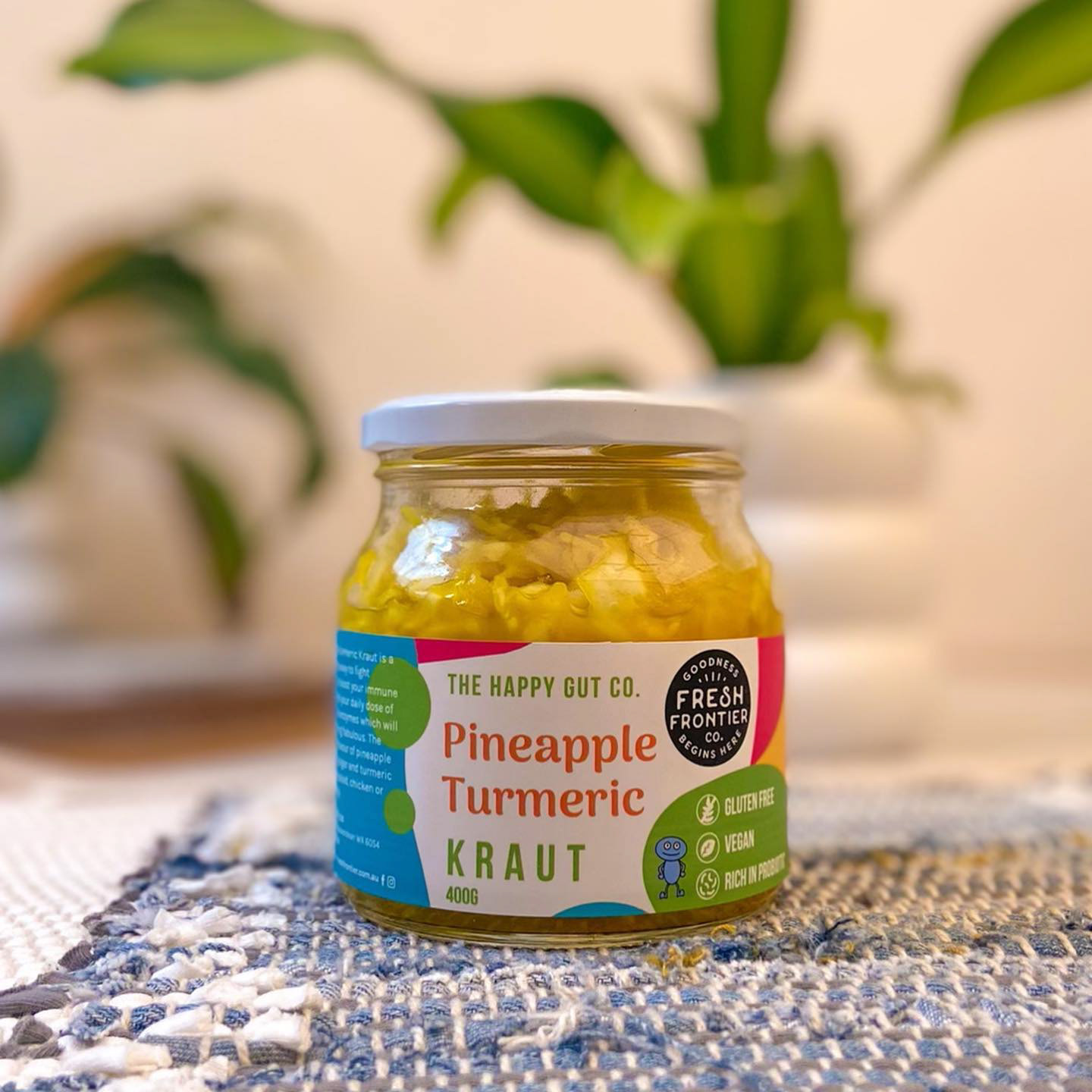
Fresh Frontier chose Ann Marie's concepts for both the Naked Salads and Kraut Jars as it best suited their vision for the brand best. I've put a collection of photos which I have taken from Fresh Frontier's social media, to showcase the products altogether.

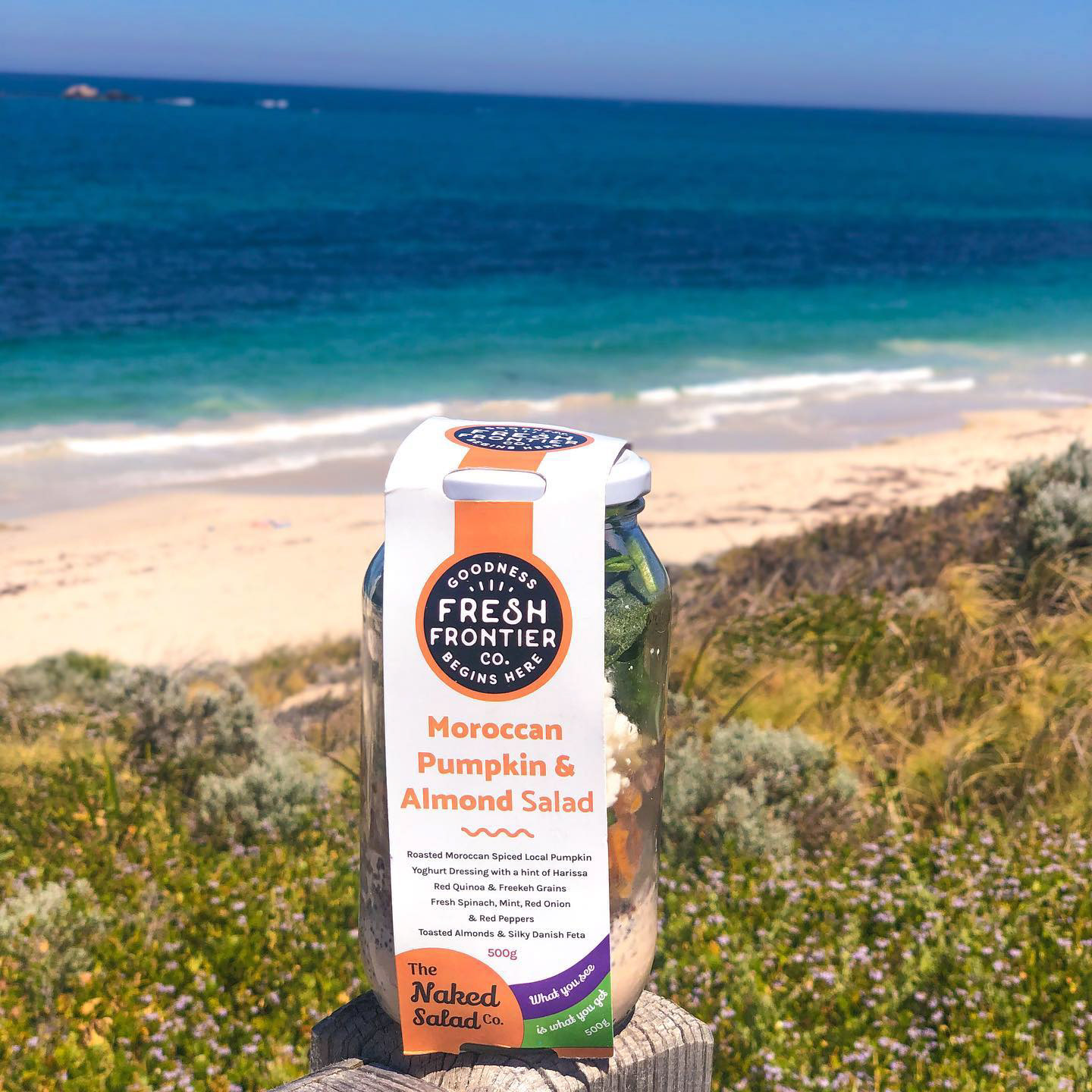
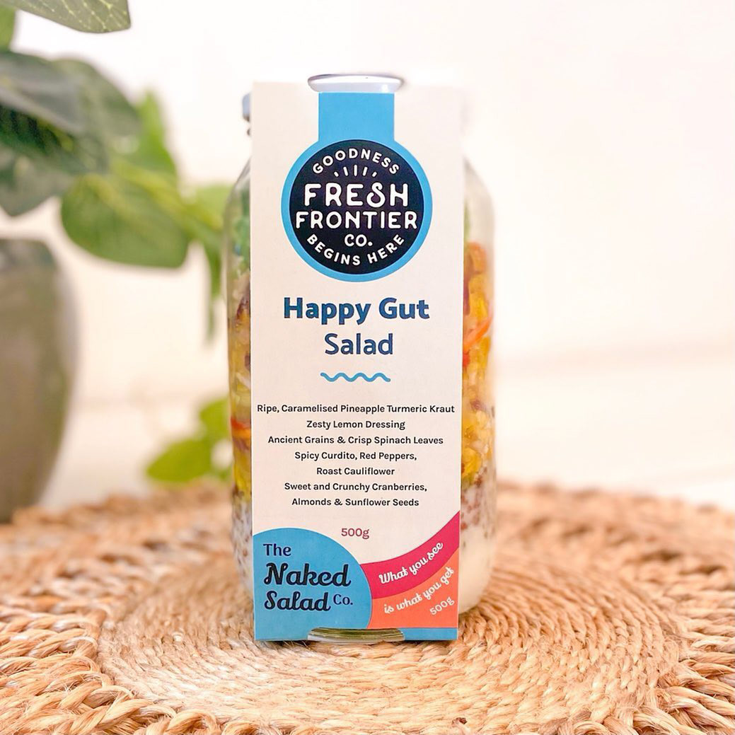
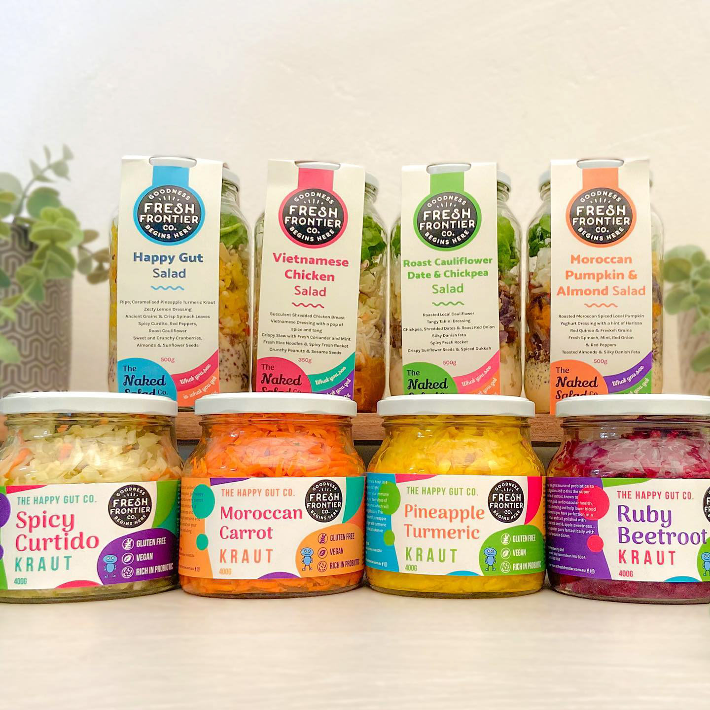


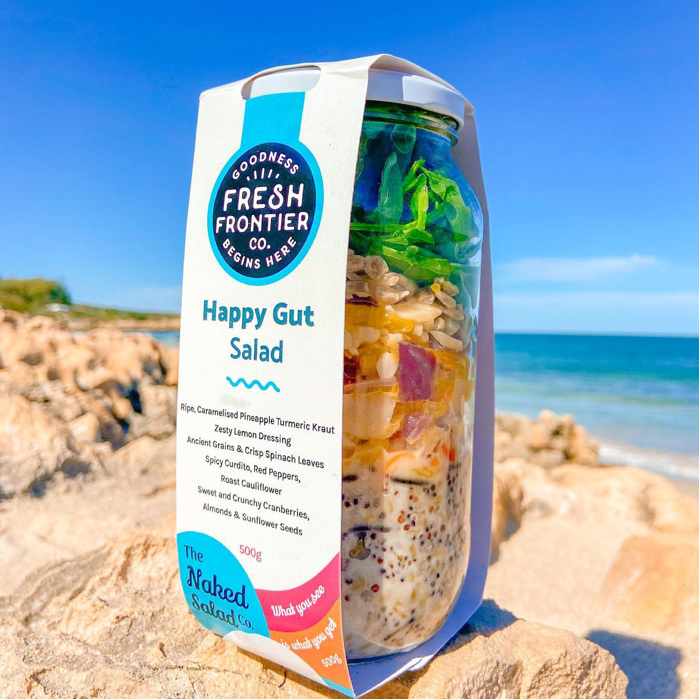
I'll be honest, while this may be a loss for me just like the Wellness Bowl project (perhaps the Water Kefir too), I didn't feel as sour as I did in the Wellness Bowl project. Perhaps at first I was like, "oh bummer, I worked on those concepts and it didn't get chosen" but after looking at their brand altogether as a whole, it was starting to piece to me in my head how their ideal aesthetic should look like. While I was taking notes before in my previous projects, I think these two and the next project really defined Fresh Frontier's ideal brand image. I could see why they chose Ann Marie's concepts and to me, I felt like it was okay that they didn't chose mine. Mine just didn't fit their vision, or Ann Marie's just fit their vision more than mine did.
If anything, I think the loss was necessary to my growth. Sometimes it's a good ego check too and it really made me want to work harder to try and listen to the client's goals and needs to provide a closer visualisation of their vision. I also feel grateful because while my design may not have fit the client's vision, I felt like I got paid to essentially practice and put out designs that challenge me and represent my best self at the time. It encourages me to keep challenging myself to create designs that builds on my graphic design skills which doing these label projects are certainly helping!
So here's to me and my past self for trying her best and learning as she does it. An acknowledgement from her present self that these projects were essential to my growth and I wouldn't be making cool labels for other companies if it weren't for these projects.
Plus I made some cool lettering artwork from this project which I posted on my personal art page. See you at the next project - I'll be continuing this story with the Happy Gut Mayo Project coming soon!

